インフォグラフィック・案内
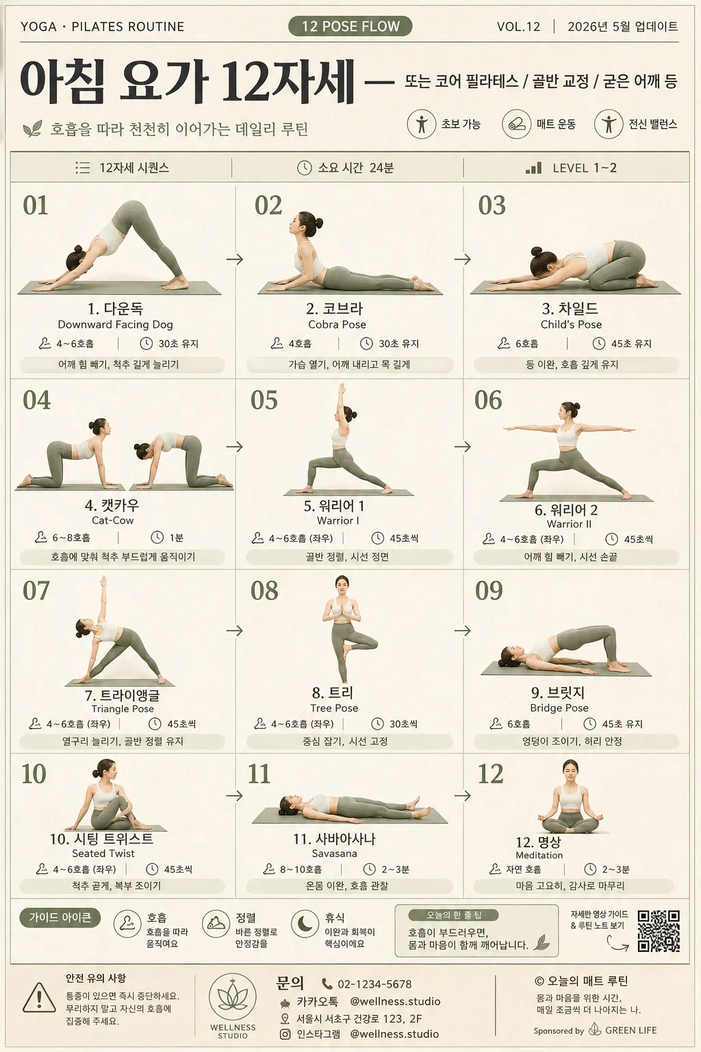
요가·필라테스 자세 인포그래픽 (12자세 시퀀스)
요가·필라테스 12자세 시퀀스 인포그래픽. 자세명·호흡·시간·난이도 + 인물 일러스트. 헬스 SNS·홈트 가이드.
요가·필라테스 자세 인포그래픽 (12자세 시퀀스)の概要
インフォグラフィック・案内画像を作るためのChatGPT画像プロンプトです。主題、背景、スタイル、構図を整理し、すぐに試せるよう構成しています。
関連キーワード: 요가·필라테스 자세 인포그래픽 (12자세 시퀀스), 요가·필라테스 자세 인포그래픽 (12자세 시퀀스) 프롬프트, インフォグラフィック・案内 프롬프트, インフォグラフィック・案内 AI 이미지 프롬프트, ChatGPT 이미지 프롬프트, AI 이미지 생성 프롬프트, AI 프롬프트, 이미지 프롬프트
요가·필라테스 자세 인포그래픽 (12자세 시퀀스)の活用方法
元の構造を保ちながら、被写体、背景、色、構図を変更して別案に展開できます。
- 主題を維持し、ブランドや季節、媒体に合わせて色と背景を変更してください。
- 結果が複雑な場合は背景要素を減らし、被写体、構図、照明を具体化してください。
- コピー後、ChatGPTに媒体、アスペクト比、文字の有無を追加で指定できます。
プロンプト原文
[Input]
- language: Korean
- output_size: 1024x1536

[Purpose]
Yoga and Pilates pose infographic poster, 12-step sequence, designed for health/wellness social sharing and printable guide use.
Polished editorial layout that teaches a full routine at a glance with clear progression, readable pose labels, and realistic printed-poster details such as guide metadata, footer notes, studio contact text, and small wellness icons.

[Composition]
- Main composition: a vertical 3x4 or 4x3 grid with 12 evenly sized panels, each panel containing one pose illustration, pose name, breathing cue, and hold timing details.
- Overall poster should feel like a real yoga studio handout: full-frame vertical sheet, warm matte paper texture, faint ink grain, subtle sage-green dividers, charcoal typography, and small editorial annotations.
- Sequence title area at the top should span the full width and include {시퀀스 종류} as the primary Korean title, plus compact supporting metadata such as "12자세 시퀀스", "총 24분", "LEVEL 1–2", "VOL.12", and "2026.05 가이드".
- Grid block should sit below the header with a precise, readable structure; each cell should include a small pose number 01–12, a pose illustration, Korean pose name from {자세 리스트}, English pose name when appropriate, and timing/breathing notes from {자세 정보}.
- Background should be a calm matte paper texture in warm beige, with sage-green accents, muted olive section tags, charcoal text, and soft cream panel surfaces.
- Add realistic guide elements around the layout: small line icons for breath / alignment / rest, tiny arrow markers showing flow direction, a footer reminder strip, a QR-code-style square, studio contact line, and a small sponsor/credit area.
- Use {시퀀스 종류}, {자세 리스트}, {자세 정보}, {레이아웃}, {컬러 톤}, {인물 톤}, {비율} placeholders throughout the infographic content.

[3. CORE STRUCTURE]
- Header band: place the sequence title at the top in a strong editorial headline area. Set main Korean title using {시퀀스 종류}; include small labels such as "YOGA · PILATES ROUTINE", "12 POSE FLOW", "VOL.12", "2026년 5월 업데이트", and "소요 시간 24분".
- Header details: add a slim divider line beneath the title, a small subtitle such as "호흡을 따라 천천히 이어가는 데일리 루틴", and compact category chips like "초보 가능", "매트 운동", "전신 밸런스".
- Grid block: render 12 pose panels in strict sequence order, reading left-to-right, top-to-bottom according to {레이아웃}, with consistent visual rhythm and clear spacing between cells.
- Each pose panel: show the pose illustration centered in the upper portion, with the Korean pose name and English pose name below, followed by breathing cycle and hold time in smaller type. Use {인물 톤} and {비율} for the figure style and body proportions.
- Sequence labels: make numbering clear and compact, e.g. 01–12, placed near the top-left or top-center of each cell for fast scanning. Add tiny flow arrows between selected panels so the sequence feels guided.
- Timing details: keep duration and breathing notes in a smaller secondary line so the pose name remains dominant; include realistic examples such as "4호흡", "30초 유지", "좌우 3회", or content from {자세 정보}.
- Micro guidance: include one short alignment cue per row or small side note such as "어깨 힘 빼기", "골반 정렬", "목 긴장 완화", "호흡 유지" without crowding the pose names.
- Footer strip: use a visually lighter bottom band for a routine note, safety reminder, page metadata, and credit text. Include Korean footer strings such as "통증이 있으면 즉시 중단하세요", "© 오늘의 매트 루틴", "@wellness.studio", "문의 02-1234-5678", and a QR-code-style block labeled "루틴 영상 보기".

[4. STYLE RULES]
- Typography: use Pretendard or Noto Sans KR for Korean labels, with Bold 700 for headings and Medium 500 / Regular 400 for body text; size hierarchy should be clear, with the title roughly 2.5–3x larger than panel text.
- If English pose names appear, use a clean sans-serif such as Inter or Montserrat in small caps or regular weight.
- Color palette: warm beige #F3EBDD, sage green #A9B89A, muted olive #7E8B6A, charcoal #2F3432, soft cream #FAF7F1. Apply {컬러 톤} as the guiding palette direction.
- Use thin 1px separators, soft panel boundaries, subtle paper fibers, faint ink misregistration, tiny editorial symbols, and a gentle 4px y-offset, 10px blur shadow at 10% opacity where panels need separation.
- Pose illustrations may be refined flat editorial figures or soft semi-realistic fitness illustrations; keep anatomy believable, joints aligned, and the same drawing style across all 12 panels.
- Decorative details should support the guide: small breath icons, alignment dots, leaf-like line ornaments, calm geometric markers, and muted section labels that make the poster feel printed and practical.

[5. VISUAL STYLE]
- Camera / lens: if using photoreal model references, present them like an 85mm f/1.8 portrait setup or a 50mm f/2 studio reference; if illustrated, keep the figure proportions clean and consistent with editorial fitness graphics.
- Lighting: soft diffused studio light from upper-left with gentle fill from the right, natural paper shadows, mild surface texture, and no harsh specular highlights.
- Color grade: muted wellness palette with beige paper, sage green accents, charcoal typography, soft cream panels, and slightly desaturated skin or line-art tones for a calm premium magazine spread feel.
- Realism details: include tactile printed-poster texture, slight paper grain, crisp Korean typography, carefully aligned grid columns, subtle ink density variation, and believable small-print footer information.

[6. MOOD]
Premium wellness magazine editorial — like a modern yoga studio handout designed with the clarity of Kinfolk and the polish of Monocle, but with enough real guide information to feel usable, printed, and content-rich.

[7. CRITICAL]
- Korean text accuracy: 반드시 정확히 표시되어야 하는 문자열 — "시퀀스 종류", "자세 리스트", "자세 정보", "레이아웃", "컬러 톤", "인물 톤", "비율".
- Render Korean guide text clearly and naturally, including examples such as "12자세 시퀀스", "총 24분", "4호흡", "30초 유지", "어깨 힘 빼기", "골반 정렬", "통증이 있으면 즉시 중단하세요", "루틴 영상 보기", "2026년 5월 업데이트".
- If pose names are rendered, they must be legible, correctly spelled Korean, and aligned consistently across all 12 panels.
- All 12 panels must follow the same layout logic and visual hierarchy; do not vary panel structure randomly.
- Keep the poster vertical at 1024x1536, with the 12-pose grid as the dominant visual subject and all added metadata serving the yoga/Pilates guide concept.

[8. 🚫 PROHIBITED]
- Fake official seals / certifications
- Broken Korean characters