広告・ポスター
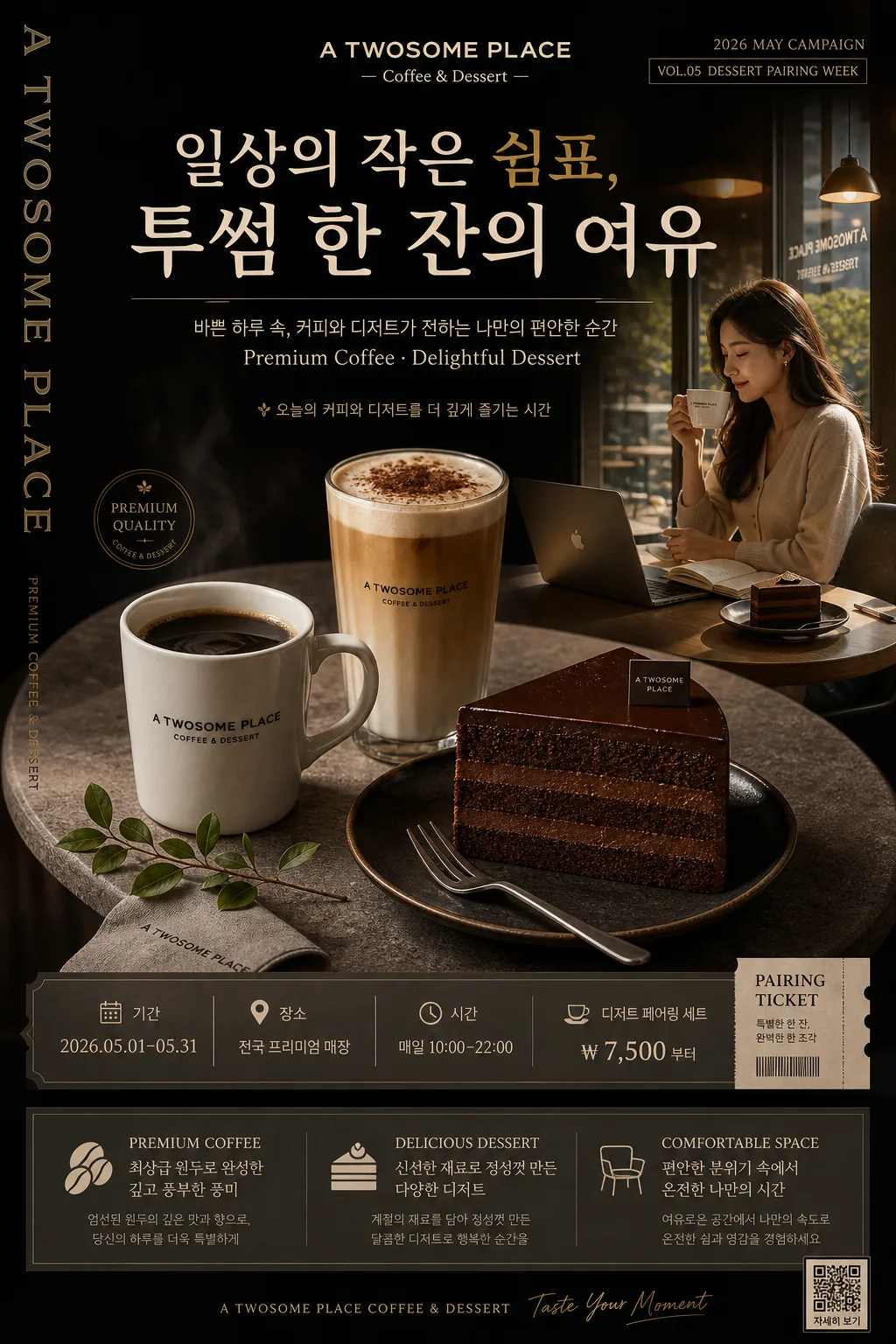
프리미엄 카페 다크 광고 포스터
투썸·할리스 같은 프리미엄 카페 광고. 다크 차콜 + 베이지·골드 + 큰 한글 헤드라인 + 커피+디저트 hero + 3대 가치. 일상의 쉼표 결.
프리미엄 카페 다크 광고 포스터の概要
広告・ポスター画像を作るためのChatGPT画像プロンプトです。主題、背景、スタイル、構図を整理し、すぐに試せるよう構成しています。
関連キーワード: 프리미엄 카페 다크 광고 포스터, 프리미엄 카페 다크 광고 포스터 프롬프트, 広告・ポスター 프롬프트, 広告・ポスター AI 이미지 프롬프트, ChatGPT 이미지 프롬프트, AI 이미지 생성 프롬프트, AI 프롬프트, 이미지 프롬프트
프리미엄 카페 다크 광고 포스터の活用方法
元の構造を保ちながら、被写体、背景、色、構図を変更して別案に展開できます。
- 主題を維持し、ブランドや季節、媒体に合わせて色と背景を変更してください。
- 結果が複雑な場合は背景要素を減らし、被写体、構図、照明を具体化してください。
- コピー後、ChatGPTに媒体、アスペクト比、文字の有無を追加で指定できます。
プロンプト原文
[Input]
- language: Korean
- output_size: 1024x1536

[Purpose]
Premium dark café advertisement poster for a luxury-brand coffee and dessert campaign, designed as a vertical A4 editorial poster with polished commercial photography, real printed-poster details, and persuasive in-store campaign information.
Suitable for premium café window display, counter standee reproduction, social media promo, seasonal dessert-pairing campaign visuals, and luxury coffee brand launch advertising.

[Composition]
- Main subject placement: the hero still life sits in the center-lower 55% of the frame, while the headline block occupies the top 20% and the value-summary / campaign-information block anchors the bottom 18%.
- Background treatment: deep charcoal matte backdrop with a subtle gradient from near-black top-left to warm dark brown bottom-right, faint stone texture around the table area, and realistic café ambience such as soft reflected highlights, distant warm pendant-light glow, and a barely visible dark wood counter edge.
- Spacing and framing: build a premium editorial hierarchy with controlled breathing room, layered microcopy, date labels, ticket-style campaign information, and refined decorative lines so the poster feels like a real café promotion rather than a sterile mockup.
- Use {브랜드명}, {메인 한글 헤드라인}, {부카피}, {3대 가치}, {hero 비주얼}, {컬러 톤}, {레이아웃}, {인물·lifestyle 컷} exactly as the customizable campaign elements.

[3. CORE STRUCTURE]
1. Top header zone: place {메인 한글 헤드라인} in a bold, elegant display arrangement near the upper center, with {브랜드명} aligned as the brand anchor above or near it; keep the headline visually dominant and poster-scale, supported by a small date label such as “2026 MAY CAMPAIGN” and “VOL.05 DESSERT PAIRING WEEK”.
2. Subcopy zone: position {부카피} directly below the headline in a smaller, clean sans-serif line, with refined letter spacing; add one short Korean feature blurb line nearby, for example “오늘의 커피와 디저트를 더 깊게 즐기는 시간”.
3. Hero still life zone: render {hero 비주얼} as the central product cluster on a round stone table, with the mug, latte glass, and chocolate cake forming a triangular composition; include realistic crema, condensation on glass, cake crumb detail, a dark ceramic saucer, a folded linen napkin, a small dessert fork, a tiny leafy branch, and a subtle logo detail for campaign realism.
4. Lifestyle connection zone: integrate {인물·lifestyle 컷} as a secondary editorial moment, either as a soft side panel, inset photo strip, or visually linked cutaway that feels like part of the same café campaign; show believable café gestures such as a hand holding a cup, a customer by a window, or a quiet table scene with warm reflections.
5. Campaign information zone: add a refined poster information strip with event details, using Korean text such as “기간 2026.05.01–05.31”, “장소 전국 프리미엄 매장”, “시간 매일 10:00–22:00”, and “디저트 페어링 세트 ₩7,500부터”; include a small coupon / ticket stub area reading “PAIRING TICKET” and a tiny QR-style square or barcode-like block for realism.
6. Value block zone: place {3대 가치} in a bottom gray-toned information box or structured panel, using compact spacing and clear hierarchy so each value reads like a premium feature line; add subtle divider rules, small numerals 01 / 02 / 03, and muted-gold icons or dots.
7. Layout system zone: follow {레이아웃} as the overall spatial blueprint, including the vertical English side line, dark top copy area, centered hero zone, lower structured value block, sponsor / store-info footer, and small credit text such as “Photo by Studio Seoul / Barista Selection”.

[4. STYLE RULES]
- Typography: use Pretendard ExtraBold or Noto Sans KR Bold for the main headline, Pretendard Medium for subcopy, and a condensed sans-serif for the 3-value block; headline size should feel poster-scale, with tight but readable line spacing and crisp Korean glyph rendering.
- Color palette: apply {컬러 톤} with exact anchors like deep charcoal #1f1f1f, warm beige #e8dfca, muted gold #b8924a, espresso brown, cream foam white, and soft stone gray for the lower panel.
- Poster graphic details: include thin muted-gold rules, small typographic labels, date chips, ticket-like perforation marks, a refined sponsor / store-info footer, and subtle café menu-style dividers that enhance the luxury campaign without overpowering the food photography.
- Texture and material realism: show matte paper grain, stone table pores, ceramic glaze, glass rim highlights, chocolate ganache sheen, cake crumb texture, linen weave, and tiny coffee splashes or sugar dust where natural.
- Border/shadow: use a soft realistic drop shadow with 4px y-offset, 12px blur, and 15% opacity under cups, glass, cake, fork, napkin, and table edges; use refined hairline framing and embedded print-poster details instead of flat boxed sticker graphics.

[5. VISUAL STYLE]
- Camera / lens: Hasselblad X2D 100c with XCD 80mm f/2.8 at ISO 100, f/4, or Sony A7R V with 50mm f/1.4 for the lifestyle component; maintain premium campaign-photography sharpness and natural depth.
- Lighting: soft studio key from upper-left at 45° with a subtle fill from right, plus gentle rim separation on glassware; for the lifestyle cut, use window light from the side with visible ambient café reflections, warm highlights on skin and cup rims, and natural shadow falloff.
- Color grade: deep espresso brown, warm beige, muted gold highlights, restrained contrast, slightly lifted shadows, and rich dark tonal separation that preserves detail while keeping a luxury café mood.
- Real-world finish: the final image should feel like a photographed premium printed poster displayed in a café or professionally composed for an advertising campaign, with believable scale, tactile surfaces, and readable promotional information.

[6. MOOD]
Premium café editorial campaign — feels like a Kinfolk-meets-Aesop product spread with high-end Seoul café advertising polish, dark luxury ambience, warm dessert-pairing comfort, and a real seasonal campaign poster presence.

[7. CRITICAL]
- Korean text accuracy: “일상의 작은 쉼표, / 투썸 한 잔의 여유”, “바쁜 하루 속, 커피와 디저트가 전하는 나만의 편안한 순간”, “PREMIUM COFFEE — 최상급 원두로 완성한 깊고 풍부한 풍미”, “DELICIOUS DESSERT — 신선한 재료로 정성껏 만든 다양한 디저트”, “COMFORTABLE SPACE — 편안한 분위기 속에서 온전한 나만의 시간”, “A TWOSOME PLACE — Coffee & Dessert”.
- Additional Korean poster microcopy should be clear and realistic: “2026 MAY CAMPAIGN”, “기간 2026.05.01–05.31”, “장소 전국 프리미엄 매장”, “시간 매일 10:00–22:00”, “디저트 페어링 세트 ₩7,500부터”, “PAIRING TICKET”, “Photo by Studio Seoul”, and “Barista Selection”.
- All food, glassware, tableware, printed text, QR-style blocks, and lifestyle elements must look physically plausible; if hands appear, fingers must be natural and complete.
- Preserve a true premium café campaign hierarchy: brand, headline, subcopy, hero products, lifestyle connection, campaign details, value block, and footer information.

[8. 🚫 PROHIBITED]
- Fake official seals / certifications
- Broken Korean characters
- Celebrity composites or unauthorized likeness