廣告/海報
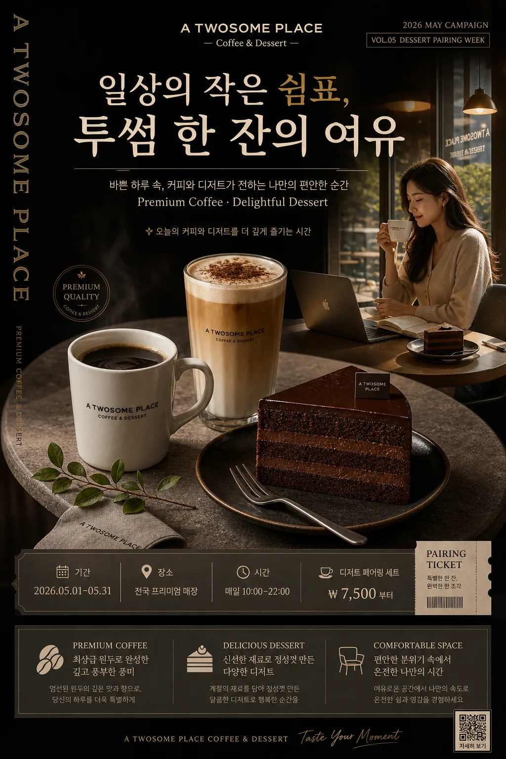
프리미엄 카페 다크 광고 포스터
투썸·할리스 같은 프리미엄 카페 광고. 다크 차콜 + 베이지·골드 + 큰 한글 헤드라인 + 커피+디저트 hero + 3대 가치. 일상의 쉼표 결.
프리미엄 카페 다크 광고 포스터摘要
這是用來製作廣告/海報內容的 ChatGPT 圖像提示詞,已整理主題、背景、風格與構圖,方便快速調整。
相關關鍵字: 프리미엄 카페 다크 광고 포스터, 프리미엄 카페 다크 광고 포스터 프롬프트, 廣告/海報 프롬프트, 廣告/海報 AI 이미지 프롬프트, ChatGPT 이미지 프롬프트, AI 이미지 생성 프롬프트, AI 프롬프트, 이미지 프롬프트
프리미엄 카페 다크 광고 포스터使用方式
保留原始結構並替換主體、背景、色彩或構圖,即可延伸出不同版本。
- 保留核心主體,並依品牌、季節或平台調整色彩與背景。
- 如果畫面太複雜,請減少背景元素並具體描述主體、構圖與光線。
- 複製後可要求 ChatGPT 配合平台、長寬比或文字需求調整。
提示詞原文
[Input]
- language: Korean
- output_size: 1024x1536

[Purpose]
Premium dark café advertisement poster for a luxury-brand coffee and dessert campaign, designed as a vertical A4 editorial poster with polished commercial photography, real printed-poster details, and persuasive in-store campaign information.
Suitable for premium café window display, counter standee reproduction, social media promo, seasonal dessert-pairing campaign visuals, and luxury coffee brand launch advertising.

[Composition]
- Main subject placement: the hero still life sits in the center-lower 55% of the frame, while the headline block occupies the top 20% and the value-summary / campaign-information block anchors the bottom 18%.
- Background treatment: deep charcoal matte backdrop with a subtle gradient from near-black top-left to warm dark brown bottom-right, faint stone texture around the table area, and realistic café ambience such as soft reflected highlights, distant warm pendant-light glow, and a barely visible dark wood counter edge.
- Spacing and framing: build a premium editorial hierarchy with controlled breathing room, layered microcopy, date labels, ticket-style campaign information, and refined decorative lines so the poster feels like a real café promotion rather than a sterile mockup.
- Use {브랜드명}, {메인 한글 헤드라인}, {부카피}, {3대 가치}, {hero 비주얼}, {컬러 톤}, {레이아웃}, {인물·lifestyle 컷} exactly as the customizable campaign elements.

[3. CORE STRUCTURE]
1. Top header zone: place {메인 한글 헤드라인} in a bold, elegant display arrangement near the upper center, with {브랜드명} aligned as the brand anchor above or near it; keep the headline visually dominant and poster-scale, supported by a small date label such as “2026 MAY CAMPAIGN” and “VOL.05 DESSERT PAIRING WEEK”.
2. Subcopy zone: position {부카피} directly below the headline in a smaller, clean sans-serif line, with refined letter spacing; add one short Korean feature blurb line nearby, for example “오늘의 커피와 디저트를 더 깊게 즐기는 시간”.
3. Hero still life zone: render {hero 비주얼} as the central product cluster on a round stone table, with the mug, latte glass, and chocolate cake forming a triangular composition; include realistic crema, condensation on glass, cake crumb detail, a dark ceramic saucer, a folded linen napkin, a small dessert fork, a tiny leafy branch, and a subtle logo detail for campaign realism.
4. Lifestyle connection zone: integrate {인물·lifestyle 컷} as a secondary editorial moment, either as a soft side panel, inset photo strip, or visually linked cutaway that feels like part of the same café campaign; show believable café gestures such as a hand holding a cup, a customer by a window, or a quiet table scene with warm reflections.
5. Campaign information zone: add a refined poster information strip with event details, using Korean text such as “기간 2026.05.01–05.31”, “장소 전국 프리미엄 매장”, “시간 매일 10:00–22:00”, and “디저트 페어링 세트 ₩7,500부터”; include a small coupon / ticket stub area reading “PAIRING TICKET” and a tiny QR-style square or barcode-like block for realism.
6. Value block zone: place {3대 가치} in a bottom gray-toned information box or structured panel, using compact spacing and clear hierarchy so each value reads like a premium feature line; add subtle divider rules, small numerals 01 / 02 / 03, and muted-gold icons or dots.
7. Layout system zone: follow {레이아웃} as the overall spatial blueprint, including the vertical English side line, dark top copy area, centered hero zone, lower structured value block, sponsor / store-info footer, and small credit text such as “Photo by Studio Seoul / Barista Selection”.

[4. STYLE RULES]
- Typography: use Pretendard ExtraBold or Noto Sans KR Bold for the main headline, Pretendard Medium for subcopy, and a condensed sans-serif for the 3-value block; headline size should feel poster-scale, with tight but readable line spacing and crisp Korean glyph rendering.
- Color palette: apply {컬러 톤} with exact anchors like deep charcoal #1f1f1f, warm beige #e8dfca, muted gold #b8924a, espresso brown, cream foam white, and soft stone gray for the lower panel.
- Poster graphic details: include thin muted-gold rules, small typographic labels, date chips, ticket-like perforation marks, a refined sponsor / store-info footer, and subtle café menu-style dividers that enhance the luxury campaign without overpowering the food photography.
- Texture and material realism: show matte paper grain, stone table pores, ceramic glaze, glass rim highlights, chocolate ganache sheen, cake crumb texture, linen weave, and tiny coffee splashes or sugar dust where natural.
- Border/shadow: use a soft realistic drop shadow with 4px y-offset, 12px blur, and 15% opacity under cups, glass, cake, fork, napkin, and table edges; use refined hairline framing and embedded print-poster details instead of flat boxed sticker graphics.

[5. VISUAL STYLE]
- Camera / lens: Hasselblad X2D 100c with XCD 80mm f/2.8 at ISO 100, f/4, or Sony A7R V with 50mm f/1.4 for the lifestyle component; maintain premium campaign-photography sharpness and natural depth.
- Lighting: soft studio key from upper-left at 45° with a subtle fill from right, plus gentle rim separation on glassware; for the lifestyle cut, use window light from the side with visible ambient café reflections, warm highlights on skin and cup rims, and natural shadow falloff.
- Color grade: deep espresso brown, warm beige, muted gold highlights, restrained contrast, slightly lifted shadows, and rich dark tonal separation that preserves detail while keeping a luxury café mood.
- Real-world finish: the final image should feel like a photographed premium printed poster displayed in a café or professionally composed for an advertising campaign, with believable scale, tactile surfaces, and readable promotional information.

[6. MOOD]
Premium café editorial campaign — feels like a Kinfolk-meets-Aesop product spread with high-end Seoul café advertising polish, dark luxury ambience, warm dessert-pairing comfort, and a real seasonal campaign poster presence.

[7. CRITICAL]
- Korean text accuracy: “일상의 작은 쉼표, / 투썸 한 잔의 여유”, “바쁜 하루 속, 커피와 디저트가 전하는 나만의 편안한 순간”, “PREMIUM COFFEE — 최상급 원두로 완성한 깊고 풍부한 풍미”, “DELICIOUS DESSERT — 신선한 재료로 정성껏 만든 다양한 디저트”, “COMFORTABLE SPACE — 편안한 분위기 속에서 온전한 나만의 시간”, “A TWOSOME PLACE — Coffee & Dessert”.
- Additional Korean poster microcopy should be clear and realistic: “2026 MAY CAMPAIGN”, “기간 2026.05.01–05.31”, “장소 전국 프리미엄 매장”, “시간 매일 10:00–22:00”, “디저트 페어링 세트 ₩7,500부터”, “PAIRING TICKET”, “Photo by Studio Seoul”, and “Barista Selection”.
- All food, glassware, tableware, printed text, QR-style blocks, and lifestyle elements must look physically plausible; if hands appear, fingers must be natural and complete.
- Preserve a true premium café campaign hierarchy: brand, headline, subcopy, hero products, lifestyle connection, campaign details, value block, and footer information.

[8. 🚫 PROHIBITED]
- Fake official seals / certifications
- Broken Korean characters
- Celebrity composites or unauthorized likeness