広告・ポスター
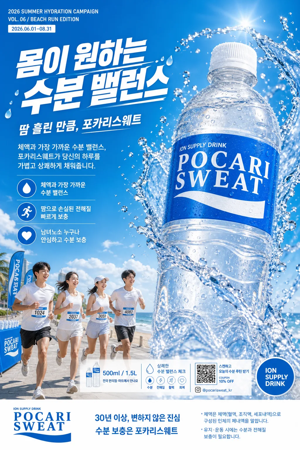
이온 음료 청량 광고 포스터
포카리스웨트 같은 이온 음료 광고. 스카이 블루·화이트 + 큰 한글 헤드라인 + 부카피 + 3대 가치 + 큰 PET 병 hero + splash + 운동하는 모델 군중 (해변). 운동·청량·건강 강조.
이온 음료 청량 광고 포스터の概要
広告・ポスター画像を作るためのChatGPT画像プロンプトです。主題、背景、スタイル、構図を整理し、すぐに試せるよう構成しています。
関連キーワード: 이온 음료 청량 광고 포스터, 이온 음료 청량 광고 포스터 프롬프트, 広告・ポスター 프롬프트, 広告・ポスター AI 이미지 프롬프트, ChatGPT 이미지 프롬프트, AI 이미지 생성 프롬프트, AI 프롬프트, 이미지 프롬프트
이온 음료 청량 광고 포스터の活用方法
元の構造を保ちながら、被写体、背景、色、構図を変更して別案に展開できます。
- 主題を維持し、ブランドや季節、媒体に合わせて色と背景を変更してください。
- 結果が複雑な場合は背景要素を減らし、被写体、構図、照明を具体化してください。
- コピー後、ChatGPTに媒体、アスペクト比、文字の有無を追加で指定できます。
プロンプト原文
[Input]
- language: Korean
- output_size: 1024x1536

[Purpose]
Korean ion beverage advertising poster, vertical A4-style promotional key visual for a refreshing sports-drink campaign.
Editorial commercial poster with photoreal product hero, dynamic splash action, energetic beach-running lifestyle context, and polished Korean typography for print, subway lightbox, convenience-store POP, and social use.

[Composition]
- Overall layout: {레이아웃} with a strong vertical split; left column for campaign copy, runner scene, and small promotional details, right side for the oversized bottle hero, and a white bottom band for logo, availability, QR/coupon area, and legal copy.
- Subject placement: the bottle hero occupies about 42% of the frame height on the right, angled slightly toward camera; left text column takes about 34% width; bottom band about 11% height, with realistic print-ad micro text and a small barcode/QR-style coupon box.
- Background treatment: cool sky-blue to white gradient field with a subtle water mist texture, condensation droplets, refractive splash particles, and a distant beach-and-sky morning scene anchored in the lower-left area with promenade details, flags, hydration station cups, and soft sunlight on the sand.
- Spacing and framing: keep the headline, bottle label, and footer readable while allowing natural advertising details such as campaign date, small sponsor/retail information, tiny product-size callouts, and realistic poster production marks.
- Use {브랜드·제품명}, {메인 한글 헤드라인}, {부카피}, {3대 가치}, {hero 비주얼}, {배경 군중}, {컬러 톤}, {하단 슬로건·로고}, {fine print} as the content variables.

[3. CORE STRUCTURE]
1) Top campaign strip: add a slim upper-left label reading "2026 SUMMER HYDRATION CAMPAIGN" and "VOL. 06 / BEACH RUN EDITION" in small type, with a tiny date label "2026.06.01–08.31".
2) Left copy block: set {메인 한글 헤드라인} large at the upper-left, followed by {부카피} in smaller body text, with {3대 가치} stacked beneath as three compact icon-led bullets; include small blue divider lines and tiny water-drop icons that feel like printed campaign graphics.
3) Left lower visual block: place {배경 군중} beneath the copy, blending them into the scene as a lifestyle runner group with clear silhouettes and energetic motion, realistic race bibs, sweat-darkened athletic fabric, morning beach haze, and a small hydration point in the background.
4) Right hero block: render {hero 비주얼} as a photoreal translucent PET bottle with crisp label readability, visible condensation beads, cap grooves, transparent liquid refraction, and high-speed water splash arcs with bright refractive highlights.
5) Promotional detail layer: near the lower middle, add realistic poster callouts such as "500ml / 1.5L", "전국 편의점·마트에서 만나요", "상쾌한 수분 밸런스 체크", a small QR coupon box labeled "스캔하고 오늘의 수분 루틴 받기", and a tiny handle "@pocarisweat_kr".
6) Background integration: wrap the entire poster in {컬러 톤}, using the sky-blue area behind the runners and a whiter, brighter zone behind the bottle for contrast; add layered splash droplets that cross the split subtly so the scene feels physically connected.
7) Bottom band: place {하단 슬로건·로고} on the left and center, with {fine print} in very small but legible type along the bottom edge; include a narrow barcode-style retail mark, production code "AD-ION-2026-06", and small recycling/PET sorting icons as realistic packaging-ad details.
8) Brand hierarchy: {브랜드·제품명} should be visually dominant on the bottle label and echoed in the footer branding, while the main headline remains the emotional campaign message.

[4. STYLE RULES]
- Typography: Pretendard Black or Cafe24 for the main headline at very large size; Pretendard SemiBold for subcopy; Noto Sans KR for fine print; use confident Korean sans-serif forms with tight tracking for the hero headline, compact captions for micro information, and more open tracking for footer copy.
- Color palette: sky blue #1AA3E8, white #FFFFFF, ice blue #DDF4FF, deep cobalt #1E5FA8, and soft silver-gray #D9E2EC.
- Border/shadow: use a subtle soft shadow under the bottle, 4px y-offset, 14px blur, 18% opacity; add a faint white glow around splash highlights for separation.
- Decorative graphic elements: use translucent water-drop badges, cobalt divider rules, tiny wave-line motifs, and print-realistic registration/crop micro marks near the edges, all integrated into the commercial poster design.
- Product realism: the bottle plastic should show molded seams, label wrap curvature, condensation, slight cap texture, and believable liquid thickness; splashes must interact with the bottle and foreground light.

[5. VISUAL STYLE]
- Camera / lens: commercial product-photo look shot on a Phase One IQ4 with an 80mm lens at f/8 for the bottle, paired with a 35mm editorial framing feel for the full poster composition.
- Lighting: bright studio key from upper-left at 45° with a cool fill from the right, plus hard specular catches on the bottle and splash edges; the runners should be lit with soft daylight consistent with a beach morning scene.
- Color grade: crisp cyan-white commercial grade with cool aqua mids, clean whites, and slightly boosted clarity on the splash droplets.
- Material detail: droplets should have individual highlights and shadows, beach air should feel slightly humid, and the printed typography should sit naturally over the photographic layers like a finished outdoor ad.

[6. MOOD]
Premium Korean sports-drink campaign visual — modern Seoul outdoor ad aesthetic with refreshing summer energy, beach-run realism, crisp hydration cues, and a high-end beverage poster finish.

[7. CRITICAL]
- Korean text accuracy: 반드시 정확히 렌더링되어야 하는 문구: "몸이 원하는 / 수분 밸런스", "땀 흘린 만큼, 포카리스웨트", "체액과 가장 가까운 수분 밸런스, 포카리스웨트가 당신의 하루를 가볍고 상쾌하게 채워줍니다.", "💧 체액과 가장 가까운 수분 밸런스", "🏃 땀으로 손실된 전해질 빠르게 보충", "❤️ 남녀노소 누구나 안심하고 수분 보충", "30년 이상, 변하지 않은 진심 / 수분 보충은 포카리스웨트", "ION SUPPLY DRINK".
- Additional small Korean/English poster details may include: "2026 SUMMER HYDRATION CAMPAIGN", "VOL. 06 / BEACH RUN EDITION", "2026.06.01–08.31", "500ml / 1.5L", "전국 편의점·마트에서 만나요", "스캔하고 오늘의 수분 루틴 받기", "@pocarisweat_kr", "AD-ION-2026-06".
- Bottle label must read exactly POCARI SWEAT with the white serif logo treatment, white curve mark, and the small ION SUPPLY DRINK text.
- Human figures in {배경 군중} should look anatomically correct, natural-running posture, and the group must contain exactly 4 people with a 2 male / 2 female balance as described.
- Keep splash motion photoreal and physically plausible, with droplets and arcs driven by bottle movement rather than abstract CG ribbons.

[8. 🚫 PROHIBITED]
- Fake official seals / certifications
- Broken Korean characters