広告・ポスター
소상공인 BI 매뉴얼
소상공인 한 페이지 BI 가이드라인. 로고·컬러·타이포·금지.
소상공인 BI 매뉴얼の概要
広告・ポスター画像を作るためのChatGPT画像プロンプトです。主題、背景、スタイル、構図を整理し、すぐに試せるよう構成しています。
関連キーワード: 소상공인 BI 매뉴얼, 소상공인 BI 매뉴얼 프롬프트, 広告・ポスター 프롬프트, 広告・ポスター AI 이미지 프롬프트, ChatGPT 이미지 프롬프트, AI 이미지 생성 프롬프트, AI 프롬프트, 이미지 프롬프트
소상공인 BI 매뉴얼の活用方法
元の構造を保ちながら、被写体、背景、色、構図を変更して別案に展開できます。
- 主題を維持し、ブランドや季節、媒体に合わせて色と背景を変更してください。
- 結果が複雑な場合は背景要素を減らし、被写体、構図、照明を具体化してください。
- コピー後、ChatGPTに媒体、アスペクト比、文字の有無を追加で指定できます。
プロンプト原文
[Input]
- language: Korean
- output_size: 1024x1536

[Purpose]
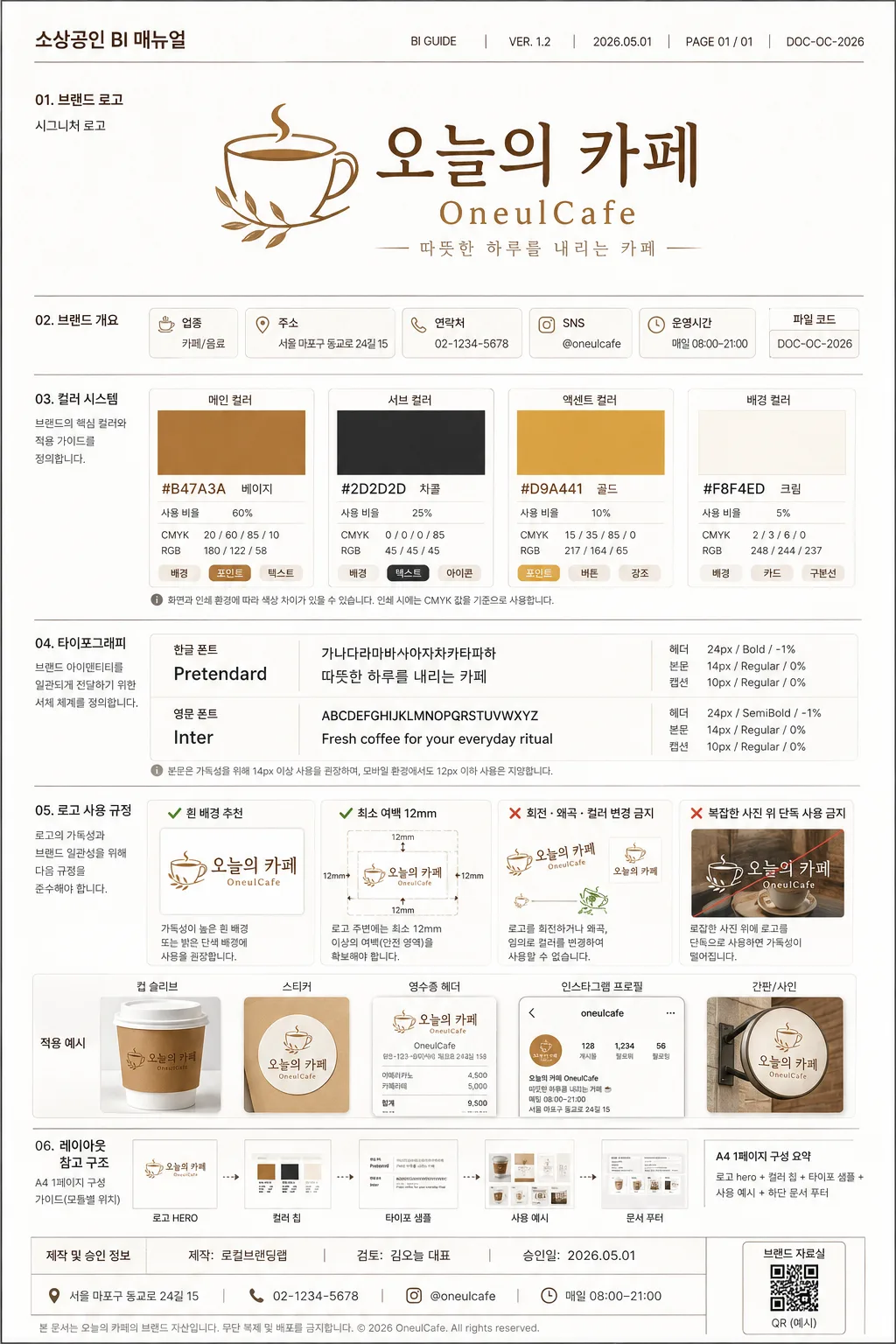
1-page small business BI manual cover and guideline sheet, designed as an A4 vertical brand identity guide that looks like a refined agency presentation for a real local business handoff.

[Composition]
- Hero content is a structured editorial BI board: top document metadata for {문서 정보}, main brand block for {매장명·로고}, mid-page guideline modules for {컬러 가이드} and {타이포}, and lower rule examples for {로고 사용 규칙}.
- Page uses a clean A4 portrait grid with clear section separation, print-safe alignment guides, document code, version label, and page footer details.
- Background is bright white with subtle paper texture, thin rule lines, warm-gray module cards, labeled callout arrows, small sample mockup tiles, and practical brand-system annotations that make the manual feel real.
- Include business contact information from {매장 정보}, approval/date details from {승인 정보}, and a small QR-placeholder style square labeled “브랜드 자료실” as part of the manual footer.
- Keep all labels, sample text, and rule callouts aligned to a strict grid; use {레이아웃} as the structural reference for all modules.

[3. CORE STRUCTURE]
- Header zone (top 16%): place “소상공인 BI 매뉴얼” at the upper-left with {문서 정보} at the upper-right, then place the logo hero for {매장명·로고} centered in a premium brand-presentation block with a thin divider rule below.
- Identity summary strip (upper-mid 10%): show {매장 정보} as compact data chips such as 업종, 주소, 연락처, 운영시간, and SNS handle; include a small file-code tag and page number “PAGE 01 / 01”.
- Color system zone (mid-upper 20%): display swatches for {컬러 가이드} as rectangular chips with hex labels, usage ratio labels, CMYK/RGB micro text, and “배경 / 포인트 / 텍스트” application tags beneath each chip.
- Typography zone (mid-lower 20%): show {타이포} as specimen lines, with Korean and English sample text set in separated rows, visible size hierarchy, tracking notes, and {샘플 문구} as the specimen copy.
- Usage rules zone (lower 18%): present {로고 사용 규칙} as a concise do/don’t panel using check and cross marks, including small logo placement examples on cup sleeve, sticker, receipt header, and Instagram profile mockup tiles.
- Layout reference zone (bottom 16%): show {레이아웃} with miniature module previews, sample annotations, approval stamp-style text from {승인 정보}, document contact line, QR-placeholder square, and a clean footer rule to complete the one-page manual.

[4. STYLE RULES]
- Typography: Pretendard for Korean and Inter for English, with bold 24px-ish header text, 14px body text, and smaller 10–12px annotation labels; use crisp corporate editorial spacing and consistent baseline rhythm.
- Color palette: use {컬러 가이드} exactly as the core palette, supported by clean white, soft warm gray, and charcoal text for contrast.
- Module details: thin 1px rules, subtle card outlines, small index numbers, color-chip captions, micro icons for print/web usage, and very soft shadow 0px 4px 12px at 12% opacity.
- Realistic manual content: include version number, date, document owner, page number, shop address/contact, SNS handle, production credit, and practical usage examples without making the page look like an advertisement.

[5. VISUAL STYLE]
- Camera / lens: front-facing flat graphic layout, equivalent to a 50mm normal-view design capture with no perspective distortion.
- Lighting: soft studio diffuse light from upper-left, even illumination across the page, no hard highlights, no dramatic shadows.
- Color grade: white paper base with beige, charcoal, and gold accents; clean tone-on-tone brand guide presentation with restrained contrast.
- Print finish: premium matte paper texture, crisp vector edges, high-resolution typography, precise rule lines, realistic A4 presentation-sheet feel.

[6. MOOD]
Premium brand identity manual — Pentagram and B&B-style corporate presentation with a polished agency-board feel, practical local-business documentation, and refined editorial confidence.

[7. CRITICAL]
- Korean text accuracy: 반드시 정확히 표시할 문구: “소상공인 BI 매뉴얼”, “오늘의 카페”, “OneulCafe”, “BI GUIDE”, “VER. 1.2”, “2026.05.01”, “PAGE 01 / 01”, “브랜드 자료실”, “제작: 로컬브랜딩랩”.
- 반드시 정확히 표시할 섹션 문구: “한글”, “영문”, “본문”, “헤더”, “흰 배경 추천”, “회전·왜곡·컬러 변경 금지”, “A4 1페이지”, “로고 hero”, “컬러 칩”, “타이포 샘플”, “사용 예시”.
- 반드시 정확히 표시할 샘플 정보: “서울 마포구 동교로 24길 15”, “02-1234-5678”, “@oneulcafe”, “매일 08:00–21:00”, “따뜻한 하루를 내리는 카페”.
- All Korean and English brand sample text must be crisp, correctly spelled, and aligned to the grid; no broken Hangul, no warped typography.
- Preserve a single-page A4 vertical manual layout with clear section hierarchy, realistic BI guideline content, and professional spacing.

[8. 🚫 PROHIBITED]
- Fake official seals / certifications
- Broken Korean characters
- Celebrity composites or unauthorized likenesses