Ads/Posters
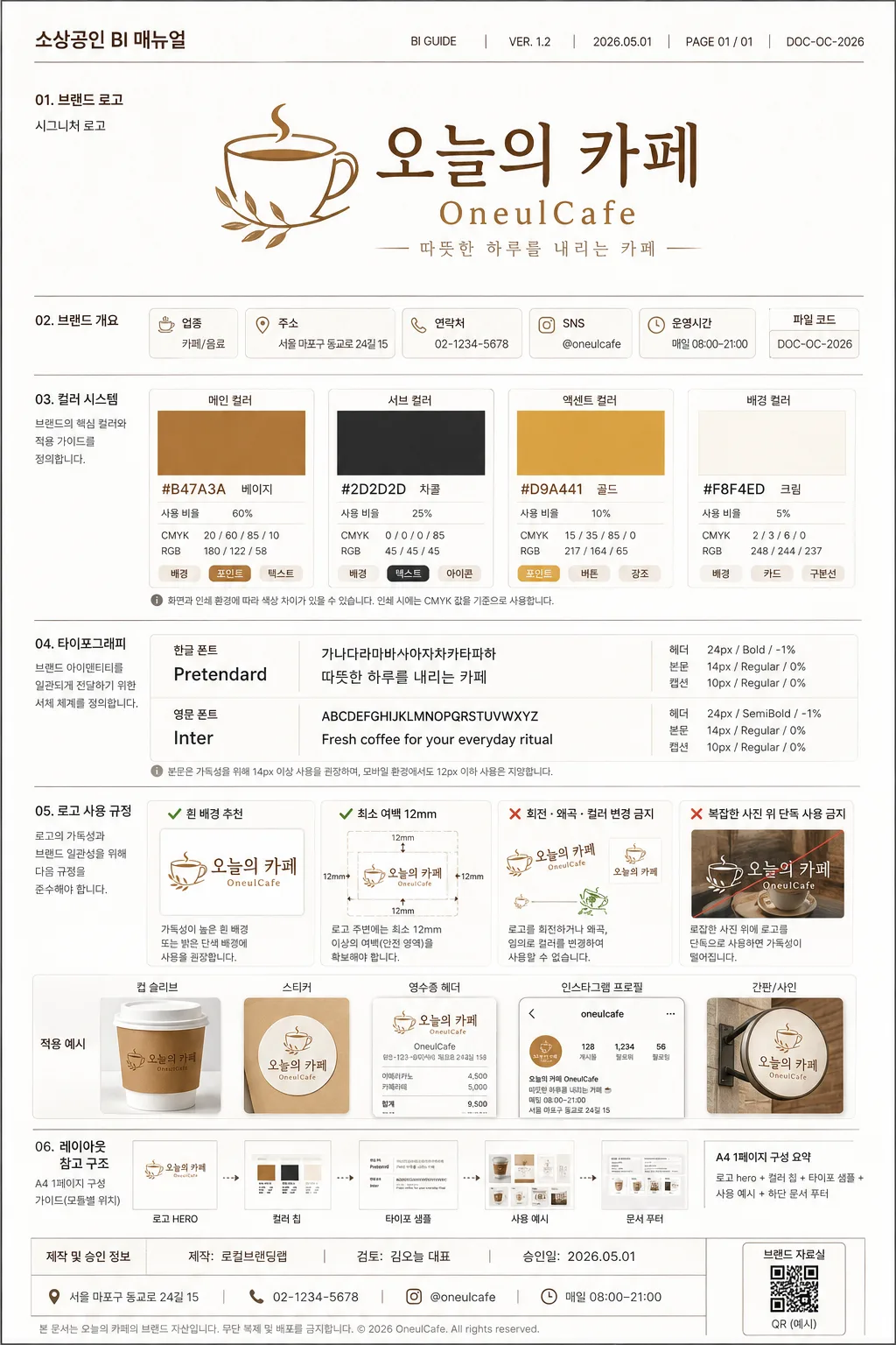
소상공인 BI 매뉴얼
소상공인 한 페이지 BI 가이드라인. 로고·컬러·타이포·금지.
소상공인 BI 매뉴얼 summary
Copy this ChatGPT image prompt to create Ads/Posters results. Its subject, background, style, and composition are organized for quick iteration.
Related keywords: 소상공인 BI 매뉴얼, 소상공인 BI 매뉴얼 프롬프트, Ads/Posters 프롬프트, Ads/Posters AI 이미지 프롬프트, ChatGPT 이미지 프롬프트, AI 이미지 생성 프롬프트, AI 프롬프트, 이미지 프롬프트
How to use 소상공인 BI 매뉴얼
Keep the prompt structure and swap the subject, background, palette, or composition to create new variations.
- Keep the main subject and adjust the palette and background for your brand, season, or channel.
- If the result feels busy, simplify the background and make the subject, composition, and lighting more specific.
- After copying, ask ChatGPT to adapt it for your platform, aspect ratio, or text requirements.
Original prompt
[Input]
- language: Korean
- output_size: 1024x1536

[Purpose]
1-page small business BI manual cover and guideline sheet, designed as an A4 vertical brand identity guide that looks like a refined agency presentation for a real local business handoff.

[Composition]
- Hero content is a structured editorial BI board: top document metadata for {문서 정보}, main brand block for {매장명·로고}, mid-page guideline modules for {컬러 가이드} and {타이포}, and lower rule examples for {로고 사용 규칙}.
- Page uses a clean A4 portrait grid with clear section separation, print-safe alignment guides, document code, version label, and page footer details.
- Background is bright white with subtle paper texture, thin rule lines, warm-gray module cards, labeled callout arrows, small sample mockup tiles, and practical brand-system annotations that make the manual feel real.
- Include business contact information from {매장 정보}, approval/date details from {승인 정보}, and a small QR-placeholder style square labeled “브랜드 자료실” as part of the manual footer.
- Keep all labels, sample text, and rule callouts aligned to a strict grid; use {레이아웃} as the structural reference for all modules.

[3. CORE STRUCTURE]
- Header zone (top 16%): place “소상공인 BI 매뉴얼” at the upper-left with {문서 정보} at the upper-right, then place the logo hero for {매장명·로고} centered in a premium brand-presentation block with a thin divider rule below.
- Identity summary strip (upper-mid 10%): show {매장 정보} as compact data chips such as 업종, 주소, 연락처, 운영시간, and SNS handle; include a small file-code tag and page number “PAGE 01 / 01”.
- Color system zone (mid-upper 20%): display swatches for {컬러 가이드} as rectangular chips with hex labels, usage ratio labels, CMYK/RGB micro text, and “배경 / 포인트 / 텍스트” application tags beneath each chip.
- Typography zone (mid-lower 20%): show {타이포} as specimen lines, with Korean and English sample text set in separated rows, visible size hierarchy, tracking notes, and {샘플 문구} as the specimen copy.
- Usage rules zone (lower 18%): present {로고 사용 규칙} as a concise do/don’t panel using check and cross marks, including small logo placement examples on cup sleeve, sticker, receipt header, and Instagram profile mockup tiles.
- Layout reference zone (bottom 16%): show {레이아웃} with miniature module previews, sample annotations, approval stamp-style text from {승인 정보}, document contact line, QR-placeholder square, and a clean footer rule to complete the one-page manual.

[4. STYLE RULES]
- Typography: Pretendard for Korean and Inter for English, with bold 24px-ish header text, 14px body text, and smaller 10–12px annotation labels; use crisp corporate editorial spacing and consistent baseline rhythm.
- Color palette: use {컬러 가이드} exactly as the core palette, supported by clean white, soft warm gray, and charcoal text for contrast.
- Module details: thin 1px rules, subtle card outlines, small index numbers, color-chip captions, micro icons for print/web usage, and very soft shadow 0px 4px 12px at 12% opacity.
- Realistic manual content: include version number, date, document owner, page number, shop address/contact, SNS handle, production credit, and practical usage examples without making the page look like an advertisement.

[5. VISUAL STYLE]
- Camera / lens: front-facing flat graphic layout, equivalent to a 50mm normal-view design capture with no perspective distortion.
- Lighting: soft studio diffuse light from upper-left, even illumination across the page, no hard highlights, no dramatic shadows.
- Color grade: white paper base with beige, charcoal, and gold accents; clean tone-on-tone brand guide presentation with restrained contrast.
- Print finish: premium matte paper texture, crisp vector edges, high-resolution typography, precise rule lines, realistic A4 presentation-sheet feel.

[6. MOOD]
Premium brand identity manual — Pentagram and B&B-style corporate presentation with a polished agency-board feel, practical local-business documentation, and refined editorial confidence.

[7. CRITICAL]
- Korean text accuracy: 반드시 정확히 표시할 문구: “소상공인 BI 매뉴얼”, “오늘의 카페”, “OneulCafe”, “BI GUIDE”, “VER. 1.2”, “2026.05.01”, “PAGE 01 / 01”, “브랜드 자료실”, “제작: 로컬브랜딩랩”.
- 반드시 정확히 표시할 섹션 문구: “한글”, “영문”, “본문”, “헤더”, “흰 배경 추천”, “회전·왜곡·컬러 변경 금지”, “A4 1페이지”, “로고 hero”, “컬러 칩”, “타이포 샘플”, “사용 예시”.
- 반드시 정확히 표시할 샘플 정보: “서울 마포구 동교로 24길 15”, “02-1234-5678”, “@oneulcafe”, “매일 08:00–21:00”, “따뜻한 하루를 내리는 카페”.
- All Korean and English brand sample text must be crisp, correctly spelled, and aligned to the grid; no broken Hangul, no warped typography.
- Preserve a single-page A4 vertical manual layout with clear section hierarchy, realistic BI guideline content, and professional spacing.

[8. 🚫 PROHIBITED]
- Fake official seals / certifications
- Broken Korean characters
- Celebrity composites or unauthorized likenesses