Ads/Posters
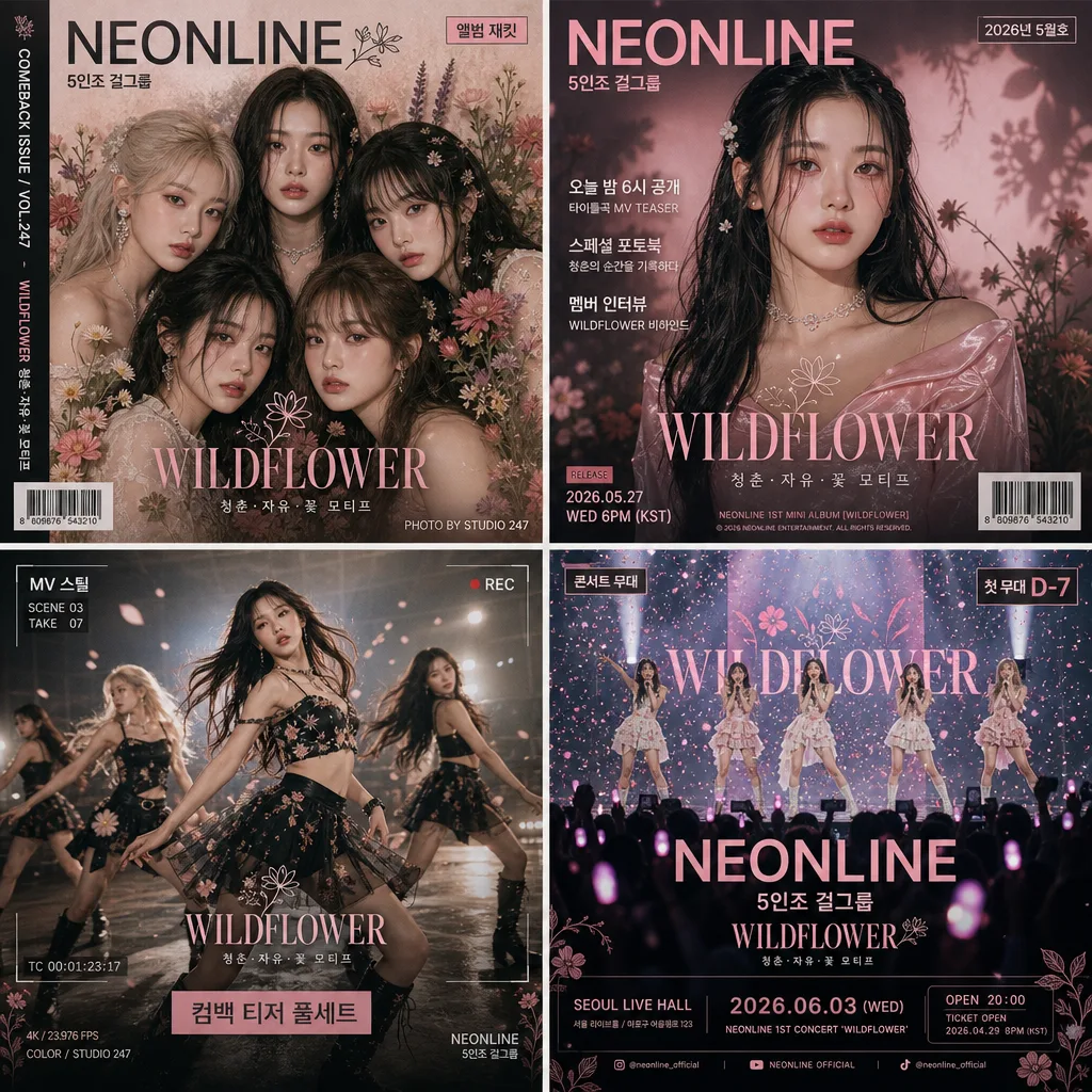
K-pop 컴백 티저 풀세트 (재킷·티저 컷·MV 스틸·콘서트 4컷)
K-pop 그룹 컴백 4컷 시리즈. 앨범 재킷·티저 포스터·MV 스틸·콘서트 무대. 통일된 컨셉·컬러로 4컷 spread.
K-pop 컴백 티저 풀세트 (재킷·티저 컷·MV 스틸·콘서트 4컷) summary
Copy this ChatGPT image prompt to create Ads/Posters results. Its subject, background, style, and composition are organized for quick iteration.
Related keywords: K-pop 컴백 티저 풀세트 (재킷·티저 컷·MV 스틸·콘서트 4컷), K-pop 컴백 티저 풀세트 (재킷·티저 컷·MV 스틸·콘서트 4컷) 프롬프트, Ads/Posters 프롬프트, Ads/Posters AI 이미지 프롬프트, ChatGPT 이미지 프롬프트, AI 이미지 생성 프롬프트, AI 프롬프트, 이미지 프롬프트
How to use K-pop 컴백 티저 풀세트 (재킷·티저 컷·MV 스틸·콘서트 4컷)
Keep the prompt structure and swap the subject, background, palette, or composition to create new variations.
- Keep the main subject and adjust the palette and background for your brand, season, or channel.
- If the result feels busy, simplify the background and make the subject, composition, and lighting more specific.
- After copying, ask ChatGPT to adapt it for your platform, aspect ratio, or text requirements.
Original prompt
[Input]
- language: Korean
- output_size: 1024x1024

[Purpose]
K-pop comeback teaser full set for a girl group, designed as a 4-panel editorial campaign package for album jacket, teaser poster, MV still, and concert stage.
Magazine-style K-pop rollout visual with cohesive branding, realistic printed/social campaign details, and enough small metadata to feel like an actual comeback promotion post.

[Composition]
- 2x2 grid fills the square canvas evenly, with each panel separated by thin off-white gutters and a consistent editorial magazine margin.
- {그룹 이름} should feel like the central brand across all four panels, with the same logo treatment, color identity, date labels, and campaign typography carrying through every frame.
- Backgrounds shift by panel but stay inside the same palette, using soft floral surfaces, stage-light ambience, satin fabric, printed paper grain, lens flare, confetti specks, and lightly textured poster overlays.
- Keep {컴백 컨셉} present through styling, set dressing, props, motion cues, lighting motifs, and repeated graphic symbols rather than literal repetition.
- Use {레이아웃} as the structural guide, while maintaining readable panel hierarchy, authentic comeback-poster density, and clear editorial framing between the four cuts.
- Add small real-world campaign elements: issue/date label, barcode block, track-release note, short feature blurbs, panel captions, model/member credit, tiny production credit, and social-handle style microtext.

[3. CORE STRUCTURE]
1. Panel 1 — Album jacket: a clustered group close-up with layered flower backdrop, faces and shoulders overlapping slightly, soft frontal composition, polished cover-art framing. Add a compact album-cover masthead, {그룹 이름} logo, small sticker-like label "앨범 재킷", tiny credit line "PHOTO BY STUDIO 247", and a slim side-spine text strip reading "COMEBACK ISSUE / VOL.247".
2. Panel 2 — Teaser poster: one main member as the hero, centered at 60% frame height, surrounded by dramatic floral shadows, glossy hair highlights, fabric texture, and a bold poster title zone. Include short Korean cover blurbs such as "오늘 밤 6시 공개", "스페셜 포토북", and "멤버 인터뷰", plus a small barcode area and release-date label "2026년 5월호".
3. Panel 3 — MV still: dynamic dance moment captured mid-motion, diagonal body lines, one or two members partially motion-blurred for energy, realistic studio floor reflections, haze, backlight streaks, and visible choreography spacing. Add film-still metadata like "MV 스틸", "SCENE 03", "TAKE 07", a tiny timecode strip, and a caption bar reading "컴백 티저 풀세트".
4. Panel 4 — Concert stage: wide live performance shot with visible stage lights, LED screen glow, microphone stands or handheld mics, audience light-stick bokeh dots, confetti particles, stage smoke, and the group arranged in a strong horizontal stage line. Add concert-poster details: "콘서트 무대", "첫 무대 D-7", venue-style microtext "SEOUL LIVE HALL", and a small ticket-info block "OPEN 20:00".
5. Across all four panels, preserve one shared graphic language: floral texture, soft editorial contrast, consistent color treatment, small magazine annotations, and repeated comeback-campaign icon marks so the set reads as one professionally art-directed rollout.
6. Integrate {4컷 시리즈} as clearly distinct visual beats, each panel immediately understandable at a glance: cover art, teaser portrait, music-video performance, and live concert reveal.

[4. STYLE RULES]
- Typography: bold English sans-serif for {그룹 이름}, paired with compact Korean supporting text in Pretendard or Noto Sans KR, heavy weight for headers and medium weight for subtext, roughly 42–64 px for main titles and 18–24 px for secondary labels, with tiny 8–12 px production credits and barcode captions.
- Color palette: {컬러 톤} with controlled accents of charcoal, plus paper white #F5F1EA and deep near-black #1E1C1F for contrast; allow realistic lipstick tones, skin tones, metallic jewelry glints, stage LEDs, and printed-paper ink variation.
- Border/shadow: thin editorial gutters, subtle soft drop shadow 4px y-offset, 12px blur, 15% opacity under each panel, refined magazine-cutout separation, no hard outlines.
- Use {타이포} for title treatment, keeping letter spacing slightly expanded and the hierarchy clean like a K-pop magazine spread, while adding authentic small cover lines, captions, issue labels, and social-post metadata.
- Graphic details may include small flower icons, translucent stickers, corner crop marks, vertical spine text, tiny page codes, and a barcode rectangle, all integrated into the campaign design without overpowering the idols.

[5. VISUAL STYLE]
- Camera / lens: editorial fashion photography look, 85mm f/1.4 for the hero and group close-ups, 35mm f/1.8 for the stage wide, crisp but not hyperreal.
- Lighting: soft diffused studio key from upper-left at 45°, gentle fill from right, plus subtle rim light on hair and shoulders; stage panel uses concert spotlights with controlled bloom, LED backlight, atmospheric haze, and realistic reflections on skin, sequins, microphones, and glossy floor.
- Color grade: faded pink, coral, and ivory with deep charcoal anchoring shadows, slightly filmic contrast, clean print-like separation.
- Surface realism: visible magazine paper grain, soft halftone-like ink texture in poster areas, realistic fabric folds, flower petal depth, hair detail, makeup sheen, jewelry highlights, concert smoke, and shallow depth-of-field bokeh where appropriate.

[6. MOOD]
K-pop comeback campaign editorial — feels like a high-end music magazine spread and fandom teaser package, polished like a Vogue Korea x DAZED-style rollout, with the excitement of a real album comeback, teaser drop, MV reveal, and first concert stage announcement.

[7. CRITICAL]
- Korean text accuracy: the rendered image must correctly show these Korean strings when text is included in the design: "K-pop 그룹", "컴백 티저 풀세트", "앨범 재킷", "티저 포스터", "MV 스틸", "콘서트 무대", "오늘 밤 6시 공개", "스페셜 포토북", "멤버 인터뷰", "첫 무대 D-7", "2026년 5월호".
- Keep {그룹 이름}, {컴백 컨셉}, {4컷 시리즈}, {컬러 톤}, {레이아웃}, {타이포}, and {비율} visually respected exactly as the user-provided creative direction.
- All 4 panels must clearly read as distinct scenes while sharing one cohesive brand identity for {그룹 이름}.
- Keep faces anatomically correct, hands correct with exactly 5 fingers per hand if visible, and stage choreography believable.
- Text should look printed or professionally composited into the campaign design, with clean Korean character rendering and plausible magazine/poster alignment.

[8. 🚫 PROHIBITED]
- Fake official seals / certifications
- Broken Korean characters
- Celebrity composites / unauthorized real-person likeness