プロフィール・アバター
게임 캐릭터 셀렉트 화면 변환
본인 사진 → RPG·격투 게임 캐릭터 셀렉트 화면. 캐릭터 정보 카드 (이름·클래스·스탯) + 무대 백드롭 + 게임 UI.
게임 캐릭터 셀렉트 화면 변환の概要
プロフィール・アバター画像を作るためのChatGPT画像プロンプトです。主題、背景、スタイル、構図を整理し、すぐに試せるよう構成しています。
関連キーワード: 게임 캐릭터 셀렉트 화면 변환, 게임 캐릭터 셀렉트 화면 변환 프롬프트, プロフィール・アバター 프롬프트, プロフィール・アバター AI 이미지 프롬프트, ChatGPT 이미지 프롬프트, AI 이미지 생성 프롬프트, AI 프롬프트, 이미지 프롬프트
게임 캐릭터 셀렉트 화면 변환の活用方法
元の構造を保ちながら、被写体、背景、色、構図を変更して別案に展開できます。
- 主題を維持し、ブランドや季節、媒体に合わせて色と背景を変更してください。
- 結果が複雑な場合は背景要素を減らし、被写体、構図、照明を具体化してください。
- コピー後、ChatGPTに媒体、アスペクト比、文字の有無を追加で指定できます。
プロンプト原文
[Input]
- reference_image: {참고 이미지}
- language: Korean
- output_size: 1024x1536

[Purpose]
Turn the attached person into a game character select screen portrait and full UI mockup, with a polished but authentic in-game interface look. The final image should feel like a real character selection screen from a commercial fantasy RPG / fighting game / sci-fi / cyberpunk title, complete with playable-character UI layers, ranked-mode details, loadout panels, selectable slots, ability icons, and readable Korean interface text.

[Composition]
- Center the converted character portrait as the hero element, occupying about 55% of the frame height, framed by a high-end game UI character bay with layered metallic / glass panels.
- Keep {원본 보존} visible in face identity and overall likeness, while swapping clothing, props, armor, weapon styling, and scene into the selected {게임 장르} style.
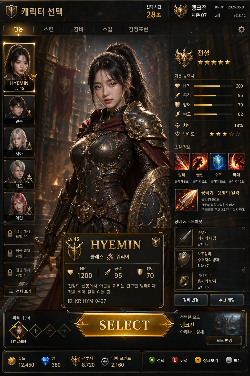
- Add a top navigation/header bar with Korean game UI text such as "캐릭터 선택", "랭크전", "시즌 07", a small server/date label like "KR-01 · 2026.05.01", and a subtle build/version tag like "v3.8.12".
- Place the character info card on the lower-left or lower-center area, with the right side and upper-right area filled by stat bars, ability icons, rarity badges, and loadout buttons.
- Background treatment should match {배경 무대}: medieval castle / dragon cave, cyberpunk city, or fighting stage, with layered stage architecture, lighting sources, banners/screens, particles, and arena atmosphere that still supports UI readability.
- Use {캐릭터명·클래스·스탯}, {무기·장비}, {UI 디자인}, and {컬러 톤} as editable content anchors, integrated naturally into the interface.

[3. CORE STRUCTURE]
- Portrait area (main 55%): {원본 보존} preserved in facial structure, converted into a game character render with matching costume, weapon, class-specific stance, hair/detail styling, gloves/armor trims, and believable fabric/metal textures.
- Weapon / equipment layer: {무기·장비} placed in hand, across the back, or strapped on the body, sized to read clearly as a selectable character loadout item; include small item tags such as "주무기", "보조장비", "강화 +7".
- Top UI header: include a bold title area reading "캐릭터 선택" and secondary menu tabs such as "영웅", "스킨", "장비", "스킬", plus a small timer or matchmaking label like "선택 시간 28초".
- Info panel: {캐릭터명·클래스·스탯} displayed inside a crisp premium game card with visible hierarchy, including name, class, level badge, rarity frame, short lore line, and tiny ID text such as "ID: KR-HYM-0427".
- Stat section: horizontal bars for HP, attack, and defense, aligned cleanly and spaced evenly, with numeric labels, small icons, and secondary attributes like "속도 82", "치명 18%", "난이도 ★★★".
- Ability section: add 4–5 square skill icons with cooldown labels and Korean captions such as "강타", "돌진", "수호", "궁극기", using genre-matched icon art and hover-card style tooltips.
- Background stage: {배경 무대} rendered as a recognizable game arena backdrop with layered environment detail, interactive lighting, atmospheric depth, banners, monitors, stone arches, neon signs, or arena floor markings depending on the genre.
- Character carousel: add side thumbnails of other selectable heroes as dimmed cards with Korean placeholder names like "민준", "서아", "태오", lock icons on a few slots, and one highlighted slot for the main character.
- Selection controls: {UI 디자인} including a bold SELECT button, controller/key prompts like "A 선택", "B 뒤로", "Y 상세보기", character slots, party indicator "파티 1/4", and premium HUD accents placed as a believable playable menu.
- Bottom information strip: include ticket/currency/resource indicators such as "골드 12,450", "젬 380", "전투력 8,720", plus a small notice line like "오늘의 보너스 활성화".

[4. STYLE RULES]
- Typography: Pretendard Bold for the main name, Noto Sans KR Medium for class and stats, and a compact arcade-style sans for button labels; title size large, stat labels small and readable.
- Color palette: use {컬러 톤} with genre-specific accents such as gold and brown for fantasy, neon cyan and magenta for cyberpunk, or red and black for fighting-game energy; pair with dark neutral UI panels and luminous selection states.
- Border/shadow: sharp beveled UI frames with subtle outer glow, 2px inner stroke, and soft drop shadow at 4px y-offset, 12px blur, 15% opacity.
- Interface texture: add light scanline / glass / metallic panel treatment depending on genre, with readable Korean labels, semi-transparent overlays, brushed metal edges, holographic highlights, and small micro-text details.
- UI density: the screen should feel like an actual playable game menu with layered panels, tabs, badges, stats, notifications, selection outlines, and controller prompts, not a single character poster.
- Korean text styling: render short Korean labels cleanly with proper spacing and punctuation; mix English only where typical for game UI such as "SELECT", "READY", "LOCKED", "Lv.".

[5. VISUAL STYLE]
- Camera / lens: 85mm f/1.8 portrait look for the character face and upper body, combined with a game key art presentation rather than a real-world photograph.
- Lighting: studio-style key light from upper-left at 45°, controlled rim light from upper-right, balanced fill so the face remains clear inside the UI frame, and genre-matched environmental glow from the stage.
- Color grade: genre-matched game art grading — fantasy amber and steel, cyberpunk neon teal and violet, or fighting-game red and charcoal.
- Rendering quality: premium AAA game menu render with sharp facial identity, realistic armor/material response, readable UI panels, detailed background stage elements, and subtle animated-menu cues implied through glow streaks and particle accents.

[6. MOOD]
Premium AAA game character select screen — a polished Capcom / Square Enix / Blizzard-style interface with strong esports-menu clarity, cinematic character presence, believable menu functionality, and enough UI information to feel like a screenshot from a finished commercial game.

[7. CRITICAL]
- Korean text accuracy: 반드시 아래 문구가 정확히 보여야 함: "SELECT", "이름: HYEMIN", "클래스: 워리어", "HP 1200", "공격 95", "방어 70".
- Additional Korean UI text should be short and legible, such as "캐릭터 선택", "랭크전", "시즌 07", "선택 시간 28초", "강타", "돌진", "수호", "궁극기", "파티 1/4".
- Maintain the original face identity from the reference image.
- Character anatomy must remain natural and game-poster believable, with correct proportions and no extra limbs or distorted hands.
- UI layout must read as a real character select screen with clear hierarchy, not a poster or social media edit.

[8. 🚫 PROHIBITED]
- Fake official seals / certifications
- Broken Korean characters
- Celebrity composites or unauthorized celebrity likeness