漫画・イラスト
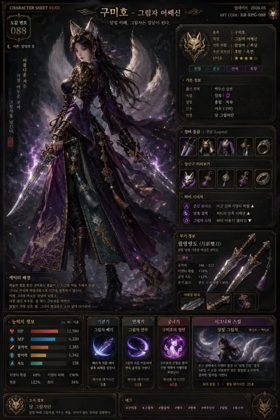
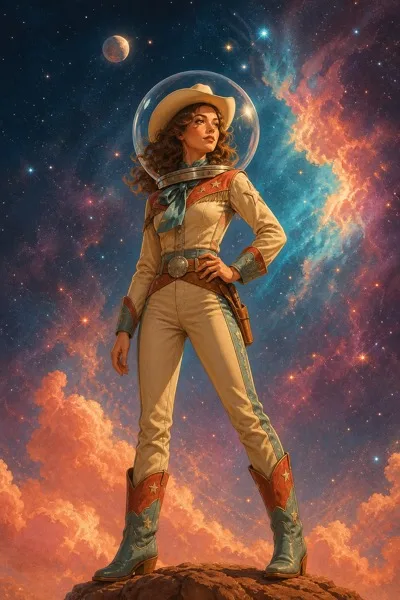
웹소설 표지 (BL·로맨스·판타지·스릴러)
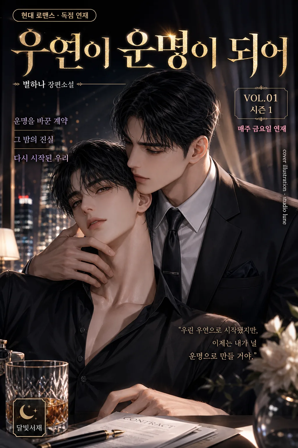
웹소설 표지 디자인. 인물 hero + 제목 + 작가명.
웹소설 표지 (BL·로맨스·판타지·스릴러)の概要
漫画・イラスト画像を作るためのChatGPT画像プロンプトです。主題、背景、スタイル、構図を整理し、すぐに試せるよう構成しています。
関連キーワード: 웹소설 표지 (BL·로맨스·판타지·스릴러), 웹소설 표지 (BL·로맨스·판타지·스릴러) 프롬프트, 漫画・イラスト 프롬프트, 漫画・イラスト AI 이미지 프롬프트, ChatGPT 이미지 프롬프트, AI 이미지 생성 프롬프트, AI 프롬프트, 이미지 프롬프트
웹소설 표지 (BL·로맨스·판타지·스릴러)の活用方法
元の構造を保ちながら、被写体、背景、色、構図を変更して別案に展開できます。
- 主題を維持し、ブランドや季節、媒体に合わせて色と背景を変更してください。
- 結果が複雑な場合は背景要素を減らし、被写体、構図、照明を具体化してください。
- コピー後、ChatGPTに媒体、アスペクト比、文字の有無を追加で指定できます。
プロンプト原文
[Input]
- language: Korean
- output_size: 1024x1536

[Purpose]
Korean web novel cover design for BL, romance, fantasy, thriller, martial-arts, SF, or mystery genres. Vertical marketplace-ready cover with strong genre readability for KakaoPage, Munpia, and Novelepia-style presentation, enriched with realistic serial-cover details such as genre tag, season/volume label, short promotional blurbs, publisher imprint, and small credit text.

[Composition]
- Main subject placement: use {인물 결} as the dominant focal area in the central 55–65% of the frame, with {제목·작가} reserved for top and lower title zones.
- Background treatment: build {배경·세트} as a clear genre-specific environment with cinematic depth, layered atmospheric detail, practical set elements, and story-relevant textures that support the characters.
- Spacing and framing: keep a readable vertical hierarchy with a strong title band, compact author line, genre/season micro-labels, and natural cover details placed around the hero figures without hiding faces.
- Genre direction: shape the entire layout according to {장르} so the composition instantly signals romance, BL, fantasy, thriller, or related subgenre through pose, costume, lighting, props, setting, and typography.
- Marketplace realism: add small but legible cover furniture such as “VOL.01”, “시즌 1”, “매주 금요일 연재”, a tiny publisher imprint “달빛서재”, and one vertical side credit line like “cover illustration · studio lune”.

[3. CORE STRUCTURE]
1) Title zone (top 18–22%): place {제목·작가} in a bold Korean display typographic treatment, with the title larger than the author line and strong separation between the two. Add a small genre pill near the title, for example “{장르} · 독점 연재” or “{장르} · 오리지널”.
2) Character zone (mid 50–60%): render {인물 결} as the visual hero, with expressive pose, clear silhouette, face/upper-body emphasis, nuanced clothing detail, hair highlights, jewelry, weapons, magic effects, documents, flowers, neon reflections, or other genre-appropriate story cues.
3) Environment zone (full-frame depth): extend {배경·세트} behind the characters with foreground/midground/background separation so the cover feels like an illustrated key visual; include believable environmental details such as candlelight, rain-streaked glass, palace curtains, city signs, library shelves, battlefield smoke, occult symbols, or starship panels depending on {장르}.
4) Cover information layer: add 2–3 short Korean cover blurbs in small type, such as “운명을 바꾼 계약”, “그 밤의 진실”, “다시 시작된 첫사랑”, “왕좌를 건 맹세”, or “살인 예고 D-3”, selecting lines that match {장르}.
5) Color system: apply {컬러 톤} consistently across background, lighting accents, title effects, atmospheric overlays, genre tag, and decorative dividers so the cover reads instantly at thumbnail size.
6) Typography integration: place the title, author text, micro-labels, side credit, and short blurbs so they remain legible over the artwork, using contrast, subtle glow, outline, shadow, translucent panels, or metallic foil effects where needed. Reflect {타이포} in the title treatment.
7) Final polish: keep the image polished like a commercial web novel cover, with crisp character edges, tactile fabric/material rendering, cinematic lighting, and refined details that reward close viewing while preserving thumbnail readability.

[4. STYLE RULES]
- Typography: use {타이포} as the primary title direction; if unspecified, use a bold Korean serif such as Noto Serif KR or Sandoll Myeongjo Heavy for dramatic genres, or an elegant modern display style for romance/BL, paired with Pretendard Medium or Inter for author, volume, credit, and blurb text.
- Color palette: follow {컬러 톤} with genre-specific tones such as pink-gold for romance, deep purple-black for fantasy, icy blue-silver for SF, ink-black crimson for thriller, or jade-gold for martial arts; use high-contrast highlights and secondary accent colors for title shine, eyes, magic, rain, neon, blood-red warning marks, or floral glow.
- Decorative cover furniture: include a refined top/bottom rule, small corner ornament, thin vertical spine-like credit text, tiny imprint mark, and a small serial label area; these should feel like part of a premium Korean web novel cover, not like an official certification.
- Border/shadow: add a soft 4px y-offset shadow with 12px blur at 18% opacity for text, plus subtle vignette, rim glow, foil sheen, atmospheric particles, or edge darkening only where it improves drama and readability.
- Scale: compose for {비율} while maintaining the 1024x1536 vertical cover implication, with all text and character silhouettes readable as a marketplace thumbnail.

[5. VISUAL STYLE]
- Camera / lens: cinematic poster framing with a 50mm f/1.8 or 85mm f/1.4 portrait look, shallow depth of field, and crisp subject separation from background.
- Lighting: use a controlled key light from upper-left at 45° with a gentle fill from front-right and a faint rim light to define hair, clothing, weapon edges, magical aura, rain droplets, or silhouette contours.
- Color grade: apply a high-end webtoon-cover grade tuned to the genre, with either warm rose-gold highlights, cool violet shadows, icy neon blues, jade mist, or deep noir reds depending on {컬러 톤}.
- Rendering quality: realistic premium illustrated cover finish, detailed skin and fabric texture, cinematic atmosphere, high-resolution brushwork, glossy title effects, believable depth haze, and dramatic but readable contrast.

[6. MOOD]
Commercial Korean web novel key visual — the polished, high-contrast storefront cover feel of KakaoPage, Munpia, and Novelepia promotional art, with enough narrative detail to suggest a full serialized story at first glance.

[7. CRITICAL]
- Korean text accuracy: “웹소설 표지”, {제목·작가}, and any title or author text embedded in the design must appear in correct Korean characters without distortion.
- Include realistic Korean cover details in small type, such as “VOL.01”, “시즌 1”, “매주 금요일 연재”, “달빛서재”, “cover illustration · studio lune”, and 2–3 short blurbs like “운명을 바꾼 계약”, “그 밤의 진실”, or “다시 시작된 첫사랑”; keep them accurate and legible.
- Layout invariants: preserve a clear vertical cover hierarchy with title at top, character hero in the middle, and background environment behind; keep the composition readable at thumbnail size.
- Genre fidelity: {장르} must be visually obvious from pose, costume, lighting, background, palette, title styling, and small cover details.

[8. 🚫 PROHIBITED]
- Broken Korean characters
- Fake official seals or certifications