만화/일러스트
웹소설 표지 (BL·로맨스·판타지·스릴러)
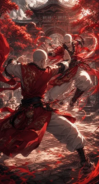
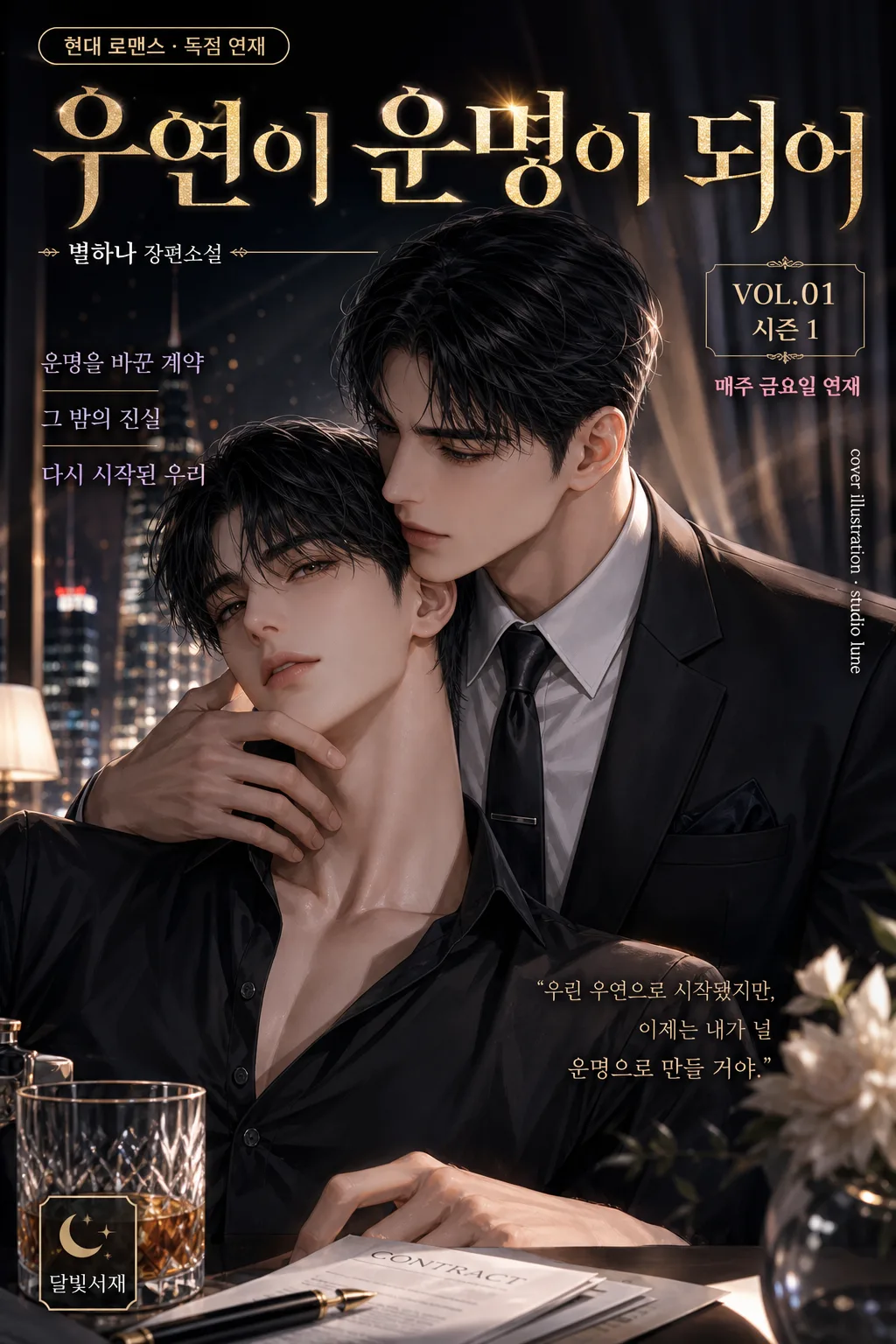
웹소설 표지 디자인. 인물 hero + 제목 + 작가명.
웹소설 표지 (BL·로맨스·판타지·스릴러) 검색 요약
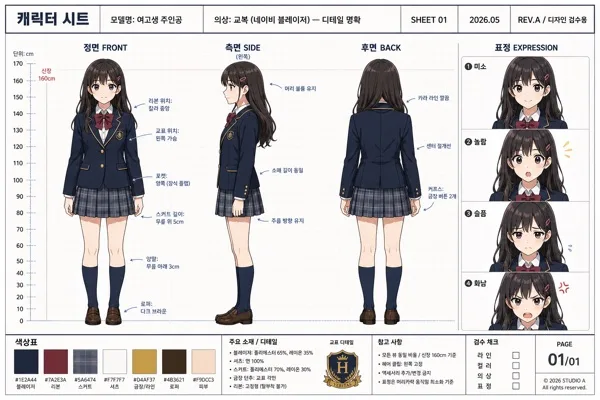
웹소설 표지 (BL·로맨스·판타지·스릴러)은 만화/일러스트 결과물을 만들 때 바로 복사해 활용할 수 있는 ChatGPT 이미지 프롬프트입니다. 주제, 배경, 스타일, 구도 조건을 함께 담아 빠르게 시안을 만들 수 있도록 구성했습니다.
관련 키워드: 웹소설 표지 (BL·로맨스·판타지·스릴러), 웹소설 표지 (BL·로맨스·판타지·스릴러) 프롬프트, 만화/일러스트 프롬프트, 만화/일러스트 AI 이미지 프롬프트, ChatGPT 이미지 프롬프트, AI 이미지 생성 프롬프트, AI 프롬프트, 이미지 프롬프트
웹소설 표지 (BL·로맨스·판타지·스릴러) 활용 포인트
원본 구조를 유지하면서 피사체, 배경, 색감, 구도를 바꿔 다양한 시안으로 확장할 수 있습니다.
- 핵심 소재는 유지하고 브랜드, 계절, 채널 목적에 맞는 색감과 배경을 바꿔보세요.
- 결과가 산만하면 배경 요소를 줄이고 피사체, 구도, 조명 조건을 구체화하세요.
- 복사한 뒤 ChatGPT에서 플랫폼, 화면 비율, 텍스트 포함 여부를 추가로 요청할 수 있습니다.
프롬프트 원문
[Input]
- language: Korean
- output_size: 1024x1536

[Purpose]
Korean web novel cover design for BL, romance, fantasy, thriller, martial-arts, SF, or mystery genres. Vertical marketplace-ready cover with strong genre readability for KakaoPage, Munpia, and Novelepia-style presentation, enriched with realistic serial-cover details such as genre tag, season/volume label, short promotional blurbs, publisher imprint, and small credit text.

[Composition]
- Main subject placement: use {인물 결} as the dominant focal area in the central 55–65% of the frame, with {제목·작가} reserved for top and lower title zones.
- Background treatment: build {배경·세트} as a clear genre-specific environment with cinematic depth, layered atmospheric detail, practical set elements, and story-relevant textures that support the characters.
- Spacing and framing: keep a readable vertical hierarchy with a strong title band, compact author line, genre/season micro-labels, and natural cover details placed around the hero figures without hiding faces.
- Genre direction: shape the entire layout according to {장르} so the composition instantly signals romance, BL, fantasy, thriller, or related subgenre through pose, costume, lighting, props, setting, and typography.
- Marketplace realism: add small but legible cover furniture such as “VOL.01”, “시즌 1”, “매주 금요일 연재”, a tiny publisher imprint “달빛서재”, and one vertical side credit line like “cover illustration · studio lune”.

[3. CORE STRUCTURE]
1) Title zone (top 18–22%): place {제목·작가} in a bold Korean display typographic treatment, with the title larger than the author line and strong separation between the two. Add a small genre pill near the title, for example “{장르} · 독점 연재” or “{장르} · 오리지널”.
2) Character zone (mid 50–60%): render {인물 결} as the visual hero, with expressive pose, clear silhouette, face/upper-body emphasis, nuanced clothing detail, hair highlights, jewelry, weapons, magic effects, documents, flowers, neon reflections, or other genre-appropriate story cues.
3) Environment zone (full-frame depth): extend {배경·세트} behind the characters with foreground/midground/background separation so the cover feels like an illustrated key visual; include believable environmental details such as candlelight, rain-streaked glass, palace curtains, city signs, library shelves, battlefield smoke, occult symbols, or starship panels depending on {장르}.
4) Cover information layer: add 2–3 short Korean cover blurbs in small type, such as “운명을 바꾼 계약”, “그 밤의 진실”, “다시 시작된 첫사랑”, “왕좌를 건 맹세”, or “살인 예고 D-3”, selecting lines that match {장르}.
5) Color system: apply {컬러 톤} consistently across background, lighting accents, title effects, atmospheric overlays, genre tag, and decorative dividers so the cover reads instantly at thumbnail size.
6) Typography integration: place the title, author text, micro-labels, side credit, and short blurbs so they remain legible over the artwork, using contrast, subtle glow, outline, shadow, translucent panels, or metallic foil effects where needed. Reflect {타이포} in the title treatment.
7) Final polish: keep the image polished like a commercial web novel cover, with crisp character edges, tactile fabric/material rendering, cinematic lighting, and refined details that reward close viewing while preserving thumbnail readability.

[4. STYLE RULES]
- Typography: use {타이포} as the primary title direction; if unspecified, use a bold Korean serif such as Noto Serif KR or Sandoll Myeongjo Heavy for dramatic genres, or an elegant modern display style for romance/BL, paired with Pretendard Medium or Inter for author, volume, credit, and blurb text.
- Color palette: follow {컬러 톤} with genre-specific tones such as pink-gold for romance, deep purple-black for fantasy, icy blue-silver for SF, ink-black crimson for thriller, or jade-gold for martial arts; use high-contrast highlights and secondary accent colors for title shine, eyes, magic, rain, neon, blood-red warning marks, or floral glow.
- Decorative cover furniture: include a refined top/bottom rule, small corner ornament, thin vertical spine-like credit text, tiny imprint mark, and a small serial label area; these should feel like part of a premium Korean web novel cover, not like an official certification.
- Border/shadow: add a soft 4px y-offset shadow with 12px blur at 18% opacity for text, plus subtle vignette, rim glow, foil sheen, atmospheric particles, or edge darkening only where it improves drama and readability.
- Scale: compose for {비율} while maintaining the 1024x1536 vertical cover implication, with all text and character silhouettes readable as a marketplace thumbnail.

[5. VISUAL STYLE]
- Camera / lens: cinematic poster framing with a 50mm f/1.8 or 85mm f/1.4 portrait look, shallow depth of field, and crisp subject separation from background.
- Lighting: use a controlled key light from upper-left at 45° with a gentle fill from front-right and a faint rim light to define hair, clothing, weapon edges, magical aura, rain droplets, or silhouette contours.
- Color grade: apply a high-end webtoon-cover grade tuned to the genre, with either warm rose-gold highlights, cool violet shadows, icy neon blues, jade mist, or deep noir reds depending on {컬러 톤}.
- Rendering quality: realistic premium illustrated cover finish, detailed skin and fabric texture, cinematic atmosphere, high-resolution brushwork, glossy title effects, believable depth haze, and dramatic but readable contrast.

[6. MOOD]
Commercial Korean web novel key visual — the polished, high-contrast storefront cover feel of KakaoPage, Munpia, and Novelepia promotional art, with enough narrative detail to suggest a full serialized story at first glance.

[7. CRITICAL]
- Korean text accuracy: “웹소설 표지”, {제목·작가}, and any title or author text embedded in the design must appear in correct Korean characters without distortion.
- Include realistic Korean cover details in small type, such as “VOL.01”, “시즌 1”, “매주 금요일 연재”, “달빛서재”, “cover illustration · studio lune”, and 2–3 short blurbs like “운명을 바꾼 계약”, “그 밤의 진실”, or “다시 시작된 첫사랑”; keep them accurate and legible.
- Layout invariants: preserve a clear vertical cover hierarchy with title at top, character hero in the middle, and background environment behind; keep the composition readable at thumbnail size.
- Genre fidelity: {장르} must be visually obvious from pose, costume, lighting, background, palette, title styling, and small cover details.

[8. 🚫 PROHIBITED]
- Broken Korean characters
- Fake official seals or certifications