Merch/Mockups
사장님 앞치마·유니폼 목업
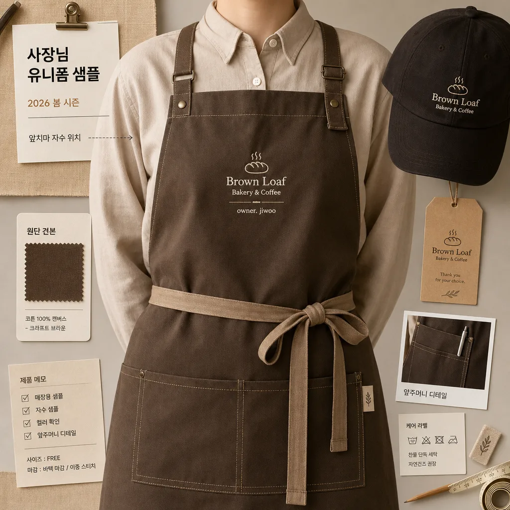
매장 사장 시그니처 앞치마 + 캡 mockup. 시그니처 자수.
사장님 앞치마·유니폼 목업 summary
Copy this ChatGPT image prompt to create Merch/Mockups results. Its subject, background, style, and composition are organized for quick iteration.
Related keywords: 사장님 앞치마·유니폼 목업, 사장님 앞치마·유니폼 목업 프롬프트, Merch/Mockups 프롬프트, Merch/Mockups AI 이미지 프롬프트, ChatGPT 이미지 프롬프트, AI 이미지 생성 프롬프트, AI 프롬프트, 이미지 프롬프트
How to use 사장님 앞치마·유니폼 목업
Keep the prompt structure and swap the subject, background, palette, or composition to create new variations.
- Keep the main subject and adjust the palette and background for your brand, season, or channel.
- If the result feels busy, simplify the background and make the subject, composition, and lighting more specific.
- After copying, ask ChatGPT to adapt it for your platform, aspect ratio, or text requirements.
Original prompt
[Input]
- language: Korean
- output_size: 1024x1024

[Purpose]
1-2 English lines: signature apron and uniform mockup for a shop owner, designed as a realistic square product-style presentation for local store branding, staff uniform planning, and merchandise preview.
Concrete: premium shop-uniform mockup, 1:1 composition, suitable for bakery/café/restaurant/flower shop/beauty salon identity previews with practical catalog details and believable studio styling.

[Composition]
- Main subject: {매장} owner uniform mockup with apron and cap as the hero object, occupying about 70% of the frame and presented like a premium staff-uniform sample ready for approval.
- Framing: square-centered layout with the torso cropped cleanly at mid-chest to upper-thigh, keeping the garment silhouette readable and balanced while showing straps, pocket placement, hem, and cap position.
- Background treatment: {배경} rendered as a realistic warm studio surface or boutique worktable/peg-rail setup, with soft fabric shadows, subtle paper texture, a small swatch card, and a hangtag that supports the uniform concept without overpowering the apron.
- Clothing details: {유니폼 결} shown as a crisp apron + cap set with clearly visible seams, reinforced bar-tacks, straps, pocket stitching, folded edge thickness, metal adjuster detail, and tactile fabric weave.
- Embroidery placement: {자수·로고} placed on the chest or apron pocket area in a small but legible size, aligned straight and centered for mockup clarity, rendered as real thread with slight raised texture and stitch direction.
- Color emphasis: {컬러 톤} applied to garment accents, thread color, trim, label tabs, hangtag ink, and tiny brand marks, while keeping the base textile neutral, premium, and commercially believable.
- Supporting details: include a neat Korean sample label card reading '사장님 유니폼 샘플', a small date line '2026 봄 시즌', a tiny note '앞치마 자수 위치', and a product memo strip with size/finish cues such as '원단 견본' and '매장용 샘플'.

[3. CORE STRUCTURE]
1) Base layout — Center the {매장} uniform mockup in a square composition, with the apron as the main visual anchor and the cap/secondary piece supporting the complete shop-owner brand set.
2) Garment surface — Render {유니폼 결} with realistic cloth thickness, subtle weave detail, neat stitching, softened folds, reinforced seams, pressed-but-worn fabric behavior, and a product-photography finish rather than illustration-like flatness.
3) Brand mark zone — Place {자수·로고} in a small embroidered treatment that looks stitched into the fabric, with precise spacing, sharp edges, visible thread ridges, and no broken characters.
4) Color mapping — Apply {컬러 톤} consistently across piping, thread, label accents, cap trim, hangtag line art, or pocket details so the set feels like a cohesive brand mockup.
5) Background plane — Build {배경} as a believable boutique studio surface with soft matte texture, gentle contact shadows, a pinned fabric swatch, folded sample cloth, pencil mark or measuring tape edge, and small catalog-style labels that add context while keeping the garment dominant.
6) Format balance — Maintain {비율} proportions with comfortable product-catalog spacing, allowing the uniform silhouette, cap, hangtag, swatch, and memo labels to read clearly within the 1:1 frame.
7) Catalog realism — Add small production-preview elements: a woven neck label, a kraft paper hangtag, a short care-label tab, a compact fabric swatch card, and tiny Korean spec notes such as '자수 샘플', '컬러 확인', and '앞주머니 디테일'.

[4. STYLE RULES]
- Typography: use restrained Pretendard or Noto Sans KR style in medium weight for small catalog labels, hangtags, and spec notes; set Korean text cleanly, including '사장님 유니폼 샘플', '앞치마 자수 위치', '원단 견본', '매장용 샘플', and '2026 봄 시즌'.
- Color palette: craft brown, matte black, warm cream, natural cotton beige, and the shop’s signature accent from {컬러 톤}; keep saturation controlled and commercially believable.
- Border/shadow: soft studio drop shadow under the garment, about 4px y-offset, 12px blur, 15% opacity, with subtle edge falloff for a polished mockup look.
- Material details: fabric should show woven fibers, mild wrinkles near strap bends, stitched reinforcement, slightly raised embroidery, matte metal adjusters if present, and believable sewing construction.
- Decorative graphic elements: include small catalog ticks, fine divider lines, swatch labels, and a modest hangtag layout, all scaled like real uniform-sample documentation rather than poster headlines.

[5. VISUAL STYLE]
- Camera / lens: studio product shot, 85mm f/2.8 equivalent, front-facing composition with minimal perspective distortion.
- Lighting: even softbox key light from upper-left at about 45°, gentle fill from right, light shadow separation to reveal fabric structure, embroidery depth, paper tag texture, and layered garment edges.
- Color grade: neutral warm editorial grade with craft-brown, black, warm cream, and muted accent tones; slight desaturation for a premium local-brand merchandise feel.
- Rendering style: photorealistic product editorial image with tactile textile detail, realistic contact shadows, accurate stitch scale, and a practical boutique-workshop atmosphere.

[6. MOOD]
Local boutique merchandise preview — feels like an urban lifestyle magazine product spread for a real shop owner choosing a uniform, with polished product photography, practical sample-room details, and brand-ready presentation.

[7. CRITICAL]
- Korean text accuracy: the exact Korean strings that must appear correctly are {매장}, {유니폼 결}, {자수·로고}, {컬러 톤}, {배경}, {비율} if any visible text or label is included in the design.
- Additional visible Korean text must be spelled correctly if used: '사장님 유니폼 샘플', '앞치마 자수 위치', '원단 견본', '매장용 샘플', '2026 봄 시즌', '자수 샘플', '컬러 확인', '앞주머니 디테일'.
- Composition invariant: the apron/uniform set must remain the main hero object, centered and readable as a mockup, with supporting swatches, tags, and notes kept secondary.
- Fabric realism: seams, straps, embroidery, pockets, labels, and garment edges must look physically plausible and neatly finished.
- Brand preview clarity: {자수·로고} must look embroidered into the apron or pocket area, not printed flat or floating above the fabric.

[8. 🚫 PROHIBITED]
- Fake official seals / certifications
- Broken Korean characters