グッズ・モックアップ
사장님 앞치마·유니폼 목업
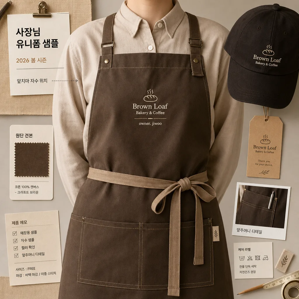
매장 사장 시그니처 앞치마 + 캡 mockup. 시그니처 자수.
사장님 앞치마·유니폼 목업の概要
グッズ・モックアップ画像を作るためのChatGPT画像プロンプトです。主題、背景、スタイル、構図を整理し、すぐに試せるよう構成しています。
関連キーワード: 사장님 앞치마·유니폼 목업, 사장님 앞치마·유니폼 목업 프롬프트, グッズ・モックアップ 프롬프트, グッズ・モックアップ AI 이미지 프롬프트, ChatGPT 이미지 프롬프트, AI 이미지 생성 프롬프트, AI 프롬프트, 이미지 프롬프트
사장님 앞치마·유니폼 목업の活用方法
元の構造を保ちながら、被写体、背景、色、構図を変更して別案に展開できます。
- 主題を維持し、ブランドや季節、媒体に合わせて色と背景を変更してください。
- 結果が複雑な場合は背景要素を減らし、被写体、構図、照明を具体化してください。
- コピー後、ChatGPTに媒体、アスペクト比、文字の有無を追加で指定できます。
プロンプト原文
[Input]
- language: Korean
- output_size: 1024x1024

[Purpose]
1-2 English lines: signature apron and uniform mockup for a shop owner, designed as a realistic square product-style presentation for local store branding, staff uniform planning, and merchandise preview.
Concrete: premium shop-uniform mockup, 1:1 composition, suitable for bakery/café/restaurant/flower shop/beauty salon identity previews with practical catalog details and believable studio styling.

[Composition]
- Main subject: {매장} owner uniform mockup with apron and cap as the hero object, occupying about 70% of the frame and presented like a premium staff-uniform sample ready for approval.
- Framing: square-centered layout with the torso cropped cleanly at mid-chest to upper-thigh, keeping the garment silhouette readable and balanced while showing straps, pocket placement, hem, and cap position.
- Background treatment: {배경} rendered as a realistic warm studio surface or boutique worktable/peg-rail setup, with soft fabric shadows, subtle paper texture, a small swatch card, and a hangtag that supports the uniform concept without overpowering the apron.
- Clothing details: {유니폼 결} shown as a crisp apron + cap set with clearly visible seams, reinforced bar-tacks, straps, pocket stitching, folded edge thickness, metal adjuster detail, and tactile fabric weave.
- Embroidery placement: {자수·로고} placed on the chest or apron pocket area in a small but legible size, aligned straight and centered for mockup clarity, rendered as real thread with slight raised texture and stitch direction.
- Color emphasis: {컬러 톤} applied to garment accents, thread color, trim, label tabs, hangtag ink, and tiny brand marks, while keeping the base textile neutral, premium, and commercially believable.
- Supporting details: include a neat Korean sample label card reading '사장님 유니폼 샘플', a small date line '2026 봄 시즌', a tiny note '앞치마 자수 위치', and a product memo strip with size/finish cues such as '원단 견본' and '매장용 샘플'.

[3. CORE STRUCTURE]
1) Base layout — Center the {매장} uniform mockup in a square composition, with the apron as the main visual anchor and the cap/secondary piece supporting the complete shop-owner brand set.
2) Garment surface — Render {유니폼 결} with realistic cloth thickness, subtle weave detail, neat stitching, softened folds, reinforced seams, pressed-but-worn fabric behavior, and a product-photography finish rather than illustration-like flatness.
3) Brand mark zone — Place {자수·로고} in a small embroidered treatment that looks stitched into the fabric, with precise spacing, sharp edges, visible thread ridges, and no broken characters.
4) Color mapping — Apply {컬러 톤} consistently across piping, thread, label accents, cap trim, hangtag line art, or pocket details so the set feels like a cohesive brand mockup.
5) Background plane — Build {배경} as a believable boutique studio surface with soft matte texture, gentle contact shadows, a pinned fabric swatch, folded sample cloth, pencil mark or measuring tape edge, and small catalog-style labels that add context while keeping the garment dominant.
6) Format balance — Maintain {비율} proportions with comfortable product-catalog spacing, allowing the uniform silhouette, cap, hangtag, swatch, and memo labels to read clearly within the 1:1 frame.
7) Catalog realism — Add small production-preview elements: a woven neck label, a kraft paper hangtag, a short care-label tab, a compact fabric swatch card, and tiny Korean spec notes such as '자수 샘플', '컬러 확인', and '앞주머니 디테일'.

[4. STYLE RULES]
- Typography: use restrained Pretendard or Noto Sans KR style in medium weight for small catalog labels, hangtags, and spec notes; set Korean text cleanly, including '사장님 유니폼 샘플', '앞치마 자수 위치', '원단 견본', '매장용 샘플', and '2026 봄 시즌'.
- Color palette: craft brown, matte black, warm cream, natural cotton beige, and the shop’s signature accent from {컬러 톤}; keep saturation controlled and commercially believable.
- Border/shadow: soft studio drop shadow under the garment, about 4px y-offset, 12px blur, 15% opacity, with subtle edge falloff for a polished mockup look.
- Material details: fabric should show woven fibers, mild wrinkles near strap bends, stitched reinforcement, slightly raised embroidery, matte metal adjusters if present, and believable sewing construction.
- Decorative graphic elements: include small catalog ticks, fine divider lines, swatch labels, and a modest hangtag layout, all scaled like real uniform-sample documentation rather than poster headlines.

[5. VISUAL STYLE]
- Camera / lens: studio product shot, 85mm f/2.8 equivalent, front-facing composition with minimal perspective distortion.
- Lighting: even softbox key light from upper-left at about 45°, gentle fill from right, light shadow separation to reveal fabric structure, embroidery depth, paper tag texture, and layered garment edges.
- Color grade: neutral warm editorial grade with craft-brown, black, warm cream, and muted accent tones; slight desaturation for a premium local-brand merchandise feel.
- Rendering style: photorealistic product editorial image with tactile textile detail, realistic contact shadows, accurate stitch scale, and a practical boutique-workshop atmosphere.

[6. MOOD]
Local boutique merchandise preview — feels like an urban lifestyle magazine product spread for a real shop owner choosing a uniform, with polished product photography, practical sample-room details, and brand-ready presentation.

[7. CRITICAL]
- Korean text accuracy: the exact Korean strings that must appear correctly are {매장}, {유니폼 결}, {자수·로고}, {컬러 톤}, {배경}, {비율} if any visible text or label is included in the design.
- Additional visible Korean text must be spelled correctly if used: '사장님 유니폼 샘플', '앞치마 자수 위치', '원단 견본', '매장용 샘플', '2026 봄 시즌', '자수 샘플', '컬러 확인', '앞주머니 디테일'.
- Composition invariant: the apron/uniform set must remain the main hero object, centered and readable as a mockup, with supporting swatches, tags, and notes kept secondary.
- Fabric realism: seams, straps, embroidery, pockets, labels, and garment edges must look physically plausible and neatly finished.
- Brand preview clarity: {자수·로고} must look embroidered into the apron or pocket area, not printed flat or floating above the fabric.

[8. 🚫 PROHIBITED]
- Fake official seals / certifications
- Broken Korean characters