SNS/카드뉴스
매장 음악 플레이리스트 카드 (스포티파이·애플뮤직)
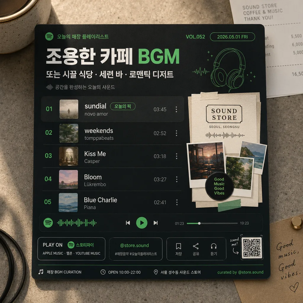
매장 BGM 추천 플레이리스트 카드. 곡명 + 무드.
매장 음악 플레이리스트 카드 (스포티파이·애플뮤직) 검색 요약
매장 음악 플레이리스트 카드 (스포티파이·애플뮤직)은 SNS/카드뉴스 결과물을 만들 때 바로 복사해 활용할 수 있는 ChatGPT 이미지 프롬프트입니다. 주제, 배경, 스타일, 구도 조건을 함께 담아 빠르게 시안을 만들 수 있도록 구성했습니다.
관련 키워드: 매장 음악 플레이리스트 카드 (스포티파이·애플뮤직), 매장 음악 플레이리스트 카드 (스포티파이·애플뮤직) 프롬프트, SNS/카드뉴스 프롬프트, SNS/카드뉴스 AI 이미지 프롬프트, ChatGPT 이미지 프롬프트, AI 이미지 생성 프롬프트, AI 프롬프트, 이미지 프롬프트
매장 음악 플레이리스트 카드 (스포티파이·애플뮤직) 활용 포인트
원본 구조를 유지하면서 피사체, 배경, 색감, 구도를 바꿔 다양한 시안으로 확장할 수 있습니다.
- 핵심 소재는 유지하고 브랜드, 계절, 채널 목적에 맞는 색감과 배경을 바꿔보세요.
- 결과가 산만하면 배경 요소를 줄이고 피사체, 구도, 조명 조건을 구체화하세요.
- 복사한 뒤 ChatGPT에서 플랫폼, 화면 비율, 텍스트 포함 여부를 추가로 요청할 수 있습니다.
프롬프트 원문
[Input]
- language: Korean
- output_size: 1024x1024

[Purpose]
Create a square store music playlist card for social posting and in-store display, styled like a Spotify/Apple Music inspired editorial graphic.
Use the card to present {매장 무드} with a polished music-app aesthetic, realistic café/store atmosphere, and clear Korean/English typography that feels like an actual printed card photographed for social media.

[Composition]
- Center the main playlist card at about 82-88% of the frame, photographed on a realistic store counter or café tabletop with subtle paper grain, soft shadows, and tactile surface texture.
- Build the background from {컬러 톤}: a real material surface such as matte paper, painted wood, stone counter, or fabric placemat, with small natural contextual details like a receipt corner, coffee cup edge, sticker label, cable loop, plant shadow, or tiny listening-note card.
- Place the title/header near the top 12% area, the playlist rows in the middle 50-55%, and the visual block for {대표 비주얼} in a prominent side or lower section depending on the card layout.
- Use {비율} as the final canvas framing and keep the design compact, poster-like, and readable at thumbnail size while still feeling like a real social post photographed in-store.
- Ensure {플랫폼} is clearly communicated through platform-inspired color blocking, rounded UI cues, app-style chips, progress-bar elements, and a small text badge such as "PLAY ON {플랫폼}".
- Add realistic social card details: store playlist handle "@store.sound", small save/share micro icons, hashtag-like text "#매장음악 #오늘의플레이리스트", a tiny QR-code area, and a printed-card footer line.

[3. CORE STRUCTURE]
1. Header zone (top 12-15%): Set a bold playlist heading tied to {매장 무드}, with smaller subtitle text beneath it in a clean app-card hierarchy. Include short Korean display text such as "오늘의 매장 플레이리스트", "VOL.052", and "2026.05.01 FRI".
2. Playlist body (middle 45-55%): Typeset the {곡 리스트 5} as exactly five neat rows, each with track number, title, artist, and a small duration-style detail aligned to the right. Add a subtle "오늘의 픽" badge near the first track without creating an extra track row.
3. Feature visual block (lower-left or right 30-35%): Render {대표 비주얼} as a rich collage-like panel with crisp cut edges, layered paper pieces, small tape tabs, tiny waveform graphics, and premium playlist-card styling.
4. Platform accent system: Apply {플랫폼} cues through UI strips, progress-bar-like elements, playback dots, rounded accent chips, and a platform name badge while keeping the overall design original.
5. Palette integration: Blend {컬러 톤} into the tabletop, printed card stock, title, separators, highlight shapes, sticker accents, and small decorative waveform elements so the card feels cohesive and physically present.
6. Information hierarchy: Keep the most important playlist title and first track visually strongest, with the rest of the lines stepping down in size and weight.
7. Footer utility area: Add a bottom strip with "매장 BGM CURATION", "OPEN 10:00-22:00", "서울 성수동 사운드 스토어", "저장 · 공유 · 듣기", a tiny QR block, and small credit text "curated by @store.sound".

[4. STYLE RULES]
- Typography: Use Pretendard or Noto Sans KR for Korean UI text, with bold 700-800 weight for headers and 400-500 weight for track rows; pair with a simple sans-serif Latin face for English artist names.
- Color palette: Derive the palette from {컬러 톤}, using platform-inspired dark green/black if {플랫폼} leans Spotify, or clean white/soft gray with subtle blue-green accents if it leans Apple Music; keep contrast high and text readable.
- Border/shadow: Add a soft drop shadow with 4px y-offset, 14px blur, 18% opacity under the main card; use thin 1px divider lines and rounded corners around 18-24px.
- Physical print detail: Add faint paper fibers, tiny ink gain, slight edge thickness, realistic corner curvature, soft contact shadows, and small printed registration marks to make the card feel photographed rather than flat-generated.
- Decorative UI details: Include tiny equalizer bars, waveform snippets, a progress slider, circular play/pause control, volume dot, playlist count label "5 TRACKS", and micro labels like "STORE MIX" and "NOW PLAYING".

[5. VISUAL STYLE]
- Camera / lens: Graphic design mockup rendered like a clean product poster, photographed with a Canon EOS R5 and RF 35mm f/1.8 lens in an overhead top-down layout equivalent to a 35mm flat composition.
- Lighting: Studio-like even illumination with a slight upper-left highlight, gentle shadow falloff on the card edges, soft reflections on any nearby cup or sticker surface, and realistic ambient light from a store window.
- Color grade: Music-app editorial grade with deep charcoal, forest green, off-white, and muted accent hues matched to {컬러 톤}.
- Surface realism: Use tangible counter texture, printed paper finish, subtle fingerprints on glossy sticker areas, and natural occlusion where props overlap the edge of the card.

[6. MOOD]
Premium in-store music curation card — Spotify editorial UI meets a modern café playlist poster aesthetic, with warm real-world store details and a curated social-media-ready atmosphere.

[7. CRITICAL]
- Korean text accuracy: resolved values for {매장 무드}, {곡 리스트 5}, {플랫폼}, {대표 비주얼}, {컬러 톤}, and {비율} must render cleanly with correct Korean spacing, punctuation, and line breaks.
- 반드시 정확히 표시되어야 하는 한글 문자열: "오늘의 매장 플레이리스트", "오늘의 픽", "매장 BGM", "저장", "공유", "듣기", "서울 성수동 사운드 스토어", "#매장음악", "#오늘의플레이리스트".
- The playlist must contain exactly 5 visible track lines matching {곡 리스트 5} structure; do not add a sixth song, bonus track, or duplicate list row.
- {플랫폼} must appear as readable text at least once, for example in a badge reading "PLAY ON {플랫폼}".
- All Korean text must render cleanly with correct spacing, punctuation, and line breaks.

[8. 🚫 PROHIBITED]
- Fake official seals / certifications
- Broken Korean characters
- Celebrity composites or unauthorized likeness