社群/圖卡
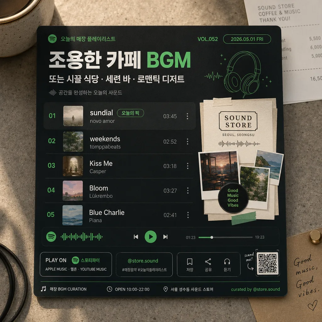
매장 음악 플레이리스트 카드 (스포티파이·애플뮤직)
매장 BGM 추천 플레이리스트 카드. 곡명 + 무드.
매장 음악 플레이리스트 카드 (스포티파이·애플뮤직)摘要
這是用來製作社群/圖卡內容的 ChatGPT 圖像提示詞,已整理主題、背景、風格與構圖,方便快速調整。
相關關鍵字: 매장 음악 플레이리스트 카드 (스포티파이·애플뮤직), 매장 음악 플레이리스트 카드 (스포티파이·애플뮤직) 프롬프트, 社群/圖卡 프롬프트, 社群/圖卡 AI 이미지 프롬프트, ChatGPT 이미지 프롬프트, AI 이미지 생성 프롬프트, AI 프롬프트, 이미지 프롬프트
매장 음악 플레이리스트 카드 (스포티파이·애플뮤직)使用方式
保留原始結構並替換主體、背景、色彩或構圖,即可延伸出不同版本。
- 保留核心主體,並依品牌、季節或平台調整色彩與背景。
- 如果畫面太複雜,請減少背景元素並具體描述主體、構圖與光線。
- 複製後可要求 ChatGPT 配合平台、長寬比或文字需求調整。
提示詞原文
[Input]
- language: Korean
- output_size: 1024x1024

[Purpose]
Create a square store music playlist card for social posting and in-store display, styled like a Spotify/Apple Music inspired editorial graphic.
Use the card to present {매장 무드} with a polished music-app aesthetic, realistic café/store atmosphere, and clear Korean/English typography that feels like an actual printed card photographed for social media.

[Composition]
- Center the main playlist card at about 82-88% of the frame, photographed on a realistic store counter or café tabletop with subtle paper grain, soft shadows, and tactile surface texture.
- Build the background from {컬러 톤}: a real material surface such as matte paper, painted wood, stone counter, or fabric placemat, with small natural contextual details like a receipt corner, coffee cup edge, sticker label, cable loop, plant shadow, or tiny listening-note card.
- Place the title/header near the top 12% area, the playlist rows in the middle 50-55%, and the visual block for {대표 비주얼} in a prominent side or lower section depending on the card layout.
- Use {비율} as the final canvas framing and keep the design compact, poster-like, and readable at thumbnail size while still feeling like a real social post photographed in-store.
- Ensure {플랫폼} is clearly communicated through platform-inspired color blocking, rounded UI cues, app-style chips, progress-bar elements, and a small text badge such as "PLAY ON {플랫폼}".
- Add realistic social card details: store playlist handle "@store.sound", small save/share micro icons, hashtag-like text "#매장음악 #오늘의플레이리스트", a tiny QR-code area, and a printed-card footer line.

[3. CORE STRUCTURE]
1. Header zone (top 12-15%): Set a bold playlist heading tied to {매장 무드}, with smaller subtitle text beneath it in a clean app-card hierarchy. Include short Korean display text such as "오늘의 매장 플레이리스트", "VOL.052", and "2026.05.01 FRI".
2. Playlist body (middle 45-55%): Typeset the {곡 리스트 5} as exactly five neat rows, each with track number, title, artist, and a small duration-style detail aligned to the right. Add a subtle "오늘의 픽" badge near the first track without creating an extra track row.
3. Feature visual block (lower-left or right 30-35%): Render {대표 비주얼} as a rich collage-like panel with crisp cut edges, layered paper pieces, small tape tabs, tiny waveform graphics, and premium playlist-card styling.
4. Platform accent system: Apply {플랫폼} cues through UI strips, progress-bar-like elements, playback dots, rounded accent chips, and a platform name badge while keeping the overall design original.
5. Palette integration: Blend {컬러 톤} into the tabletop, printed card stock, title, separators, highlight shapes, sticker accents, and small decorative waveform elements so the card feels cohesive and physically present.
6. Information hierarchy: Keep the most important playlist title and first track visually strongest, with the rest of the lines stepping down in size and weight.
7. Footer utility area: Add a bottom strip with "매장 BGM CURATION", "OPEN 10:00-22:00", "서울 성수동 사운드 스토어", "저장 · 공유 · 듣기", a tiny QR block, and small credit text "curated by @store.sound".

[4. STYLE RULES]
- Typography: Use Pretendard or Noto Sans KR for Korean UI text, with bold 700-800 weight for headers and 400-500 weight for track rows; pair with a simple sans-serif Latin face for English artist names.
- Color palette: Derive the palette from {컬러 톤}, using platform-inspired dark green/black if {플랫폼} leans Spotify, or clean white/soft gray with subtle blue-green accents if it leans Apple Music; keep contrast high and text readable.
- Border/shadow: Add a soft drop shadow with 4px y-offset, 14px blur, 18% opacity under the main card; use thin 1px divider lines and rounded corners around 18-24px.
- Physical print detail: Add faint paper fibers, tiny ink gain, slight edge thickness, realistic corner curvature, soft contact shadows, and small printed registration marks to make the card feel photographed rather than flat-generated.
- Decorative UI details: Include tiny equalizer bars, waveform snippets, a progress slider, circular play/pause control, volume dot, playlist count label "5 TRACKS", and micro labels like "STORE MIX" and "NOW PLAYING".

[5. VISUAL STYLE]
- Camera / lens: Graphic design mockup rendered like a clean product poster, photographed with a Canon EOS R5 and RF 35mm f/1.8 lens in an overhead top-down layout equivalent to a 35mm flat composition.
- Lighting: Studio-like even illumination with a slight upper-left highlight, gentle shadow falloff on the card edges, soft reflections on any nearby cup or sticker surface, and realistic ambient light from a store window.
- Color grade: Music-app editorial grade with deep charcoal, forest green, off-white, and muted accent hues matched to {컬러 톤}.
- Surface realism: Use tangible counter texture, printed paper finish, subtle fingerprints on glossy sticker areas, and natural occlusion where props overlap the edge of the card.

[6. MOOD]
Premium in-store music curation card — Spotify editorial UI meets a modern café playlist poster aesthetic, with warm real-world store details and a curated social-media-ready atmosphere.

[7. CRITICAL]
- Korean text accuracy: resolved values for {매장 무드}, {곡 리스트 5}, {플랫폼}, {대표 비주얼}, {컬러 톤}, and {비율} must render cleanly with correct Korean spacing, punctuation, and line breaks.
- 반드시 정확히 표시되어야 하는 한글 문자열: "오늘의 매장 플레이리스트", "오늘의 픽", "매장 BGM", "저장", "공유", "듣기", "서울 성수동 사운드 스토어", "#매장음악", "#오늘의플레이리스트".
- The playlist must contain exactly 5 visible track lines matching {곡 리스트 5} structure; do not add a sixth song, bonus track, or duplicate list row.
- {플랫폼} must appear as readable text at least once, for example in a badge reading "PLAY ON {플랫폼}".
- All Korean text must render cleanly with correct spacing, punctuation, and line breaks.

[8. 🚫 PROHIBITED]
- Fake official seals / certifications
- Broken Korean characters
- Celebrity composites or unauthorized likeness