Infographics/Guides
UI 컴포넌트 시트
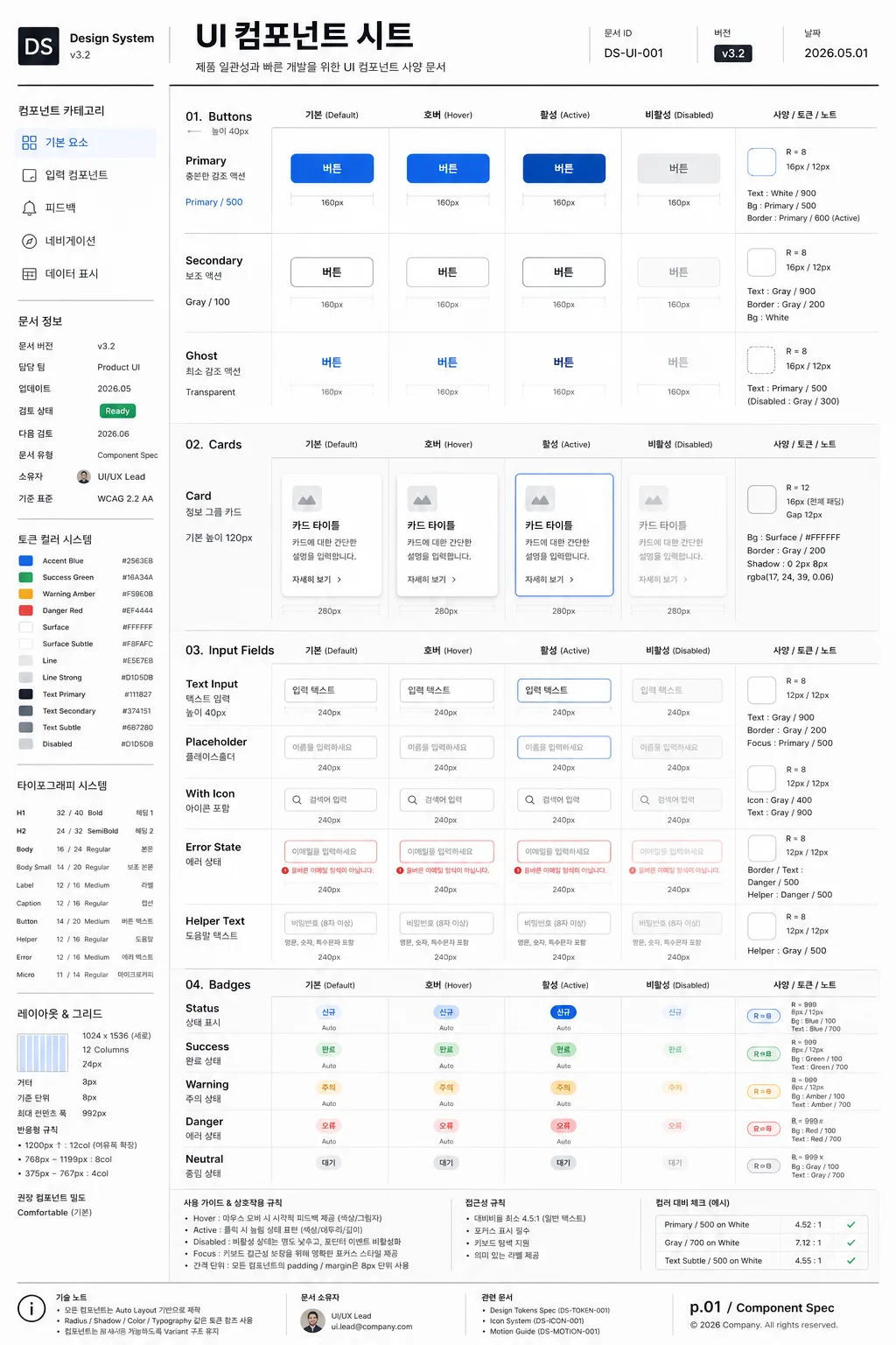
UI 컴포넌트 라이브러리. 버튼·카드·인풋·뱃지 mockup.
UI 컴포넌트 시트 summary
Copy this ChatGPT image prompt to create Infographics/Guides results. Its subject, background, style, and composition are organized for quick iteration.
Related keywords: UI 컴포넌트 시트, UI 컴포넌트 시트 프롬프트, Infographics/Guides 프롬프트, Infographics/Guides AI 이미지 프롬프트, ChatGPT 이미지 프롬프트, AI 이미지 생성 프롬프트, AI 프롬프트, 이미지 프롬프트
How to use UI 컴포넌트 시트
Keep the prompt structure and swap the subject, background, palette, or composition to create new variations.
- Keep the main subject and adjust the palette and background for your brand, season, or channel.
- If the result feels busy, simplify the background and make the subject, composition, and lighting more specific.
- After copying, ask ChatGPT to adapt it for your platform, aspect ratio, or text requirements.
Original prompt
[Input]
- language: Korean
- output_size: 1024x1536

[Purpose]
UI component spec sheet for a design system, presented as a polished editorial documentation page suitable for Figma reference, UI library documentation, product design handoff, and internal product-team review.
Vertical poster-style sheet with multiple component states displayed as a structured UI catalog, enriched with realistic design-system metadata, version labels, token notes, specs, and annotation callouts.

[Composition]
- Overall framing: a tall 1024x1536 page with a left navigation column and a right preview area, using a strict grid, dense documentation hierarchy, and professional product-design spacing.
- Left column: category labels, small supporting notes, version tags, owner information, and update history stacked vertically, aligned to the top-left, occupying about 22% of width.
- Right area: {컴포넌트 종류} arranged as a component showcase with clear separation between groups, each group showing {상태 variation} in a consistent row with labels, dimensions, token callouts, and interaction notes.
- Background treatment: refined white paper-like surface with very subtle cool-gray tint, faint grid suggestions, crisp divider lines in charcoal, and tiny measurement guides that make it feel like a real design-system artifact.
- Spacing: precise 8px-like spacing rhythm with labeled gutters, component cards, measurement ticks, and compact annotation clusters that remain readable and organized.
- Framing direction: organized like a modern design-system board, with a strong left-to-right reading flow and realistic documentation details throughout.

[3. CORE STRUCTURE]
- Header zone (top 12%): a compact title bar introducing the sheet, with the Korean title 'UI 컴포넌트 시트', small UI-system labeling, document ID, version badge, date stamp '2026.05.01', and thin horizontal rules.
- Category rail (left 22%): list the component families and labels, visually separated with light dividers, using {레이아웃} to anchor the navigation structure; include small Korean navigation items such as '기본 요소', '입력 컴포넌트', '피드백', '네비게이션', '데이터 표시'.
- Left metadata block: include realistic documentation fields such as '문서 버전 v3.2', '담당 팀 Product UI', '업데이트 2026.05', '검토 상태 Ready', and a compact token legend.
- Main preview grid (center/right 70%): display {컴포넌트 종류} as clean vector-like UI mockups, each family grouped in rows and columns with equal padding, row titles, state names, component dimensions, and small property labels.
- State row system: for each component family, show {상태 variation} in order from Default to Hover to Active to Disabled, each state visually distinct but aligned to the same baseline; add tiny Korean labels such as '기본', '호버', '활성', '비활성'.
- Component annotation layer: add small measurement rulers, radius labels such as 'R=8', padding notes such as '16px / 12px', token references like 'Primary / 500', 'Gray / 200', and short microcopy labels placed near relevant UI elements.
- Color reference strips: small swatches and annotations reflecting {컬러 톤}, placed near the component groups as system notes; include labeled tokens such as 'Accent Blue', 'Surface', 'Line', 'Text Subtle'.
- Typography sample area: a small type specimen using {타이포}, including labels, captions, button text, helper text, error text, and microcopy scaled to demonstrate hierarchy in a real documentation context.
- Ratio and layout block: a compact panel showing {비율}, grid column count, baseline unit, and recommended component density, with small Korean notes like '기준 단위 8px' and '반응형 규칙'.
- Footer note (bottom 8%): technical annotation area with aspect ratio, UI-system style notes, document owner, page number 'p.01 / Component Spec', and a tiny changelog strip, keeping the sheet looking like a real product-design deliverable.

[4. STYLE RULES]
- Typography: Inter and Pretendard, medium to semibold for headings, regular for labels, 10–14px-like sizing for micro labels, tight but readable line height, with Korean microcopy rendered sharply.
- Color palette: white #FFFFFF, charcoal #1F1F23, cool gray #E5E7EB, accent blue #4F7CFF, muted gray text #6B7280, plus controlled semantic accents for success green, warning amber, and error red when needed for component states.
- Border/shadow: 1px hairline separators, subtle 2px y-offset soft shadow at 8% opacity on component cards, crisp outlines for measurements, light dashed guides, and soft tinted state backgrounds.
- Visual consistency: all components should feel like a design system kit, with clean edges, rounded corners in the 8–12px range, precise alignment, shared tokens, repeated state patterns, and realistic UI documentation density.
- Rich documentation details: include compact tables, labels, token chips, component IDs, sample button text, form helper messages, switch/toggle examples, badges, dropdown arrows, checkboxes, radio states, tabs, segmented controls, and tooltip examples as appropriate to {컴포넌트 종류}.

[5. VISUAL STYLE]
- Camera / lens: orthographic front-on presentation, like a flat UI mockup capture, no perspective distortion, equivalent to a perfectly aligned 50mm studio reproduction look.
- Lighting: evenly lit, diffuse studio illumination from the front with smooth contrast, crisp edges, and anti-glare surface treatment.
- Color grade: neutral digital white with charcoal and blue accent, slightly cool and technical, like a high-quality Figma design-system export prepared for an internal design review.

[6. MOOD]
Premium product design-system board — Figma documentation page meets Material Design guideline sheet, with the density and credibility of a real UI kit handoff file.

[7. CRITICAL]
- Korean text accuracy: the following Korean strings must appear correctly and cleanly in the rendered image: 'UI 컴포넌트 시트', '컴포넌트 종류', '상태 variation', '레이아웃', '컬러 톤', '타이포', '비율'.
- Add realistic Korean documentation text in the image, including '문서 버전 v3.2', '업데이트 2026.05.01', '기준 단위 8px', '기본', '호버', '활성', '비활성', '컴포넌트 속성', and '디자인 토큰'.
- Exact layout discipline: left category rail + right preview grid must remain visually balanced and clearly separated.
- All component states must be shown consistently for each family, with state labels ordered Default, Hover, Active, Disabled.
- Typography must stay crisp and legible; no broken Hangul, no warped letters, no noisy compression artifacts.

[8. 🚫 PROHIBITED]
- Fake official seals / certifications
- Broken Korean characters
- Celebrity composites / unauthorized likeness