インフォグラフィック・案内
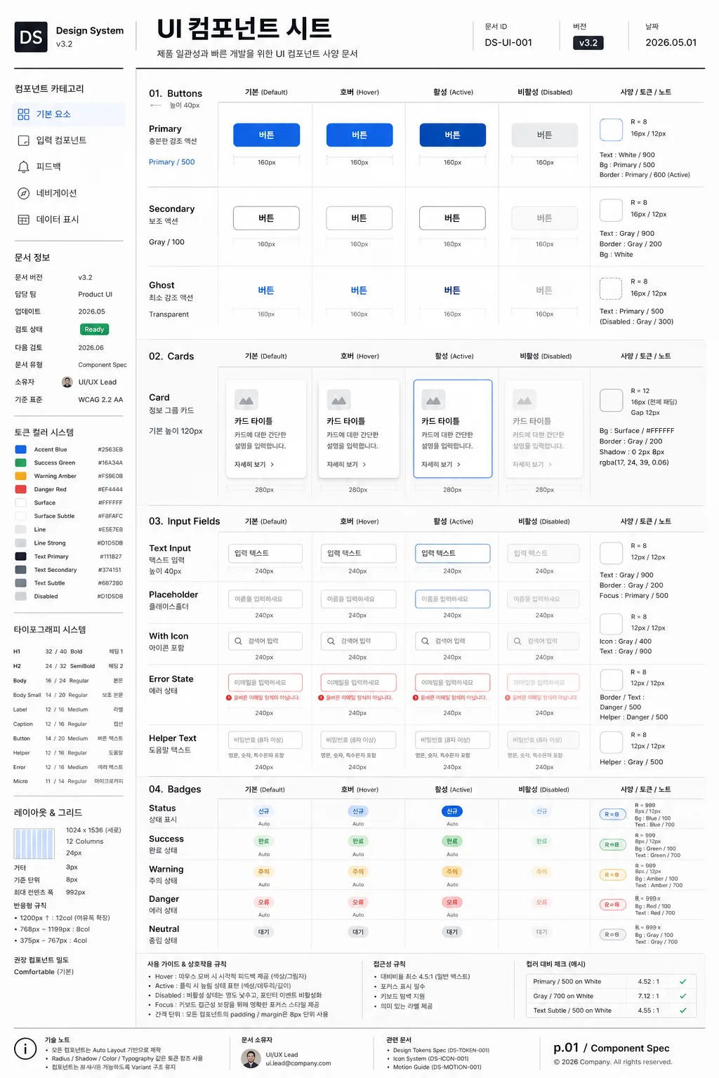
UI 컴포넌트 시트
UI 컴포넌트 라이브러리. 버튼·카드·인풋·뱃지 mockup.
UI 컴포넌트 시트の概要
インフォグラフィック・案内画像を作るためのChatGPT画像プロンプトです。主題、背景、スタイル、構図を整理し、すぐに試せるよう構成しています。
関連キーワード: UI 컴포넌트 시트, UI 컴포넌트 시트 프롬프트, インフォグラフィック・案内 프롬프트, インフォグラフィック・案内 AI 이미지 프롬프트, ChatGPT 이미지 프롬프트, AI 이미지 생성 프롬프트, AI 프롬프트, 이미지 프롬프트
UI 컴포넌트 시트の活用方法
元の構造を保ちながら、被写体、背景、色、構図を変更して別案に展開できます。
- 主題を維持し、ブランドや季節、媒体に合わせて色と背景を変更してください。
- 結果が複雑な場合は背景要素を減らし、被写体、構図、照明を具体化してください。
- コピー後、ChatGPTに媒体、アスペクト比、文字の有無を追加で指定できます。
プロンプト原文
[Input]
- language: Korean
- output_size: 1024x1536

[Purpose]
UI component spec sheet for a design system, presented as a polished editorial documentation page suitable for Figma reference, UI library documentation, product design handoff, and internal product-team review.
Vertical poster-style sheet with multiple component states displayed as a structured UI catalog, enriched with realistic design-system metadata, version labels, token notes, specs, and annotation callouts.

[Composition]
- Overall framing: a tall 1024x1536 page with a left navigation column and a right preview area, using a strict grid, dense documentation hierarchy, and professional product-design spacing.
- Left column: category labels, small supporting notes, version tags, owner information, and update history stacked vertically, aligned to the top-left, occupying about 22% of width.
- Right area: {컴포넌트 종류} arranged as a component showcase with clear separation between groups, each group showing {상태 variation} in a consistent row with labels, dimensions, token callouts, and interaction notes.
- Background treatment: refined white paper-like surface with very subtle cool-gray tint, faint grid suggestions, crisp divider lines in charcoal, and tiny measurement guides that make it feel like a real design-system artifact.
- Spacing: precise 8px-like spacing rhythm with labeled gutters, component cards, measurement ticks, and compact annotation clusters that remain readable and organized.
- Framing direction: organized like a modern design-system board, with a strong left-to-right reading flow and realistic documentation details throughout.

[3. CORE STRUCTURE]
- Header zone (top 12%): a compact title bar introducing the sheet, with the Korean title 'UI 컴포넌트 시트', small UI-system labeling, document ID, version badge, date stamp '2026.05.01', and thin horizontal rules.
- Category rail (left 22%): list the component families and labels, visually separated with light dividers, using {레이아웃} to anchor the navigation structure; include small Korean navigation items such as '기본 요소', '입력 컴포넌트', '피드백', '네비게이션', '데이터 표시'.
- Left metadata block: include realistic documentation fields such as '문서 버전 v3.2', '담당 팀 Product UI', '업데이트 2026.05', '검토 상태 Ready', and a compact token legend.
- Main preview grid (center/right 70%): display {컴포넌트 종류} as clean vector-like UI mockups, each family grouped in rows and columns with equal padding, row titles, state names, component dimensions, and small property labels.
- State row system: for each component family, show {상태 variation} in order from Default to Hover to Active to Disabled, each state visually distinct but aligned to the same baseline; add tiny Korean labels such as '기본', '호버', '활성', '비활성'.
- Component annotation layer: add small measurement rulers, radius labels such as 'R=8', padding notes such as '16px / 12px', token references like 'Primary / 500', 'Gray / 200', and short microcopy labels placed near relevant UI elements.
- Color reference strips: small swatches and annotations reflecting {컬러 톤}, placed near the component groups as system notes; include labeled tokens such as 'Accent Blue', 'Surface', 'Line', 'Text Subtle'.
- Typography sample area: a small type specimen using {타이포}, including labels, captions, button text, helper text, error text, and microcopy scaled to demonstrate hierarchy in a real documentation context.
- Ratio and layout block: a compact panel showing {비율}, grid column count, baseline unit, and recommended component density, with small Korean notes like '기준 단위 8px' and '반응형 규칙'.
- Footer note (bottom 8%): technical annotation area with aspect ratio, UI-system style notes, document owner, page number 'p.01 / Component Spec', and a tiny changelog strip, keeping the sheet looking like a real product-design deliverable.

[4. STYLE RULES]
- Typography: Inter and Pretendard, medium to semibold for headings, regular for labels, 10–14px-like sizing for micro labels, tight but readable line height, with Korean microcopy rendered sharply.
- Color palette: white #FFFFFF, charcoal #1F1F23, cool gray #E5E7EB, accent blue #4F7CFF, muted gray text #6B7280, plus controlled semantic accents for success green, warning amber, and error red when needed for component states.
- Border/shadow: 1px hairline separators, subtle 2px y-offset soft shadow at 8% opacity on component cards, crisp outlines for measurements, light dashed guides, and soft tinted state backgrounds.
- Visual consistency: all components should feel like a design system kit, with clean edges, rounded corners in the 8–12px range, precise alignment, shared tokens, repeated state patterns, and realistic UI documentation density.
- Rich documentation details: include compact tables, labels, token chips, component IDs, sample button text, form helper messages, switch/toggle examples, badges, dropdown arrows, checkboxes, radio states, tabs, segmented controls, and tooltip examples as appropriate to {컴포넌트 종류}.

[5. VISUAL STYLE]
- Camera / lens: orthographic front-on presentation, like a flat UI mockup capture, no perspective distortion, equivalent to a perfectly aligned 50mm studio reproduction look.
- Lighting: evenly lit, diffuse studio illumination from the front with smooth contrast, crisp edges, and anti-glare surface treatment.
- Color grade: neutral digital white with charcoal and blue accent, slightly cool and technical, like a high-quality Figma design-system export prepared for an internal design review.

[6. MOOD]
Premium product design-system board — Figma documentation page meets Material Design guideline sheet, with the density and credibility of a real UI kit handoff file.

[7. CRITICAL]
- Korean text accuracy: the following Korean strings must appear correctly and cleanly in the rendered image: 'UI 컴포넌트 시트', '컴포넌트 종류', '상태 variation', '레이아웃', '컬러 톤', '타이포', '비율'.
- Add realistic Korean documentation text in the image, including '문서 버전 v3.2', '업데이트 2026.05.01', '기준 단위 8px', '기본', '호버', '활성', '비활성', '컴포넌트 속성', and '디자인 토큰'.
- Exact layout discipline: left category rail + right preview grid must remain visually balanced and clearly separated.
- All component states must be shown consistently for each family, with state labels ordered Default, Hover, Active, Disabled.
- Typography must stay crisp and legible; no broken Hangul, no warped letters, no noisy compression artifacts.

[8. 🚫 PROHIBITED]
- Fake official seals / certifications
- Broken Korean characters
- Celebrity composites / unauthorized likeness