趣味・ライフスタイル
앱 스플래시·시작 화면
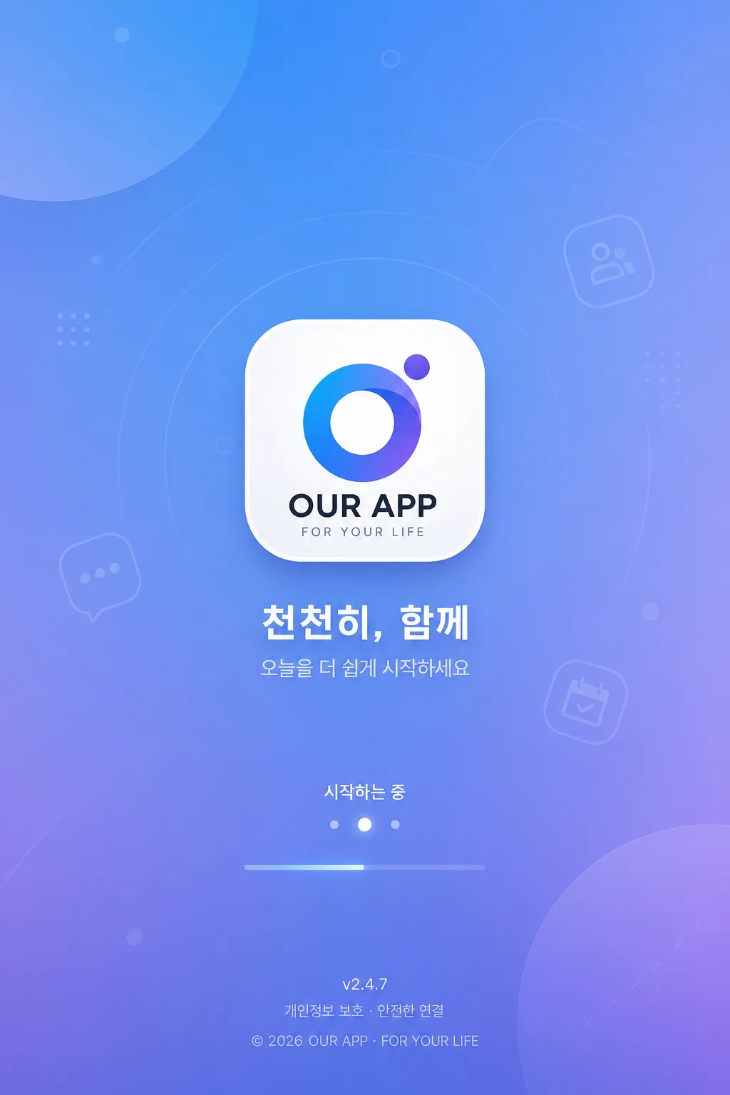
모바일 앱 시작 화면. 로고 hero + 작은 카피.
앱 스플래시·시작 화면の概要
趣味・ライフスタイル画像を作るためのChatGPT画像プロンプトです。主題、背景、スタイル、構図を整理し、すぐに試せるよう構成しています。
関連キーワード: 앱 스플래시·시작 화면, 앱 스플래시·시작 화면 프롬프트, 趣味・ライフスタイル 프롬프트, 趣味・ライフスタイル AI 이미지 프롬프트, ChatGPT 이미지 프롬프트, AI 이미지 생성 프롬프트, AI 프롬프트, 이미지 프롬프트
앱 스플래시·시작 화면の活用方法
元の構造を保ちながら、被写体、背景、色、構図を変更して別案に展開できます。
- 主題を維持し、ブランドや季節、媒体に合わせて色と背景を変更してください。
- 結果が複雑な場合は背景要素を減らし、被写体、構図、照明を具体化してください。
- コピー後、ChatGPTに媒体、アスペクト比、文字の有無を追加で指定できます。
プロンプト原文
[Input]
- language: Korean
- output_size: 1024x1536

[Purpose]
Mobile app splash / launch screen design for a Korean app, optimized for first-open branding, quick recognition, and a polished real-product presentation.
Create a contemporary Korean startup screen with a centered {앱·로고}, memorable short tagline, brand gradient background, subtle launch-state details, and refined app metadata that feels ready for an actual App Store / Play Store release.

[Composition]
- Main subject: {앱·로고} placed at the visual center, occupying about 22–28% of the frame width, rendered as a crisp app icon or logo mark with precise edges and premium finish.
- Supporting copy: {비주얼} positioned directly below the logo, aligned center, using a compact one- or two-line layout if needed; keep it clear enough to read at mobile-screen scale.
- App launch details: add small realistic splash-screen microcopy such as “시작하는 중”, “v2.4.7”, “© 2026 {앱·로고}”, and a tiny loading dot row or short progress indicator near the lower center.
- Background treatment: {배경} with soft geometric accents, faint brand-symbol patterns, translucent gradient blobs, or lightly layered interface-inspired shapes that support the centered logo.
- Color direction: {컬러 톤} with a premium, app-store-ready finish, using one distinct brand accent and carefully balanced neutrals.
- Framing: vertical mobile composition matching {비율} for 1024x1536 output, straight-on splash-screen layout with natural safe-area awareness at the top and bottom.

[3. CORE STRUCTURE]
- Top area: include a very subtle phone-safe-area feeling, such as a faint status-bar zone or barely visible top breathing band, without turning the image into a full app UI screen.
- Hero area: place {앱·로고} as the focal point in the center with polished vector-like sharpness, balanced spacing, and a believable app-launch scale.
- Brand identity stack: under the logo, render {비주얼} in Korean, then add one small secondary line such as “오늘을 더 쉽게 시작하세요” or “당신의 일상을 연결합니다” if it fits {컨셉}.
- Launch-state area: near the lower third, add tiny Korean microcopy “시작하는 중” with three animated-style dots, a slim soft progress line, or a quiet loading pulse.
- Footer metadata: at the bottom safe area, include a small version label like “v2.4.7”, a short privacy or company line like “개인정보 보호 · 안전한 연결”, and “© 2026 {앱·로고}”.
- Background layer: build {배경} as a soft radial gradient, layered two-tone blend, or refined brand field with faint icons, abstract cards, rounded capsules, light particles, or translucent app-symbol silhouettes.
- Brand tone: apply {컨셉} through color temperature, spacing density, typography mood, icon geometry, and the rhythm of background elements so the screen feels like a complete Korean mobile brand system.
- Final polish: use the look of a real Korean app splash screen with immediate logo recognition, readable Korean microcopy, tactile digital surfaces, and launch-screen credibility.

[4. STYLE RULES]
- Typography: clean sans-serif system such as Pretendard or Noto Sans KR; medium to semi-bold for the tagline, 20–36px equivalent for visible copy, 10–14px equivalent for footer metadata, with tight but readable letter spacing.
- Color palette: use {컬러 톤} as the main palette, with off-white, charcoal, warm gray, or soft dark-mode neutrals if needed; accents should feel brand-led and consistent across logo, loading details, and decorative shapes.
- Logo treatment: keep {앱·로고} crisp and intentional, with a believable app-icon radius, subtle depth, or matte shadow if appropriate to {컨셉}; the mark must remain readable and not melt into the background.
- Border/shadow: if shadow is used, make it modern and soft, e.g. 0–6px y-offset, 12–20px blur, 8–15% opacity; avoid heavy bevels or old-fashioned glossy effects.
- Surface quality: matte, clean, slightly tactile digital finish with delicate gradient depth, soft noise only if it improves realism, and carefully layered translucent accents.
- Decorative system: use small Korean-app-style details such as rounded capsules, faint map-pin/calendar/chat/card icons, small brand particles, or abstract UI fragments that make the splash feel produced by a real design team.

[5. VISUAL STYLE]
- Camera / lens: digital product-style flat graphic composition, effectively a straight-on orthographic layout with no lens distortion; if rendered as a mockup, use a 50mm equivalent front-facing setup.
- Lighting: even studio-style illumination with a gentle upper-left emphasis and very mild fill from the opposite side; keep contrast controlled and screen-friendly.
- Color grade: Toss / 당근 / 카카오-inspired modern app tone, with crisp whites, stable neutrals, soft gradients, and one distinct brand accent; keep saturation refined and commercially polished.
- Rendering fidelity: high-resolution mobile UI artwork with sharp vector edges, clean Korean glyph rendering, realistic safe-area spacing, and subtle antialiasing suitable for a launch screen.

[6. MOOD]
Premium Korean mobile app launch screen — Toss and Kakao-style startup clarity with a warm, contemporary brand feel, enriched by real launch metadata, subtle motion cues, and polished first-open credibility.

[7. CRITICAL]
- Korean text accuracy: include “앱 스플래시·시작 화면”, “천천히, 함께”, “시작하는 중”, “오늘을 더 쉽게 시작하세요”, “v2.4.7”, “개인정보 보호 · 안전한 연결”.
- All on-image Korean and English text must be clean, correctly spelled, and fully legible.
- Composition invariant: centered {앱·로고} hero, small {비주얼} tagline below, refined brand background, subtle loading/footer details, vertical mobile splash layout.
- Keep all text hierarchy believable for a real app launch screen: logo first, tagline second, launch-state and metadata third.

[8. 🚫 PROHIBITED]
- Fake official seals / certifications
- Broken Korean characters
- Celebrity composites / unauthorized likeness