Ads/Posters
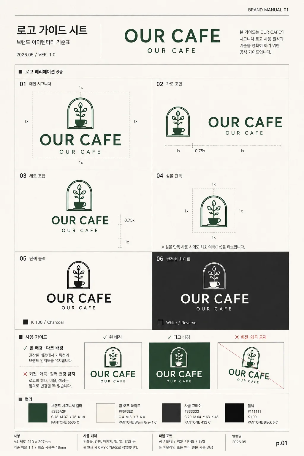
로고 가이드 시트
로고 변형 가이드. 시그니처·심볼·가로·세로·모노크롬.
로고 가이드 시트 summary
Copy this ChatGPT image prompt to create Ads/Posters results. Its subject, background, style, and composition are organized for quick iteration.
Related keywords: 로고 가이드 시트, 로고 가이드 시트 프롬프트, Ads/Posters 프롬프트, Ads/Posters AI 이미지 프롬프트, ChatGPT 이미지 프롬프트, AI 이미지 생성 프롬프트, AI 프롬프트, 이미지 프롬프트
How to use 로고 가이드 시트
Keep the prompt structure and swap the subject, background, palette, or composition to create new variations.
- Keep the main subject and adjust the palette and background for your brand, season, or channel.
- If the result feels busy, simplify the background and make the subject, composition, and lighting more specific.
- After copying, ask ChatGPT to adapt it for your platform, aspect ratio, or text requirements.
Original prompt
[Input]
- language: Korean
- output_size: 1024x1536

[Purpose]
Logo guideline sheet / brand identity reference page for a café or retail brand, presented as a realistic A4 portrait brand manual page with 6 logo variations, usage rules, color chips, scale notes, and production-ready identity details.

[Composition]
- Page format: A4 vertical poster layout, with a structured editorial grid, visible page hierarchy, and realistic brand-manual annotations.
- Main composition: top title zone, central 6-variation grid, and bottom usage-guide zone stacked vertically, with a slim footer strip containing version/date/page metadata.
- {브랜드명·로고} should be the visual center of the sheet, supported by small production details such as section numbers, alignment ticks, color swatches, clear-space indicators, and caption labels.
- {레이아웃} must feel like a polished brand deck page from Pentagram / B&B style identity guidelines, with precise alignment, disciplined spacing, and a real design-system reference look.
- Background treatment: premium warm off-white paper surface with very subtle fiber grain, faint print texture, and crisp ink rendering, like a professionally printed guideline sheet photographed straight-on.
- Add realistic manual-page details: small header code “BRAND MANUAL 01”, date label “2026.05”, version text “VER. 1.0”, footer page number “p.01”, and tiny production notes in Korean.

[3. CORE STRUCTURE]
- Header area (top 12-15%): set a compact title block introducing the brand guide sheet, with {브랜드명·로고} displayed as the primary identity mark.
- Include title text “로고 가이드 시트”, a smaller subtitle “브랜드 아이덴티티 기준표”, a tiny issue/date line “2026.05 / VER. 1.0”, and a right-aligned micro label “BRAND MANUAL 01”.
- Main grid area (middle 58-62%): place the {6가지 variation} in a 2-column by 3-row grid, each version in its own measured cell with consistent padding, fine divider lines, and tiny labels beneath.
- Add subtle measurement marks around the grid: small baseline ticks, 1x clear-space notes, hairline cross references, and compact Korean captions that make the page feel like an actual design specification.
- Variation 01: hero/main signature version, largest and most visually emphasized; keep the exact wordmark proportions clean and centered, label it “01 메인 시그니처”.
- Variation 02: horizontal lockup, place the symbol and English wordmark side by side on one baseline, aligned with clear padding, label it “02 가로 조합”.
- Variation 03: vertical lockup, place the English wordmark below the symbol, stacked with tighter vertical rhythm, label it “03 세로 조합”.
- Variation 04: symbol-only mark, isolated in a specification cell with tiny clear-space guide lines and label “04 심볼 단독”.
- Variation 05: monochrome black version, rendered in solid charcoal-black ink with a small ink note “K 100 / Charcoal”, label it “05 단색 블랙”.
- Variation 06: monochrome white version, shown on a dark charcoal patch so the form is legible and contrast is obvious, label it “06 반전형 화이트”.
- Usage guide area (bottom 18-20%): place {사용 가이드} as a concise checklist with clear ✓ / ✗ visual rules and small explanatory labels.
- Include three compact usage examples: “✓ 흰 배경”, “✓ 다크 배경”, “✗ 회전·왜곡 금지”, using small thumbnail boxes and fine rule lines.
- Add a color specification strip with “컬러” label, 3-4 swatches including the brand signature color from {컬러 톤}, warm off-white, charcoal, and black, each with small hex-style text.
- Keep {비율} expressed as a clean specification note in the footer area, paired with tiny scale marks such as “기준 비율 1:1 / 최소 사용폭 18mm”.

[4. STYLE RULES]
- Typography: use Pretendard or Noto Sans KR for Korean UI text, medium and regular weights; use a clean geometric sans for English labels, with small sizes around 10-18pt equivalent.
- Titles and labels should be crisp, highly legible, evenly tracked, and editorial, with subtle typographic hierarchy rather than decorative flourish.
- Color palette: white #FFFFFF, warm off-white #F5F2EC, charcoal #2B2B2B, black #111111, and a single brand signature color from {컬러 톤}.
- Keep all rules, label lines, separators, scale marks, and swatch outlines thin and precise, using 1-2px strokes.
- Shadow treatment: use a very soft neutral contact shadow around the sheet edge and tiny printed-ink depth only, 2px y-offset, 6px blur, 8% opacity for separation.
- Add realistic print-design details such as tiny crop-like reference ticks, micro captions, color chips, and footer metadata while keeping the guide sheet professional and readable.

[5. VISUAL STYLE]
- Camera / lens: front-on flat graphic layout, equivalent to a 50mm standard editorial framing with no perspective distortion.
- Lighting: evenly lit studio setup, diffuse overhead softbox feel, soft paper-edge shadow, no glare, no reflections.
- Color grade: clean premium brand-manual grade with neutral whites, controlled charcoal blacks, subtle warm paper tone, and restrained accent color usage.
- Rendering style: realistic printed identity sheet with crisp vector logo marks, sharp Korean typography, visible but subtle paper grain, and tactile ink-on-paper clarity.

[6. MOOD]
Premium identity system page — like a Pentagram brand guideline spread or a refined B&B studio presentation board, enriched with real-world manual details, production notes, swatches, and precise specification graphics.

[7. CRITICAL]
- Korean text accuracy: 반드시 정확히 보일 문자열: “로고 가이드 시트”, “브랜드 아이덴티티 기준표”, “사용 가이드”, “레이아웃”, “컬러”, “비율”, “✓ 흰 배경·다크 배경 / ✗ 회전·왜곡·컬러 변경 금지”.
- Additional visible micro text should be accurate and compact: “2026.05”, “VER. 1.0”, “BRAND MANUAL 01”, “p.01”, “01 메인 시그니처”, “02 가로 조합”, “03 세로 조합”, “04 심볼 단독”, “05 단색 블랙”, “06 반전형 화이트”.
- English text accuracy: the logo text and variation labels must remain crisp, clean, and properly spelled.
- Layout invariants: exactly 6 logo variations must be shown, with clear separation between each cell and consistent alignment across the grid.
- Keep the logo forms anatomically clean as vector-style marks, with no broken strokes or warped geometry.
- Preserve all placeholder-driven content exactly: {브랜드명·로고}, {6가지 variation}, {사용 가이드}, {레이아웃}, {컬러 톤}, {비율}.

[8. 🚫 PROHIBITED]
- Fake official seals / certifications
- Broken Korean characters