廣告/海報
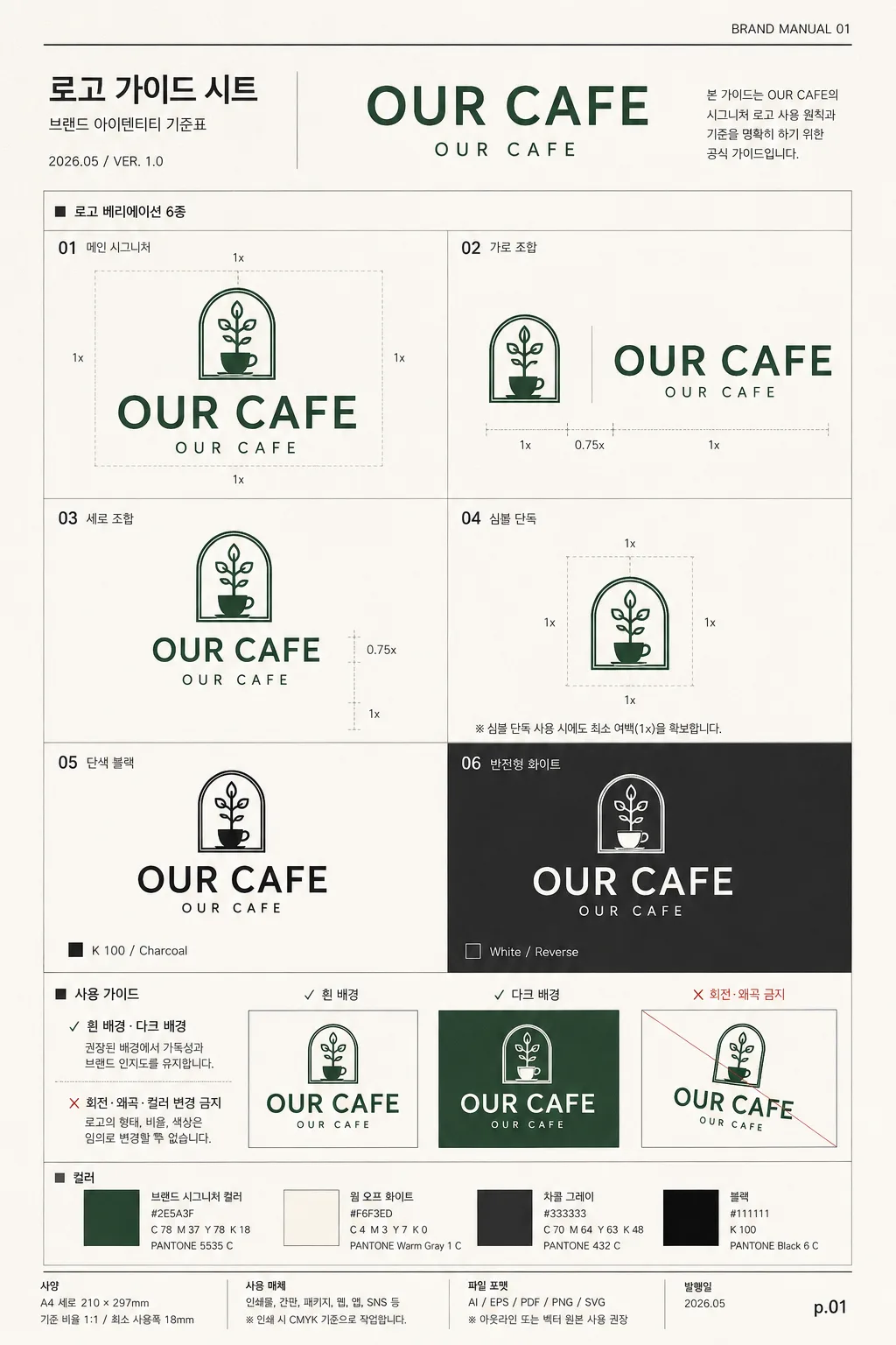
로고 가이드 시트
로고 변형 가이드. 시그니처·심볼·가로·세로·모노크롬.
로고 가이드 시트摘要
這是用來製作廣告/海報內容的 ChatGPT 圖像提示詞,已整理主題、背景、風格與構圖,方便快速調整。
相關關鍵字: 로고 가이드 시트, 로고 가이드 시트 프롬프트, 廣告/海報 프롬프트, 廣告/海報 AI 이미지 프롬프트, ChatGPT 이미지 프롬프트, AI 이미지 생성 프롬프트, AI 프롬프트, 이미지 프롬프트
로고 가이드 시트使用方式
保留原始結構並替換主體、背景、色彩或構圖,即可延伸出不同版本。
- 保留核心主體,並依品牌、季節或平台調整色彩與背景。
- 如果畫面太複雜,請減少背景元素並具體描述主體、構圖與光線。
- 複製後可要求 ChatGPT 配合平台、長寬比或文字需求調整。
提示詞原文
[Input]
- language: Korean
- output_size: 1024x1536

[Purpose]
Logo guideline sheet / brand identity reference page for a café or retail brand, presented as a realistic A4 portrait brand manual page with 6 logo variations, usage rules, color chips, scale notes, and production-ready identity details.

[Composition]
- Page format: A4 vertical poster layout, with a structured editorial grid, visible page hierarchy, and realistic brand-manual annotations.
- Main composition: top title zone, central 6-variation grid, and bottom usage-guide zone stacked vertically, with a slim footer strip containing version/date/page metadata.
- {브랜드명·로고} should be the visual center of the sheet, supported by small production details such as section numbers, alignment ticks, color swatches, clear-space indicators, and caption labels.
- {레이아웃} must feel like a polished brand deck page from Pentagram / B&B style identity guidelines, with precise alignment, disciplined spacing, and a real design-system reference look.
- Background treatment: premium warm off-white paper surface with very subtle fiber grain, faint print texture, and crisp ink rendering, like a professionally printed guideline sheet photographed straight-on.
- Add realistic manual-page details: small header code “BRAND MANUAL 01”, date label “2026.05”, version text “VER. 1.0”, footer page number “p.01”, and tiny production notes in Korean.

[3. CORE STRUCTURE]
- Header area (top 12-15%): set a compact title block introducing the brand guide sheet, with {브랜드명·로고} displayed as the primary identity mark.
- Include title text “로고 가이드 시트”, a smaller subtitle “브랜드 아이덴티티 기준표”, a tiny issue/date line “2026.05 / VER. 1.0”, and a right-aligned micro label “BRAND MANUAL 01”.
- Main grid area (middle 58-62%): place the {6가지 variation} in a 2-column by 3-row grid, each version in its own measured cell with consistent padding, fine divider lines, and tiny labels beneath.
- Add subtle measurement marks around the grid: small baseline ticks, 1x clear-space notes, hairline cross references, and compact Korean captions that make the page feel like an actual design specification.
- Variation 01: hero/main signature version, largest and most visually emphasized; keep the exact wordmark proportions clean and centered, label it “01 메인 시그니처”.
- Variation 02: horizontal lockup, place the symbol and English wordmark side by side on one baseline, aligned with clear padding, label it “02 가로 조합”.
- Variation 03: vertical lockup, place the English wordmark below the symbol, stacked with tighter vertical rhythm, label it “03 세로 조합”.
- Variation 04: symbol-only mark, isolated in a specification cell with tiny clear-space guide lines and label “04 심볼 단독”.
- Variation 05: monochrome black version, rendered in solid charcoal-black ink with a small ink note “K 100 / Charcoal”, label it “05 단색 블랙”.
- Variation 06: monochrome white version, shown on a dark charcoal patch so the form is legible and contrast is obvious, label it “06 반전형 화이트”.
- Usage guide area (bottom 18-20%): place {사용 가이드} as a concise checklist with clear ✓ / ✗ visual rules and small explanatory labels.
- Include three compact usage examples: “✓ 흰 배경”, “✓ 다크 배경”, “✗ 회전·왜곡 금지”, using small thumbnail boxes and fine rule lines.
- Add a color specification strip with “컬러” label, 3-4 swatches including the brand signature color from {컬러 톤}, warm off-white, charcoal, and black, each with small hex-style text.
- Keep {비율} expressed as a clean specification note in the footer area, paired with tiny scale marks such as “기준 비율 1:1 / 최소 사용폭 18mm”.

[4. STYLE RULES]
- Typography: use Pretendard or Noto Sans KR for Korean UI text, medium and regular weights; use a clean geometric sans for English labels, with small sizes around 10-18pt equivalent.
- Titles and labels should be crisp, highly legible, evenly tracked, and editorial, with subtle typographic hierarchy rather than decorative flourish.
- Color palette: white #FFFFFF, warm off-white #F5F2EC, charcoal #2B2B2B, black #111111, and a single brand signature color from {컬러 톤}.
- Keep all rules, label lines, separators, scale marks, and swatch outlines thin and precise, using 1-2px strokes.
- Shadow treatment: use a very soft neutral contact shadow around the sheet edge and tiny printed-ink depth only, 2px y-offset, 6px blur, 8% opacity for separation.
- Add realistic print-design details such as tiny crop-like reference ticks, micro captions, color chips, and footer metadata while keeping the guide sheet professional and readable.

[5. VISUAL STYLE]
- Camera / lens: front-on flat graphic layout, equivalent to a 50mm standard editorial framing with no perspective distortion.
- Lighting: evenly lit studio setup, diffuse overhead softbox feel, soft paper-edge shadow, no glare, no reflections.
- Color grade: clean premium brand-manual grade with neutral whites, controlled charcoal blacks, subtle warm paper tone, and restrained accent color usage.
- Rendering style: realistic printed identity sheet with crisp vector logo marks, sharp Korean typography, visible but subtle paper grain, and tactile ink-on-paper clarity.

[6. MOOD]
Premium identity system page — like a Pentagram brand guideline spread or a refined B&B studio presentation board, enriched with real-world manual details, production notes, swatches, and precise specification graphics.

[7. CRITICAL]
- Korean text accuracy: 반드시 정확히 보일 문자열: “로고 가이드 시트”, “브랜드 아이덴티티 기준표”, “사용 가이드”, “레이아웃”, “컬러”, “비율”, “✓ 흰 배경·다크 배경 / ✗ 회전·왜곡·컬러 변경 금지”.
- Additional visible micro text should be accurate and compact: “2026.05”, “VER. 1.0”, “BRAND MANUAL 01”, “p.01”, “01 메인 시그니처”, “02 가로 조합”, “03 세로 조합”, “04 심볼 단독”, “05 단색 블랙”, “06 반전형 화이트”.
- English text accuracy: the logo text and variation labels must remain crisp, clean, and properly spelled.
- Layout invariants: exactly 6 logo variations must be shown, with clear separation between each cell and consistent alignment across the grid.
- Keep the logo forms anatomically clean as vector-style marks, with no broken strokes or warped geometry.
- Preserve all placeholder-driven content exactly: {브랜드명·로고}, {6가지 variation}, {사용 가이드}, {레이아웃}, {컬러 톤}, {비율}.

[8. 🚫 PROHIBITED]
- Fake official seals / certifications
- Broken Korean characters