광고/포스터
3D 음식 렌더 (스시·피자·디저트)
3D 음식 미니어처. 매크로 + 부드러운 광택.
3D 음식 렌더 (스시·피자·디저트) 검색 요약
3D 음식 렌더 (스시·피자·디저트)은 광고/포스터 결과물을 만들 때 바로 복사해 활용할 수 있는 ChatGPT 이미지 프롬프트입니다. 주제, 배경, 스타일, 구도 조건을 함께 담아 빠르게 시안을 만들 수 있도록 구성했습니다.
관련 키워드: 3D 음식 렌더 (스시·피자·디저트), 3D 음식 렌더 (스시·피자·디저트) 프롬프트, 광고/포스터 프롬프트, 광고/포스터 AI 이미지 프롬프트, ChatGPT 이미지 프롬프트, AI 이미지 생성 프롬프트, AI 프롬프트, 이미지 프롬프트
3D 음식 렌더 (스시·피자·디저트) 활용 포인트
원본 구조를 유지하면서 피사체, 배경, 색감, 구도를 바꿔 다양한 시안으로 확장할 수 있습니다.
- 핵심 소재는 유지하고 브랜드, 계절, 채널 목적에 맞는 색감과 배경을 바꿔보세요.
- 결과가 산만하면 배경 요소를 줄이고 피사체, 구도, 조명 조건을 구체화하세요.
- 복사한 뒤 ChatGPT에서 플랫폼, 화면 비율, 텍스트 포함 여부를 추가로 요청할 수 있습니다.
프롬프트 원문
[Input]
- language: Korean
- output_size: 1024x1024

[Purpose]
3D food render poster for social media and portfolio use, with a polished magazine-food aesthetic that can swap between sushi, pizza, dessert, ramen, chicken, or fruit.
Render the food as an appetizing hero object with miniature stylization, combining realistic surface detail, clay-like softness, and a lived-in premium tabletop scene suitable for a square editorial menu post.

[Composition]
- Main subject placement: {음식} occupies the central 62% of the frame as the hero, slightly lifted above the ground plane or plated on a low dish so the cast shadow is visible and readable.
- Background treatment: {배경} as a tactile studio tabletop scene with believable surface texture, gentle color variation, and food-appropriate context such as a ceramic plate, parchment sheet, lacquer tray, linen napkin, sauce dish, crumbs, herbs, sesame, fruit slices, or steam accents depending on {음식}.
- Framing and spacing: keep the hero food dominant in a square poster layout, with supporting details arranged around it to create a realistic editorial food set rather than an empty product mockup.
- Surface treatment: place the subject on a premium tabletop, plate, tray, or small plinth with realistic contact shadows, tiny crumbs, glaze marks, sauce streaks, moisture beads, or powder dusting where appropriate.
- Poster information layer: add small editorial menu-poster details around the food, including a top date label, short Korean title line, tiny price or volume tag, and a small social handle, integrated as tasteful printed or overlay typography.

[3. CORE STRUCTURE]
- Hero object (center 62%): {음식} modeled as a refined 3D food render with glossy highlights, tiny texture imperfections, appetizing volume, clean edge definition, and visible ingredient layering; keep the form stylized but rich enough to feel like premium food advertising.
- Material pass: apply {결} to the food surface, mixing soft specular reflections with micro-detail such as toasted edges, rice grain definition, melted cheese pull texture, cream swirls, fruit gel shine, crispy crust pores, sauce thickness, or powder granules as appropriate to {음식}.
- Base environment: build the scene around {배경} with layered tabletop objects that naturally belong with the food: a plate or tray, small garnish pieces, crumbs, sauce droplets, folded napkin, chopsticks, fork, cup, menu slip, or small ingredient fragments, all scaled to support the hero food.
- Light behavior: shape the scene with {조명} so the shadow falls softly and the highlights wrap naturally around the food, emphasizing rounded forms, moist surfaces, crispy textures, and dimensional 3D depth.
- Color emphasis: guide the palette using {컬러 톤}, ensuring the food remains the highest-contrast element while the surrounding props, tabletop, and typography harmonize with the same palette.
- Format control: maintain a square composition using {비율}, with the subject centered, fully readable, and supported by balanced editorial details around the frame.
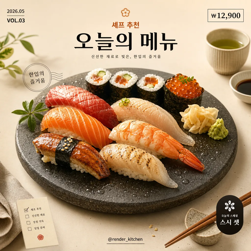
- Micro text elements: include short Korean poster copy such as "오늘의 메뉴", "셰프 추천", "한입의 즐거움", "₩12,900", "VOL.03", "2026.05", and "@render_kitchen"; keep text small-to-medium except for one clear headline.

[4. STYLE RULES]
- Typography: use Pretendard SemiBold or Noto Sans KR Medium for visible Korean food-poster typography. Set one bold Korean title near the lower or upper third, such as "오늘의 메뉴" or "셰프 추천 {음식}", plus smaller support text like "2026.05", "VOL.03", "₩12,900", and "@render_kitchen".
- Color palette: use food-specific signature colors from {컬러 톤}, supported by tactile neutrals such as warm ceramic, muted pastel paper, wood grain, stone, brushed metal, linen, or charcoal depending on {배경}; allow vivid food color accents where appetizing.
- Border/shadow: use a soft drop shadow with 4px y-offset, 14px blur, and 16% opacity for the main object or typography accents; avoid harsh outlines while allowing subtle printed-poster depth, small labels, decorative dividers, and soft graphic shapes.
- Decorative graphic system: add small editorial elements such as thin divider lines, a circular price tag, tiny corner index marks, ingredient icon dots, or a small menu-card strip; these should feel like a designed social food poster, not a sterile catalog render.
- Texture realism: preserve visible texture in the food and set dressing, including glaze, crumbs, grains, bubbles, char marks, sauce sheen, condensation, ceramic speckles, paper fibers, or wooden pores where relevant.

[5. VISUAL STYLE]
- Camera / lens: studio product photography look, equivalent to a 85mm macro-style lens at f/8 for crisp food detail and shallow scene clutter.
- Lighting: soft diffused natural light with a warm amber fill, key light from upper-left at about 45°, subtle rim light from upper-right, and gentle shadow falloff.
- Color grade: premium editorial food grade with clean neutrals, warm highlights, and slightly enriched food tones; keep the background supportive while allowing tactile props, typography, and garnish details to make the poster feel real and content-rich.
- Render quality: physically based 3D render with global illumination, realistic subsurface hints for soft ingredients, believable roughness variation, high-resolution texture maps, and gentle ambient occlusion in contact areas.

[6. MOOD]
Premium 3D food editorial — like a high-end Blender food render for a boutique café menu campaign, with playful miniature realism, appetizing surface detail, warm studio lighting, and designed Korean social-poster information.

[7. CRITICAL]
- Korean text accuracy: render all on-image Korean text cleanly and legibly. Recommended text strings include "오늘의 메뉴", "셰프 추천", "한입의 즐거움", "신선한 재료", "₩12,900", "2026.05", "VOL.03", and "@render_kitchen".
- Composition invariant: keep the main food subject centered, dominant, and fully readable in a square frame while surrounding it with believable food styling, tabletop texture, and small editorial menu details.
- Style invariant: preserve the 3D food render look with a mix of realistic detail and clay-like softness; do not turn it into flat illustration or photographic real food.
- Content richness: include food-appropriate contextual details such as garnish, sauce, crumbs, steam, utensils, dishware, napkin, menu label, or ingredient fragments when they naturally match {음식}.

[8. 🚫 PROHIBITED]
- Fake official seals / certifications
- Broken Korean characters
- Celebrity composites / unauthorized likeness