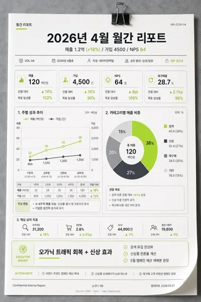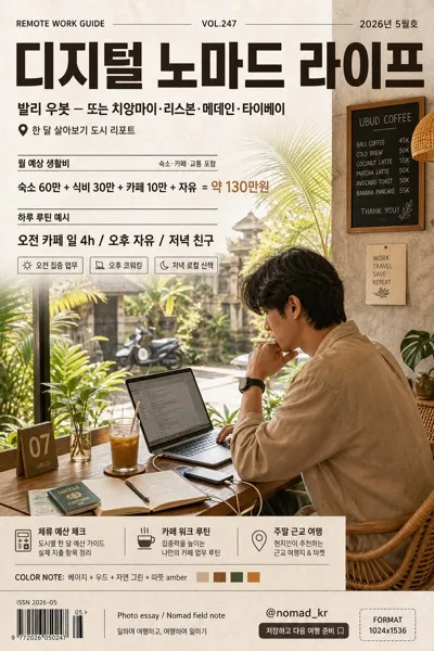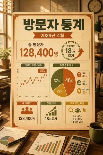
資訊圖表/指南
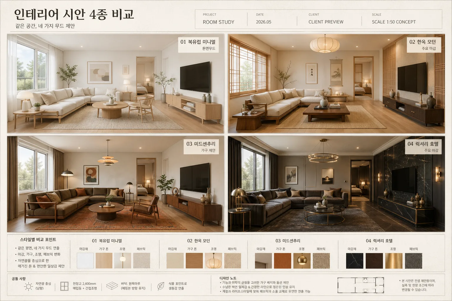
인테리어 시안 4종 비교
한 공간을 4가지 스타일로 변환 비교.
인테리어 시안 4종 비교摘要
這是用來製作資訊圖表/指南內容的 ChatGPT 圖像提示詞,已整理主題、背景、風格與構圖,方便快速調整。
相關關鍵字: 인테리어 시안 4종 비교, 인테리어 시안 4종 비교 프롬프트, 資訊圖表/指南 프롬프트, 資訊圖表/指南 AI 이미지 프롬프트, ChatGPT 이미지 프롬프트, AI 이미지 생성 프롬프트, AI 프롬프트, 이미지 프롬프트
인테리어 시안 4종 비교使用方式
保留原始結構並替換主體、背景、色彩或構圖,即可延伸出不同版本。
- 保留核心主體,並依品牌、季節或平台調整色彩與背景。
- 如果畫面太複雜,請減少背景元素並具體描述主體、構圖與光線。
- 複製後可要求 ChatGPT 配合平台、長寬比或文字需求調整。
提示詞原文
[Input]
- language: Korean
- output_size: 1536x1024

[Purpose]
4-panel interior design comparison board, same room reimagined in four distinct styles, suitable for client presentation, interior studio portfolio, and social-media design reference.
Create a realistic editorial presentation sheet with rich room details, material differences, concise Korean labels, project metadata, color swatches, and small design notes so it feels like a real interior proposal board rather than a blank mockup.

[Composition]
- Use {공간} as the single repeated room base across all 4 panels, keeping camera angle, perspective, ceiling height, window placement, main wall, flooring direction, and dominant furniture positions consistent so the comparison is easy to read.
- Arrange the image as a 2x2 grid with equal-sized interior render panels; each panel should occupy roughly 24-25% of the canvas with narrow gutters, thin separators, and an editorial header/footer information band.
- Background treatment should feel like a polished interior magazine proposal board: warm off-white canvas, subtle premium paper grain, light drafting-guide lines, small material chips, and a few tasteful presentation annotations around the grid.
- Apply {레이아웃} exactly as a presentation system, with each panel showing the same room footprint but different material, furniture, lighting fixture, textile, plant, art, and decor styling.
- Use {라벨} as style tags in the upper-right corner of each panel, aligned consistently, with a small style number marker such as 01, 02, 03, 04.
- Add a top title block in Korean: '인테리어 시안 4종 비교', plus a smaller subtitle such as '같은 공간, 네 가지 무드 제안'. Include realistic proposal metadata: 'PROJECT ROOM STUDY', '2026.05', 'CLIENT PREVIEW', and 'SCALE 1:50 CONCEPT'.
- Add a lower comparison strip with small Korean notes, palette chips, and finish callouts such as '마감재', '가구 톤', '조명', '패브릭', using colors derived from {각 스타일 컬러} and {컬러}.

[3. CORE STRUCTURE]
1. Overall canvas: create a balanced 2x2 comparison grid with equal visual weight, thin separators, consistent crop framing, a compact Korean title header, and a practical footer area containing design notes, miniature swatches, and project information.
2. Top-left panel: render the room in {4종 스타일} first style, using {각 스타일 컬러} for the palette and a clean daytime interior editorial look. Include believable room contents such as sofa or bed depending on {공간}, side table, rug, framed wall art, curtains, plant, books, ceramics, and warm material accents.
3. Top-right panel: render the same {공간} as the second style, preserving architecture and viewpoint while changing furniture language, finishes, lighting fixture, wall treatment, textile texture, and accent objects. Keep the same major furniture footprint but use a clearly different mood and color balance.
4. Bottom-left panel: render the same room as the third style, emphasizing distinct materials, silhouette choices, layered decor, natural surface textures, and decorative tone while keeping the layout matched. Add realistic details such as cushions, throw blanket, art frame, floor lamp, coffee-table objects, and visible fabric weave.
5. Bottom-right panel: render the same room as the fourth style, with richer contrast, upscale surfaces, refined lighting, metallic or stone accents where suitable, and a polished hospitality-inspired arrangement. Keep it believable and lived-in with selected accessories, not empty.
6. Labeling: place the style name from {라벨} in each panel’s upper-right corner in consistent Pretendard-style text, paired with a small Korean caption line such as '톤앤무드', '주요 마감', or '가구 제안'.
7. Comparison clarity: keep floor lines, main wall angle, ceiling line, window shape, and dominant furniture positions aligned across all panels so differences come from styling, color, finish, lighting temperature, textiles, artwork, and decor.
8. Add small per-panel material swatches near each label or along the panel bottom edge: 3-4 tiny rectangles/circles showing wood, fabric, wall color, metal, stone, or accent color. Use {각 스타일 컬러} and {컬러} as the guiding palette.
9. Include subtle realistic editorial details: tiny page code 'BOARD 04 / STYLE OPTION', small project credit 'DESIGN REVIEW BY STUDIO', and a footer note in Korean such as '최종 선택 전 마감 샘플 확인 권장'.

[4. STYLE RULES]
- Typography: use Pretendard SemiBold for main labels, around 18–24px equivalent, with crisp anti-aliased edges; use Pretendard Regular or Medium for smaller captions, metadata, footer notes, and material callouts.
- Color palette: build each panel around {컬러} while preserving an overall restrained interior-design editorial palette; use neutral whites, warm wood, beige, taupe, terracotta, dark charcoal, muted gold, soft olive, stone gray, linen ivory, and style-specific accent colors as appropriate.
- Border/shadow: use thin 1px dividers in soft gray #D8D8D8 and a subtle 3px y-offset shadow with 10% opacity to separate panels without looking heavy.
- Presentation graphics: include refined design-board elements such as fine rule lines, tiny legend marks, numbered tabs, swatch chips, caption blocks, and scale-style annotations, all integrated naturally with the grid.
- Interior realism: show tactile materials clearly — wood grain, linen weave, boucle, matte painted wall, brushed metal, ceramic glaze, stone veining, soft rugs, curtain folds, plant leaves, and realistic shadow contact under furniture.
- Keep labels and information hierarchy legible at 1536x1024: main Korean title strongest, panel style labels second, micro metadata smaller but still plausible.

[5. VISUAL STYLE]
- Camera / lens: wide 24mm interior photography perspective, straightened verticals, architectural magazine composition, f/8 clarity for crisp room detail.
- Lighting: soft overcast daylight entering from a large window on the left, gentle ambient fill across the room, controlled natural shadows, and subtle variation in fixture warmth per style while preserving comparison readability.
- Color grade: natural magazine tone with slightly warm whites, balanced midtones, accurate wood and textile color, and style-specific accent colors kept true and legible.
- Rendering quality: photorealistic interior photography with believable scale, proportion, reflections, material roughness, fabric softness, and architectural depth; avoid flat template appearance by adding real proposal-board texture and dimensional room details.

[6. MOOD]
Archdigest-style interior comparison spread — polished architectural magazine presentation with restrained luxury, realistic lived-in styling, tactile material richness, and clear design differentiation across four options.

[7. CRITICAL]
- Korean text accuracy: the exact Korean style labels from {라벨} must appear cleanly and without broken characters.
- Include Korean rendered text elements such as '인테리어 시안 4종 비교', '같은 공간, 네 가지 무드 제안', '마감재', '가구 톤', '조명', '패브릭', '2026.05', and '최종 선택 전 마감 샘플 확인 권장'.
- The four panels must show the same room and same camera framing, with only styling changes between panels.
- All layout proportions must remain consistent across the 2x2 grid.
- {4종 스타일}, {각 스타일 컬러}, {레이아웃}, {컬러}, {라벨}, and {비율} must guide the visual system without changing the fixed 1536x1024 presentation-board format.

[8. 🚫 PROHIBITED]
- Fake official seals / certifications
- Broken Korean characters