社群/圖卡
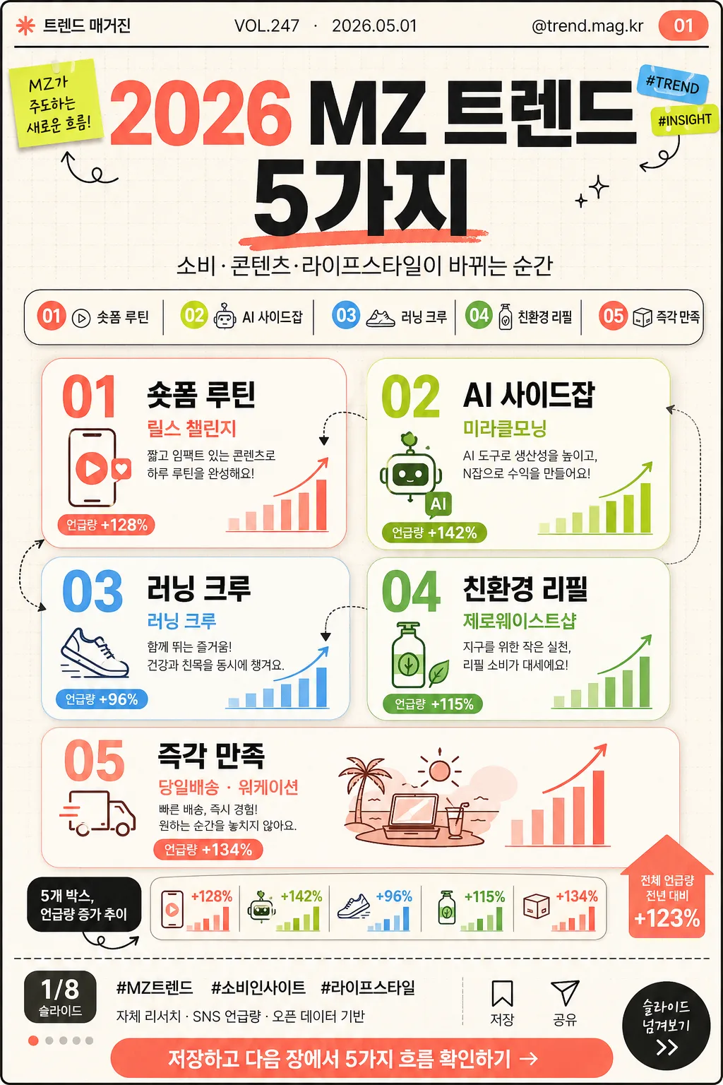
트렌드 카드뉴스 (MZ 트렌드 5가지)
MZ 트렌드 5가지 카드뉴스. 핵심 + 사례.
트렌드 카드뉴스 (MZ 트렌드 5가지)摘要
這是用來製作社群/圖卡內容的 ChatGPT 圖像提示詞,已整理主題、背景、風格與構圖,方便快速調整。
相關關鍵字: 트렌드 카드뉴스 (MZ 트렌드 5가지), 트렌드 카드뉴스 (MZ 트렌드 5가지) 프롬프트, 社群/圖卡 프롬프트, 社群/圖卡 AI 이미지 프롬프트, ChatGPT 이미지 프롬프트, AI 이미지 생성 프롬프트, AI 프롬프트, 이미지 프롬프트
트렌드 카드뉴스 (MZ 트렌드 5가지)使用方式
保留原始結構並替換主體、背景、色彩或構圖,即可延伸出不同版本。
- 保留核心主體,並依品牌、季節或平台調整色彩與背景。
- 如果畫面太複雜,請減少背景元素並具體描述主體、構圖與光線。
- 複製後可要求 ChatGPT 配合平台、長寬比或文字需求調整。
提示詞原文
[Input]
- language: Korean
- output_size: {비율}

[Purpose]
Trend card news cover/editorial slide for an MZ audience, designed as the first slide of a vertical social-media carousel. The image should feel like a real Korean digital magazine card-news opener: punchy headline, useful trend modules, visible issue metadata, page indicator, social handle, source note, and a save/share-friendly CTA.

[Composition]
- Place the main headline block in the upper 26% of the canvas with strong vertical hierarchy, a compact subtitle, and a small editorial issue label.
- Build a lively 5-card grid across the middle and lower 50% of the frame: five distinct rounded cards, each with a number, trend label, short example copy, icon accent, and tiny chart cue.
- Use a bright editorial background with layered off-white panels, faint dotted graph paper texture, small arrows, sticker-like category tags, and thin divider lines to make the card news feel published and realistic.
- Add social-media publishing details: {발행처}, {채널핸들}, {호수}, {날짜}, {슬라이드번호}, {페이지표시}, {해시태그}, {출처문구}, and {CTA}.
- Use {주제} as the main theme headline, {부제} as the subtitle, {트렌드목록} as the five trend labels, {사례문구} as supporting examples, {비주얼요소} as infographic cues, and {컬러} as the palette direction.

[3. CORE STRUCTURE]
1. Header metadata bar (top 7%): Place {발행처} on the left, {채널핸들} on the right, and a small issue/date line reading {호수} · {날짜}. Add {슬라이드번호} in a small rounded badge.
2. Main title area (upper 19%): Set {주제} in large bold Korean type, centered or slightly left-aligned, with {부제} below as a smaller editorial subtitle. Include one accent underline or highlight swash in coral or lime.
3. Trend summary chip row (upper-mid 10%): Convert {트렌드목록} into five compact chips or numbered tabs, separated by thin charcoal dividers and small icons.
4. Main 5-card grid (middle 42%): Arrange exactly five trend cards in a structured layout, such as two cards on the first row, two on the second row, and one wider highlight card on the third row. Each card must include a number 01–05, one trend label from {트렌드목록}, one concise example from {사례문구}, and a simple icon.
5. Visual data layer (lower-mid 12%): Use {비주얼요소} as small infographic accents: mini bars, percentage chips, tiny upward arrows, dotted line connectors, and a compact “언급량 증가” style note.
6. Footer publishing strip (bottom 10%): Include {페이지표시}, {해시태그}, {출처문구}, and a CTA pill with {CTA}. Add tiny save/share micro icons and a subtle carousel cue, making it feel like a real Instagram card-news cover.
7. Color application: Apply {컬러} as the dominant palette, alternating coral, lime, sky blue, white, and charcoal so the five items remain visually distinct while still feeling like one editorial system.

[4. STYLE RULES]
- Typography: Use Pretendard ExtraBold for the main headline, Pretendard SemiBold for trend labels, and Noto Sans KR Regular for supporting copy; title around 76–96px, subtitle 26–34px, labels 28–38px, body 18–23px, metadata 14–18px.
- Color palette: Use saturated coral, lime, sky blue, white, and charcoal based on {컬러}; suggested anchors: coral #FF6B6B, lime #B8F500, sky #66B8FF, white #FFFFFF, charcoal #222222, warm off-white #F7F4EC.
- Card styling: Rounded cards with soft editorial shadows, 4px y-offset, 14px blur, 14% opacity; thin 1px charcoal separators, dotted graph lines, and small icon outlines.
- Graphic details: Include realistic card-news elements such as a page indicator, slide number badge, source note, category chips, micro save/share icons, and tiny caption labels without making the Korean text unreadable.

[5. VISUAL STYLE]
- Camera / lens: Clean graphic editorial layout, simulated top-down design presentation, like a contemporary magazine infographic rather than a photographed scene.
- Lighting: Bright even studio-like illumination with no harsh shadows; subtle contrast only, keeping white areas crisp and colored blocks vivid.
- Color grade: High-chroma contemporary palette with fresh social-media brightness, balanced by charcoal text, warm off-white panels, and vivid accent cards.

[6. MOOD]
Modern Korean trend-report editorial — feels like a smart Seoul youth-culture publication prepared for an Instagram carousel, with crisp infographic energy, practical insight, and a polished magazine-card finish.

[7. CRITICAL]
- 반드시 선명하게 렌더링할 한국어 텍스트: {주제}, {부제}, {트렌드목록}, {사례문구}, {발행처}, {채널핸들}, {호수}, {날짜}, {페이지표시}, {해시태그}, {CTA}.
- Layout invariant: Keep exactly 5 trend cards, all clearly numbered 01–05, with consistent card styling and mobile-first readability.
- Include visible card-news publishing details: slide badge {슬라이드번호}, page indicator {페이지표시}, source line {출처문구}, and save/share micro icons.
- No broken Korean characters, no garbled type, and no distorted headline lettering.

[8. 🚫 PROHIBITED]
- Fake official seals / certifications
- Broken Korean characters
- Unreadable microtext
- Celebrity face composites or unauthorized likeness