広告・ポスター
매장 5주년 기념 카드
매장 5주년 기념 카드. 감사 + 할인 이벤트.
매장 5주년 기념 카드の概要
広告・ポスター画像を作るためのChatGPT画像プロンプトです。主題、背景、スタイル、構図を整理し、すぐに試せるよう構成しています。
関連キーワード: 매장 5주년 기념 카드, 매장 5주년 기념 카드 프롬프트, 広告・ポスター 프롬프트, 広告・ポスター AI 이미지 프롬프트, ChatGPT 이미지 프롬프트, AI 이미지 생성 프롬프트, AI 프롬프트, 이미지 프롬프트
매장 5주년 기념 카드の活用方法
元の構造を保ちながら、被写体、背景、色、構図を変更して別案に展開できます。
- 主題を維持し、ブランドや季節、媒体に合わせて色と背景を変更してください。
- 結果が複雑な場合は背景要素を減らし、被写体、構図、照明を具体化してください。
- コピー後、ChatGPTに媒体、アスペクト比、文字の有無を追加で指定できます。
プロンプト原文
[Input]
- language: Korean
- output_size: 1024x1536

[Purpose]
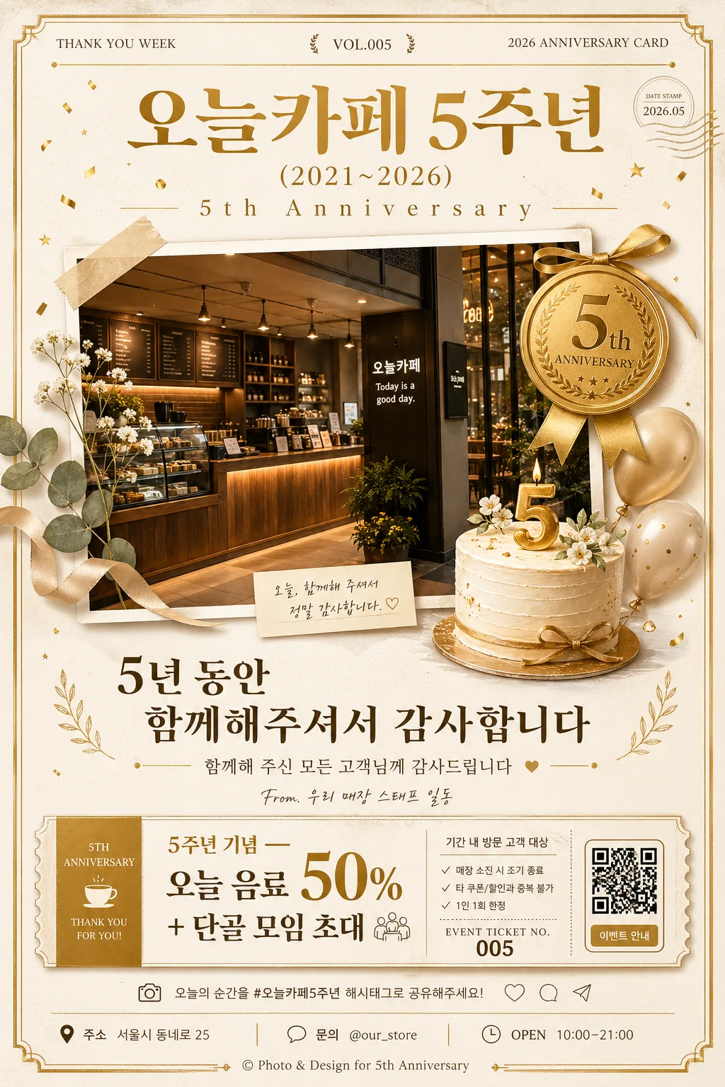
Korean store 5th anniversary commemorative card, vertical poster-style social post for in-store display and messaging channels.
Create a warm, premium retail-brand anniversary announcement that feels like a real printed celebration card, combining a realistic store photo, anniversary medal, cake illustration, event information, gratitude message, and small customer-facing details.

[Composition]
- Main subject placement: centered vertical layout with the store celebration title occupying the upper 18%, the hero visual block in the middle 50%, and message, event, and contact details in the lower 22%.
- Background treatment: warm white and cream paper stock with visible fine grain, subtle printed ink texture, gold-accent framing elements, faint confetti speckles, and a soft shadow suggesting a premium card photographed on a tabletop.
- Spacing and framing: layered editorial card grid with rich but orderly anniversary details, realistic print alignment, readable hierarchy, and a balanced text-to-image ratio.
- Include realistic card-news style micro details: small date stamp, anniversary issue label, page-style number such as CARD 05, short Korean caption, store handle, address/contact line, and a tiny QR/ticket-style event marker.
- Use {매장·기간}, {감사 메시지}, {이벤트}, {비주얼}, {컬러}, {타이포}, {비율} placeholders as the editable content anchors.

[3. CORE STRUCTURE]
1. Top header area: set the anniversary title as a bold Korean masthead, with {매장·기간} placed prominently and a small English anniversary subline integrated near it. Add small supporting labels such as ‘THANK YOU WEEK’, ‘VOL.005’, ‘2026 ANNIVERSARY CARD’, and a tiny date mark ‘2026.05’.
2. Middle hero area: combine the store photo with a small 5th-anniversary medal and a cake illustration, arranged as a layered celebratory collage with realistic paper cutout edges, taped-photo corners, a gold ribbon, small balloons, flower sprigs, and subtle confetti around the frame. The store photo should show believable interior details such as counter lighting, shelves, menu board blur, packaging, and a welcoming entrance mood.
3. Message block: place {감사 메시지} beneath the hero visual in a refined centered composition using clear line breaks, accompanied by a short caption line in Korean such as ‘함께해 주신 모든 고객님께 감사드립니다’ and a tiny signature text ‘From. 우리 매장 스태프 일동’.
4. Offer block: render {이벤트} as a highlighted promotional line with gold rules, a small coupon-style badge, and additional realistic event metadata such as ‘기간 내 방문 고객 대상’, ‘매장 소진 시 조기 종료’, ‘EVENT TICKET NO. 005’, and a small QR placeholder box.
5. Footer styling: reinforce the visual identity with {컬러}, {타이포}, and {비율} in a stable, print-ready poster layout. Include a footer row with ‘주소 서울시 동네로 25’, ‘문의 @our_store’, ‘OPEN 10:00–21:00’, tiny social/share-like icons, and a small copyright-style credit line ‘Photo & Design for 5th Anniversary’.

[4. STYLE RULES]
- Typography: use a Korean serif such as Noto Serif KR or Nanum Myeongjo for the main message, paired with a clean sans-serif like Pretendard for supporting text; headline weight 700-800, body weight 400-500, with a slightly expanded tracking for the English line ‘5th Anniversary’.
- Color palette: gold #C8A24A, warm white #F7F3EA, signature store accent color, and soft charcoal #2B2B2B; keep gold as the premium accent rather than a flat neon tone.
- Border/shadow: use a subtle soft drop shadow with 4px y-offset, 12px blur, and 15% opacity; thin gold divider lines, decorative corner flourishes, foil-like medal highlights, printed coupon perforation marks, and soft paper layering.
- Text details should look professionally typeset, with Korean headline, date, event notes, handle, and footer microcopy remaining legible and aligned.

[5. VISUAL STYLE]
- Camera / lens: front-facing retail poster composition, simulated with a 50mm lens look at f/4 for natural perspective and balanced product-display clarity.
- Lighting: soft diffused studio light from upper-left with a gentle fill from front-right, producing clean highlights on gold details and mild shadow separation.
- Color grade: warm cream + gold + neutral white with slightly muted contrast, similar to a polished lifestyle brand anniversary flyer.
- Material realism: visible matte paper grain, slight embossing on the 5th-anniversary medal, soft printed edges on the cake illustration, gentle reflections on the store photo surface, and believable ink density on Korean text.

[6. MOOD]
Premium neighborhood café anniversary card — feels like a refined Kinfolk-style brand print with a heartfelt local-store celebration mood, warm customer appreciation, and realistic in-store promotional details.

[7. CRITICAL]
- Korean text accuracy: must appear exactly as rendered text for {매장·기간}, {감사 메시지}, and {이벤트}.
- Additional Korean text may include realistic supporting labels such as ‘5주년 감사제’, ‘함께해 주셔서 감사합니다’, ‘방문 감사 쿠폰’, ‘기간 내 방문 고객 대상’, ‘문의 @our_store’, and ‘OPEN 10:00–21:00’.
- The composition must remain vertical, with the main title at the top, the collage visual in the middle, and the message/offer blocks clearly separated.
- Keep the store photo, medal, and cake illustration all visible and neatly layered without overlap confusion.
- Preserve the premium gold, warm cream, and signature accent color direction from {컬러}, and respect {타이포} and {비율} as the guiding design anchors.

[8. 🚫 PROHIBITED]
- Fake official seals / certifications
- Broken Korean characters
- Celebrity composites / unauthorized likeness