Ads/Posters
시즌 세일 (블랙프라이데이·크리스마스·신년)
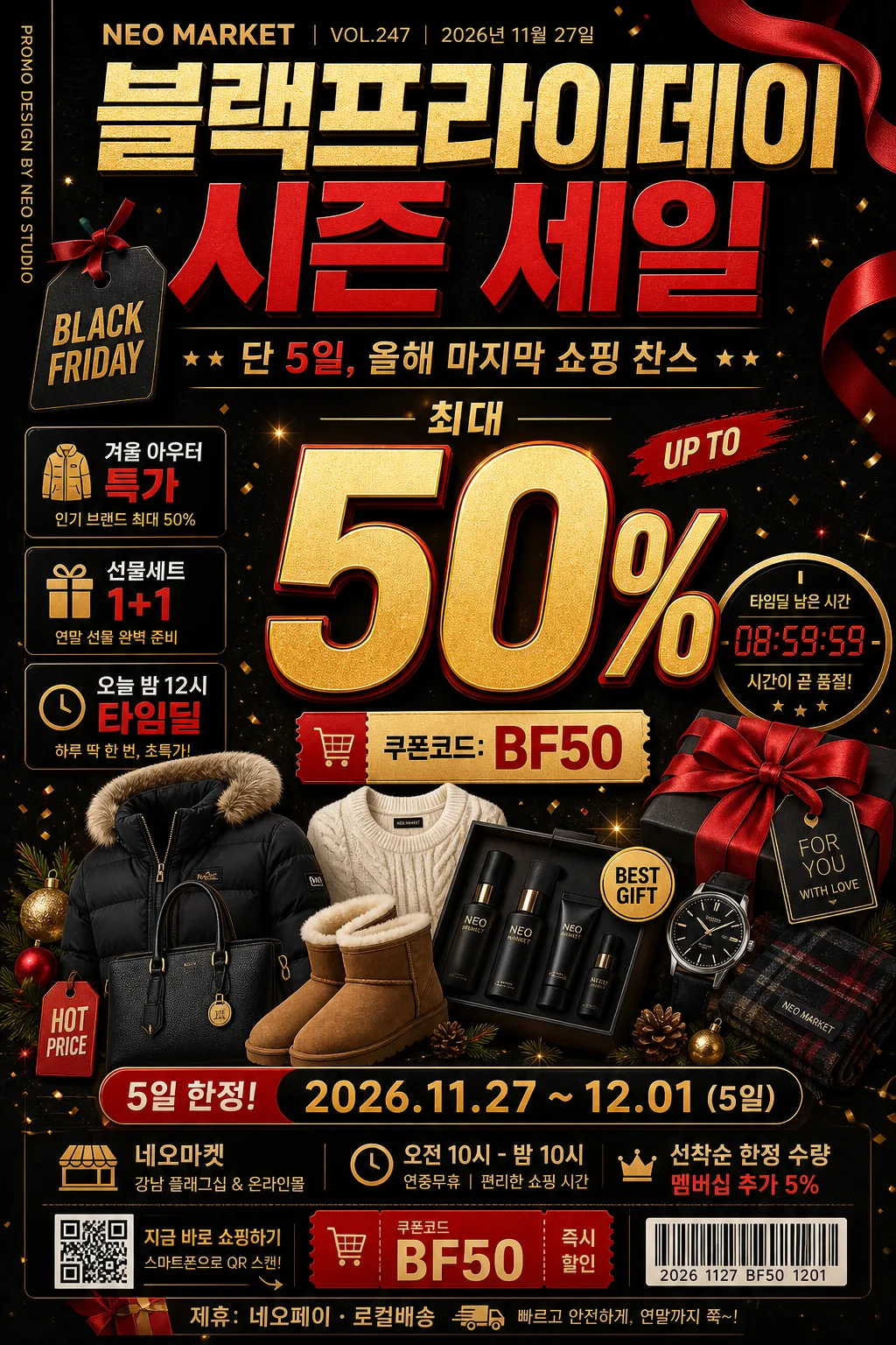
시즌 세일 광고 카드. 할인율 + 기간.
시즌 세일 (블랙프라이데이·크리스마스·신년) summary
Copy this ChatGPT image prompt to create Ads/Posters results. Its subject, background, style, and composition are organized for quick iteration.
Related keywords: 시즌 세일 (블랙프라이데이·크리스마스·신년), 시즌 세일 (블랙프라이데이·크리스마스·신년) 프롬프트, Ads/Posters 프롬프트, Ads/Posters AI 이미지 프롬프트, ChatGPT 이미지 프롬프트, AI 이미지 생성 프롬프트, AI 프롬프트, 이미지 프롬프트
How to use 시즌 세일 (블랙프라이데이·크리스마스·신년)
Keep the prompt structure and swap the subject, background, palette, or composition to create new variations.
- Keep the main subject and adjust the palette and background for your brand, season, or channel.
- If the result feels busy, simplify the background and make the subject, composition, and lighting more specific.
- After copying, ask ChatGPT to adapt it for your platform, aspect ratio, or text requirements.
Original prompt
[Input]
- language: Korean
- output_size: 1024x1536

[Purpose]
Seasonal sale poster for Black Friday, Christmas, and New Year promotions, designed as a high-impact vertical retail banner for social media, storefront signage, and mobile commerce event pages.
Bold price-led commercial layout with strong urgency, clear discount hierarchy, realistic shopping-event details, premium holiday-sales energy, and enough retail information to feel like an actual campaign poster.

[Composition]
- Main headline zone sits in the upper 22% with oversized typography; {시즌명} is the dominant title, followed by a smaller Korean supporting line reading {세일부제}.
- Add a compact retail header above or beside the title: {매장명}, {이슈번호}, {발행일}, and a small vertical spine credit reading {스파인문구} along the left or right edge.
- Center composition uses a product collection cluster occupying the mid 48% of the frame, with {대표비주얼} arranged like a dense retail campaign collage and a large percentage mark as the focal anchor.
- {할인율} appears as the primary numerical emphasis near the center-right or center-left, sized to be readable at thumbnail scale, supported by a coupon badge showing {쿠폰코드}.
- Include 2–3 realistic feature callouts around the collage, such as {특가문구1}, {특가문구2}, and {특가문구3}, styled as small editorial sale headlines.
- {행사기간} is placed as a compact countdown/event strip in the lower 12%, visually separated from the main offer with a thin divider, boxed label, or ribbon tag.
- Add practical event details near the bottom: {장소}, {운영시간}, {구매안내}, a small barcode/QR-style block, and a sponsor/partner strip reading {후원문구}.
- Background uses a dark premium surface with festive accents, subtle wrapping-paper texture, confetti flecks, ribbon shadows, gift-tag labels, and warm reflected highlights that support the promotional hierarchy.
- {컬러팔레트} should be applied as the dominant palette across headline, accent shapes, sale badges, sponsor strip, barcode label, and highlight ribbons, with metallic gold used for premium emphasis.

[3. CORE STRUCTURE]
1) Top header band: set {시즌명} in a bold editorial masthead style, spanning most of the width with tight kerning and strong visual weight; place {매장명}, {이슈번호}, and {발행일} as small but readable retail-poster metadata.
2) Main offer block: place {할인율} large and central, using the biggest type on the poster, with a subtle offset shadow so it stays readable over the product collage.
3) Product collage area: build {대표비주얼} beneath and around the discount number, stacking items with slight overlap, crisp cutout edges, price-tag stickers, ribbon tabs, gift-box corners, and controlled depth layering.
4) Feature headline system: place {특가문구1}, {특가문구2}, and {특가문구3} in small boxed callouts or angled tags around the main offer, making them readable without overpowering the discount percentage.
5) Countdown and event strip: place {행사기간} inside a small rounded rectangle or slim bar near the bottom, using condensed text and a high-contrast fill for urgency; add {운영시간} nearby as a secondary line.
6) Store and purchase info: include {장소}, {구매안내}, {쿠폰코드}, barcode/QR-style graphic, and {후원문구} in a realistic retail footer area.
7) Supporting typography: add {타이포스타일} as a secondary lockup, aligned to the main hierarchy without competing with the sale percentage.
8) Color reinforcement: use {컬러팔레트} across badges, separators, corner accents, ribbon graphics, confetti, coupon labels, and background gradients to keep the whole poster in a coherent seasonal sale system.
9) Final framing: keep the layout centered and vertically balanced, with major information comfortably away from trim edges and readable on a 1024x1536 vertical canvas.

[4. STYLE RULES]
- Typography: headline in Pretendard ExtraBold or Noto Sans KR Black, 86–120px equivalent; secondary text in Pretendard SemiBold, 28–40px; countdown text in Pretendard Medium, 18–24px; footer metadata in 14–18px but still legible.
- Color palette: matte black #0B0B0D, deep red #C1121F, warm gold #D4AF37, ivory highlight #F5F1E8, optional charcoal #2B2B2F, with festive red-gold sparkle points and subtle paper-grain texture.
- Border/shadow: subtle soft drop shadow 0px x-offset, 6px y-offset, 18px blur, 18% opacity; thin gold rules 2px for separators; glossy badge sheen may appear on coupon stickers and discount tags, not as a full plastic UI.
- Poster realism: include retail artifacts such as a barcode block, coupon tag, tiny SKU-like numbers, event footer, sponsor/partner strip, ribbon corners, gift-tag labels, and sale category chips.

[5. VISUAL STYLE]
- Camera / lens: high-end commercial product composite look, equivalent to a Sony A7R IV with 50mm f/1.8 for main product clarity and 85mm f/1.4 for headline depth separation.
- Lighting: studio softbox key from upper-left at 45°, weak fill from front-right, faint rim light to outline product edges and metallic highlights.
- Color grade: black velvet base with crimson and antique gold accents, slightly lifted shadows, crisp contrast, holiday campaign finish.

[6. MOOD]
Premium holiday retail campaign — a Vogue Business x Apple keynote promo aesthetic with Black Friday urgency, luxury department-store polish, festive gift-market details, and a believable limited-time shopping-event atmosphere.

[7. CRITICAL]
- Korean text accuracy: 반드시 정확히 보여야 하는 문자열: "블랙프라이데이 시즌 세일", "단 5일, 올해 마지막 쇼핑 찬스", "최대 50%", "2026.11.27 ~ 12.01 (5일)", "오전 10시 - 밤 10시", "네오마켓 강남 플래그십 & 온라인몰", "쿠폰코드: BF50", "선착순 한정 수량 · 멤버십 추가 5%", "겨울 아우터 특가", "선물세트 1+1", "오늘 밤 12시 타임딜", "NEO MARKET", "VOL.247", "2026년 11월 27일", "PROMO DESIGN BY NEO STUDIO", "제휴: 네오페이 · 로컬배송", "굵은 영문 BLACK FRIDAY + 한글 부제", "1024x1536".
- Layout invariants: large discount percentage must remain the primary focal point; countdown must stay smaller than the headline; product collage and sale badges must support the offer rather than hide it.
- Readability: all required Korean text, coupon code, event period, store name, and footer details must be sharp and fully legible at vertical poster scale.
- Realism: barcode/QR-style block, sponsor strip, date, issue number, coupon badge, category callouts, and decorative holiday graphics should feel like a real retail campaign poster.

[8. 🚫 PROHIBITED]
- Fake official seals / government-style certifications
- Broken Korean characters
- Illegible tiny text in required sale information
- Unauthorized celebrity composites