廣告/海報
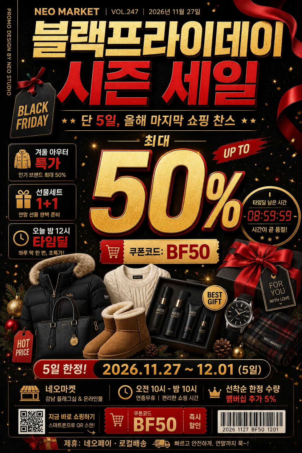
시즌 세일 (블랙프라이데이·크리스마스·신년)
시즌 세일 광고 카드. 할인율 + 기간.
시즌 세일 (블랙프라이데이·크리스마스·신년)摘要
這是用來製作廣告/海報內容的 ChatGPT 圖像提示詞,已整理主題、背景、風格與構圖,方便快速調整。
相關關鍵字: 시즌 세일 (블랙프라이데이·크리스마스·신년), 시즌 세일 (블랙프라이데이·크리스마스·신년) 프롬프트, 廣告/海報 프롬프트, 廣告/海報 AI 이미지 프롬프트, ChatGPT 이미지 프롬프트, AI 이미지 생성 프롬프트, AI 프롬프트, 이미지 프롬프트
시즌 세일 (블랙프라이데이·크리스마스·신년)使用方式
保留原始結構並替換主體、背景、色彩或構圖,即可延伸出不同版本。
- 保留核心主體,並依品牌、季節或平台調整色彩與背景。
- 如果畫面太複雜,請減少背景元素並具體描述主體、構圖與光線。
- 複製後可要求 ChatGPT 配合平台、長寬比或文字需求調整。
提示詞原文
[Input]
- language: Korean
- output_size: 1024x1536

[Purpose]
Seasonal sale poster for Black Friday, Christmas, and New Year promotions, designed as a high-impact vertical retail banner for social media, storefront signage, and mobile commerce event pages.
Bold price-led commercial layout with strong urgency, clear discount hierarchy, realistic shopping-event details, premium holiday-sales energy, and enough retail information to feel like an actual campaign poster.

[Composition]
- Main headline zone sits in the upper 22% with oversized typography; {시즌명} is the dominant title, followed by a smaller Korean supporting line reading {세일부제}.
- Add a compact retail header above or beside the title: {매장명}, {이슈번호}, {발행일}, and a small vertical spine credit reading {스파인문구} along the left or right edge.
- Center composition uses a product collection cluster occupying the mid 48% of the frame, with {대표비주얼} arranged like a dense retail campaign collage and a large percentage mark as the focal anchor.
- {할인율} appears as the primary numerical emphasis near the center-right or center-left, sized to be readable at thumbnail scale, supported by a coupon badge showing {쿠폰코드}.
- Include 2–3 realistic feature callouts around the collage, such as {특가문구1}, {특가문구2}, and {특가문구3}, styled as small editorial sale headlines.
- {행사기간} is placed as a compact countdown/event strip in the lower 12%, visually separated from the main offer with a thin divider, boxed label, or ribbon tag.
- Add practical event details near the bottom: {장소}, {운영시간}, {구매안내}, a small barcode/QR-style block, and a sponsor/partner strip reading {후원문구}.
- Background uses a dark premium surface with festive accents, subtle wrapping-paper texture, confetti flecks, ribbon shadows, gift-tag labels, and warm reflected highlights that support the promotional hierarchy.
- {컬러팔레트} should be applied as the dominant palette across headline, accent shapes, sale badges, sponsor strip, barcode label, and highlight ribbons, with metallic gold used for premium emphasis.

[3. CORE STRUCTURE]
1) Top header band: set {시즌명} in a bold editorial masthead style, spanning most of the width with tight kerning and strong visual weight; place {매장명}, {이슈번호}, and {발행일} as small but readable retail-poster metadata.
2) Main offer block: place {할인율} large and central, using the biggest type on the poster, with a subtle offset shadow so it stays readable over the product collage.
3) Product collage area: build {대표비주얼} beneath and around the discount number, stacking items with slight overlap, crisp cutout edges, price-tag stickers, ribbon tabs, gift-box corners, and controlled depth layering.
4) Feature headline system: place {특가문구1}, {특가문구2}, and {특가문구3} in small boxed callouts or angled tags around the main offer, making them readable without overpowering the discount percentage.
5) Countdown and event strip: place {행사기간} inside a small rounded rectangle or slim bar near the bottom, using condensed text and a high-contrast fill for urgency; add {운영시간} nearby as a secondary line.
6) Store and purchase info: include {장소}, {구매안내}, {쿠폰코드}, barcode/QR-style graphic, and {후원문구} in a realistic retail footer area.
7) Supporting typography: add {타이포스타일} as a secondary lockup, aligned to the main hierarchy without competing with the sale percentage.
8) Color reinforcement: use {컬러팔레트} across badges, separators, corner accents, ribbon graphics, confetti, coupon labels, and background gradients to keep the whole poster in a coherent seasonal sale system.
9) Final framing: keep the layout centered and vertically balanced, with major information comfortably away from trim edges and readable on a 1024x1536 vertical canvas.

[4. STYLE RULES]
- Typography: headline in Pretendard ExtraBold or Noto Sans KR Black, 86–120px equivalent; secondary text in Pretendard SemiBold, 28–40px; countdown text in Pretendard Medium, 18–24px; footer metadata in 14–18px but still legible.
- Color palette: matte black #0B0B0D, deep red #C1121F, warm gold #D4AF37, ivory highlight #F5F1E8, optional charcoal #2B2B2F, with festive red-gold sparkle points and subtle paper-grain texture.
- Border/shadow: subtle soft drop shadow 0px x-offset, 6px y-offset, 18px blur, 18% opacity; thin gold rules 2px for separators; glossy badge sheen may appear on coupon stickers and discount tags, not as a full plastic UI.
- Poster realism: include retail artifacts such as a barcode block, coupon tag, tiny SKU-like numbers, event footer, sponsor/partner strip, ribbon corners, gift-tag labels, and sale category chips.

[5. VISUAL STYLE]
- Camera / lens: high-end commercial product composite look, equivalent to a Sony A7R IV with 50mm f/1.8 for main product clarity and 85mm f/1.4 for headline depth separation.
- Lighting: studio softbox key from upper-left at 45°, weak fill from front-right, faint rim light to outline product edges and metallic highlights.
- Color grade: black velvet base with crimson and antique gold accents, slightly lifted shadows, crisp contrast, holiday campaign finish.

[6. MOOD]
Premium holiday retail campaign — a Vogue Business x Apple keynote promo aesthetic with Black Friday urgency, luxury department-store polish, festive gift-market details, and a believable limited-time shopping-event atmosphere.

[7. CRITICAL]
- Korean text accuracy: 반드시 정확히 보여야 하는 문자열: "블랙프라이데이 시즌 세일", "단 5일, 올해 마지막 쇼핑 찬스", "최대 50%", "2026.11.27 ~ 12.01 (5일)", "오전 10시 - 밤 10시", "네오마켓 강남 플래그십 & 온라인몰", "쿠폰코드: BF50", "선착순 한정 수량 · 멤버십 추가 5%", "겨울 아우터 특가", "선물세트 1+1", "오늘 밤 12시 타임딜", "NEO MARKET", "VOL.247", "2026년 11월 27일", "PROMO DESIGN BY NEO STUDIO", "제휴: 네오페이 · 로컬배송", "굵은 영문 BLACK FRIDAY + 한글 부제", "1024x1536".
- Layout invariants: large discount percentage must remain the primary focal point; countdown must stay smaller than the headline; product collage and sale badges must support the offer rather than hide it.
- Readability: all required Korean text, coupon code, event period, store name, and footer details must be sharp and fully legible at vertical poster scale.
- Realism: barcode/QR-style block, sponsor strip, date, issue number, coupon badge, category callouts, and decorative holiday graphics should feel like a real retail campaign poster.

[8. 🚫 PROHIBITED]
- Fake official seals / government-style certifications
- Broken Korean characters
- Illegible tiny text in required sale information
- Unauthorized celebrity composites