광고/포스터
매장 픽업 스테이션 (배달·테이크아웃 안내)
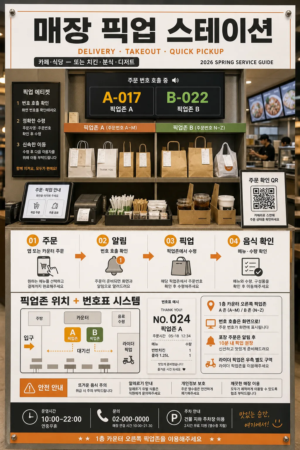
매장 픽업 스테이션 안내. 배달·테이크아웃 절차.
매장 픽업 스테이션 (배달·테이크아웃 안내) 검색 요약
매장 픽업 스테이션 (배달·테이크아웃 안내)은 광고/포스터 결과물을 만들 때 바로 복사해 활용할 수 있는 ChatGPT 이미지 프롬프트입니다. 주제, 배경, 스타일, 구도 조건을 함께 담아 빠르게 시안을 만들 수 있도록 구성했습니다.
관련 키워드: 매장 픽업 스테이션 (배달·테이크아웃 안내), 매장 픽업 스테이션 (배달·테이크아웃 안내) 프롬프트, 광고/포스터 프롬프트, 광고/포스터 AI 이미지 프롬프트, ChatGPT 이미지 프롬프트, AI 이미지 생성 프롬프트, AI 프롬프트, 이미지 프롬프트
매장 픽업 스테이션 (배달·테이크아웃 안내) 활용 포인트
원본 구조를 유지하면서 피사체, 배경, 색감, 구도를 바꿔 다양한 시안으로 확장할 수 있습니다.
- 핵심 소재는 유지하고 브랜드, 계절, 채널 목적에 맞는 색감과 배경을 바꿔보세요.
- 결과가 산만하면 배경 요소를 줄이고 피사체, 구도, 조명 조건을 구체화하세요.
- 복사한 뒤 ChatGPT에서 플랫폼, 화면 비율, 텍스트 포함 여부를 추가로 요청할 수 있습니다.
프롬프트 원문
[Input]
- language: Korean
- output_size: 1024x1536

[Purpose]
Store pickup station 안내 poster for delivery and takeaway, designed as a realistic vertical service infographic displayed inside a busy cafe, restaurant, chicken shop, or snack/dessert venue. It should feel like a printed in-store poster mounted near the counter, with practical operational details, readable Korean signage, and a lively retail atmosphere.

[Composition]
- Main title sits at the top 12–15% as a strong headline, with the central service board occupying about 60% of the frame.
- Use {매장} as the venue context, showing a believable pickup-counter scene with order shelves, receipt slips, food bags, drink trays, a small tablet/kiosk screen, and a QR block arranged into a clear service layout.
- The procedure line should read naturally left-to-right or top-to-bottom depending on panel fit, with {절차} displayed as the core workflow.
- Place {위치 안내} in a secondary information zone near the lower half, aligned with the pickup counter visual and supported by directional arrows, floor-marker graphics, and a small counter map.
- Add realistic poster information such as operating hours, pickup etiquette, order-number display, short notices, and contact/parking microcopy while keeping the workflow instantly readable from a distance.

[3. CORE STRUCTURE]
- Top header band: set the poster title “매장 픽업 스테이션” in a bold, highly legible Korean headline treatment, with a small English subtitle line beneath it such as “DELIVERY · TAKEOUT · QUICK PICKUP”. Include a small store label using {매장}, plus a date-style service label like “2026 SPRING SERVICE GUIDE”.
- Center hero area (mid 40–50%): depict a pickup counter with a compact kiosk-like feel, a glowing number display showing realistic sample numbers like “A-017” and “B-022”, neatly stacked takeout bags, drink carriers, a receipt printer, condiment tray, and labeled pickup shelves. The scene should visually explain where customers and riders collect orders.
- Procedure strip: show {절차} as four steps using numbered blocks, arrows, circular markers, or receipt-ticket tabs. Each step should be evenly spaced and easy to read, with the required labels “01 주문”, “02 알림”, “03 픽업”, “04 음식 확인”. Add tiny supporting Korean microcopy under each step, for example “앱 또는 카운터 주문”, “번호 호출 확인”, “픽업존에서 수령”, “메뉴·수량 확인”.
- Information block: place {위치 안내} beside or below the workflow, as a concise location note tied to the pickup counter and waiting area. Include the required text “픽업존 위치 + 번호표 시스템” and a small directional map with labels like “입구”, “카운터”, “대기선”, “라이더 픽업”.
- Visual support elements: integrate {비주얼} as practical diagram-like illustrations and real poster details: a QR square labeled “주문 확인 QR”, a sample ticket/receipt marked “NO. 024”, a bell notification icon, a food-bag icon, arrow decals, counter shelf labels, and a small safety notice strip.
- Bottom utility band: create a strong footer zone using {컬러} and {타이포} styling cues. Add realistic service details such as “운영시간 10:00–22:00”, “문의 02-000-0000”, “포장 주문은 알림 후 10분 내 픽업 권장”, and a compact address line like “1층 카운터 오른쪽 픽업존”.
- Size cue: keep the composition optimized for {비율}, with vertical poster readability, strong top-to-bottom hierarchy, and enough density to feel like a real operational poster in a store.

[4. STYLE RULES]
- Typography: bold Korean sans serif such as Pretendard ExtraBold or Noto Sans KR Bold for the main title; English subtitle in Pretendard Medium or Inter Medium; step labels in Pretendard SemiBold at compact sizes; microcopy in Noto Sans KR Regular with high contrast.
- Color palette: use {컬러} as the base system, supported by off-white #F7F7F4, charcoal #2B2B2B, warm paper white, and one clear accent tone for arrows, number tags, QR label, and pickup-zone markers.
- Border/shadow: use thin divider lines, subtle card borders, receipt-paper textures, acrylic sign shadows, and a soft drop shadow with 4px y-offset, 12px blur, 15% opacity for floating info blocks.
- Layout treatment: sharp rectangular panels, readable spacing, disciplined alignment, service-counter realism, small practical decals, shelf labels, printed paper grain, and everyday retail details that support the pickup guidance.

[5. VISUAL STYLE]
- Camera / lens: clean product-poster look with a 50mm standard lens aesthetic, straight-on framing, and shallow perspective only if needed for the counter area.
- Lighting: bright diffused studio light from upper-left at about 45°, with a gentle fill from the right to keep the counter, printed Korean text, number display, and QR elements readable.
- Color grade: neutral retail palette with white, charcoal, and the venue accent color, crisp and slightly cool for operational clarity, with subtle warm highlights from the counter lights and realistic printed poster texture.

[6. MOOD]
Practical service-signage editorial — the clarity and layout discipline of modern wayfinding posters used in premium cafe interiors, enriched with real in-store pickup details, friendly customer guidance, and a believable takeaway counter environment.

[7. CRITICAL]
- Korean text accuracy: the following strings must appear exactly as written in the rendered image: “매장 픽업 스테이션”, “01 주문”, “02 알림”, “03 픽업”, “04 음식 확인”, “픽업존 위치 + 번호표 시스템”.
- Additional Korean poster text should be realistic and short, such as “주문 확인 QR”, “운영시간 10:00–22:00”, “대기선”, “라이더 픽업”, “음식 수령 후 메뉴와 수량을 확인해 주세요”.
- The workflow must remain four steps, clearly separated, with no merged or missing stage.
- Keep the pickup counter, QR element, number display, receipt/ticket details, and location guidance visibly connected as one service system.
- Maintain a vertical poster structure with clean hierarchy and no distorted Korean characters.

[8. 🚫 PROHIBITED]
- Fake official seals / certifications
- Broken Korean characters