資訊圖表/指南
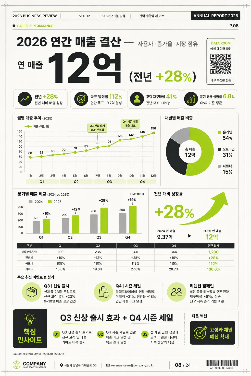
연간 통계 인포그래픽 (매출·증가율)
연간 통계 인포 카드. 매출·증가율·차트.
연간 통계 인포그래픽 (매출·증가율)摘要
這是用來製作資訊圖表/指南內容的 ChatGPT 圖像提示詞,已整理主題、背景、風格與構圖,方便快速調整。
相關關鍵字: 연간 통계 인포그래픽 (매출·증가율), 연간 통계 인포그래픽 (매출·증가율) 프롬프트, 資訊圖表/指南 프롬프트, 資訊圖表/指南 AI 이미지 프롬프트, ChatGPT 이미지 프롬프트, AI 이미지 생성 프롬프트, AI 프롬프트, 이미지 프롬프트
연간 통계 인포그래픽 (매출·증가율)使用方式
保留原始結構並替換主體、背景、色彩或構圖,即可延伸出不同版本。
- 保留核心主體,並依品牌、季節或平台調整色彩與背景。
- 如果畫面太複雜,請減少背景元素並具體描述主體、構圖與光線。
- 複製後可要求 ChatGPT 配合平台、長寬比或文字需求調整。
提示詞原文
[Input]
- language: Korean
- output_size: 1024x1536

[Purpose]
Korean annual statistics infographic poster for sales summary, growth rate, and market performance. Designed as a realistic vertical annual report page that can be shared on social media, inserted into an internal deck, or printed as a one-page executive summary.

[Composition]
- Vertical editorial report layout with a strong top-to-bottom hierarchy: a branded report header and date metadata at the very top, the large headline number in the upper hero zone, the main chart dashboard in the center, and the insight / action summary anchored near the bottom.
- Background treatment: premium off-white report paper with very subtle fiber grain, faint spreadsheet grid cues, light page shadow, and small registration/crop details to make it feel like a real printed business infographic.
- Add realistic report-page details: issue label “ANNUAL REPORT 2026”, section tag “SALES PERFORMANCE”, page number “P.08”, source note “Source: 내부 매출 데이터 · 2025.01–2025.12”, and a small QR-style data access block labeled “DATA ROOM”.
- Use {주제}, {주요 수치}, {차트}, {인사이트}, {비주얼}, {컬러}, {비율} placeholders exactly as configurable content.

[3. CORE STRUCTURE]
- Top report header: place a compact masthead row with “2026 BUSINESS REVIEW”, “VOL.12”, “2026년 1월 발행”, and a small department credit “전략기획팀 리포트”. Include thin colored rules and tiny metadata text for realism.
- Top hero section: display {주제} as the main Korean business headline and {주요 수치} as the largest typographic element. Add supporting KPI chips around it: “전년 +28%”, “목표 달성률 112%”, “고객 재구매율 41%”, and “분기 평균 성장률 6.8%”.
- Middle chart dashboard: place {차트} as the central analytical visual inside layered report cards. Include a quarterly line chart labeled Q1, Q2, Q3, Q4; a donut chart for channel mix labeled “온라인 54% / 오프라인 31% / 파트너 15%”; a vertical bar comparison for “2024 vs 2025”; and a lime green upward growth arrow with percentage callout.
- Supporting context area: add compact legends, axis labels, tick marks, data point labels, a tiny table row with “매출 / 전년비 / 목표비 / 기여도”, and short photo-free business annotations such as “Q3 신상 출시”, “Q4 시즌 세일”, “리텐션 캠페인”.
- Bottom insight band: render {인사이트} in a highlighted executive insight strip with a title “핵심 인사이트”, a numbered 3-point summary, and a small CTA label “다음 액션: 고성과 채널 예산 확대”.
- Footer: include address/contact-style corporate footer text “서울시 강남구 테헤란로 00 · revenue-team@company.co.kr”, a small page marker “08 / 24”, and a barcode-like reference area “AR-2026-12-SALES”. Overall layout direction should match {비주얼}: large number on top, chart in center, insight at bottom, with a polished business-report rhythm.

[4. STYLE RULES]
- Typography: Pretendard and Noto Sans KR mix; headline in ExtraBold 72–92px, supporting labels in Medium 22–28px, annotations in Regular 18–20px, micro metadata in 11–14px, with tight but readable line spacing.
- Color palette: use {컬러} as a strict palette direction, with white #FFFFFF, charcoal #222222, lime green #A6E22E for key growth accents, warm off-white #F7F6F1 for paper, and light gray #E9E9E9 for dividers, table lines, and chart axes.
- Border/shadow: subtle soft shadow 0px 8px 24px at 12% opacity on chart cards, fine 1px divider lines, realistic report-card layering, restrained corner radius, and crisp vector-like chart edges.
- Add content-rich business details without changing the core subject: legends, axis numbers, annotations, footer source notes, page codes, KPI badges, and small report metadata should support the annual sales and growth-rate story.

[5. VISUAL STYLE]
- Camera / lens: clean graphic design layout with top-down editorial poster presentation; 50mm equivalent neutrality, orthographic-feeling composition, and true vertical 1024x1536 report-page framing.
- Lighting: even studio-style illumination with a slight soft ambient falloff near the edges, gentle paper shadow, and enough dimensionality for the cards and layered report elements to feel tangible.
- Color grade: neutral white + charcoal + lime green business palette, with restrained contrast, precise data-viz clarity, and subtle premium print texture.

[6. MOOD]
Premium corporate annual report infographic — Apple Keynote-style presentation meets Financial Times data visualization clarity, with the realism of a finished executive summary page ready for quarterly board review.

[7. CRITICAL]
- Korean text accuracy: 반드시 정확히 보일 문구 — “연간 매출 결산”, “연 매출 12억”, “전년 +28%”, “Q3 신상 출시 효과 + Q4 시즌 세일”.
- Additional Korean report text should be legible and contextually correct: “2026년 1월 발행”, “핵심 인사이트”, “목표 달성률 112%”, “온라인 54%”, “오프라인 31%”, “파트너 15%”, “다음 액션: 고성과 채널 예산 확대”.
- All numeric figures must remain sharp, legible, and aligned with the chart hierarchy.
- Do not distort Korean characters; preserve clean baseline alignment and consistent spacing across headings, labels, tables, chart legends, and insight text.

[8. 🚫 PROHIBITED]
- Fake official seals / certifications
- Broken Korean characters