Infographics/Guides
연간 통계 인포그래픽 (매출·증가율)
연간 통계 인포 카드. 매출·증가율·차트.
연간 통계 인포그래픽 (매출·증가율) summary
Copy this ChatGPT image prompt to create Infographics/Guides results. Its subject, background, style, and composition are organized for quick iteration.
Related keywords: 연간 통계 인포그래픽 (매출·증가율), 연간 통계 인포그래픽 (매출·증가율) 프롬프트, Infographics/Guides 프롬프트, Infographics/Guides AI 이미지 프롬프트, ChatGPT 이미지 프롬프트, AI 이미지 생성 프롬프트, AI 프롬프트, 이미지 프롬프트
How to use 연간 통계 인포그래픽 (매출·증가율)
Keep the prompt structure and swap the subject, background, palette, or composition to create new variations.
- Keep the main subject and adjust the palette and background for your brand, season, or channel.
- If the result feels busy, simplify the background and make the subject, composition, and lighting more specific.
- After copying, ask ChatGPT to adapt it for your platform, aspect ratio, or text requirements.
Original prompt
[Input]
- language: Korean
- output_size: 1024x1536

[Purpose]
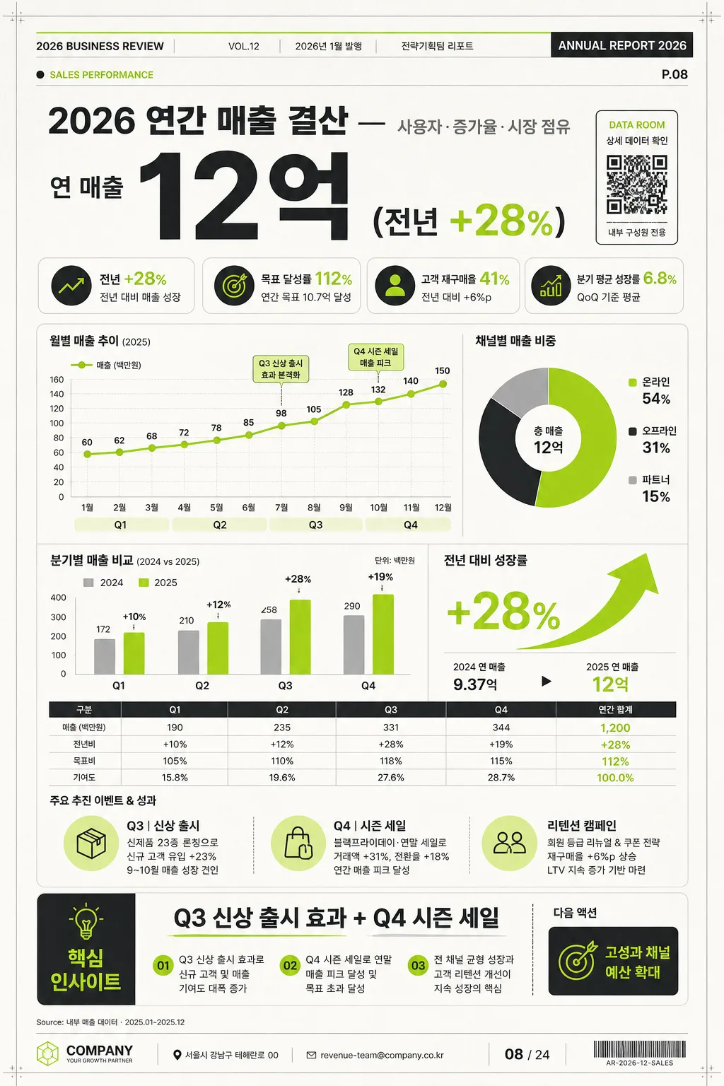
Korean annual statistics infographic poster for sales summary, growth rate, and market performance. Designed as a realistic vertical annual report page that can be shared on social media, inserted into an internal deck, or printed as a one-page executive summary.

[Composition]
- Vertical editorial report layout with a strong top-to-bottom hierarchy: a branded report header and date metadata at the very top, the large headline number in the upper hero zone, the main chart dashboard in the center, and the insight / action summary anchored near the bottom.
- Background treatment: premium off-white report paper with very subtle fiber grain, faint spreadsheet grid cues, light page shadow, and small registration/crop details to make it feel like a real printed business infographic.
- Add realistic report-page details: issue label “ANNUAL REPORT 2026”, section tag “SALES PERFORMANCE”, page number “P.08”, source note “Source: 내부 매출 데이터 · 2025.01–2025.12”, and a small QR-style data access block labeled “DATA ROOM”.
- Use {주제}, {주요 수치}, {차트}, {인사이트}, {비주얼}, {컬러}, {비율} placeholders exactly as configurable content.

[3. CORE STRUCTURE]
- Top report header: place a compact masthead row with “2026 BUSINESS REVIEW”, “VOL.12”, “2026년 1월 발행”, and a small department credit “전략기획팀 리포트”. Include thin colored rules and tiny metadata text for realism.
- Top hero section: display {주제} as the main Korean business headline and {주요 수치} as the largest typographic element. Add supporting KPI chips around it: “전년 +28%”, “목표 달성률 112%”, “고객 재구매율 41%”, and “분기 평균 성장률 6.8%”.
- Middle chart dashboard: place {차트} as the central analytical visual inside layered report cards. Include a quarterly line chart labeled Q1, Q2, Q3, Q4; a donut chart for channel mix labeled “온라인 54% / 오프라인 31% / 파트너 15%”; a vertical bar comparison for “2024 vs 2025”; and a lime green upward growth arrow with percentage callout.
- Supporting context area: add compact legends, axis labels, tick marks, data point labels, a tiny table row with “매출 / 전년비 / 목표비 / 기여도”, and short photo-free business annotations such as “Q3 신상 출시”, “Q4 시즌 세일”, “리텐션 캠페인”.
- Bottom insight band: render {인사이트} in a highlighted executive insight strip with a title “핵심 인사이트”, a numbered 3-point summary, and a small CTA label “다음 액션: 고성과 채널 예산 확대”.
- Footer: include address/contact-style corporate footer text “서울시 강남구 테헤란로 00 · revenue-team@company.co.kr”, a small page marker “08 / 24”, and a barcode-like reference area “AR-2026-12-SALES”. Overall layout direction should match {비주얼}: large number on top, chart in center, insight at bottom, with a polished business-report rhythm.

[4. STYLE RULES]
- Typography: Pretendard and Noto Sans KR mix; headline in ExtraBold 72–92px, supporting labels in Medium 22–28px, annotations in Regular 18–20px, micro metadata in 11–14px, with tight but readable line spacing.
- Color palette: use {컬러} as a strict palette direction, with white #FFFFFF, charcoal #222222, lime green #A6E22E for key growth accents, warm off-white #F7F6F1 for paper, and light gray #E9E9E9 for dividers, table lines, and chart axes.
- Border/shadow: subtle soft shadow 0px 8px 24px at 12% opacity on chart cards, fine 1px divider lines, realistic report-card layering, restrained corner radius, and crisp vector-like chart edges.
- Add content-rich business details without changing the core subject: legends, axis numbers, annotations, footer source notes, page codes, KPI badges, and small report metadata should support the annual sales and growth-rate story.

[5. VISUAL STYLE]
- Camera / lens: clean graphic design layout with top-down editorial poster presentation; 50mm equivalent neutrality, orthographic-feeling composition, and true vertical 1024x1536 report-page framing.
- Lighting: even studio-style illumination with a slight soft ambient falloff near the edges, gentle paper shadow, and enough dimensionality for the cards and layered report elements to feel tangible.
- Color grade: neutral white + charcoal + lime green business palette, with restrained contrast, precise data-viz clarity, and subtle premium print texture.

[6. MOOD]
Premium corporate annual report infographic — Apple Keynote-style presentation meets Financial Times data visualization clarity, with the realism of a finished executive summary page ready for quarterly board review.

[7. CRITICAL]
- Korean text accuracy: 반드시 정확히 보일 문구 — “연간 매출 결산”, “연 매출 12억”, “전년 +28%”, “Q3 신상 출시 효과 + Q4 시즌 세일”.
- Additional Korean report text should be legible and contextually correct: “2026년 1월 발행”, “핵심 인사이트”, “목표 달성률 112%”, “온라인 54%”, “오프라인 31%”, “파트너 15%”, “다음 액션: 고성과 채널 예산 확대”.
- All numeric figures must remain sharp, legible, and aligned with the chart hierarchy.
- Do not distort Korean characters; preserve clean baseline alignment and consistent spacing across headings, labels, tables, chart legends, and insight text.

[8. 🚫 PROHIBITED]
- Fake official seals / certifications
- Broken Korean characters