資訊圖表/指南
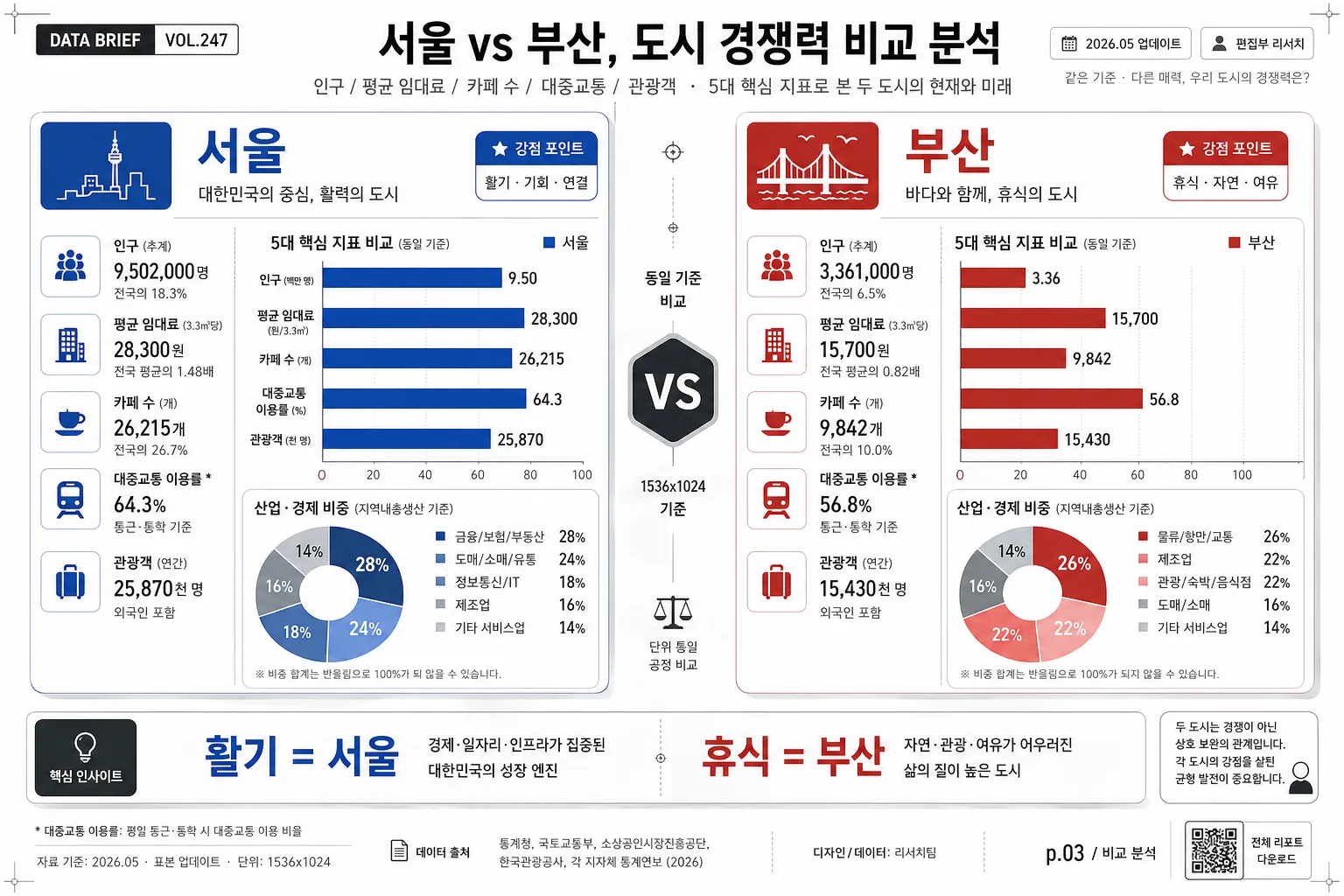
비교 차트 인포그래픽
비교 인포 카드. 두 항목 vs 그래프.
비교 차트 인포그래픽摘要
這是用來製作資訊圖表/指南內容的 ChatGPT 圖像提示詞,已整理主題、背景、風格與構圖,方便快速調整。
相關關鍵字: 비교 차트 인포그래픽, 비교 차트 인포그래픽 프롬프트, 資訊圖表/指南 프롬프트, 資訊圖表/指南 AI 이미지 프롬프트, ChatGPT 이미지 프롬프트, AI 이미지 생성 프롬프트, AI 프롬프트, 이미지 프롬프트
비교 차트 인포그래픽使用方式
保留原始結構並替換主體、背景、色彩或構圖,即可延伸出不同版本。
- 保留核心主體,並依品牌、季節或平台調整色彩與背景。
- 如果畫面太複雜,請減少背景元素並具體描述主體、構圖與光線。
- 複製後可要求 ChatGPT 配合平台、長寬比或文字需求調整。
提示詞原文
[Input]
- language: Korean
- output_size: 1536x1024

[Purpose]
Korean comparison infographic chart for editorial/social use, designed as a polished data-poster spread that looks ready for a magazine, news app, or research report.
Show two entities with a clear versus structure, combining bar charts, a donut chart, small metric icons, annotation labels, source microcopy, and realistic editorial details in one content-rich layout.

[Composition]
- Main composition: a strict left-right split layout with a centered “VS” divider, where each side occupies roughly 44% of the frame and the middle gutter takes about 12%.
- Title/header area: top band 14–16% of height, containing a bold comparison headline, a short subtitle line, a date label, and a small publication-style tag such as “DATA BRIEF VOL.247” or “2026년 5월 리포트”.
- Data area: the lower 70–74% holds charts, labels, metric cards, legends, small icons, and short explanatory notes, with aligned rows to keep both sides perfectly comparable.
- Background treatment: white or very light gray editorial sheet with subtle paper grain, faint grid ticks, tiny registration marks, and a refined printed-report feeling.
- Add realistic infographic details: small source line, page marker “p.03 / 비교 분석”, tiny QR-style box, compact legend chips, footnote symbols, and caption text without changing the core side-by-side comparison.
- Use {비교 대상}, {비교 항목}, {차트}, {인사이트}, {비주얼}, {컬러} placeholders naturally as the content variables for the poster.

[3. CORE STRUCTURE]
1. Header zone: place a concise Korean comparison headline at the top, followed by a smaller subline that introduces {비교 대상} in one sentence. Include issue/date metadata such as “VOL.247”, “2026.05 업데이트”, “편집부 리서치”.
2. Left comparison panel: present the first item of {비교 대상} with a stacked label block, one dominant bar chart set, 2–3 small metric icons aligned vertically, a short caption, and a small accent badge such as “강점 포인트”.
3. Center divider: render a bold “VS” separator in the middle gutter using a compact badge, vertical rule, and tiny comparison ticks; add subtle labels like “동일 기준 비교” and “{비율} 기준”.
4. Right comparison panel: mirror the left side with the second item of {비교 대상}, keeping the same chart positions, label sizes, icon scale, and value axis logic for symmetry.
5. Chart layer: integrate {차트} so the primary bar comparison sits near the middle of each panel, the donut chart acts as a supporting visual, and the small icons clarify each metric row. Include axis labels, percentage/value labels, legend chips, and small callout arrows for key differences.
6. Insight strip: near the bottom, place {인사이트} in a highlighted callout box so the conclusion is immediately readable; add a short Korean label like “핵심 인사이트” and a tiny analyst note line.
7. Footer microcopy: add realistic source-style detail and caption line such as “자료 기준: 2026.05 · 표본 업데이트 · 단위: {비율}”, plus a small page number, QR-style square, and editorial credit “디자인/데이터: 리서치팀”.

[4. STYLE RULES]
- Typography: use Pretendard or Noto Sans KR for all Korean text, with 700–800 weight for the headline and 400–500 weight for labels; title size should feel poster-like while body text remains highly legible.
- Color palette: base on white and charcoal, then apply two accent colors from {컬러}; keep contrast strong, newsroom-like, and consistent across bars, donut segments, badges, and legend chips.
- Border/shadow: use thin 1px divider lines, soft shadow 4px y-offset with 12px blur at 15% opacity for chart cards, and clean rounded rectangles with 10–14px radius.
- Layout finish: use precise alignment, consistent padding, clear grid rhythm, small editorial ornaments, fine divider ticks, numeric labels, and structured metadata so the image feels like a real published comparison graphic.
- Data styling: all values should feel plausible and organized; use readable Korean labels for {비교 항목}, with bar lengths and donut percentages visually coherent with {비율}.

[5. VISUAL STYLE]
- Camera / lens: flat graphic design layout, top-down editorial infographic framing, equivalent to an orthographic poster composition with no perspective distortion.
- Lighting: soft studio-style even illumination, digitally rendered with gentle paper depth and uniform card shadows.
- Color grade: crisp white + charcoal base with two contrasting accent tones, similar to a modern newsroom infographic, premium business magazine data spread, and tech comparison slide.
- Surface realism: include subtle paper fiber, crisp printed edges, microtext, fine ruled lines, small icon glyphs, and polished vector shapes for a believable finished editorial poster.

[6. MOOD]
Modern editorial infographic — sharp newsroom data-visualization feel, like a premium comparison spread from The Economist graphics, Information is Beautiful, or a Korean business magazine data brief.

[7. CRITICAL]
- Korean text accuracy: 반드시 정확히 표기할 한국어 문자열: {비교 대상}, {비교 항목}, {차트}, {인사이트}, {비주얼}, {컬러}, {비율}.
- Include realistic Korean microcopy rendered in the image, such as “비교 분석 리포트”, “핵심 지표”, “데이터 업데이트 2026.05”, “자료 기준”, “편집부 리서치”, “p.03”.
- All charts must remain perfectly readable and aligned; both comparison sides should use the same structure, scale logic, and spacing.
- The composition must clearly communicate “comparison” at a glance with a centered VS logic and symmetrical framing.

[8. 🚫 PROHIBITED]
- Fake official seals / certifications
- Broken Korean characters
- Cropped or misaligned text blocks