資訊圖表/指南
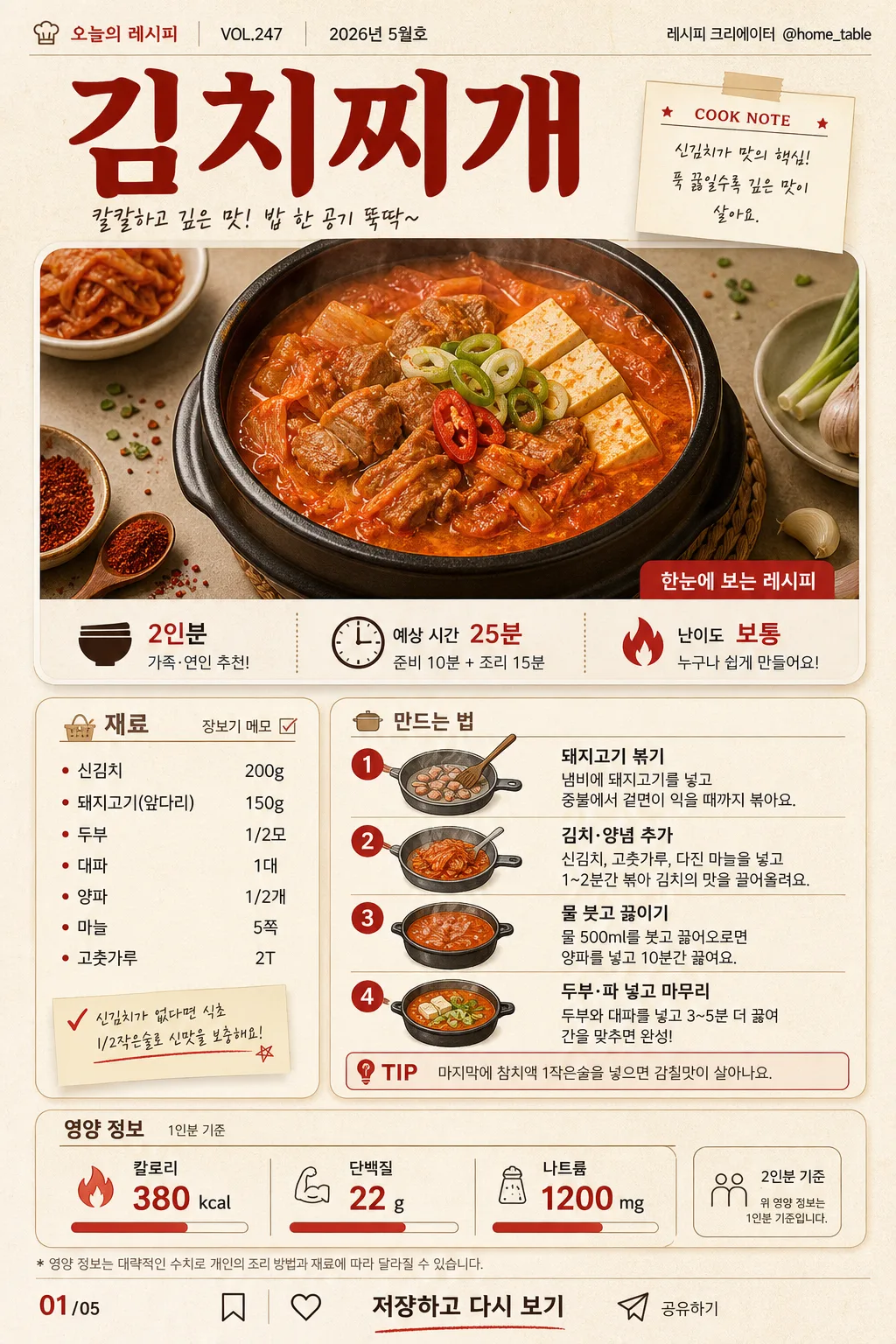
음식 인포그래픽 (재료·조리법·영양 정보 시각화)
음식 인포그래픽 — 재료·조리 단계·영양 정보 + 음식 사진. 카드뉴스·블로그·요리책 활용.
음식 인포그래픽 (재료·조리법·영양 정보 시각화)摘要
這是用來製作資訊圖表/指南內容的 ChatGPT 圖像提示詞,已整理主題、背景、風格與構圖,方便快速調整。
相關關鍵字: 음식 인포그래픽 (재료·조리법·영양 정보 시각화), 음식 인포그래픽 (재료·조리법·영양 정보 시각화) 프롬프트, 資訊圖表/指南 프롬프트, 資訊圖表/指南 AI 이미지 프롬프트, ChatGPT 이미지 프롬프트, AI 이미지 생성 프롬프트, AI 프롬프트, 이미지 프롬프트
음식 인포그래픽 (재료·조리법·영양 정보 시각화)使用方式
保留原始結構並替換主體、背景、色彩或構圖,即可延伸出不同版本。
- 保留核心主體,並依品牌、季節或平台調整色彩與背景。
- 如果畫面太複雜,請減少背景元素並具體描述主體、構圖與光線。
- 複製後可要求 ChatGPT 配合平台、長寬比或文字需求調整。
提示詞原文
[Input]
- language: Korean
- output_size: 1024x1536

[Purpose]
Vertical food infographic for a Korean recipe card, combining ingredient list, cooking steps, nutrition facts, and small editorial metadata in a polished cookbook-magazine layout.
Designed for card news, blog posts, mobile recipe saving, and cookbook-style sharing with clear Korean readability and a realistic printed-page feel.

[Composition]
- Overall layout: a tall single-page infographic with a top editorial header and hero food photo occupying about 30% of the canvas, a middle recipe information section occupying about 42%, and a bottom nutrition plus CTA block occupying about 18%, with practical outer margins around 40–48px.
- Subject placement: {요리명} appears as the main header near the top, supported by recipe metadata such as serving size, cook time, difficulty, issue/date label, and a small creator credit; the plated dish photo sits directly beneath with ingredient accents and food-styling details around the frame.
- Background treatment: warm cream paper texture with visible subtle grain, faint cookbook scan texture, soft warm shadows, lightly tinted off-white cards, and small realistic tabletop details such as a linen corner, tiny herb flakes, salt grains, measuring spoon, or chopstick edge that support the recipe theme.
- Spacing and framing: use a structured editorial grid with readable section blocks, thin divider lines, numbered markers, small caption labels, slide indicator, and a balanced mobile-first hierarchy for dense Korean text.

[3. CORE STRUCTURE]
1. Header area: set {요리명} as the largest title, bold and centered-left or centered depending on {레이아웃}; add a small magazine-style label line such as "오늘의 레시피", "VOL.247", "2026년 5월호", and creator credit "@home_table" near the top edge.
2. Food photo area: place a realistic overhead or slightly angled plated dish photo in a rounded rectangle frame with soft shadow; include natural matching garnish, steam or glossy sauce highlights when appropriate, and a small caption strip reading "한눈에 보는 레시피" or "COOK NOTE".
3. Quick info strip: directly below or beside the hero photo, add three compact badges for "2인분", "예상 시간 25분", and "난이도 보통", using icons such as a bowl, clock, and flame/star.
4. Ingredient area: list {재료 리스트} under the Korean section label "재료" as compact bullet points, ingredient chips, or small illustrated ingredient tiles; include tiny quantity markers, shopping-note styling, and a side label "장보기 메모" when space allows.
5. Cooking steps area: present {조리 단계} as 4 numbered step cards or a vertical timeline under "만드는 법", using action-matched illustrated icons such as wash, slice, stir-fry, boil, plate, season, or serve; add a small highlighted "TIP" note box with a short Korean cooking hint.
6. Nutrition area: show {영양 정보} in a structured bottom summary panel labeled "영양 정보" and "1인분 기준", with bold numeric callouts, aligned labels, tiny bar indicators, and a small footnote line for serving context.
7. Card news details: include a page indicator such as "01/05", tiny save/share/bookmark micro icons, and a bottom CTA line reading "저장하고 다시 보기"; keep these details small but visible like a real social recipe card.
8. Layout note area: follow {레이아웃} as the organizing logic, keeping the composition editorial, content-rich, and easy to read on mobile.
9. Color emphasis: apply {컬러 톤} consistently across title accents, icons, dividers, badges, step numbers, and key nutritional numbers.

[4. STYLE RULES]
- Typography: use Pretendard or Noto Sans KR for body text in medium weight, with the title in Pretendard ExtraBold or Nanum Myeongjo Bold; title size should be significantly larger than body text for clear hierarchy, while micro labels use condensed medium-weight Korean sans serif.
- Color palette: derive the palette from {컬러 톤}, with specific implementation using cream #F6F0E6, charcoal #2F2F2F, kimchi red #C73A2C, muted warm gray #B8B0A6, and small herb-green or sesame-beige accents when they support the food.
- Border/shadow: use thin 1px charcoal or warm-gray rules, rounded cards with 16px radius, soft drop shadows at 4px y-offset, 12px blur, 15% opacity, and occasional hand-drawn divider strokes or dotted guide lines for a printed recipe-book feeling.
- Editorial details: add realistic micro text blocks, small captions, recipe badges, page number, decorative dividers, and subtle food-themed icons; make them look intentionally typeset rather than floating randomly.

[5. VISUAL STYLE]
- Camera / lens: editorial food photography look, shot on a 50mm lens at f/4 for the hero dish, or a top-down 35mm equivalent for a flat-lay ingredient style.
- Lighting: soft diffused window light from upper-left, with a gentle fill from the right, natural shadows under the plate and paper cards, and controlled appetizing highlights on sauces, grains, vegetables, or broth.
- Color grade: warm cream and natural food tones with restrained red accents, slightly desaturated to keep the infographic readable while preserving appetizing texture in the plated food.
- Material realism: paper grain, printed ink edges, ceramic plate texture, wooden tabletop warmth, linen weave, tiny crumbs or sesame seeds, and realistic food surface detail should be visible at close inspection.

[6. MOOD]
Modern Korean cookbook infographic — feels like a premium food magazine recipe spread adapted into a social card news format, warm, useful, appetizing, and ready to save.

[7. CRITICAL]
- Korean text accuracy: 반드시 정확히 표시되어야 하는 문자열: "{요리명}", "{재료 리스트}", "{조리 단계}", "{영양 정보}".
- Additional Korean labels must render cleanly if included: "오늘의 레시피", "재료", "만드는 법", "영양 정보", "1인분 기준", "2인분", "예상 시간 25분", "난이도 보통", "장보기 메모", "TIP", "저장하고 다시 보기", "01/05", "2026년 5월호".
- Layout integrity: the page must remain a single vertical infographic with clear section separation, and the nutrition block must stay at the bottom.
- Text legibility: all Korean characters must render cleanly with no broken glyphs, truncation, or overlap.

[8. 🚫 PROHIBITED]
- Fake official seals / certifications
- Broken Korean characters