インフォグラフィック・案内
음식 인포그래픽 (재료·조리법·영양 정보 시각화)
음식 인포그래픽 — 재료·조리 단계·영양 정보 + 음식 사진. 카드뉴스·블로그·요리책 활용.
음식 인포그래픽 (재료·조리법·영양 정보 시각화)の概要
インフォグラフィック・案内画像を作るためのChatGPT画像プロンプトです。主題、背景、スタイル、構図を整理し、すぐに試せるよう構成しています。
関連キーワード: 음식 인포그래픽 (재료·조리법·영양 정보 시각화), 음식 인포그래픽 (재료·조리법·영양 정보 시각화) 프롬프트, インフォグラフィック・案内 프롬프트, インフォグラフィック・案内 AI 이미지 프롬프트, ChatGPT 이미지 프롬프트, AI 이미지 생성 프롬프트, AI 프롬프트, 이미지 프롬프트
음식 인포그래픽 (재료·조리법·영양 정보 시각화)の活用方法
元の構造を保ちながら、被写体、背景、色、構図を変更して別案に展開できます。
- 主題を維持し、ブランドや季節、媒体に合わせて色と背景を変更してください。
- 結果が複雑な場合は背景要素を減らし、被写体、構図、照明を具体化してください。
- コピー後、ChatGPTに媒体、アスペクト比、文字の有無を追加で指定できます。
プロンプト原文
[Input]
- language: Korean
- output_size: 1024x1536

[Purpose]
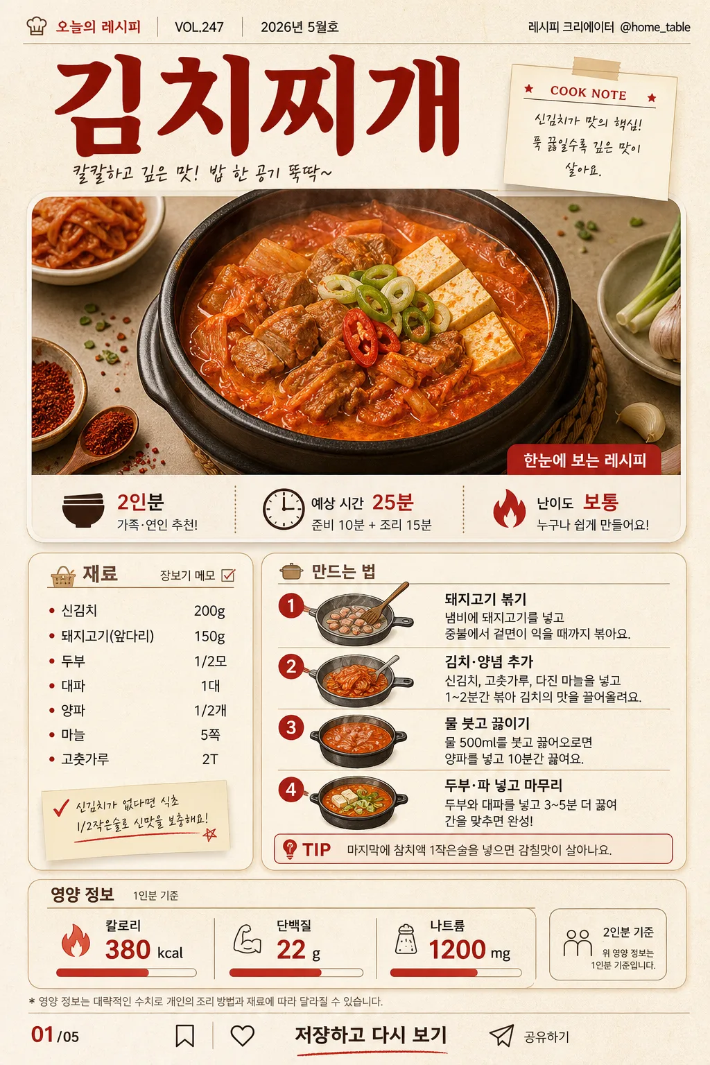
Vertical food infographic for a Korean recipe card, combining ingredient list, cooking steps, nutrition facts, and small editorial metadata in a polished cookbook-magazine layout.
Designed for card news, blog posts, mobile recipe saving, and cookbook-style sharing with clear Korean readability and a realistic printed-page feel.

[Composition]
- Overall layout: a tall single-page infographic with a top editorial header and hero food photo occupying about 30% of the canvas, a middle recipe information section occupying about 42%, and a bottom nutrition plus CTA block occupying about 18%, with practical outer margins around 40–48px.
- Subject placement: {요리명} appears as the main header near the top, supported by recipe metadata such as serving size, cook time, difficulty, issue/date label, and a small creator credit; the plated dish photo sits directly beneath with ingredient accents and food-styling details around the frame.
- Background treatment: warm cream paper texture with visible subtle grain, faint cookbook scan texture, soft warm shadows, lightly tinted off-white cards, and small realistic tabletop details such as a linen corner, tiny herb flakes, salt grains, measuring spoon, or chopstick edge that support the recipe theme.
- Spacing and framing: use a structured editorial grid with readable section blocks, thin divider lines, numbered markers, small caption labels, slide indicator, and a balanced mobile-first hierarchy for dense Korean text.

[3. CORE STRUCTURE]
1. Header area: set {요리명} as the largest title, bold and centered-left or centered depending on {레이아웃}; add a small magazine-style label line such as "오늘의 레시피", "VOL.247", "2026년 5월호", and creator credit "@home_table" near the top edge.
2. Food photo area: place a realistic overhead or slightly angled plated dish photo in a rounded rectangle frame with soft shadow; include natural matching garnish, steam or glossy sauce highlights when appropriate, and a small caption strip reading "한눈에 보는 레시피" or "COOK NOTE".
3. Quick info strip: directly below or beside the hero photo, add three compact badges for "2인분", "예상 시간 25분", and "난이도 보통", using icons such as a bowl, clock, and flame/star.
4. Ingredient area: list {재료 리스트} under the Korean section label "재료" as compact bullet points, ingredient chips, or small illustrated ingredient tiles; include tiny quantity markers, shopping-note styling, and a side label "장보기 메모" when space allows.
5. Cooking steps area: present {조리 단계} as 4 numbered step cards or a vertical timeline under "만드는 법", using action-matched illustrated icons such as wash, slice, stir-fry, boil, plate, season, or serve; add a small highlighted "TIP" note box with a short Korean cooking hint.
6. Nutrition area: show {영양 정보} in a structured bottom summary panel labeled "영양 정보" and "1인분 기준", with bold numeric callouts, aligned labels, tiny bar indicators, and a small footnote line for serving context.
7. Card news details: include a page indicator such as "01/05", tiny save/share/bookmark micro icons, and a bottom CTA line reading "저장하고 다시 보기"; keep these details small but visible like a real social recipe card.
8. Layout note area: follow {레이아웃} as the organizing logic, keeping the composition editorial, content-rich, and easy to read on mobile.
9. Color emphasis: apply {컬러 톤} consistently across title accents, icons, dividers, badges, step numbers, and key nutritional numbers.

[4. STYLE RULES]
- Typography: use Pretendard or Noto Sans KR for body text in medium weight, with the title in Pretendard ExtraBold or Nanum Myeongjo Bold; title size should be significantly larger than body text for clear hierarchy, while micro labels use condensed medium-weight Korean sans serif.
- Color palette: derive the palette from {컬러 톤}, with specific implementation using cream #F6F0E6, charcoal #2F2F2F, kimchi red #C73A2C, muted warm gray #B8B0A6, and small herb-green or sesame-beige accents when they support the food.
- Border/shadow: use thin 1px charcoal or warm-gray rules, rounded cards with 16px radius, soft drop shadows at 4px y-offset, 12px blur, 15% opacity, and occasional hand-drawn divider strokes or dotted guide lines for a printed recipe-book feeling.
- Editorial details: add realistic micro text blocks, small captions, recipe badges, page number, decorative dividers, and subtle food-themed icons; make them look intentionally typeset rather than floating randomly.

[5. VISUAL STYLE]
- Camera / lens: editorial food photography look, shot on a 50mm lens at f/4 for the hero dish, or a top-down 35mm equivalent for a flat-lay ingredient style.
- Lighting: soft diffused window light from upper-left, with a gentle fill from the right, natural shadows under the plate and paper cards, and controlled appetizing highlights on sauces, grains, vegetables, or broth.
- Color grade: warm cream and natural food tones with restrained red accents, slightly desaturated to keep the infographic readable while preserving appetizing texture in the plated food.
- Material realism: paper grain, printed ink edges, ceramic plate texture, wooden tabletop warmth, linen weave, tiny crumbs or sesame seeds, and realistic food surface detail should be visible at close inspection.

[6. MOOD]
Modern Korean cookbook infographic — feels like a premium food magazine recipe spread adapted into a social card news format, warm, useful, appetizing, and ready to save.

[7. CRITICAL]
- Korean text accuracy: 반드시 정확히 표시되어야 하는 문자열: "{요리명}", "{재료 리스트}", "{조리 단계}", "{영양 정보}".
- Additional Korean labels must render cleanly if included: "오늘의 레시피", "재료", "만드는 법", "영양 정보", "1인분 기준", "2인분", "예상 시간 25분", "난이도 보통", "장보기 메모", "TIP", "저장하고 다시 보기", "01/05", "2026년 5월호".
- Layout integrity: the page must remain a single vertical infographic with clear section separation, and the nutrition block must stay at the bottom.
- Text legibility: all Korean characters must render cleanly with no broken glyphs, truncation, or overlap.

[8. 🚫 PROHIBITED]
- Fake official seals / certifications
- Broken Korean characters