資訊圖表/指南
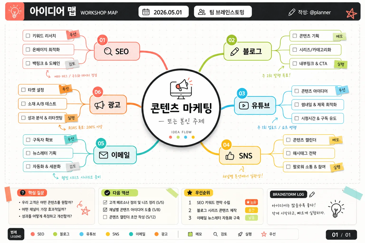
마인드맵 인포그래픽 (브레인스토밍·아이디어)
마인드맵 인포. 중심 주제 + 가지·하위 노드.
마인드맵 인포그래픽 (브레인스토밍·아이디어)摘要
這是用來製作資訊圖表/指南內容的 ChatGPT 圖像提示詞,已整理主題、背景、風格與構圖,方便快速調整。
相關關鍵字: 마인드맵 인포그래픽 (브레인스토밍·아이디어), 마인드맵 인포그래픽 (브레인스토밍·아이디어) 프롬프트, 資訊圖表/指南 프롬프트, 資訊圖表/指南 AI 이미지 프롬프트, ChatGPT 이미지 프롬프트, AI 이미지 생성 프롬프트, AI 프롬프트, 이미지 프롬프트
마인드맵 인포그래픽 (브레인스토밍·아이디어)使用方式
保留原始結構並替換主體、背景、色彩或構圖,即可延伸出不同版本。
- 保留核心主體,並依品牌、季節或平台調整色彩與背景。
- 如果畫面太複雜,請減少背景元素並具體描述主體、構圖與光線。
- 複製後可要求 ChatGPT 配合平台、長寬比或文字需求調整。
提示詞原文
[Input]
- language: Korean
- output_size: 1536x1024

[Purpose]
Korean mind map infographic for brainstorming and idea organization, designed as a polished presentation graphic for slides, reports, workshop documentation, or social sharing.
Single-page editorial infographic with a central topic hub, 4–6 branching categories, compact subnodes, and realistic workshop-style supporting details such as a title strip, date label, legend, small icons, and annotation chips.

[Composition]
- Centered main hub occupies about 22% of the canvas width, with {중심 주제} inside a large circular node.
- 4–6 main branches radiate outward in balanced directions, keeping the left and right sides visually even while allowing natural variation in branch length.
- Each branch ends in a rounded rectangular label, with smaller subnode boxes nested beneath or beside each branch.
- Add a top editorial header bar reading “아이디어 맵” with a small date label “2026.05.01”, a project tag “팀 브레인스토밍”, and a tiny credit line “작성: @planner”.
- Add a compact lower information strip with “핵심 질문”, “다음 액션”, “우선순위” chips, a small page marker “01 / 01”, and a simple color legend matching the branch colors.
- Background is bright white with subtle off-white paper texture, faint dotted grid marks, light pencil-like alignment guides, and small sticky-note or marker accents that support the brainstorming theme.
- Use {중심 주제}, {가지 (4~6개)}, {하위 노드}, {비주얼}, {컬러}, {타이포}, {비율} placeholders exactly as user-customizable content.

[3. CORE STRUCTURE]
- Center hub: render {중심 주제} as the largest circular node in the middle, with a strong visual anchor, crisp outline, and a small icon or pictogram derived from {비주얼} placed subtly above or beside the text.
- Main branches: place each item from {가지 (4~6개)} on its own color-coded branch, evenly spaced around the center like a strategic brainstorming map.
- Subnode layer: under each branch, place the relevant items from {하위 노드} in smaller boxes, aligned clearly and connected by thin curved lines.
- Add realistic idea-board details: tiny numbered dots on main branches, small checkbox bullets beside selected subnodes, short Korean annotation tags such as “메모”, “검토”, “실행”, and “우선” where appropriate.
- Visual scaffolding: match {비주얼} with a clear center-circle-plus-branch-line system, using smooth curved connectors, neat node spacing, and occasional small icon badges that help differentiate categories.
- Color system: apply {컬러} with one distinct accent color per branch, while keeping the background and core text neutral for readability.
- Typography layer: apply {타이포} with a rounded Korean sans-serif for main labels and a smaller English subtitle style where needed; include tiny editorial microcopy such as “WORKSHOP MAP”, “IDEA FLOW”, and “BRAINSTORM LOG”.
- Canvas ratio: maintain {비율} with a wide infographic layout that feels balanced, content-rich, and presentation-ready.

[4. STYLE RULES]
- Typography: Pretendard or Noto Sans KR for main Korean text, SemiBold for branch labels, Medium for subnodes, 28–40 px for the center, 18–24 px for branches, 14–18 px for subnodes; optional English subtitle in Inter Regular.
- Color palette: clean white #FFFFFF, charcoal #2B2B2B, coral #FF7A6B, lime #9AD84B, cyan #4CC9F0, gold #F2C14E, with branch-specific color coding.
- Border/shadow: thin 2px charcoal outline on the center node, soft drop shadow 0px 6px 14px at 12% opacity, rounded corners on all boxes, no heavy bevels.
- Graphic texture: use faint paper grain, subtle dotted grid, light marker strokes, small tape-tab shapes, and simple flat icons to make the infographic feel like a real workshop artifact refined for publication.
- Information density: include enough labels, subnodes, legend items, metadata, and visual cues for the page to feel complete and usable rather than like a template placeholder.

[5. VISUAL STYLE]
- Camera / lens: top-down flat graphic layout inspired by Adobe Illustrator infographic design, equivalent to a 35mm flat-lay framing if photographed.
- Lighting: even diffused studio lighting, soft natural paper shadows under sticker-like chips and node cards, high readability with flat poster-like consistency.
- Color grade: neutral white base with vivid coral, lime, cyan, and gold accents; slightly cool-balanced whites with charcoal text.
- Finish: editorial vector infographic blended with realistic printed-paper texture, precise alignment, crisp Korean typography, and tactile workshop-board details.

[6. MOOD]
Clean strategy-board editorial — like a modern startup workshop slide or a polished Notion / Miro brainstorming board translated into a refined infographic, with the warmth of an actual planning session captured on a finished presentation sheet.

[7. CRITICAL]
- Korean text accuracy: 반드시 정확히 보여야 하는 문자열: {중심 주제}, {가지 (4~6개)}, {하위 노드}
- Additional Korean text rendered in the image should be short and clear: “아이디어 맵”, “팀 브레인스토밍”, “핵심 질문”, “다음 액션”, “우선순위”, “메모”, “검토”, “실행”.
- Layout invariants: 중심 허브 1개, 방사형 가지 4~6개, 각 가지별 하위 노드가 명확히 구분되어야 함, 텍스트는 모두 한글이 깨지지 않고 선명해야 함.

[8. 🚫 PROHIBITED]
- Fake official seals / certifications
- Broken Korean characters