漫画・イラスト
음식 플랫 일러스트 (단순 카툰)
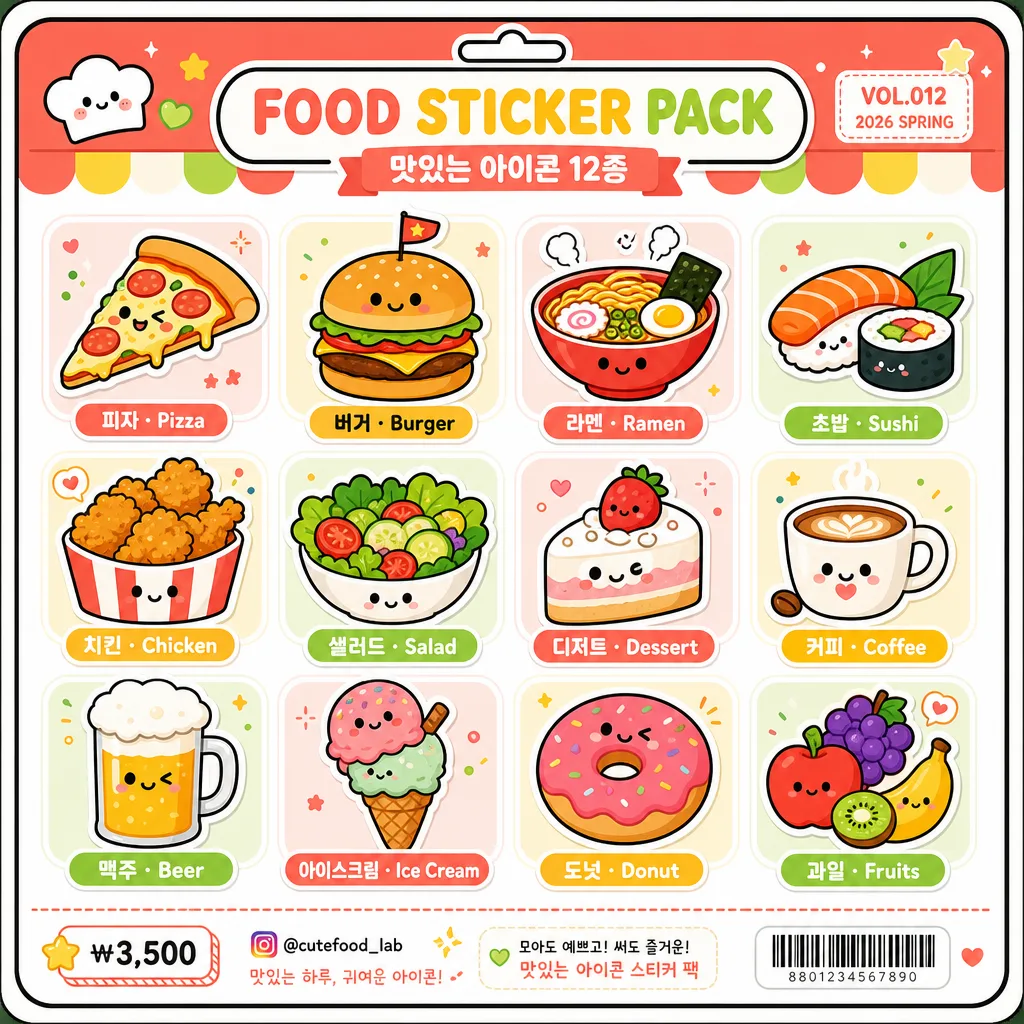
음식 플랫 일러스트 12종. 단순 카툰 결.
음식 플랫 일러스트 (단순 카툰)の概要
漫画・イラスト画像を作るためのChatGPT画像プロンプトです。主題、背景、スタイル、構図を整理し、すぐに試せるよう構成しています。
関連キーワード: 음식 플랫 일러스트 (단순 카툰), 음식 플랫 일러스트 (단순 카툰) 프롬프트, 漫画・イラスト 프롬프트, 漫画・イラスト AI 이미지 프롬프트, ChatGPT 이미지 프롬프트, AI 이미지 생성 프롬프트, AI 프롬프트, 이미지 프롬프트
음식 플랫 일러스트 (단순 카툰)の活用方法
元の構造を保ちながら、被写体、背景、色、構図を変更して別案に展開できます。
- 主題を維持し、ブランドや季節、媒体に合わせて色と背景を変更してください。
- 結果が複雑な場合は背景要素を減らし、被写体、構図、照明を具体化してください。
- コピー後、ChatGPTに媒体、アスペクト比、文字の有無を追加で指定できます。
プロンプト原文
[Input]
- language: Korean
- output_size: 1024x1024

[Purpose]
Simple cartoon food icon sheet for social media, app UI, sticker-pack style use, and cute printed merchandise preview.
Flat illustrated food grid with bold outlines, cheerful package-like details, clear bilingual labels, and a lively retail sticker-sheet finish.

[Composition]
- Center the full composition as a 3x4 grid covering about 82–88% of the canvas, with even gutters and consistent tile size for {음식 12종}, while allowing a small header and footer area like a real sticker-pack backing card.
- Use a clean white #FFFFFF base with soft pastel accent blocks, tiny food-themed decorative marks, rounded dividers, and a light printed-paper feel so the sheet looks like finished character-goods packaging.
- Keep all 12 food items visually balanced in scale, aligned on a strict grid, and separated by cheerful rounded tile zones or subtle sticker backing shapes.
- Add rounded Korean and English labels beneath each item in the {타이포} style, with centered placement and enough breathing room so text stays legible.
- Include a small top header strip reading "FOOD STICKER PACK" and "맛있는 아이콘 12종", plus a tiny product code such as "VOL.012" and "2026 SPRING" in the corner.
- Add a compact footer area with tiny price/contact-style details like "₩3,500", "@cutefood_lab", a small barcode-style rectangle, and short decorative captions, keeping the 12 icons as the main subject.

[3. CORE STRUCTURE]
- Top-to-bottom, left-to-right grid: place one distinct food icon in each of the 12 slots, matching the simple cartoon look described by {결}.
- Each icon should be rendered with simplified geometry, thick outer contour lines, friendly facial or shine accents where appropriate, small garnish marks, and a consistent sticker-sheet finish.
- Apply the {컬러} palette across all items, keeping the base clean white while adding coordinated pastel panels, small dots, stripes, sparkles, and label ribbons that support the food theme.
- Preserve the {레이아웃} arrangement exactly, with equal spacing between rows and columns and no overlap between the 12 labeled icon tiles.
- Use the {결 추가} treatment so the entire sheet feels like a cohesive icon set rather than mixed illustration styles.
- Keep all label text crisp, centered, and readable under each icon, following the rounded, friendly look of {타이포}.
- Respect {비율} so the icons, header, footer, labels, and decorative packaging elements feel balanced on the square canvas.

[4. STYLE RULES]
- Typography: rounded Korean and English sans-serif, similar to Pretendard Rounded or Nanum Square Round, medium-to-bold weight; food labels about 22–28 px at 1024 canvas scale, header text larger and playful.
- Color palette: {컬러} with vivid coral #FF6F61, bright yellow #FFD84D, lime green #A8E063, clean white #FFFFFF base, and deep outline black #1A1A1A; add soft pastel tints derived from the palette for tile backgrounds and package accents.
- Border/shadow: bold 3–5 px black outlines around every icon, with light flat offset shadows and tiny printed sticker edges for a tactile merchandise-sheet look.
- Graphic details: include rounded corner backing-card frame, small sticker cut-line hints, tiny stars, dots, hearts, sauce marks, steam marks, and simple divider lines without disturbing the 3x4 grid.

[5. VISUAL STYLE]
- Camera / lens: orthographic illustration look, no perspective distortion, no photographic lens feel; crisp vector-style framing on a square canvas.
- Lighting: even studio-flat illumination with soft flat shadows used only as graphic accents, no dramatic shadow, and no surface glare.
- Color grade: high-saturation candy palette with clean white and pastel packaging accents, matching a cheerful UI sticker sheet and cute retail stationery design.

[6. MOOD]
Playful retail sticker sheet — Japanese character goods packaging meets Korean cafe-menu cuteness and clean flat icon design, like a finished app asset board sold as a small sticker pack.

[7. CRITICAL]
- Korean text accuracy: the labels and package text must render clearly and without broken characters.
- Every food icon must remain distinct and recognizable, with exactly 12 food items shown in the 3x4 grid.
- Composition invariants: equal spacing, centered layout, consistent icon scale, bold outline style across all 12 items.
- Verbatim Korean strings that must appear correctly: "피자", "버거", "라멘", "초밥", "치킨", "샐러드", "디저트", "커피", "맥주", "아이스크림", "도넛", "과일".
- Additional Korean package text that may appear clearly: "맛있는 아이콘 12종", "오늘의 간식", "귀여운 푸드 스티커", "₩3,500".

[8. 🚫 PROHIBITED]
- Fake official seals / certifications
- Broken Korean characters