漫畫/插畫
음식 플랫 일러스트 (단순 카툰)
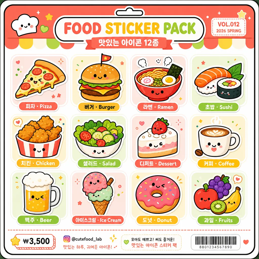
음식 플랫 일러스트 12종. 단순 카툰 결.
음식 플랫 일러스트 (단순 카툰)摘要
這是用來製作漫畫/插畫內容的 ChatGPT 圖像提示詞,已整理主題、背景、風格與構圖,方便快速調整。
相關關鍵字: 음식 플랫 일러스트 (단순 카툰), 음식 플랫 일러스트 (단순 카툰) 프롬프트, 漫畫/插畫 프롬프트, 漫畫/插畫 AI 이미지 프롬프트, ChatGPT 이미지 프롬프트, AI 이미지 생성 프롬프트, AI 프롬프트, 이미지 프롬프트
음식 플랫 일러스트 (단순 카툰)使用方式
保留原始結構並替換主體、背景、色彩或構圖,即可延伸出不同版本。
- 保留核心主體,並依品牌、季節或平台調整色彩與背景。
- 如果畫面太複雜,請減少背景元素並具體描述主體、構圖與光線。
- 複製後可要求 ChatGPT 配合平台、長寬比或文字需求調整。
提示詞原文
[Input]
- language: Korean
- output_size: 1024x1024

[Purpose]
Simple cartoon food icon sheet for social media, app UI, sticker-pack style use, and cute printed merchandise preview.
Flat illustrated food grid with bold outlines, cheerful package-like details, clear bilingual labels, and a lively retail sticker-sheet finish.

[Composition]
- Center the full composition as a 3x4 grid covering about 82–88% of the canvas, with even gutters and consistent tile size for {음식 12종}, while allowing a small header and footer area like a real sticker-pack backing card.
- Use a clean white #FFFFFF base with soft pastel accent blocks, tiny food-themed decorative marks, rounded dividers, and a light printed-paper feel so the sheet looks like finished character-goods packaging.
- Keep all 12 food items visually balanced in scale, aligned on a strict grid, and separated by cheerful rounded tile zones or subtle sticker backing shapes.
- Add rounded Korean and English labels beneath each item in the {타이포} style, with centered placement and enough breathing room so text stays legible.
- Include a small top header strip reading "FOOD STICKER PACK" and "맛있는 아이콘 12종", plus a tiny product code such as "VOL.012" and "2026 SPRING" in the corner.
- Add a compact footer area with tiny price/contact-style details like "₩3,500", "@cutefood_lab", a small barcode-style rectangle, and short decorative captions, keeping the 12 icons as the main subject.

[3. CORE STRUCTURE]
- Top-to-bottom, left-to-right grid: place one distinct food icon in each of the 12 slots, matching the simple cartoon look described by {결}.
- Each icon should be rendered with simplified geometry, thick outer contour lines, friendly facial or shine accents where appropriate, small garnish marks, and a consistent sticker-sheet finish.
- Apply the {컬러} palette across all items, keeping the base clean white while adding coordinated pastel panels, small dots, stripes, sparkles, and label ribbons that support the food theme.
- Preserve the {레이아웃} arrangement exactly, with equal spacing between rows and columns and no overlap between the 12 labeled icon tiles.
- Use the {결 추가} treatment so the entire sheet feels like a cohesive icon set rather than mixed illustration styles.
- Keep all label text crisp, centered, and readable under each icon, following the rounded, friendly look of {타이포}.
- Respect {비율} so the icons, header, footer, labels, and decorative packaging elements feel balanced on the square canvas.

[4. STYLE RULES]
- Typography: rounded Korean and English sans-serif, similar to Pretendard Rounded or Nanum Square Round, medium-to-bold weight; food labels about 22–28 px at 1024 canvas scale, header text larger and playful.
- Color palette: {컬러} with vivid coral #FF6F61, bright yellow #FFD84D, lime green #A8E063, clean white #FFFFFF base, and deep outline black #1A1A1A; add soft pastel tints derived from the palette for tile backgrounds and package accents.
- Border/shadow: bold 3–5 px black outlines around every icon, with light flat offset shadows and tiny printed sticker edges for a tactile merchandise-sheet look.
- Graphic details: include rounded corner backing-card frame, small sticker cut-line hints, tiny stars, dots, hearts, sauce marks, steam marks, and simple divider lines without disturbing the 3x4 grid.

[5. VISUAL STYLE]
- Camera / lens: orthographic illustration look, no perspective distortion, no photographic lens feel; crisp vector-style framing on a square canvas.
- Lighting: even studio-flat illumination with soft flat shadows used only as graphic accents, no dramatic shadow, and no surface glare.
- Color grade: high-saturation candy palette with clean white and pastel packaging accents, matching a cheerful UI sticker sheet and cute retail stationery design.

[6. MOOD]
Playful retail sticker sheet — Japanese character goods packaging meets Korean cafe-menu cuteness and clean flat icon design, like a finished app asset board sold as a small sticker pack.

[7. CRITICAL]
- Korean text accuracy: the labels and package text must render clearly and without broken characters.
- Every food icon must remain distinct and recognizable, with exactly 12 food items shown in the 3x4 grid.
- Composition invariants: equal spacing, centered layout, consistent icon scale, bold outline style across all 12 items.
- Verbatim Korean strings that must appear correctly: "피자", "버거", "라멘", "초밥", "치킨", "샐러드", "디저트", "커피", "맥주", "아이스크림", "도넛", "과일".
- Additional Korean package text that may appear clearly: "맛있는 아이콘 12종", "오늘의 간식", "귀여운 푸드 스티커", "₩3,500".

[8. 🚫 PROHIBITED]
- Fake official seals / certifications
- Broken Korean characters