漫畫/插畫
보태닉 일러 아트 (식물·꽃 컬렉션)
보태닉 일러 아트. 식물 컬렉션 결.
보태닉 일러 아트 (식물·꽃 컬렉션)摘要
這是用來製作漫畫/插畫內容的 ChatGPT 圖像提示詞,已整理主題、背景、風格與構圖,方便快速調整。
相關關鍵字: 보태닉 일러 아트 (식물·꽃 컬렉션), 보태닉 일러 아트 (식물·꽃 컬렉션) 프롬프트, 漫畫/插畫 프롬프트, 漫畫/插畫 AI 이미지 프롬프트, ChatGPT 이미지 프롬프트, AI 이미지 생성 프롬프트, AI 프롬프트, 이미지 프롬프트
보태닉 일러 아트 (식물·꽃 컬렉션)使用方式
保留原始結構並替換主體、背景、色彩或構圖,即可延伸出不同版本。
- 保留核心主體,並依品牌、季節或平台調整色彩與背景。
- 如果畫面太複雜,請減少背景元素並具體描述主體、構圖與光線。
- 複製後可要求 ChatGPT 配合平台、長寬比或文字需求調整。
提示詞原文
[Input]
- language: Korean
- output_size: 1024x1536

[Purpose]
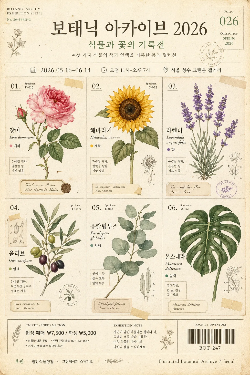
보태닉 일러스트 포스터 / 식물·꽃 컬렉션 편집 디자인. 2x3 grid or free collage layout for editorial wall art, printable poster, botanical exhibition poster, and social-media share.

[Composition]
- Overall framing: a tall 1024x1536 vertical poster with {레이아웃} as the main structure, designed like a vintage botanical art exhibition sheet with editorial poster information integrated into the artwork.
- Subject placement: six botanical illustrations distributed across the page with clear visual hierarchy; larger focal blooms near the upper-left and lower-right, smaller leaf specimens woven between labels, captions, date blocks, and decorative specimen marks.
- Background treatment: warm cream-beige paper texture with visible fibrous grain, light archival stains, faint print speckles, and subtle pressed-flower shadows that make the poster feel physically printed.
- Poster information layer: include the exhibition title “{전시명}”, date “{행사일정}”, time “{행사시간}”, venue “{장소}”, ticket line “{티켓정보}”, and a small sponsor/archive area “{후원문구}”.
- Editorial details: add specimen numbers, Latin-style plant names, Korean plant labels, page-like folio marks, a small barcode-style inventory mark, and delicate botanical diagram lines without overwhelming the six featured plants.
- Apply {결} as the underlying art direction, and keep {결_추가} influence visible through magazine-like section labels, herbarium annotations, and refined printed finishing.

[3. CORE STRUCTURE]
1. Canvas base — set an off-white cream paper field with faint natural fiber texture, lightly aged edges, tiny ink flecks, and a scanned archival herbarium-sheet feeling.
2. Primary botanical set — place {식물목록} as six distinct illustrated subjects, each with nearby Korean name, Latin-inspired caption, specimen number, and one small descriptive note such as “개화”, “향”, or “잎맥”.
3. Layout system — arrange the six pieces according to {레이아웃}: either a structured 2x3 grid with editorial gutters or a loose collage with slight rotation, overlapping stems, label stickers, thin guide lines, and herbarium tape details while keeping all six plants readable.
4. Poster title block — position “{전시명}” prominently near the upper area, with a smaller subtitle “식물과 꽃의 기록전” and the short curator note “{소개문구}”.
5. Event detail block — place “{행사일정} · {행사시간} · {장소}” in a neat information band; add “{티켓정보}” as a ticket/call-to-action line near the lower third or bottom.
6. Sponsor and archive strip — include “{후원문구}”, a small barcode-style code “BOT-{포스터번호}”, and a printed credit line “Illustrated Botanical Archive / Seoul” near the bottom edge.
7. Color handling — render all flora using {컬러} as the governing palette, with soft watercolor washes, ink outlines, muted shadowing, pressed-petal stains, and restrained vintage print contrast.
8. Typography layer — apply {타이포} as delicate label text near each plant, resembling vintage botanical specimen tags with Korean lettering, Latin serif captions, and small event typography.
9. Finishing pass — add fine rule lines, tiny decorative flower icons, specimen arrows, transparent washi-tape corners, and subtle overprint texture inspired by {결_추가}.

[4. STYLE RULES]
- Typography: use Pretendard or Noto Sans KR for Korean labels and event details, paired with a thin Latin serif such as Cormorant Garamond or Baskerville; use readable hierarchy with 18–28 px specimen labels, 34–52 px poster title, and smaller 12–16 px archive notes.
- Rendered Korean text examples in the poster: “{전시명}”, “식물과 꽃의 기록전”, “{행사일정}”, “{행사시간}”, “{장소}”, “{티켓정보}”, “{후원문구}”, “장미 Rosa”, “라벤더 Lavender”, “올리브 Olive”.
- Color palette: {컬러} should resolve into botanical greens, floral signature accents, warm cream beige, aged ink brown, and softened leaf-shadow gray; recommend tones like #EDE4D1, #7C9B74, #D98C8C, #C9B07A, #5E6F58, and #6D5A45.
- Border/shadow: use a printed poster edge, fine hairline rules, pinned-paper shadows, and soft herbarium tape overlays; shadows should feel like physical paper layers photographed in daylight.
- Decorative graphics: include tiny seed diagrams, leaf cross-section icons, dotted measuring ticks, archival catalog numbers, and small floral corner ornaments that match the botanical theme.

[5. VISUAL STYLE]
- Camera / lens: editorial flat-lay look, equivalent to a top-down 50mm lens perspective with no perspective distortion, as if photographed for a modern herbarium catalog.
- Lighting: even diffused daylight from upper-left, soft fill from right, gentle paper-layer shadows, visible watercolor pigment blooms, ink texture, and cream paper grain throughout.
- Color grade: muted natural greens, dusty petal tones, warm cream paper, slightly desaturated vintage print contrast, and a tactile museum-shop poster finish.

[6. MOOD]
Vintage botanical magazine spread meets small gallery exhibition poster — poetic, collectible, archival, and handmade, like a refined museum catalog plate printed for a spring botanical art fair.

[7. CRITICAL]
- Korean text accuracy: the rendered image must preserve clean, correct Korean lettering wherever labels, event details, and captions appear; no broken characters, no missing glyphs.
- Must visually communicate six botanical subjects in one cohesive collection page: “장미”, “해바라기”, “라벤더”, “올리브”, “유칼립투스”, “몬스테라”.
- Required visible Korean poster text: “{전시명}”, “{행사일정}”, “{행사시간}”, “{장소}”, “{티켓정보}”, “{후원문구}”.
- Labels should remain elegant and legible, with botanical illustration details, specimen numbers, and archive-style captions supporting the poster rather than hiding the plants.

[8. 🚫 PROHIBITED]
- Fake official seals / certifications
- Broken Korean characters or garbled botanical labels
- Celebrity composites / real-person likeness insertion
- AI-smooth plastic rendering that removes watercolor, ink, and paper texture