趣味・ライフスタイル
기하 패턴 아트 (도형·라인·웨이브)
기하 패턴 아트. 모던 디자인.
기하 패턴 아트 (도형·라인·웨이브)の概要
趣味・ライフスタイル画像を作るためのChatGPT画像プロンプトです。主題、背景、スタイル、構図を整理し、すぐに試せるよう構成しています。
関連キーワード: 기하 패턴 아트 (도형·라인·웨이브), 기하 패턴 아트 (도형·라인·웨이브) 프롬프트, 趣味・ライフスタイル 프롬프트, 趣味・ライフスタイル AI 이미지 프롬프트, ChatGPT 이미지 프롬프트, AI 이미지 생성 프롬프트, AI 프롬프트, 이미지 프롬프트
기하 패턴 아트 (도형·라인·웨이브)の活用方法
元の構造を保ちながら、被写体、背景、色、構図を変更して別案に展開できます。
- 主題を維持し、ブランドや季節、媒体に合わせて色と背景を変更してください。
- 結果が複雑な場合は背景要素を減らし、被写体、構図、照明を具体化してください。
- コピー後、ChatGPTに媒体、アスペクト比、文字の有無を追加で指定できます。
プロンプト原文
[Input]
- language: Korean
- output_size: {비율}

[Purpose]
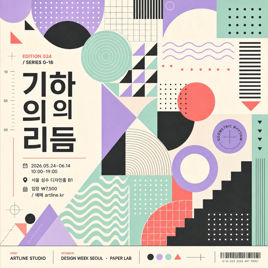
Geometric pattern art poster, abstract shape composition for modern editorial, exhibition, and wall-art use.
Full-frame square poster built from circles, triangles, grids, lines, dots, and waves with a polished contemporary graphic identity, including realistic exhibition-poster information and collectible print details.

[Composition]
- Canvas is filled edge-to-edge with {패턴} as the main subject, creating a dense and visually complete square artwork.
- Overall structure uses {레이아웃}: modular zones, diagonal rhythm, repeated shape clusters, and layered wave or grid accents that make the poster feel intentionally composed.
- Visual language follows {디자인결}, so the surface feels crisp, editorial, and print-ready rather than painterly.
- Main shapes should be arranged in a stable modular system, with repeated forms aligned cleanly across the square frame while allowing a few playful overlaps, cropped circles, and stepped line groups.
- Color treatment uses {컬러} with strong contrast control, consistent saturation, and 1–2 accent colors reserved for hierarchy.
- Add realistic poster typography: a Korean exhibition title {전시명}, edition code {에디션}, date/time line {행사정보}, venue {장소}, ticket line {티켓}, host credit {주최}, and sponsor strip {스폰서}.
- Typography should follow {타이포스타일}; text may run vertically along one side, sit inside a small label block, or align to the grid as part of the artwork.

[3. CORE STRUCTURE]
- Base field: build a full-bleed square composition that feels like a designed art poster, with graphic elements reaching the edges and key text held inside a readable poster-safe zone.
- Pattern layer: render {패턴} as the dominant visual language, mixing geometric repetition, line logic, dot matrices, modular spacing, and wave bands so the whole image reads as one cohesive system.
- Rhythm layer: vary scale and density across the canvas to create movement: large cropped circles, thin parallel lines, checkerboard micro-grids, triangular markers, dotted constellations, and wave ribbons.
- Color layer: apply {컬러} as a refined palette with one dominant background tone, one strong structural color, and one bright accent for title or wayfinding labels.
- Information layer: include {전시명} as the main Korean title, {에디션} as a collectible art-print mark, and compact lines for {행사정보}, {장소}, and {티켓}.
- Sponsor / credit layer: place {주최} and {스폰서} in a small footer or side rail, separated by fine divider rules, small dots, or geometric icons.
- Style reference layer: emphasize {디자인결} influence in the geometry, using clean circles, grid logic, disciplined spacing, and bold modernist proportions.
- Final finish: keep edges crisp, surfaces smooth, ink-like, and print-flat, with subtle paper grain or risograph-like registration texture only if it supports a believable poster print.

[4. STYLE RULES]
- Typography: use Pretendard, Noto Sans KR, or a clean geometric sans-serif; mix bold title text with regular-weight information lines, approximately 10–48px equivalent depending on hierarchy.
- Korean title treatment: {전시명} should be highly legible, set horizontally or vertically with correct spacing and natural Korean typography.
- Color palette: use the exact feel of {컬러}, such as pastel lavender, mint, blush, sky blue, charcoal, gold, coral, cyan, cream, or warm gray; keep saturation controlled and avoid muddy blends.
- Decorative graphics: include small registration marks, numbered ticks, micro arrows, circular labels, thin divider lines, or wave badges that belong naturally to an art poster.
- Border/shadow: if separation is needed, use fine graphic rules, inset label panels, or gentle 6–10% shadow on text panels while maintaining a flat poster impression.

[5. VISUAL STYLE]
- Camera / lens: simulated flat graphic artwork, top-down poster layout, no perspective distortion, no photographic depth of field.
- Lighting: even studio-like illumination with print-flat clarity and clean color separation.
- Color grade: modern graphic palette with crisp contrast, soft pastel balance, or bold Bauhaus-style primary accents depending on {컬러}.
- Rendering: vector-clean edges, sharp typography, believable screen-print or fine paper texture, precise alignment, and square 1024x1024 composition.

[6. MOOD]
{분위기} — a contemporary Korean design-festival poster, Bauhaus and Material Design inspired, like a collectible museum shop print with real exhibition details and lively abstract motion.

[7. CRITICAL]
- Korean text accuracy: 한글 정확.
- Visible Korean text must be clean and readable, especially “{전시명}”, “{행사정보}”, “{장소}”, “{티켓}”, “{주최}”.
- Suggested rendered copy may include: “기하의 리듬”, “2026.05.24–06.14”, “서울 성수 디자인홀 B1”, “입장 ₩7,500”, “EDITION 024”.
- Keep the composition fully geometric and abstract; text and decorative marks are allowed as poster design elements, but do not introduce figurative imagery.

[8. 🚫 PROHIBITED]
- Fake official seals / certifications
- Broken Korean characters
- People, faces, hands, animals, or any figurative subject
- Photographic realism, 3D mockup styling, or glossy AI-smoothed surfaces