취미/라이프
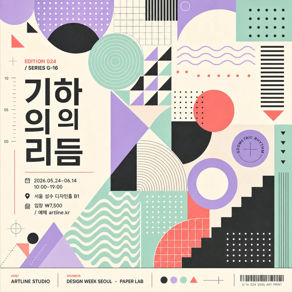
기하 패턴 아트 (도형·라인·웨이브)
기하 패턴 아트. 모던 디자인.
기하 패턴 아트 (도형·라인·웨이브) 검색 요약
기하 패턴 아트 (도형·라인·웨이브)은 취미/라이프 결과물을 만들 때 바로 복사해 활용할 수 있는 ChatGPT 이미지 프롬프트입니다. 주제, 배경, 스타일, 구도 조건을 함께 담아 빠르게 시안을 만들 수 있도록 구성했습니다.
관련 키워드: 기하 패턴 아트 (도형·라인·웨이브), 기하 패턴 아트 (도형·라인·웨이브) 프롬프트, 취미/라이프 프롬프트, 취미/라이프 AI 이미지 프롬프트, ChatGPT 이미지 프롬프트, AI 이미지 생성 프롬프트, AI 프롬프트, 이미지 프롬프트
기하 패턴 아트 (도형·라인·웨이브) 활용 포인트
원본 구조를 유지하면서 피사체, 배경, 색감, 구도를 바꿔 다양한 시안으로 확장할 수 있습니다.
- 핵심 소재는 유지하고 브랜드, 계절, 채널 목적에 맞는 색감과 배경을 바꿔보세요.
- 결과가 산만하면 배경 요소를 줄이고 피사체, 구도, 조명 조건을 구체화하세요.
- 복사한 뒤 ChatGPT에서 플랫폼, 화면 비율, 텍스트 포함 여부를 추가로 요청할 수 있습니다.
프롬프트 원문
[Input]
- language: Korean
- output_size: {비율}

[Purpose]
Geometric pattern art poster, abstract shape composition for modern editorial, exhibition, and wall-art use.
Full-frame square poster built from circles, triangles, grids, lines, dots, and waves with a polished contemporary graphic identity, including realistic exhibition-poster information and collectible print details.

[Composition]
- Canvas is filled edge-to-edge with {패턴} as the main subject, creating a dense and visually complete square artwork.
- Overall structure uses {레이아웃}: modular zones, diagonal rhythm, repeated shape clusters, and layered wave or grid accents that make the poster feel intentionally composed.
- Visual language follows {디자인결}, so the surface feels crisp, editorial, and print-ready rather than painterly.
- Main shapes should be arranged in a stable modular system, with repeated forms aligned cleanly across the square frame while allowing a few playful overlaps, cropped circles, and stepped line groups.
- Color treatment uses {컬러} with strong contrast control, consistent saturation, and 1–2 accent colors reserved for hierarchy.
- Add realistic poster typography: a Korean exhibition title {전시명}, edition code {에디션}, date/time line {행사정보}, venue {장소}, ticket line {티켓}, host credit {주최}, and sponsor strip {스폰서}.
- Typography should follow {타이포스타일}; text may run vertically along one side, sit inside a small label block, or align to the grid as part of the artwork.

[3. CORE STRUCTURE]
- Base field: build a full-bleed square composition that feels like a designed art poster, with graphic elements reaching the edges and key text held inside a readable poster-safe zone.
- Pattern layer: render {패턴} as the dominant visual language, mixing geometric repetition, line logic, dot matrices, modular spacing, and wave bands so the whole image reads as one cohesive system.
- Rhythm layer: vary scale and density across the canvas to create movement: large cropped circles, thin parallel lines, checkerboard micro-grids, triangular markers, dotted constellations, and wave ribbons.
- Color layer: apply {컬러} as a refined palette with one dominant background tone, one strong structural color, and one bright accent for title or wayfinding labels.
- Information layer: include {전시명} as the main Korean title, {에디션} as a collectible art-print mark, and compact lines for {행사정보}, {장소}, and {티켓}.
- Sponsor / credit layer: place {주최} and {스폰서} in a small footer or side rail, separated by fine divider rules, small dots, or geometric icons.
- Style reference layer: emphasize {디자인결} influence in the geometry, using clean circles, grid logic, disciplined spacing, and bold modernist proportions.
- Final finish: keep edges crisp, surfaces smooth, ink-like, and print-flat, with subtle paper grain or risograph-like registration texture only if it supports a believable poster print.

[4. STYLE RULES]
- Typography: use Pretendard, Noto Sans KR, or a clean geometric sans-serif; mix bold title text with regular-weight information lines, approximately 10–48px equivalent depending on hierarchy.
- Korean title treatment: {전시명} should be highly legible, set horizontally or vertically with correct spacing and natural Korean typography.
- Color palette: use the exact feel of {컬러}, such as pastel lavender, mint, blush, sky blue, charcoal, gold, coral, cyan, cream, or warm gray; keep saturation controlled and avoid muddy blends.
- Decorative graphics: include small registration marks, numbered ticks, micro arrows, circular labels, thin divider lines, or wave badges that belong naturally to an art poster.
- Border/shadow: if separation is needed, use fine graphic rules, inset label panels, or gentle 6–10% shadow on text panels while maintaining a flat poster impression.

[5. VISUAL STYLE]
- Camera / lens: simulated flat graphic artwork, top-down poster layout, no perspective distortion, no photographic depth of field.
- Lighting: even studio-like illumination with print-flat clarity and clean color separation.
- Color grade: modern graphic palette with crisp contrast, soft pastel balance, or bold Bauhaus-style primary accents depending on {컬러}.
- Rendering: vector-clean edges, sharp typography, believable screen-print or fine paper texture, precise alignment, and square 1024x1024 composition.

[6. MOOD]
{분위기} — a contemporary Korean design-festival poster, Bauhaus and Material Design inspired, like a collectible museum shop print with real exhibition details and lively abstract motion.

[7. CRITICAL]
- Korean text accuracy: 한글 정확.
- Visible Korean text must be clean and readable, especially “{전시명}”, “{행사정보}”, “{장소}”, “{티켓}”, “{주최}”.
- Suggested rendered copy may include: “기하의 리듬”, “2026.05.24–06.14”, “서울 성수 디자인홀 B1”, “입장 ₩7,500”, “EDITION 024”.
- Keep the composition fully geometric and abstract; text and decorative marks are allowed as poster design elements, but do not introduce figurative imagery.

[8. 🚫 PROHIBITED]
- Fake official seals / certifications
- Broken Korean characters
- People, faces, hands, animals, or any figurative subject
- Photographic realism, 3D mockup styling, or glossy AI-smoothed surfaces