취미/라이프
한국 전통 패턴 (단청·태극·꽃문양)
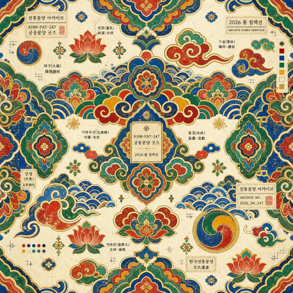
한국 전통 패턴 시트. 단청·태극·꽃문양.
한국 전통 패턴 (단청·태극·꽃문양) 검색 요약
한국 전통 패턴 (단청·태극·꽃문양)은 취미/라이프 결과물을 만들 때 바로 복사해 활용할 수 있는 ChatGPT 이미지 프롬프트입니다. 주제, 배경, 스타일, 구도 조건을 함께 담아 빠르게 시안을 만들 수 있도록 구성했습니다.
관련 키워드: 한국 전통 패턴 (단청·태극·꽃문양), 한국 전통 패턴 (단청·태극·꽃문양) 프롬프트, 취미/라이프 프롬프트, 취미/라이프 AI 이미지 프롬프트, ChatGPT 이미지 프롬프트, AI 이미지 생성 프롬프트, AI 프롬프트, 이미지 프롬프트
한국 전통 패턴 (단청·태극·꽃문양) 활용 포인트
원본 구조를 유지하면서 피사체, 배경, 색감, 구도를 바꿔 다양한 시안으로 확장할 수 있습니다.
- 핵심 소재는 유지하고 브랜드, 계절, 채널 목적에 맞는 색감과 배경을 바꿔보세요.
- 결과가 산만하면 배경 요소를 줄이고 피사체, 구도, 조명 조건을 구체화하세요.
- 복사한 뒤 ChatGPT에서 플랫폼, 화면 비율, 텍스트 포함 여부를 추가로 요청할 수 있습니다.
프롬프트 원문
[Input]
- language: Korean
- output_size: 1024x1024

[Purpose]
Korean traditional pattern design, museum-goods style decorative square graphic.
Suitable for cultural product packaging, poster backgrounds, editorial ornament panels, stationery wraps, textile swatches, and cultural souvenir label systems.

[Composition]
- Square full-bleed ornamental pattern field filling the entire 1024x1024 canvas as a premium Korean heritage graphic.
- Repeating traditional motif system built from {패턴}, arranged as a dense, rhythmic, readable decorative surface.
- Texture layer should feel like {질감}, with visible hanji fiber grain, light ink absorption, and tactile printed-paper warmth.
- Layout should stay {레이아웃}, maintaining balanced symmetry, diagonal rhythm, and carefully varied motif scale across the whole frame.
- Add small museum-goods catalogue details using {타이포}: tiny motif labels, product code, season mark, and archive-style annotations integrated between pattern clusters.
- Include realistic printed souvenir information such as {라벨문구}, {굿즈정보}, and {시즌} as subtle decorative microtext, not as a dominant headline.

[3. CORE STRUCTURE]
- Base field: establish a seamless all-over decorative surface that reads like a refined traditional textile, hanji wrapping paper, or museum souvenir packaging sheet.
- Main motifs: distribute {패턴} evenly across the canvas, mixing larger emblem-like dancheong and taegeuk forms with smaller flower, cloud, wave, roof-tile, and bead-like filler shapes.
- Secondary ornament: add fine linework, small rosette repeats, corner-like motif fragments, and soft gold-ink accents so the surface feels crafted rather than flat.
- Texture layer: overlay subtle hanji paper grain, matte ink absorption, faint block-print irregularity, and slight pigment pooling along motif edges, echoing {질감} without reducing clarity.
- Color blocking: apply {컬러} with strong contrast, clean motif separation, and traditional layered color relationships inspired by palace dancheong painting.
- Label accents: insert tiny {타이포} elements such as “{라벨문구}”, “{굿즈정보}”, and “{시즌}” near motif seams, between repeat clusters, or inside small cartouche shapes.
- Print details: include tasteful miniature crop marks, registration dots, swatch chips, archive numbers, and woven-tag inspired rectangles that look like part of a real museum shop pattern sheet.
- Finish: integrate a premium souvenir-poster polish with crisp edges, controlled repetition, tactile paper character, and print-friendly clarity for {비율} output.

[4. STYLE RULES]
- Typography: Noto Sans KR or Pretendard, medium weight, 12–18px equivalent, compact and museum-label-like for {타이포}; Hanja may appear as tiny decorative annotation when clean and legible.
- Color palette: use the traditional dancheong-inspired mix from {컬러}, with saturated red, deep blue, warm yellow, jade green, off-white, and restrained gold accents.
- Pattern rhythm: combine mirrored symmetry, tiled repetition, and hand-painted imperfections so the design feels like contemporary museum merchandise based on historical Korean ornament.
- Graphic finish: clean vector-like motif boundaries with subtle paper tooth, printed ink density variation, and a refined archive-scan polish.
- Edge treatment: allow the pattern to continue beyond the canvas edges, with occasional small tag panels or motif fragments clipped naturally by the square format.

[5. VISUAL STYLE]
- Camera / lens: front-facing flat graphic composition, equivalent to a perfectly aligned top-down print scan, no perspective distortion.
- Lighting: even diffuse studio illumination with zero harsh directionality, as if lit by a museum archive lightbox.
- Color grade: vivid dancheong palette with slightly muted paper whites, balanced for screen and print reproduction.
- Material rendering: matte hanji, lightly raised ink, soft pigment texture, and tiny fiber speckles visible at close inspection.

[6. MOOD]
Premium Korean heritage graphic — museum gift shop pattern sheet meets contemporary cultural editorial design, warm, ceremonial, tactile, and collectible.

[7. CRITICAL]
- Korean text accuracy: visible microtext must render cleanly, for example “전통문양 아카이브”, “단청 색채 연구”, “궁중문양 굿즈”, “VOL.247”, “2026 봄 컬렉션”, without broken characters.
- All motifs must feel authentically Korean in spirit: dancheong, taegeuk, flower patterns, clouds, waves, roof-tile curves, lotus details, and palace ornament references should remain coherent.
- The composition must stay a seamless all-over traditional pattern sheet, with catalogue labels and product marks supporting the pattern rather than becoming the main subject.
- Printed details such as product code, season label, swatch chips, and archive annotations should look like real museum merchandise design elements.

[8. 🚫 PROHIBITED]
- Fake official seals / certifications
- Broken Korean or Hanja characters
- Celebrity composites or real-person likeness misuse