興趣/生活
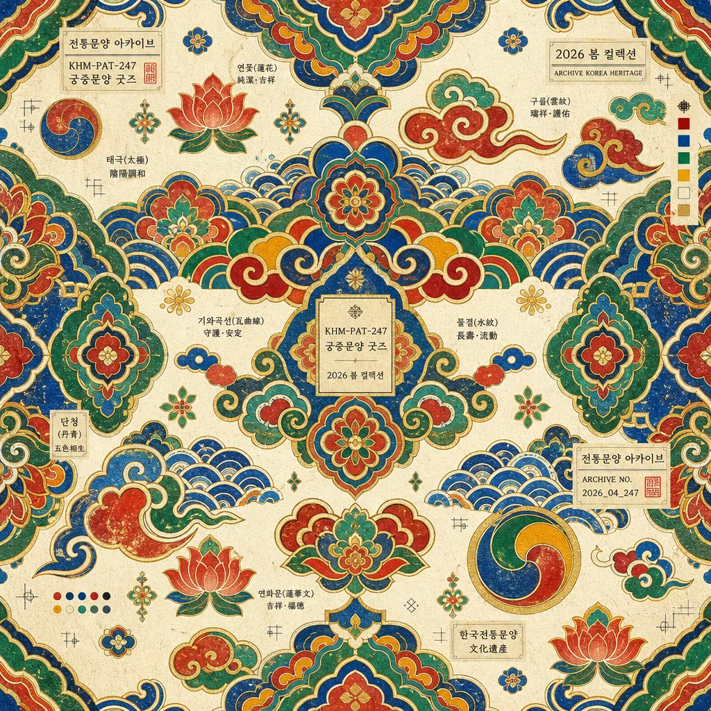
한국 전통 패턴 (단청·태극·꽃문양)
한국 전통 패턴 시트. 단청·태극·꽃문양.
한국 전통 패턴 (단청·태극·꽃문양)摘要
這是用來製作興趣/生活內容的 ChatGPT 圖像提示詞,已整理主題、背景、風格與構圖,方便快速調整。
相關關鍵字: 한국 전통 패턴 (단청·태극·꽃문양), 한국 전통 패턴 (단청·태극·꽃문양) 프롬프트, 興趣/生活 프롬프트, 興趣/生活 AI 이미지 프롬프트, ChatGPT 이미지 프롬프트, AI 이미지 생성 프롬프트, AI 프롬프트, 이미지 프롬프트
한국 전통 패턴 (단청·태극·꽃문양)使用方式
保留原始結構並替換主體、背景、色彩或構圖,即可延伸出不同版本。
- 保留核心主體,並依品牌、季節或平台調整色彩與背景。
- 如果畫面太複雜,請減少背景元素並具體描述主體、構圖與光線。
- 複製後可要求 ChatGPT 配合平台、長寬比或文字需求調整。
提示詞原文
[Input]
- language: Korean
- output_size: 1024x1024

[Purpose]
Korean traditional pattern design, museum-goods style decorative square graphic.
Suitable for cultural product packaging, poster backgrounds, editorial ornament panels, stationery wraps, textile swatches, and cultural souvenir label systems.

[Composition]
- Square full-bleed ornamental pattern field filling the entire 1024x1024 canvas as a premium Korean heritage graphic.
- Repeating traditional motif system built from {패턴}, arranged as a dense, rhythmic, readable decorative surface.
- Texture layer should feel like {질감}, with visible hanji fiber grain, light ink absorption, and tactile printed-paper warmth.
- Layout should stay {레이아웃}, maintaining balanced symmetry, diagonal rhythm, and carefully varied motif scale across the whole frame.
- Add small museum-goods catalogue details using {타이포}: tiny motif labels, product code, season mark, and archive-style annotations integrated between pattern clusters.
- Include realistic printed souvenir information such as {라벨문구}, {굿즈정보}, and {시즌} as subtle decorative microtext, not as a dominant headline.

[3. CORE STRUCTURE]
- Base field: establish a seamless all-over decorative surface that reads like a refined traditional textile, hanji wrapping paper, or museum souvenir packaging sheet.
- Main motifs: distribute {패턴} evenly across the canvas, mixing larger emblem-like dancheong and taegeuk forms with smaller flower, cloud, wave, roof-tile, and bead-like filler shapes.
- Secondary ornament: add fine linework, small rosette repeats, corner-like motif fragments, and soft gold-ink accents so the surface feels crafted rather than flat.
- Texture layer: overlay subtle hanji paper grain, matte ink absorption, faint block-print irregularity, and slight pigment pooling along motif edges, echoing {질감} without reducing clarity.
- Color blocking: apply {컬러} with strong contrast, clean motif separation, and traditional layered color relationships inspired by palace dancheong painting.
- Label accents: insert tiny {타이포} elements such as “{라벨문구}”, “{굿즈정보}”, and “{시즌}” near motif seams, between repeat clusters, or inside small cartouche shapes.
- Print details: include tasteful miniature crop marks, registration dots, swatch chips, archive numbers, and woven-tag inspired rectangles that look like part of a real museum shop pattern sheet.
- Finish: integrate a premium souvenir-poster polish with crisp edges, controlled repetition, tactile paper character, and print-friendly clarity for {비율} output.

[4. STYLE RULES]
- Typography: Noto Sans KR or Pretendard, medium weight, 12–18px equivalent, compact and museum-label-like for {타이포}; Hanja may appear as tiny decorative annotation when clean and legible.
- Color palette: use the traditional dancheong-inspired mix from {컬러}, with saturated red, deep blue, warm yellow, jade green, off-white, and restrained gold accents.
- Pattern rhythm: combine mirrored symmetry, tiled repetition, and hand-painted imperfections so the design feels like contemporary museum merchandise based on historical Korean ornament.
- Graphic finish: clean vector-like motif boundaries with subtle paper tooth, printed ink density variation, and a refined archive-scan polish.
- Edge treatment: allow the pattern to continue beyond the canvas edges, with occasional small tag panels or motif fragments clipped naturally by the square format.

[5. VISUAL STYLE]
- Camera / lens: front-facing flat graphic composition, equivalent to a perfectly aligned top-down print scan, no perspective distortion.
- Lighting: even diffuse studio illumination with zero harsh directionality, as if lit by a museum archive lightbox.
- Color grade: vivid dancheong palette with slightly muted paper whites, balanced for screen and print reproduction.
- Material rendering: matte hanji, lightly raised ink, soft pigment texture, and tiny fiber speckles visible at close inspection.

[6. MOOD]
Premium Korean heritage graphic — museum gift shop pattern sheet meets contemporary cultural editorial design, warm, ceremonial, tactile, and collectible.

[7. CRITICAL]
- Korean text accuracy: visible microtext must render cleanly, for example “전통문양 아카이브”, “단청 색채 연구”, “궁중문양 굿즈”, “VOL.247”, “2026 봄 컬렉션”, without broken characters.
- All motifs must feel authentically Korean in spirit: dancheong, taegeuk, flower patterns, clouds, waves, roof-tile curves, lotus details, and palace ornament references should remain coherent.
- The composition must stay a seamless all-over traditional pattern sheet, with catalogue labels and product marks supporting the pattern rather than becoming the main subject.
- Printed details such as product code, season label, swatch chips, and archive annotations should look like real museum merchandise design elements.

[8. 🚫 PROHIBITED]
- Fake official seals / certifications
- Broken Korean or Hanja characters
- Celebrity composites or real-person likeness misuse