広告・ポスター
Zara Home 럭셔리 인테리어 광고
Zara Home 톤 — 럭셔리 미니멀 + 자연 소재
Zara Home 럭셔리 인테리어 광고の概要
広告・ポスター画像を作るためのChatGPT画像プロンプトです。主題、背景、スタイル、構図を整理し、すぐに試せるよう構成しています。
関連キーワード: Zara Home 럭셔리 인테리어 광고, Zara Home 럭셔리 인테리어 광고 프롬프트, 広告・ポスター 프롬프트, 広告・ポスター AI 이미지 프롬프트, ChatGPT 이미지 프롬프트, AI 이미지 생성 프롬프트, AI 프롬프트, 이미지 프롬프트
Zara Home 럭셔리 인테리어 광고の活用方法
元の構造を保ちながら、被写体、背景、色、構図を変更して別案に展開できます。
- 主題を維持し、ブランドや季節、媒体に合わせて色と背景を変更してください。
- 結果が複雑な場合は背景要素を減らし、被写体、構図、照明を具体化してください。
- コピー後、ChatGPTに媒体、アスペクト比、文字の有無を追加で指定できます。
プロンプト原文
[Input]
- language: Korean
- output_size: 1024x1536

[Purpose]
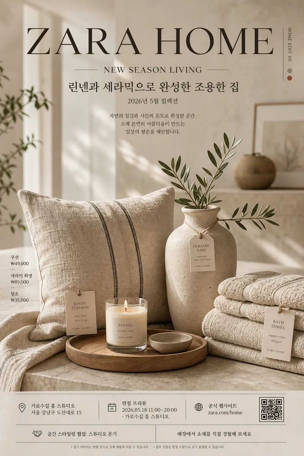
Luxury interior advertising poster in the Zara Home style, designed as an editorial product-led brand image for social media, boutique display, and print-like campaign use. Focus on a refined home-lifestyle composition with premium catalog polish, realistic product information, and believable retail poster details.

[Composition]
- Main subject: a large still-life hero arrangement of {제품·소재} occupying the lower 62% of the frame, with the visual anchor slightly below center for a balanced luxury advertising spread feel.
- Brand tone: express {브랜드 톤} through refined spacing, soft contrast, tactile surfaces, and curated home styling.
- Signature texture: build the scene around {시그니처 결} with visible linen weave, matte ceramic pores, pale wood grain, wax texture, folded fabric edges, and small paper product tags.
- Background treatment: shallow-focus interior backdrop with blurred architectural lines, soft window glow, a warm neutral wall, a stone tabletop, and gentle bokeh that feels like a premium home showroom set.
- Poster information layer: place the masthead “ZARA HOME” at the top, followed by “NEW SEASON LIVING”, {한글 부제}, {시즌·날짜}, and a small campaign note so the poster reads as a real seasonal interior advertisement.
- Retail detail layer: integrate {가격 정보}, {스토어 정보}, {웹사이트}, {행사 정보}, {스폰서 문구}, and {하단 CTA} as small refined footer text, product tag text, or side-label information.
- Framing: vertical 1024x1536 poster layout with an elegant upper title band, a detailed product scene in the lower field, and a footer area containing store, event, and contact information.
- Text placement: keep the main typography aligned with the product geometry, using thin divider lines, small material labels, and a discreet square QR-style mark near the footer.

[3. CORE STRUCTURE]
1. Background plane — Create a softly lit neutral interior base in beige, warm stone, or off-white, with subtle wall plaster texture, a stone or pale wood surface, and blurred showroom depth.
2. Hero still life — Place {제품·소재} as a refined layered composition, mixing one dominant object with several supporting pieces, folded linens, stacked towels, a ceramic vessel, a candle, and a small product card.
3. Material contrast — Emphasize the contrast between linen softness, ceramic matte surfaces, wax translucency, and wood warmth, with realistic fibers, edges, creases, grain, and contact shadows.
4. Light shaping — Use {무드·라이팅} so the edges of the objects fall into soft shadow while the highlights remain gentle, premium, and photographic rather than glossy.
5. Main copy block — Set “ZARA HOME” large in the upper area, “NEW SEASON LIVING” beneath it, then {한글 부제} and {시즌·날짜} in smaller Korean editorial type.
6. Information block — Add a believable poster footer: {행사 정보}, {스토어 정보}, {웹사이트}, {가격 정보}, and {스폰서 문구}, separated by fine hairline rules and small typographic dividers.
7. Decorative graphics — Add subtle catalog-style accents such as thin vertical rules, tiny material swatch labels, a small page-code like “HOME EDIT 05”, and a discreet QR-style square, all integrated into the luxury layout.
8. Layout balance — Keep {레이아웃} with the background blur strongest behind the upper copy and the clearest focus on the central product grouping.
9. Color discipline — Apply {컬러 팔레트} consistently across products, textiles, wall tones, tabletop, paper tags, and accent objects so the whole poster reads as one coherent luxury palette.
10. Final polish — Ensure the entire image feels like a high-end lifestyle catalog advertisement: carefully styled, tactile, commercially believable, and ready for a seasonal home collection campaign.

[4. STYLE RULES]
- Typography: use Pretendard or Noto Sans KR for Korean, paired with a clean modern sans-serif for English; masthead weight 700–800, subtitle weight 300–400, footer weight 300–500, headline size large with wide tracking.
- Color palette: {컬러 팔레트}, with muted beige foundations, charcoal anchor notes, warm cream paper labels, and one controlled accent such as terracotta or sage.
- Layout system: editorial grid with a top masthead, centered product hero, left or right micro-labels, and a bottom information strip containing date, venue, store, price, and web details.
- Graphic details: include fine divider lines, small catalog numbers, material tags, a discreet QR-style mark, and soft natural drop shadows under objects, about 4px y-offset, 14px blur, 18% opacity, plus subtle ambient occlusion at contact points.
- Copy hierarchy: “ZARA HOME” must feel like the primary brand mark; “NEW SEASON LIVING” and {한글 부제} should feel editorial; store, price, and event information should be readable but secondary.

[5. VISUAL STYLE]
- Camera / lens: full-frame editorial product photography look, 50mm lens at f/2.8 for gentle depth separation, or 85mm f/4 for a tighter luxury catalog perspective.
- Lighting: soft natural side light from upper-left at roughly 45°, with mild bounce fill from the right and diffuse falloff across the background.
- Color grade: warm cream, beige, charcoal, and muted sage/terracotta grading with low saturation, slightly lifted blacks, and a polished magazine finish.
- Surface realism: show linen fibers, ceramic pores, wood grain, candle wax edges, paper tag texture, folded towel thickness, and delicate shadows where objects overlap.

[6. MOOD]
Premium interior editorial — like a Zara Home / Kinfolk / The Gentlewoman home spread with calm luxury, tactile material emphasis, seasonal retail storytelling, and quiet boutique sophistication.

[7. CRITICAL]
- Korean text accuracy: the rendered image must preserve these strings exactly as written: “ZARA HOME”, “NEW SEASON LIVING”, “린넨과 세라믹으로 완성한 조용한 집”, “2026년 5월 컬렉션”, “런칭 프리뷰 2026.05.18 11:00–20:00”, “zara.com/home”.
- Composition invariant: keep a large hero still life with soft bokeh background, an upper brand-and-collection title area, and a believable lower poster footer with store, price, event, sponsor, and contact information.
- Visual fidelity: maintain natural material texture, refined home styling, premium catalog lighting, and a calm high-end retail advertisement feel.
- Realism requirement: all printed elements should look physically plausible on a luxury poster or catalog ad, with legible Korean microcopy, stable alignment, and no warped typography.

[8. 🚫 PROHIBITED]
- Fake official seals / certifications / government-like endorsement marks
- Broken Korean characters or unreadable Hangul
- Celebrity composites or recognizable public-figure likenesses