廣告/海報
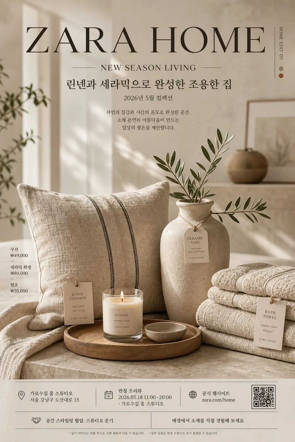
Zara Home 럭셔리 인테리어 광고
Zara Home 톤 — 럭셔리 미니멀 + 자연 소재
Zara Home 럭셔리 인테리어 광고摘要
這是用來製作廣告/海報內容的 ChatGPT 圖像提示詞,已整理主題、背景、風格與構圖,方便快速調整。
相關關鍵字: Zara Home 럭셔리 인테리어 광고, Zara Home 럭셔리 인테리어 광고 프롬프트, 廣告/海報 프롬프트, 廣告/海報 AI 이미지 프롬프트, ChatGPT 이미지 프롬프트, AI 이미지 생성 프롬프트, AI 프롬프트, 이미지 프롬프트
Zara Home 럭셔리 인테리어 광고使用方式
保留原始結構並替換主體、背景、色彩或構圖,即可延伸出不同版本。
- 保留核心主體,並依品牌、季節或平台調整色彩與背景。
- 如果畫面太複雜,請減少背景元素並具體描述主體、構圖與光線。
- 複製後可要求 ChatGPT 配合平台、長寬比或文字需求調整。
提示詞原文
[Input]
- language: Korean
- output_size: 1024x1536

[Purpose]
Luxury interior advertising poster in the Zara Home style, designed as an editorial product-led brand image for social media, boutique display, and print-like campaign use. Focus on a refined home-lifestyle composition with premium catalog polish, realistic product information, and believable retail poster details.

[Composition]
- Main subject: a large still-life hero arrangement of {제품·소재} occupying the lower 62% of the frame, with the visual anchor slightly below center for a balanced luxury advertising spread feel.
- Brand tone: express {브랜드 톤} through refined spacing, soft contrast, tactile surfaces, and curated home styling.
- Signature texture: build the scene around {시그니처 결} with visible linen weave, matte ceramic pores, pale wood grain, wax texture, folded fabric edges, and small paper product tags.
- Background treatment: shallow-focus interior backdrop with blurred architectural lines, soft window glow, a warm neutral wall, a stone tabletop, and gentle bokeh that feels like a premium home showroom set.
- Poster information layer: place the masthead “ZARA HOME” at the top, followed by “NEW SEASON LIVING”, {한글 부제}, {시즌·날짜}, and a small campaign note so the poster reads as a real seasonal interior advertisement.
- Retail detail layer: integrate {가격 정보}, {스토어 정보}, {웹사이트}, {행사 정보}, {스폰서 문구}, and {하단 CTA} as small refined footer text, product tag text, or side-label information.
- Framing: vertical 1024x1536 poster layout with an elegant upper title band, a detailed product scene in the lower field, and a footer area containing store, event, and contact information.
- Text placement: keep the main typography aligned with the product geometry, using thin divider lines, small material labels, and a discreet square QR-style mark near the footer.

[3. CORE STRUCTURE]
1. Background plane — Create a softly lit neutral interior base in beige, warm stone, or off-white, with subtle wall plaster texture, a stone or pale wood surface, and blurred showroom depth.
2. Hero still life — Place {제품·소재} as a refined layered composition, mixing one dominant object with several supporting pieces, folded linens, stacked towels, a ceramic vessel, a candle, and a small product card.
3. Material contrast — Emphasize the contrast between linen softness, ceramic matte surfaces, wax translucency, and wood warmth, with realistic fibers, edges, creases, grain, and contact shadows.
4. Light shaping — Use {무드·라이팅} so the edges of the objects fall into soft shadow while the highlights remain gentle, premium, and photographic rather than glossy.
5. Main copy block — Set “ZARA HOME” large in the upper area, “NEW SEASON LIVING” beneath it, then {한글 부제} and {시즌·날짜} in smaller Korean editorial type.
6. Information block — Add a believable poster footer: {행사 정보}, {스토어 정보}, {웹사이트}, {가격 정보}, and {스폰서 문구}, separated by fine hairline rules and small typographic dividers.
7. Decorative graphics — Add subtle catalog-style accents such as thin vertical rules, tiny material swatch labels, a small page-code like “HOME EDIT 05”, and a discreet QR-style square, all integrated into the luxury layout.
8. Layout balance — Keep {레이아웃} with the background blur strongest behind the upper copy and the clearest focus on the central product grouping.
9. Color discipline — Apply {컬러 팔레트} consistently across products, textiles, wall tones, tabletop, paper tags, and accent objects so the whole poster reads as one coherent luxury palette.
10. Final polish — Ensure the entire image feels like a high-end lifestyle catalog advertisement: carefully styled, tactile, commercially believable, and ready for a seasonal home collection campaign.

[4. STYLE RULES]
- Typography: use Pretendard or Noto Sans KR for Korean, paired with a clean modern sans-serif for English; masthead weight 700–800, subtitle weight 300–400, footer weight 300–500, headline size large with wide tracking.
- Color palette: {컬러 팔레트}, with muted beige foundations, charcoal anchor notes, warm cream paper labels, and one controlled accent such as terracotta or sage.
- Layout system: editorial grid with a top masthead, centered product hero, left or right micro-labels, and a bottom information strip containing date, venue, store, price, and web details.
- Graphic details: include fine divider lines, small catalog numbers, material tags, a discreet QR-style mark, and soft natural drop shadows under objects, about 4px y-offset, 14px blur, 18% opacity, plus subtle ambient occlusion at contact points.
- Copy hierarchy: “ZARA HOME” must feel like the primary brand mark; “NEW SEASON LIVING” and {한글 부제} should feel editorial; store, price, and event information should be readable but secondary.

[5. VISUAL STYLE]
- Camera / lens: full-frame editorial product photography look, 50mm lens at f/2.8 for gentle depth separation, or 85mm f/4 for a tighter luxury catalog perspective.
- Lighting: soft natural side light from upper-left at roughly 45°, with mild bounce fill from the right and diffuse falloff across the background.
- Color grade: warm cream, beige, charcoal, and muted sage/terracotta grading with low saturation, slightly lifted blacks, and a polished magazine finish.
- Surface realism: show linen fibers, ceramic pores, wood grain, candle wax edges, paper tag texture, folded towel thickness, and delicate shadows where objects overlap.

[6. MOOD]
Premium interior editorial — like a Zara Home / Kinfolk / The Gentlewoman home spread with calm luxury, tactile material emphasis, seasonal retail storytelling, and quiet boutique sophistication.

[7. CRITICAL]
- Korean text accuracy: the rendered image must preserve these strings exactly as written: “ZARA HOME”, “NEW SEASON LIVING”, “린넨과 세라믹으로 완성한 조용한 집”, “2026년 5월 컬렉션”, “런칭 프리뷰 2026.05.18 11:00–20:00”, “zara.com/home”.
- Composition invariant: keep a large hero still life with soft bokeh background, an upper brand-and-collection title area, and a believable lower poster footer with store, price, event, sponsor, and contact information.
- Visual fidelity: maintain natural material texture, refined home styling, premium catalog lighting, and a calm high-end retail advertisement feel.
- Realism requirement: all printed elements should look physically plausible on a luxury poster or catalog ad, with legible Korean microcopy, stable alignment, and no warped typography.

[8. 🚫 PROHIBITED]
- Fake official seals / certifications / government-like endorsement marks
- Broken Korean characters or unreadable Hangul
- Celebrity composites or recognizable public-figure likenesses