광고/포스터
롯데마트·롯데슈퍼 광고
롯데마트 톤 — 한국 대형 마트 결
롯데마트·롯데슈퍼 광고 검색 요약
롯데마트·롯데슈퍼 광고은 광고/포스터 결과물을 만들 때 바로 복사해 활용할 수 있는 ChatGPT 이미지 프롬프트입니다. 주제, 배경, 스타일, 구도 조건을 함께 담아 빠르게 시안을 만들 수 있도록 구성했습니다.
관련 키워드: 롯데마트·롯데슈퍼 광고, 롯데마트·롯데슈퍼 광고 프롬프트, 광고/포스터 프롬프트, 광고/포스터 AI 이미지 프롬프트, ChatGPT 이미지 프롬프트, AI 이미지 생성 프롬프트, AI 프롬프트, 이미지 프롬프트
롯데마트·롯데슈퍼 광고 활용 포인트
원본 구조를 유지하면서 피사체, 배경, 색감, 구도를 바꿔 다양한 시안으로 확장할 수 있습니다.
- 핵심 소재는 유지하고 브랜드, 계절, 채널 목적에 맞는 색감과 배경을 바꿔보세요.
- 결과가 산만하면 배경 요소를 줄이고 피사체, 구도, 조명 조건을 구체화하세요.
- 복사한 뒤 ChatGPT에서 플랫폼, 화면 비율, 텍스트 포함 여부를 추가로 요청할 수 있습니다.
프롬프트 원문
[Input]
- language: Korean
- output_size: 1024x1536

[Purpose]
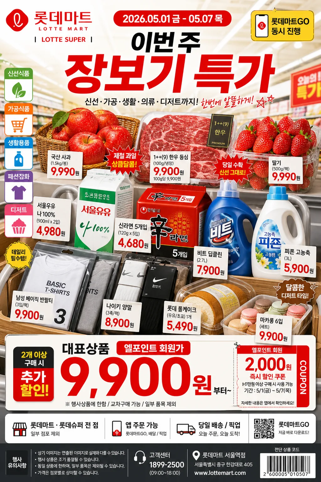
Korean large-mart advertising poster for LOTTE Mart / LOTTE Super, designed as a product-forward promotional layout with family-friendly retail energy. Vertical ad composition suitable for in-store signage, social media promotions, weekly circular flyer use, mobile app banners, and entrance standees.

[Composition]
- Main hero product cluster occupies the center 55–60% of the frame, with a clear promotional hierarchy that keeps the event title, sale dates, and price area highly legible.
- Background uses a bright real retail-ad setting with visible supermarket context: softly blurred shelves, aisle signage, shopping basket hints, refrigerated-case highlights, and lively accents in {컬러 팔레트}.
- Arrange copy blocks on a practical flyer grid with energetic retail density: headline, event dates, coupon callouts, product labels, price tags, small disclaimer lines, and footer details all feel like a real Korean hypermarket campaign.
- Use {브랜드 톤}, {시그니처 결}, {제품·소재}, {무드·라이팅}, {컬러 팔레트}, {카피·타이포}, {레이아웃}, and {비율} as the customizable content anchors.

[3. CORE STRUCTURE]
1) Top header zone (upper 15–18%): place the main brand headline in bold Korean display type, with a concise English subtitle beneath it; include a small date label such as “2026.05.01 금 - 05.07 목”, a compact app/event badge “롯데마트GO 동시 진행”, and a short campaign line “이번 주 장보기 특가”.
2) Hero zone (middle 45–55%): arrange the product assortment as a layered supermarket promo cluster, with the most important item front and center, secondary items fanning behind it, and small retail price tags attached to each category. Include realistic items: glossy apples or strawberries, Korean beef or pork pack, milk or ramen multipack, laundry detergent, socks or basic T-shirt pack, and bakery/dessert such as roll cake or macarons.
3) Price / offer zone (lower-middle 18–22%): place a large promotional price block with high contrast, thick numerals, and compact supporting line. Include realistic offer details such as “대표상품 9,900원부터”, “엘포인트 회원가”, “2개 이상 구매 시 추가 할인”, and coupon-sticker shapes in LOTTE red/yellow.
4) Store info zone (bottom 10–15%): add compact retail detail text in a neat footer strip, aligned to the grid and sized smaller than the price block. Include store/channel information like “롯데마트·롯데슈퍼 전 점”, “앱 주문 가능”, “일부 점포 제외”, “행사 상품은 조기 품절될 수 있습니다”, a tiny QR-code placeholder, customer center line, address-style microcopy, and a small barcode/circular-flyer code area.
5) Category balance: ensure fresh food, processed food, clothing, household goods, and dessert references are all represented in a way that feels like a real Korean hypermarket campaign, not a generic collage.
6) Edge treatment: use subtle framing, colored tabs, coupon perforation marks, shelf-label graphics, small arrows, starburst price stickers, and diagonal sale ribbons so the composition feels like a polished advertisement with authentic flyer detail.

[4. STYLE RULES]
- Typography: use Pretendard ExtraBold or Noto Sans KR Black for the headline, Pretendard SemiBold for subcopy, and a compact sans for store details; price numerals should be oversized, tightly kerned, and supported by smaller Korean unit text.
- Color palette: {컬러 팔레트} with strong use of LOTTE red, warm yellow, clean white, and charcoal for hierarchy and legibility; add small blue/green category tags only where useful for product grouping.
- Border/shadow: soft drop shadow 4px y-offset, 14px blur, 18% opacity behind hero elements; thin white separators for price and footer areas; use realistic glossy highlights on packaging, plastic wrap, fruit skins, bakery film, detergent bottles, and paper price cards.
- Retail details: include small product/category labels in Korean such as “신선식품”, “가공식품”, “생활용품”, “패션잡화”, “디저트”, plus short price-card notes and membership labels that look printed, not floating.
- Decorative graphic elements: add sale burst shapes, coupon cut lines, small cart icon, L.POINT-style membership tag, app-order badge, shelf-talkers, and subtle confetti dots in brand colors while keeping the product and main price visually dominant.

[5. VISUAL STYLE]
- Camera / lens: commercial advertising look, equivalent to a 50mm full-frame product lens at f/5.6 for the hero cluster, with crisp detail and mild perspective depth.
- Lighting: bright store ambient light with overhead LED panels, softened by diffused fill from the front-left; subtle highlight control to keep packaging, produce, price cards, and Korean text sharp.
- Color grade: vivid retail red-yellow-white with clean neutral whites, slight contrast boost, and minimal warm tint for a polished Korean supermarket promo finish.
- Realism: product surfaces should feel tactile and varied — condensation on chilled packs, transparent plastic wrap on meat, paper texture on coupons, glossy snack packaging, woven texture on clothing basics, and bakery crumbs or cream detail visible in dessert items.

[6. MOOD]
High-energy Korean retail campaign — polished hypermarket flyer aesthetic with a real-world supermarket promotional feel, similar to a mainstream weekly mart ad but cleaner and more premium. The mood should feel busy enough to be believable, with family-friendly savings energy, bright aisle atmosphere, and immediate “이번 주 장보기” urgency.

[7. CRITICAL]
- Korean text accuracy: “롯데마트”, “롯데슈퍼”, “장보기 페스타”, “이번 주 특가”, “엘포인트 회원가”, “2026.05.01 금 - 05.07 목”, “대표상품 9,900원부터”, “앱 주문 가능”, and any Korean product/category labels must render without broken characters.
- Composition must preserve a clear hero product center, prominent price block, readable event dates, and smaller store information footer.
- Maintain the intended balance of fresh food, processed food, clothing, household goods, and dessert cues in the same promotional layout.
- Use realistic small-print retail disclaimer text in Korean, such as “행사 상품은 점포별 재고에 따라 조기 품절될 수 있습니다” and “일부 점포 및 온라인몰 가격은 상이할 수 있습니다”, kept tiny but aligned.
- Keep all typography clean, printed, and aligned to the flyer grid; prices and brand names must be readable at poster scale.

[8. 🚫 PROHIBITED]
- Fake official seals / certifications
- Broken Korean characters
- Celebrity composites / unauthorized likeness