広告・ポスター
KFC 치킨 광고
KFC 톤 — 빨강·치킨 매크로
KFC 치킨 광고の概要
広告・ポスター画像を作るためのChatGPT画像プロンプトです。主題、背景、スタイル、構図を整理し、すぐに試せるよう構成しています。
関連キーワード: KFC 치킨 광고, KFC 치킨 광고 프롬프트, 広告・ポスター 프롬프트, 広告・ポスター AI 이미지 프롬프트, ChatGPT 이미지 프롬프트, AI 이미지 생성 프롬프트, AI 프롬프트, 이미지 프롬프트
KFC 치킨 광고の活用方法
元の構造を保ちながら、被写体、背景、色、構図を変更して別案に展開できます。
- 主題を維持し、ブランドや季節、媒体に合わせて色と背景を変更してください。
- 結果が複雑な場合は背景要素を減らし、被写体、構図、照明を具体化してください。
- コピー後、ChatGPTに媒体、アスペクト比、文字の有無を追加で指定できます。
プロンプト原文
[Input]
- language: Korean
- output_size: {비율}

[Purpose]
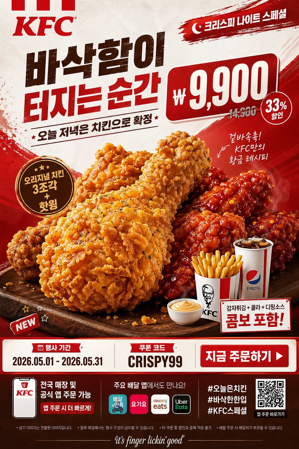
Korean fried chicken ad poster, premium fast-food campaign vertical layout for social feed, store window print, delivery-app banner, and in-store digital signage.
Bold product-first hero image with strong price-and-copy hierarchy, using {브랜드명} commercial styling: red-and-white QSR energy, crispy macro food appeal, realistic menu promotion details, and clear Korean ad copy.

[Composition]
- Main subject placement: a large chicken hero occupies about 55% of the frame, slightly lower-center, with the price block above or beside it depending on {레이아웃}.
- Background treatment: studio backdrop with deep red, white, and Kentucky-brown accents; include subtle paper grain, warm spotlight gradients, faint sauce-brush marks, diagonal promo panels, and small graphic tags that match {시그니처 결}.
- Apply {브랜드 톤} consistently across all text treatment, food styling, CTA buttons, discount badge, and hierarchy decisions.
- Make {시그니처 결} the dominant visual signature through the hero food cutout, golden crust rim light, red ribbon shapes, white boxed typography, and small stamp-like promo labels.
- Add realistic fast-food campaign components: campaign period, app/order notice, QR-code placeholder, store/channel line, coupon code, and small legal disclaimer near the bottom.

[3. CORE STRUCTURE]
1. Hero food zone: place {메인 제품} as the primary cutout subject, scaled large enough to command attention, with crisp crumb detail, visible seasoning flecks, glossy hot highlights, and realistic fried texture.
2. Brand zone: reserve a strong top or upper-left brand area for {브랜드명} and {카피·타이포}, using bold commercial layout logic and clear contrast against the background.
3. Main headline zone: render a large Korean headline such as “바삭함이 터지는 순간” and a short subheadline such as “오늘 저녁은 치킨으로 확정” in bold, clean Korean typography.
4. Price zone: set {대표 가격} or promo message in a large secondary block with high readability, heavy condensed numerals, won symbol, and a small red discount badge.
5. Promotion detail zone: include {프로모션명}, {행사 기간}, {쿠폰 코드}, and {CTA} as real ad information, placed in a compact ribbon or coupon strip.
6. Supporting product zone: show {서브 세트} as a smaller set near the hero food, with a drink cup, fries, sauce cup, or bucket element if appropriate, matching the same lighting and color tone.
7. Store/app info zone: add {매장·앱 정보}, {해시태그}, tiny delivery-app style icons, and QR-code placeholder at the bottom, like a finished retail campaign poster.
8. Frame control: maintain a vertical {비율} ad composition that feels centered, premium, and immediately readable on mobile.

[4. STYLE RULES]
- Typography: use bold sans-serif commercial fonts such as Pretendard ExtraBold, Noto Sans KR Bold, or Montserrat Black for the main headline; use smaller Noto Sans KR Medium for subcopy; keep price numerals heavy and condensed-looking.
- Color palette: use {컬러 팔레트} with saturated red, clean white, and warm Kentucky brown; add warm beige, golden crust yellow, and dark cocoa shadow tones for appetizing depth.
- Graphic system: combine red blocks, white coupon strips, rounded price badge, diagonal speed lines, sauce-splash accents, and small “NEW”, “HOT”, “앱 주문” labels so the poster feels like a real limited-time QSR promotion.
- Food realism: emphasize crispy ridges, oil sheen, irregular crust flakes, pepper specks, steam hints, sauce gloss, and natural crumbs on the tray surface.
- Border/shadow: add a soft realistic drop shadow under the chicken hero, about 4px y-offset, 12px blur, 15% opacity; keep edge separation sharp and clean.

[5. VISUAL STYLE]
- Camera / lens: commercial food photography look, full-frame 85mm f/2.8 for the hero cutout, or 100mm macro detail for crispy texture close-up.
- Lighting: studio key light from upper-left at roughly 45°, strong fill from front-right, subtle warm rim light to define the crust and keep the chicken glossy.
- Color grade: warm fast-food campaign grade with saturated red, clean white balance, rich golden browns, controlled contrast, and appetizing specular highlights on fried crust and sauce.
- Finish: high-resolution print-ad finish, sharp typography, realistic product shadows, tactile paper texture in background, and clean mobile readability.

[6. MOOD]
Premium fast-food campaign poster — polished international QSR ad with the assertive hierarchy of a KFC promotional billboard, energetic Korean delivery-app promotion feeling, and indulgent crispy chicken close-up appeal.

[7. CRITICAL]
- Korean text accuracy: “바삭함이 터지는 순간”, “오늘 저녁은 치킨으로 확정”, “앱 주문 전용”, “쿠폰코드: {쿠폰 코드}”, “행사기간: {행사 기간}”, “지금 주문하기” must render cleanly with no broken characters.
- Exact composition requirement: preserve the chicken hero + large price + small set hierarchy as a real fast-food ad layout.
- Include realistic small-print Korean copy near the bottom: “매장별 판매 여부와 가격은 다를 수 있습니다. 이미지는 연출된 예시입니다.”
- Add visible retail details: {브랜드명}, {프로모션명}, {대표 가격}, {매장·앱 정보}, QR-code placeholder, and {해시태그}.
- Typography must stay bold, legible, and commercially clean; price, coupon code, and headline must be readable at thumbnail size.

[8. 🚫 PROHIBITED]
- Fake official seals / certifications
- Broken Korean characters
- Celebrity composites or public figure likeness
- Unreadable or deformed price, coupon, and menu text