광고/포스터
올리브영 뷰티 광고
올리브영 톤 — MZ 뷰티 + 한국 화장품
올리브영 뷰티 광고 검색 요약
올리브영 뷰티 광고은 광고/포스터 결과물을 만들 때 바로 복사해 활용할 수 있는 ChatGPT 이미지 프롬프트입니다. 주제, 배경, 스타일, 구도 조건을 함께 담아 빠르게 시안을 만들 수 있도록 구성했습니다.
관련 키워드: 올리브영 뷰티 광고, 올리브영 뷰티 광고 프롬프트, 광고/포스터 프롬프트, 광고/포스터 AI 이미지 프롬프트, ChatGPT 이미지 프롬프트, AI 이미지 생성 프롬프트, AI 프롬프트, 이미지 프롬프트
올리브영 뷰티 광고 활용 포인트
원본 구조를 유지하면서 피사체, 배경, 색감, 구도를 바꿔 다양한 시안으로 확장할 수 있습니다.
- 핵심 소재는 유지하고 브랜드, 계절, 채널 목적에 맞는 색감과 배경을 바꿔보세요.
- 결과가 산만하면 배경 요소를 줄이고 피사체, 구도, 조명 조건을 구체화하세요.
- 복사한 뒤 ChatGPT에서 플랫폼, 화면 비율, 텍스트 포함 여부를 추가로 요청할 수 있습니다.
프롬프트 원문
[Input]
- language: Korean
- output_size: 1024x1536

[Purpose]
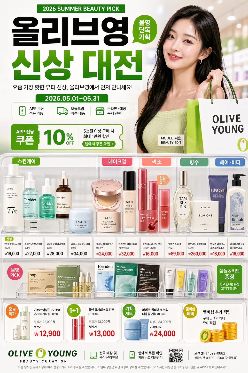
Korean beauty retail advertisement poster, fashion-forward product-led brand promo for mobile feed and poster display.
Olive Young-style commercial layout with hero product cluster, model presence, pricing callouts, app-coupon cues, store-pickup messaging, and glossy editorial merchandising.
The image should feel like a real in-store campaign poster photographed and designed for a flagship K-beauty retailer, with layered product information, retail tags, and seasonal promotion details.

[Composition]
- Canvas is vertical poster format; the main product zone occupies the lower-mid 45% with a structured retail-display feel, while the model hero area takes 30%–35% of the upper half.
- Background uses a bright white base with Olive Young green accents, subtle gradient blocks, translucent category panels, glossy acrylic shelf cues, and faint store-light reflections; keep surfaces premium and commercially polished.
- Place {브랜드 톤} as the overall design direction, with {시그니처 결} expressed through dense but orderly category variety, layered labels, product swatches, and retail merchandising depth.
- Arrange {제품·소재} in grouped clusters rather than scattered single items: skincare bottles, cushion compacts, lip tints, serum ampoules, fragrance boxes, shampoo tubes, cotton pads, sample sachets, and small tester trays.
- Use {무드·라이팅} to create realistic beauty-store shine: soft reflections on plastic caps, glass serum bottles, metallic makeup cases, and laminated price tags.
- Keep {레이아웃} balanced: hero figure, product stack, headline, category tabs, promo stickers, and price labels should read instantly at thumbnail size while still containing rich retail detail up close.
- Use {비율} to guide the relationship between model, headline, product clusters, and promotion callouts.

[3. CORE STRUCTURE]
1. Header zone (top 15%): set the main Korean headline in bold retail typography, aligned center or slightly left depending on balance, with a strong brand-banner feel. Include a small campaign kicker such as "2026 SUMMER BEAUTY PICK", "올영 단독 기획", and a compact date label "2026.05.01–05.31".
2. Brand identity strip (upper-mid 10%): show {브랜드 톤} as a concise subline or brand voice cue, using compact sans-serif text and a clean separator rule. Add tiny retail microcopy: "APP 쿠폰 적용 가능", "오늘드림", "온라인·매장 동시 진행".
3. Hero area (mid 30%): present the model or fashion-beauty lead as a polished campaign subject, framed like a modern retail ad, with crisp cutout edges, glossy skin texture, fashionable hair styling, and a confident shopping-bag pose. Add a small model-name credit line near the figure: "MODEL. 지윤 / BEAUTY EDIT".
4. Product display zone (lower-mid 30%): show {제품·소재} as a curated assortment of skincare, makeup, color cosmetics, perfume, and hair products, ordered by category and size. Include readable category tabs in Korean: "스킨케어", "메이크업", "헤어·바디", "향수", plus small shelf labels and product-card tags.
5. Price and promo callouts (mid-lower 10%): include high-contrast retail labels with short Korean copy and realistic prices such as "신상", "가격", "오늘 특가", "1+1", "쿠폰가 ₩12,900", "기획세트 ₩24,000", "멤버십 추가 적립". Use sticker shapes, green pill labels, small orange accent flags, and barcode/QR-code style promo blocks.
6. Footer zone (bottom 10%): place supporting copy and brand signage in a retail footer band. Include store details and app CTA: "OLIVE YOUNG BEAUTY CURATION", "전국 매장 및 공식 온라인몰", "앱에서 쿠폰 확인", "고객센터 1522-0882", and a small disclaimer line in Korean.

[4. STYLE RULES]
- Typography: use Pretendard ExtraBold for the main headline, Pretendard Medium for support text, and Noto Sans KR Bold for price callouts; headline size should feel billboard-like, support text compact and retail-clean.
- Apply {카피·타이포} to headline hierarchy and promo labels, ensuring Korean copy feels like authentic retail advertising rather than placeholder text.
- Color palette: Olive Young green, pure white #FFFFFF, cool light gray #EEF1F4, deep charcoal #1F1F1F, and one signature accent from {컬러 팔레트}.
- Border/shadow: use soft retail-product shadows with 4px y-offset, 12px blur, 15% opacity; add thin white borders around select callout labels for catalog clarity.
- Decorative retail elements: include glossy sticker badges, shelf-edge price cards, tiny barcode area, app QR placeholder, translucent rounded rectangles, product swatch circles, and subtle dotted divider lines.
- Korean retail text should be short and legible: examples include "나다운 뷰티 루틴", "요즘 뜨는 신상", "피부결 케어", "컬러 맛집", "장바구니 PICK".

[5. VISUAL STYLE]
- Camera / lens: high-end commercial fashion ad look shot on a Canon EOS R5 with 85mm f/1.4 for the model and a 50mm lens for product grouping, crisp focus with shallow background separation.
- Lighting: bright softbox key from upper-left at 45°, subtle fill from right, controlled specular highlights on packaging, and gentle ambient bounce for a clean storefront finish.
- Color grade: fresh retail white with Olive Young green, balanced amber warmth, and slightly desaturated editorial contrast for a polished Korean beauty campaign look.
- Materials should feel real: semi-gloss paper labels, matte cosmetic tubes, glass serum bottles with liquid depth, reflective compact cases, laminated price cards, clear acrylic shelf risers, and soft cosmetic powder textures.

[6. MOOD]
Premium Korean beauty retail campaign — Olive Young flagship ad meets high-end magazine merchandising energy, like a Harper’s Bazaar Korea x urban beauty store promo.
The mood is bright, confident, trend-aware, and purchase-driven, with the lively density of an actual K-beauty promotion wall and the polish of a fashion editorial.

[7. CRITICAL]
- Korean text accuracy: the following strings must appear exactly and clearly in the final image:
  - "OLIVE YOUNG"
  - "신상"
  - "가격"
- Additional Korean text should be clear and plausible, such as "2026.05.01–05.31", "오늘드림", "APP 쿠폰", "쿠폰가 ₩12,900", "전국 매장 및 공식 온라인몰".
- Composition invariants: keep the retail-ad structure clearly readable with model hero, product clusters, headline, category tabs, app/promo details, and pricing callouts all visible in one frame.
- All typography must be clean and correctly rendered in Korean and English with no broken characters.

[8. 🚫 PROHIBITED]
- Fake official seals / certifications
- Broken Korean characters
- Celebrity composites / unauthorized likeness