広告・ポスター
올리브영 뷰티 광고
올리브영 톤 — MZ 뷰티 + 한국 화장품
올리브영 뷰티 광고の概要
広告・ポスター画像を作るためのChatGPT画像プロンプトです。主題、背景、スタイル、構図を整理し、すぐに試せるよう構成しています。
関連キーワード: 올리브영 뷰티 광고, 올리브영 뷰티 광고 프롬프트, 広告・ポスター 프롬프트, 広告・ポスター AI 이미지 프롬프트, ChatGPT 이미지 프롬프트, AI 이미지 생성 프롬프트, AI 프롬프트, 이미지 프롬프트
올리브영 뷰티 광고の活用方法
元の構造を保ちながら、被写体、背景、色、構図を変更して別案に展開できます。
- 主題を維持し、ブランドや季節、媒体に合わせて色と背景を変更してください。
- 結果が複雑な場合は背景要素を減らし、被写体、構図、照明を具体化してください。
- コピー後、ChatGPTに媒体、アスペクト比、文字の有無を追加で指定できます。
プロンプト原文
[Input]
- language: Korean
- output_size: 1024x1536

[Purpose]
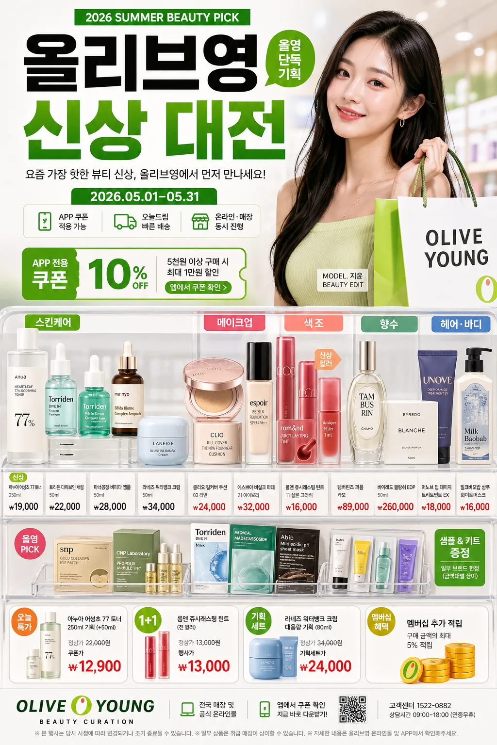
Korean beauty retail advertisement poster, fashion-forward product-led brand promo for mobile feed and poster display.
Olive Young-style commercial layout with hero product cluster, model presence, pricing callouts, app-coupon cues, store-pickup messaging, and glossy editorial merchandising.
The image should feel like a real in-store campaign poster photographed and designed for a flagship K-beauty retailer, with layered product information, retail tags, and seasonal promotion details.

[Composition]
- Canvas is vertical poster format; the main product zone occupies the lower-mid 45% with a structured retail-display feel, while the model hero area takes 30%–35% of the upper half.
- Background uses a bright white base with Olive Young green accents, subtle gradient blocks, translucent category panels, glossy acrylic shelf cues, and faint store-light reflections; keep surfaces premium and commercially polished.
- Place {브랜드 톤} as the overall design direction, with {시그니처 결} expressed through dense but orderly category variety, layered labels, product swatches, and retail merchandising depth.
- Arrange {제품·소재} in grouped clusters rather than scattered single items: skincare bottles, cushion compacts, lip tints, serum ampoules, fragrance boxes, shampoo tubes, cotton pads, sample sachets, and small tester trays.
- Use {무드·라이팅} to create realistic beauty-store shine: soft reflections on plastic caps, glass serum bottles, metallic makeup cases, and laminated price tags.
- Keep {레이아웃} balanced: hero figure, product stack, headline, category tabs, promo stickers, and price labels should read instantly at thumbnail size while still containing rich retail detail up close.
- Use {비율} to guide the relationship between model, headline, product clusters, and promotion callouts.

[3. CORE STRUCTURE]
1. Header zone (top 15%): set the main Korean headline in bold retail typography, aligned center or slightly left depending on balance, with a strong brand-banner feel. Include a small campaign kicker such as "2026 SUMMER BEAUTY PICK", "올영 단독 기획", and a compact date label "2026.05.01–05.31".
2. Brand identity strip (upper-mid 10%): show {브랜드 톤} as a concise subline or brand voice cue, using compact sans-serif text and a clean separator rule. Add tiny retail microcopy: "APP 쿠폰 적용 가능", "오늘드림", "온라인·매장 동시 진행".
3. Hero area (mid 30%): present the model or fashion-beauty lead as a polished campaign subject, framed like a modern retail ad, with crisp cutout edges, glossy skin texture, fashionable hair styling, and a confident shopping-bag pose. Add a small model-name credit line near the figure: "MODEL. 지윤 / BEAUTY EDIT".
4. Product display zone (lower-mid 30%): show {제품·소재} as a curated assortment of skincare, makeup, color cosmetics, perfume, and hair products, ordered by category and size. Include readable category tabs in Korean: "스킨케어", "메이크업", "헤어·바디", "향수", plus small shelf labels and product-card tags.
5. Price and promo callouts (mid-lower 10%): include high-contrast retail labels with short Korean copy and realistic prices such as "신상", "가격", "오늘 특가", "1+1", "쿠폰가 ₩12,900", "기획세트 ₩24,000", "멤버십 추가 적립". Use sticker shapes, green pill labels, small orange accent flags, and barcode/QR-code style promo blocks.
6. Footer zone (bottom 10%): place supporting copy and brand signage in a retail footer band. Include store details and app CTA: "OLIVE YOUNG BEAUTY CURATION", "전국 매장 및 공식 온라인몰", "앱에서 쿠폰 확인", "고객센터 1522-0882", and a small disclaimer line in Korean.

[4. STYLE RULES]
- Typography: use Pretendard ExtraBold for the main headline, Pretendard Medium for support text, and Noto Sans KR Bold for price callouts; headline size should feel billboard-like, support text compact and retail-clean.
- Apply {카피·타이포} to headline hierarchy and promo labels, ensuring Korean copy feels like authentic retail advertising rather than placeholder text.
- Color palette: Olive Young green, pure white #FFFFFF, cool light gray #EEF1F4, deep charcoal #1F1F1F, and one signature accent from {컬러 팔레트}.
- Border/shadow: use soft retail-product shadows with 4px y-offset, 12px blur, 15% opacity; add thin white borders around select callout labels for catalog clarity.
- Decorative retail elements: include glossy sticker badges, shelf-edge price cards, tiny barcode area, app QR placeholder, translucent rounded rectangles, product swatch circles, and subtle dotted divider lines.
- Korean retail text should be short and legible: examples include "나다운 뷰티 루틴", "요즘 뜨는 신상", "피부결 케어", "컬러 맛집", "장바구니 PICK".

[5. VISUAL STYLE]
- Camera / lens: high-end commercial fashion ad look shot on a Canon EOS R5 with 85mm f/1.4 for the model and a 50mm lens for product grouping, crisp focus with shallow background separation.
- Lighting: bright softbox key from upper-left at 45°, subtle fill from right, controlled specular highlights on packaging, and gentle ambient bounce for a clean storefront finish.
- Color grade: fresh retail white with Olive Young green, balanced amber warmth, and slightly desaturated editorial contrast for a polished Korean beauty campaign look.
- Materials should feel real: semi-gloss paper labels, matte cosmetic tubes, glass serum bottles with liquid depth, reflective compact cases, laminated price cards, clear acrylic shelf risers, and soft cosmetic powder textures.

[6. MOOD]
Premium Korean beauty retail campaign — Olive Young flagship ad meets high-end magazine merchandising energy, like a Harper’s Bazaar Korea x urban beauty store promo.
The mood is bright, confident, trend-aware, and purchase-driven, with the lively density of an actual K-beauty promotion wall and the polish of a fashion editorial.

[7. CRITICAL]
- Korean text accuracy: the following strings must appear exactly and clearly in the final image:
  - "OLIVE YOUNG"
  - "신상"
  - "가격"
- Additional Korean text should be clear and plausible, such as "2026.05.01–05.31", "오늘드림", "APP 쿠폰", "쿠폰가 ₩12,900", "전국 매장 및 공식 온라인몰".
- Composition invariants: keep the retail-ad structure clearly readable with model hero, product clusters, headline, category tabs, app/promo details, and pricing callouts all visible in one frame.
- All typography must be clean and correctly rendered in Korean and English with no broken characters.

[8. 🚫 PROHIBITED]
- Fake official seals / certifications
- Broken Korean characters
- Celebrity composites / unauthorized likeness