廣告/海報
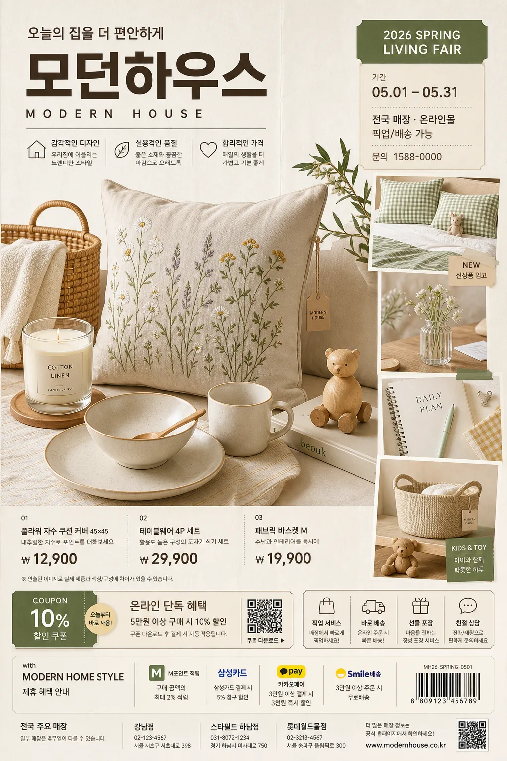
모던하우스 라이프스타일 광고
모던하우스 톤 — 한국 라이프스타일 잡화
모던하우스 라이프스타일 광고摘要
這是用來製作廣告/海報內容的 ChatGPT 圖像提示詞,已整理主題、背景、風格與構圖,方便快速調整。
相關關鍵字: 모던하우스 라이프스타일 광고, 모던하우스 라이프스타일 광고 프롬프트, 廣告/海報 프롬프트, 廣告/海報 AI 이미지 프롬프트, ChatGPT 이미지 프롬프트, AI 이미지 생성 프롬프트, AI 프롬프트, 이미지 프롬프트
모던하우스 라이프스타일 광고使用方式
保留原始結構並替換主體、背景、色彩或構圖,即可延伸出不同版本。
- 保留核心主體,並依品牌、季節或平台調整色彩與背景。
- 如果畫面太複雜,請減少背景元素並具體描述主體、構圖與光線。
- 複製後可要求 ChatGPT 配合平台、長寬比或文字需求調整。
提示詞原文
[Input]
- language: Korean
- output_size: 1024x1536

[Purpose]
Modern Korean lifestyle brand advertisement poster, vertical editorial retail composition with a product hero, styled collage accents, price/event information, and realistic store-campaign details for social-media and print use.
Brand-forward home-living campaign visual that feels like a polished department-store leaflet page: aspirational, shoppable, tactile, and information-rich while keeping product clarity and Korean copy readability strong.

[Composition]
- Overall frame: tall 1024x1536 poster with a centered product hero occupying about 55% of the height, a supporting style collage zone on one side, and a compact but content-rich information zone for {카피·타이포}, campaign date, prices, store details, and CTA labels.
- Background treatment: warm off-white studio backdrop with visible matte paper grain, soft beige floor plane, natural product shadows, folded leaflet texture, tiny printed registration marks, and subtle retail-page realism.
- Framing details: include realistic catalog-ad elements such as small product-code labels, price tags, coupon strip, QR-code placeholder area, barcode-like block, delivery/pickup icon row, and a small footer with address/contact information.
- Use {브랜드 톤}, {시그니처 결}, {제품·소재}, {무드·라이팅}, {컬러 팔레트}, {카피·타이포}, {레이아웃}, {비율} as the configurable direction for the campaign.

[3. CORE STRUCTURE]
- Hero zone (center 55%): present the main lifestyle product grouping from {제품·소재} as the visual anchor, arranged in a balanced modern home-shopping set with one dominant item and several smaller supporting items; show real tactile materials, fabric seams, ceramic edges, wood grain, woven texture, glass reflections, paper tags, and believable product scale.
- Collage zone: build a refined mini collage with 3–5 product snippets, overlapping paper-cut cards, floating swatch tiles, close-up material crops, lifestyle detail photos, and tidy editorial alignment so the assortment feels broad and retail-ready.
- Copy zone: place {카피·타이포} in a clear top or mid text block with strong hierarchy, then add short Korean retail blurbs such as “오늘의 집을 더 편안하게”, “봄 리빙 페어”, “신상품 입고”, “온라인 단독 혜택” where appropriate.
- Promotion and info zone: include realistic event details: “2026 SPRING LIVING FAIR”, “기간 05.01–05.31”, “전국 매장 · 온라인몰”, “픽업/배송 가능”, “문의 1588-0000”, plus 2–4 item price lines such as “쿠션 커버 ₩12,900”, “테이블웨어 세트 ₩29,900”, “패브릭 바스켓 ₩19,900”.
- Sponsor/partner area: add a small lower sponsor-style strip reading “with MODERN HOME STYLE” or “제휴 혜택 안내”, with tiny payment/delivery pictogram badges and a scannable-looking QR placeholder, but do not imply official certification.
- Tone zone: apply {브랜드 톤} and {시그니처 결} consistently across product styling, prop selection, paper textures, sticker labels, and small printed details so the poster reads as one unified brand page.
- Color zone: use {컬러 팔레트} as the dominant palette, with the accent color reserved for small labels, sale tags, divider rules, coupon dots, price emphasis, or short callout text.
- Layout zone: follow {레이아웃} with a premium catalog structure — hero first, collage second, information and CTA last — and keep the vertical flow easy to scan from campaign title to products to price/store details.

[4. STYLE RULES]
- Typography: Pretendard and Noto Sans KR for clean Korean ad copy, bold 700–800 weight for the main title, 400–500 weight for supporting details, tabular numerals for prices, compact leading, crisp sans-serif geometry; if English appears, match with a neutral grotesk like Inter.
- Korean text layout: use realistic retail hierarchy with a main headline, 2–3 short feature blurbs, item names, price rows, small disclaimer line, coupon label, date label, and footer contact text; all Korean must be sharply rendered and properly spaced.
- Color palette: {컬러 팔레트} should translate into warm beige #D8C8B0, off-white #F7F3EC, soft gray #CFCAC2, natural wood/cotton tones, and a controlled accent tone that stays close to the brand’s signature hue.
- Border/shadow: use soft layered drop shadows with 4px y-offset, 14px blur, 12–18% opacity for floating cards and product cutouts; avoid harsh outlines, heavy gradients, and plastic-looking glossy edge effects.
- Print feel: matte-paper texture, faint ink grain, realistic product photography contrast, small label blocks, coupon perforation marks, thin divider lines, editorial price-table alignment, and polished retail finish.

[5. VISUAL STYLE]
- Camera / lens: full-frame studio product photography, 50mm and 85mm lens mix, f/5.6 to f/8 for crisp catalog clarity, straight-on composition with slight top-down adjustment for tabletop items.
- Lighting: studio key light from upper-left at 45° with a soft fill from right, plus gentle background separation light; keep shadows short, soft, and controlled for a polished home-lifestyle ad look while retaining natural material depth.
- Color grade: warm cream + beige + soft amber with restrained contrast, slightly desaturated neutrals, realistic paper whites, natural fabric/wood texture, and clean accent pops that preserve product readability.

[6. MOOD]
Premium Korean home-lifestyle retail campaign — polished department-store catalog page with a Kinfolk-meets-modern-shopping-ad aesthetic, tactile home materials, shoppable pricing details, and a warm seasonal fair atmosphere.

[7. CRITICAL]
- Korean text accuracy: the rendered image must correctly show these verbatim Korean strings if used in the layout: “모던하우스”, “오늘의 집을 더 편안하게”, “봄 리빙 페어”, “기간 05.01–05.31”, “전국 매장 · 온라인몰”, and any Korean copy supplied through {카피·타이포}.
- Required realistic ad details: include a campaign/date label, 2–4 short Korean product or feature blurbs, at least two visible price lines in Korean won, a small QR/barcode-style area, and footer micro text such as store/contact/delivery information.
- Layout invariants: maintain the exact vertical advertising structure with a product hero, a style collage, and a small information block; do not turn it into a full-page lifestyle scene or a single-product packshot.
- Typography invariants: Korean and English text must be clean, sharp, and properly spaced; no broken syllables, no garbled characters, and no exaggerated display-font distortion.

[8. 🚫 PROHIBITED]
- Fake official seals / certifications
- Broken Korean characters
- Celebrity composites or unauthorized likeness