Ads/Posters
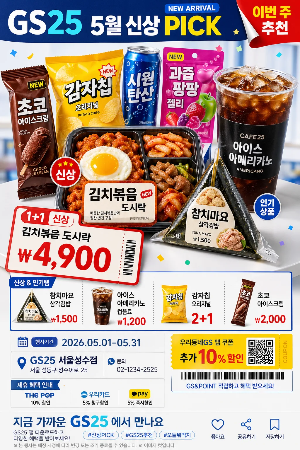
GS25 편의점 광고
GS25 톤 — 한국 편의점·MZ
GS25 편의점 광고 summary
Copy this ChatGPT image prompt to create Ads/Posters results. Its subject, background, style, and composition are organized for quick iteration.
Related keywords: GS25 편의점 광고, GS25 편의점 광고 프롬프트, Ads/Posters 프롬프트, Ads/Posters AI 이미지 프롬프트, ChatGPT 이미지 프롬프트, AI 이미지 생성 프롬프트, AI 프롬프트, 이미지 프롬프트
How to use GS25 편의점 광고
Keep the prompt structure and swap the subject, background, palette, or composition to create new variations.
- Keep the main subject and adjust the palette and background for your brand, season, or channel.
- If the result feels busy, simplify the background and make the subject, composition, and lighting more specific.
- After copying, ask ChatGPT to adapt it for your platform, aspect ratio, or text requirements.
Original prompt
[Input]
- language: Korean
- output_size: 1024x1536

[Purpose]
Korean convenience-store promotional ad poster, product-hero vertical retail layout, MZ-friendly campaign key visual.
Designed for a {브랜드 톤} convenience-store campaign sheet that highlights new arrivals, event pricing, bundle benefits, and quick-read shelf appeal at 1024x1536 vertical poster ratio.

[Composition]
- Main hero zone occupies the upper 52% of the frame, with {대표 제품} placed forward as the strongest visual anchor and {보조 제품} arranged around it like a real convenience-store promo display.
- Brand tone is guided by {브랜드 톤}, while the overall convenience-store character and youthful retail energy follow {시그니처 결}.
- Background uses a studio advertising surface with GS25-inspired blue-and-white panels, matte plastic shelf-tag textures, glossy packaging reflections, small confetti stickers, coupon-ticket shapes, and red price accents.
- Lower third becomes a practical retail information band for {프로모션명}, {메인 가격}, {추가 가격 목록}, {행사 기간}, {매장 정보}, {연락처}, and a direct CTA using {하단 CTA}.
- Use {레이아웃} as the composition rule: big product hero, bold price ticket, secondary item grid, date/store details, coupon badge, and barcode-style membership strip arranged with retail-poster hierarchy.

[3. CORE STRUCTURE]
1. Top header band: Set a bold convenience-store masthead treatment using “GS25” and {프로모션명}, slightly left-aligned with compact tracking, blue header block, small “NEW ARRIVAL” tag, and a red corner sticker reading “이번 주 추천”.
2. Hero product block: Place {대표 제품} in a stacked or clustered promo arrangement with crisp package seams, visible wrappers, printed labels, condensation on cold drinks, and believable scale differences; add {보조 제품} as supporting shelf items behind and beside the hero.
3. Price / novelty callout: Add a large retail price card for {메인 가격} directly beside or below the hero block, with “1+1”, “신상”, or “행사” micro badges, diagonal ticket shape, and a small coupon tear-off detail.
4. Item list band: Add a compact menu/pricelist area showing {추가 가격 목록}, using dividers, item bullets, tiny product thumbnails, and readable won-symbol pricing like a real store flyer.
5. Event information strip: Include {행사 기간}, {매장 정보}, {연락처}, membership/coupon notice {쿠폰 문구}, small barcode-style graphic, QR-coupon placeholder graphic, and a sponsor/partner area labeled “제휴 혜택 안내”.
6. Bottom CTA footer: Finish with {하단 CTA}, store app download hint, hashtag-style copy, save/share micro icons, and a small legal-style note line without official-looking seals.

[4. STYLE RULES]
- Typography: Pretendard ExtraBold for headline, Pretendard SemiBold for supporting copy, size hierarchy like 110–140 px for “GS25” and main campaign text, 72–110 px for {메인 가격}, and 28–48 px for item details; keep Korean text crisp, correctly spaced, and commercial.
- Color palette: {컬러 팔레트} with concrete support tones such as GS25 blue #0A4FB3, white #FFFFFF, accent red #E53935, cool gray #EEF3F8, and fresh yellow #FFD84D for coupon highlights.
- Border/shadow: subtle product shadow with 4px y-offset, 14px blur, 18% opacity; use blue panels, white keylines, shelf-label dividers, price-ticket strokes, and glossy sticker shadows for realistic retail layering.
- Graphic details: include small stars, speech-bubble stickers, receipt-paper strips, barcode line art, perforated coupon edges, and shelf-tag labels that support the convenience-store promotion.

[5. VISUAL STYLE]
- Camera / lens: studio product advertising look, shot on a Canon EOS R5 with 85mm f/1.4 portrait lens for hero packaging realism, or a 50mm f/1.8 if multiple convenience items are tightly grouped.
- Lighting: {무드·라이팅}; clean studio key light from upper-left at about 45°, soft fill from front-right, mild rim separation on package edges, controlled highlights on plastic wraps and drink bottles.
- Color grade: bright retail commercial grade with cool GS25 blue, neutral whites, appetizing food color, and controlled red/yellow accents; keep saturation punchy but believable for printed store signage.

[6. MOOD]
Commercial convenience-store campaign key visual — energetic Korean retail poster energy like a modern weekly convenience-store flyer, with polished MZ-friendly advertising, snack-run excitement, and believable in-store promotion details.

[7. CRITICAL]
- Korean text accuracy: 반드시 정확히 보여야 하는 문자열: “GS25”, “{프로모션명}”, “{메인 가격}”, “{행사 기간}”.
- 포스터 안에 함께 보일 추천 문구: “오늘 간식은 이걸로 끝”, “5월 신상 PICK”, “앱 쿠폰 받기”, “가까운 GS25에서 만나요”.
- 가격 영역에는 “{추가 가격 목록}”가 실제 편의점 전단처럼 원화 표기와 품목명이 읽히게 보여야 한다.
- 매장 안내는 “{매장 정보}”, “{연락처}”, “{쿠폰 문구}”, “{하단 CTA}”가 하단 정보 밴드에 분명히 배치되어야 한다.
- Preserve crisp packaging edges, straight layout alignment, believable retail proportions, and the product-ad framing for {대표 제품} and {보조 제품}.
- Do not alter the brand-ad framing into editorial food photography; this must remain a retail convenience-store advertisement.

[8. 🚫 PROHIBITED]
- Fake official seals / certifications
- Broken Korean characters
- Celebrity composites or unauthorized likenesses
- Illegible pricing or unreadable product labels