広告・ポスター
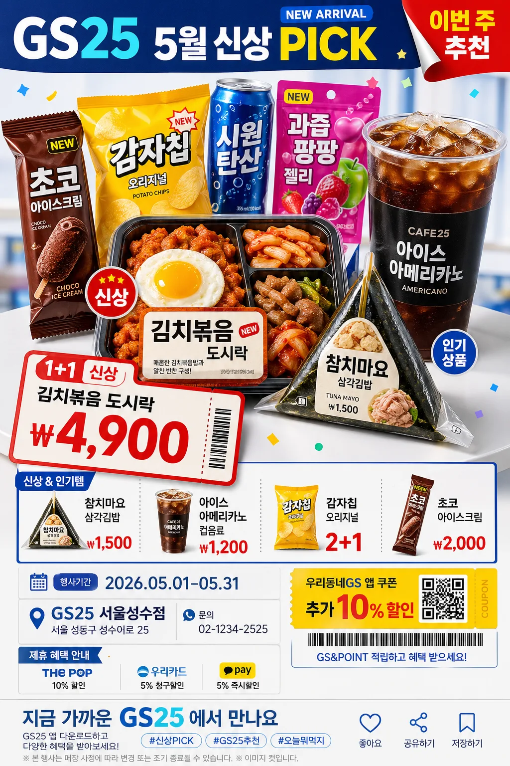
GS25 편의점 광고
GS25 톤 — 한국 편의점·MZ
GS25 편의점 광고の概要
広告・ポスター画像を作るためのChatGPT画像プロンプトです。主題、背景、スタイル、構図を整理し、すぐに試せるよう構成しています。
関連キーワード: GS25 편의점 광고, GS25 편의점 광고 프롬프트, 広告・ポスター 프롬프트, 広告・ポスター AI 이미지 프롬프트, ChatGPT 이미지 프롬프트, AI 이미지 생성 프롬프트, AI 프롬프트, 이미지 프롬프트
GS25 편의점 광고の活用方法
元の構造を保ちながら、被写体、背景、色、構図を変更して別案に展開できます。
- 主題を維持し、ブランドや季節、媒体に合わせて色と背景を変更してください。
- 結果が複雑な場合は背景要素を減らし、被写体、構図、照明を具体化してください。
- コピー後、ChatGPTに媒体、アスペクト比、文字の有無を追加で指定できます。
プロンプト原文
[Input]
- language: Korean
- output_size: 1024x1536

[Purpose]
Korean convenience-store promotional ad poster, product-hero vertical retail layout, MZ-friendly campaign key visual.
Designed for a {브랜드 톤} convenience-store campaign sheet that highlights new arrivals, event pricing, bundle benefits, and quick-read shelf appeal at 1024x1536 vertical poster ratio.

[Composition]
- Main hero zone occupies the upper 52% of the frame, with {대표 제품} placed forward as the strongest visual anchor and {보조 제품} arranged around it like a real convenience-store promo display.
- Brand tone is guided by {브랜드 톤}, while the overall convenience-store character and youthful retail energy follow {시그니처 결}.
- Background uses a studio advertising surface with GS25-inspired blue-and-white panels, matte plastic shelf-tag textures, glossy packaging reflections, small confetti stickers, coupon-ticket shapes, and red price accents.
- Lower third becomes a practical retail information band for {프로모션명}, {메인 가격}, {추가 가격 목록}, {행사 기간}, {매장 정보}, {연락처}, and a direct CTA using {하단 CTA}.
- Use {레이아웃} as the composition rule: big product hero, bold price ticket, secondary item grid, date/store details, coupon badge, and barcode-style membership strip arranged with retail-poster hierarchy.

[3. CORE STRUCTURE]
1. Top header band: Set a bold convenience-store masthead treatment using “GS25” and {프로모션명}, slightly left-aligned with compact tracking, blue header block, small “NEW ARRIVAL” tag, and a red corner sticker reading “이번 주 추천”.
2. Hero product block: Place {대표 제품} in a stacked or clustered promo arrangement with crisp package seams, visible wrappers, printed labels, condensation on cold drinks, and believable scale differences; add {보조 제품} as supporting shelf items behind and beside the hero.
3. Price / novelty callout: Add a large retail price card for {메인 가격} directly beside or below the hero block, with “1+1”, “신상”, or “행사” micro badges, diagonal ticket shape, and a small coupon tear-off detail.
4. Item list band: Add a compact menu/pricelist area showing {추가 가격 목록}, using dividers, item bullets, tiny product thumbnails, and readable won-symbol pricing like a real store flyer.
5. Event information strip: Include {행사 기간}, {매장 정보}, {연락처}, membership/coupon notice {쿠폰 문구}, small barcode-style graphic, QR-coupon placeholder graphic, and a sponsor/partner area labeled “제휴 혜택 안내”.
6. Bottom CTA footer: Finish with {하단 CTA}, store app download hint, hashtag-style copy, save/share micro icons, and a small legal-style note line without official-looking seals.

[4. STYLE RULES]
- Typography: Pretendard ExtraBold for headline, Pretendard SemiBold for supporting copy, size hierarchy like 110–140 px for “GS25” and main campaign text, 72–110 px for {메인 가격}, and 28–48 px for item details; keep Korean text crisp, correctly spaced, and commercial.
- Color palette: {컬러 팔레트} with concrete support tones such as GS25 blue #0A4FB3, white #FFFFFF, accent red #E53935, cool gray #EEF3F8, and fresh yellow #FFD84D for coupon highlights.
- Border/shadow: subtle product shadow with 4px y-offset, 14px blur, 18% opacity; use blue panels, white keylines, shelf-label dividers, price-ticket strokes, and glossy sticker shadows for realistic retail layering.
- Graphic details: include small stars, speech-bubble stickers, receipt-paper strips, barcode line art, perforated coupon edges, and shelf-tag labels that support the convenience-store promotion.

[5. VISUAL STYLE]
- Camera / lens: studio product advertising look, shot on a Canon EOS R5 with 85mm f/1.4 portrait lens for hero packaging realism, or a 50mm f/1.8 if multiple convenience items are tightly grouped.
- Lighting: {무드·라이팅}; clean studio key light from upper-left at about 45°, soft fill from front-right, mild rim separation on package edges, controlled highlights on plastic wraps and drink bottles.
- Color grade: bright retail commercial grade with cool GS25 blue, neutral whites, appetizing food color, and controlled red/yellow accents; keep saturation punchy but believable for printed store signage.

[6. MOOD]
Commercial convenience-store campaign key visual — energetic Korean retail poster energy like a modern weekly convenience-store flyer, with polished MZ-friendly advertising, snack-run excitement, and believable in-store promotion details.

[7. CRITICAL]
- Korean text accuracy: 반드시 정확히 보여야 하는 문자열: “GS25”, “{프로모션명}”, “{메인 가격}”, “{행사 기간}”.
- 포스터 안에 함께 보일 추천 문구: “오늘 간식은 이걸로 끝”, “5월 신상 PICK”, “앱 쿠폰 받기”, “가까운 GS25에서 만나요”.
- 가격 영역에는 “{추가 가격 목록}”가 실제 편의점 전단처럼 원화 표기와 품목명이 읽히게 보여야 한다.
- 매장 안내는 “{매장 정보}”, “{연락처}”, “{쿠폰 문구}”, “{하단 CTA}”가 하단 정보 밴드에 분명히 배치되어야 한다.
- Preserve crisp packaging edges, straight layout alignment, believable retail proportions, and the product-ad framing for {대표 제품} and {보조 제품}.
- Do not alter the brand-ad framing into editorial food photography; this must remain a retail convenience-store advertisement.

[8. 🚫 PROHIBITED]
- Fake official seals / certifications
- Broken Korean characters
- Celebrity composites or unauthorized likenesses
- Illegible pricing or unreadable product labels