Ads/Posters
빈폴 한국 패션 광고
빈폴 톤 — 한국 패션 + 모던 결
빈폴 한국 패션 광고 summary
Copy this ChatGPT image prompt to create Ads/Posters results. Its subject, background, style, and composition are organized for quick iteration.
Related keywords: 빈폴 한국 패션 광고, 빈폴 한국 패션 광고 프롬프트, Ads/Posters 프롬프트, Ads/Posters AI 이미지 프롬프트, ChatGPT 이미지 프롬프트, AI 이미지 생성 프롬프트, AI 프롬프트, 이미지 프롬프트
How to use 빈폴 한국 패션 광고
Keep the prompt structure and swap the subject, background, palette, or composition to create new variations.
- Keep the main subject and adjust the palette and background for your brand, season, or channel.
- If the result feels busy, simplify the background and make the subject, composition, and lighting more specific.
- After copying, ask ChatGPT to adapt it for your platform, aspect ratio, or text requirements.
Original prompt
[Input]
- language: Korean
- output_size: 1024x1536

[Purpose]
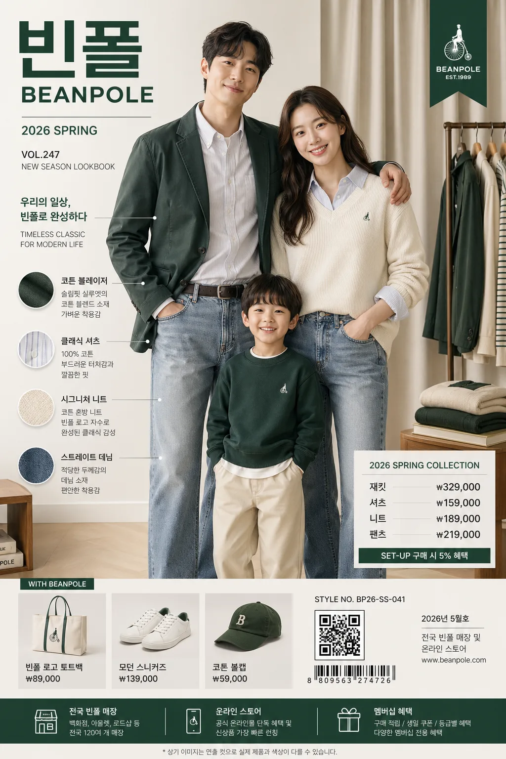
Korean fashion advertisement poster for BEANPOLE, editorial commercial style with model, product, price, and seasonal campaign information hierarchy.
Vertical brand ad designed for magazine-like print and social media, preserving the same premium modern family-newlywed fashion tone while adding realistic retail-poster details, catalog copy, barcode/QR area, and store information.

[Composition]
- Overall framing: tall 1024x1536 poster, model-led composition with product and price information arranged in a refined commercial hierarchy suitable for a department-store fashion campaign.
- Main subject placement: {레이아웃} with the model occupying the central 55% of the frame, product detail zones around the lower and side areas, and pricing copy set in a compact information block.
- Background treatment: premium Korean lifestyle studio set with a softly lit apartment-showroom atmosphere, light wood floor, linen curtain, clothing rack edge, folded knitwear on a low side table, and subtle wall texture in {컬러 팔레트}; all elements should support the fashion story and product realism.
- Spacing and direction: organize all text, garment callouts, price tags, and brand information on a clear editorial grid with strong vertical balance and realistic print-ad density.
- Visual identity: keep {브랜드 톤} and {시그니처 결} clearly visible in the overall styling, while the apparel presentation emphasizes premium everyday wear.
- Proportion: respect {비율} in the model-to-copy relationship so the ad still reads as a fashion campaign first, with supporting retail details around it.

[3. CORE STRUCTURE]
1. Hero area (top 55%): centered fashion model in a polished commercial pose, showing {제품·소재} with crisp fabric definition, natural folds, stitching, buttons, collar shape, and an approachable premium retail look.
2. Brand zone: place {카피·타이포} in a clean top or upper-mid typographic block, with the Korean wordmark and English wordmark clearly separated and well-kerned. Add small campaign metadata such as "2026 SPRING", "VOL.247", and "NEW SEASON LOOKBOOK".
3. Product zone: feature garments as the primary visual anchor, with neat styling that reads like a seasonal lookbook spread; include small Korean product callouts such as "코튼 블레이저", "클래식 셔츠", "시그니처 니트", and tiny fabric notes next to the clothing.
4. Pricing zone: position {레이아웃} as a compact lower-third or side-lower information area, using a clear hierarchy so the price is readable without overpowering the fashion imagery. Include realistic retail lines such as "재킷 ₩329,000", "셔츠 ₩159,000", "니트 ₩189,000", "팬츠 ₩219,000".
5. Palette integration: distribute {컬러 팔레트} across clothing accents, text accents, barcode/QR block, hangtag details, and background balance, keeping the palette controlled and brand-consistent.
6. Campaign detail zone: add a small barcode/QR area, a tiny product-code line like "STYLE NO. BP26-SS-041", a date label "2026년 5월호", and a store information footer such as "전국 빈폴 매장 및 온라인 스토어".
7. Mood and finish: combine {무드·라이팅} with a premium retail campaign polish, ensuring edges are clean, skin tones are natural, garments retain true texture, and the poster feels like a real printed Korean fashion advertisement.

[4. STYLE RULES]
- Typography: use Pretendard Bold for Korean brand/copy, with English in a clean sans-serif such as Helvetica Neue or Inter; headline weight 700-800, subcopy weight 400-500, tight but readable tracking.
- Color palette: use {컬러 팔레트} as the dominant palette, with bright white/off-white editorial areas, charcoal text accents, restrained green brand points, and warm natural material tones from the set.
- Border/shadow: subtle soft shadow under model, garment details, product cards, and price tags, around 4px y-offset, 12px blur, 15% opacity; use realistic print layering, fine divider lines, barcode blocks, and small catalog annotations.
- Text density: include 2-3 short Korean headline blurbs around the hero image, for example "나다운 클래식", "가볍게 입는 하루", "봄의 결을 담다".
- Retail realism: include tiny credit text such as "Model: JIHO KIM", "Styling: BEANPOLE STUDIO", "Photo: Seoul Campaign Unit", plus a small footer address/contact line.

[5. VISUAL STYLE]
- Camera / lens: medium-format fashion campaign look, Phase One IQ4 with 80mm lens at f/5.6, sharp fabric detail and clean depth separation.
- Lighting: studio key plus daylight realism, soft window-like fill from upper-left at about 45°, gentle rim light from right, controlled contrast, no harsh speculars.
- Color grade: crisp modern retail grade with beanpole green, bright white, and charcoal neutrality; slightly cool whites with natural skin-tone preservation.
- Print finish: realistic high-end magazine advertisement finish with fine paper grain, clean ink edges, precise Korean type rendering, and believable commercial retouching.

[6. MOOD]
Premium Korean fashion campaign — polished department-store editorial with a clean Kinfolk x Vogue Korea commercial feel, upgraded with lived-in showroom details, seasonal catalog cues, and authentic retail information.

[7. CRITICAL]
- Korean text accuracy: 반드시 정확히 보여야 하는 문자열: "빈폴", "BEANPOLE", "컬렉션".
- Additional Korean text to render clearly: "2026년 5월호", "나다운 클래식", "봄의 결을 담다", "전국 빈폴 매장 및 온라인 스토어", "재킷 ₩329,000", "셔츠 ₩159,000".
- Layout invariants: maintain a model + product + price advertising hierarchy; keep the image polished, modern, and brand-consistent with no distortion of apparel or typography.
- Brand realism: wordmark, barcode/QR area, product-code line, store footer, and tiny credit text should look printed into the layout, not floating randomly.

[8. 🚫 PROHIBITED]
- Fake official seals / certifications
- Broken Korean characters
- Celebrity composites / unauthorized likeness