廣告/海報
오리온 과자 광고
오리온 톤 — 한국 과자 친근
오리온 과자 광고摘要
這是用來製作廣告/海報內容的 ChatGPT 圖像提示詞,已整理主題、背景、風格與構圖,方便快速調整。
相關關鍵字: 오리온 과자 광고, 오리온 과자 광고 프롬프트, 廣告/海報 프롬프트, 廣告/海報 AI 이미지 프롬프트, ChatGPT 이미지 프롬프트, AI 이미지 생성 프롬프트, AI 프롬프트, 이미지 프롬프트
오리온 과자 광고使用方式
保留原始結構並替換主體、背景、色彩或構圖,即可延伸出不同版本。
- 保留核心主體,並依品牌、季節或平台調整色彩與背景。
- 如果畫面太複雜,請減少背景元素並具體描述主體、構圖與光線。
- 複製後可要求 ChatGPT 配合平台、長寬比或文字需求調整。
提示詞原文
[Input]
- language: Korean
- output_size: 1024x1536

[Purpose]
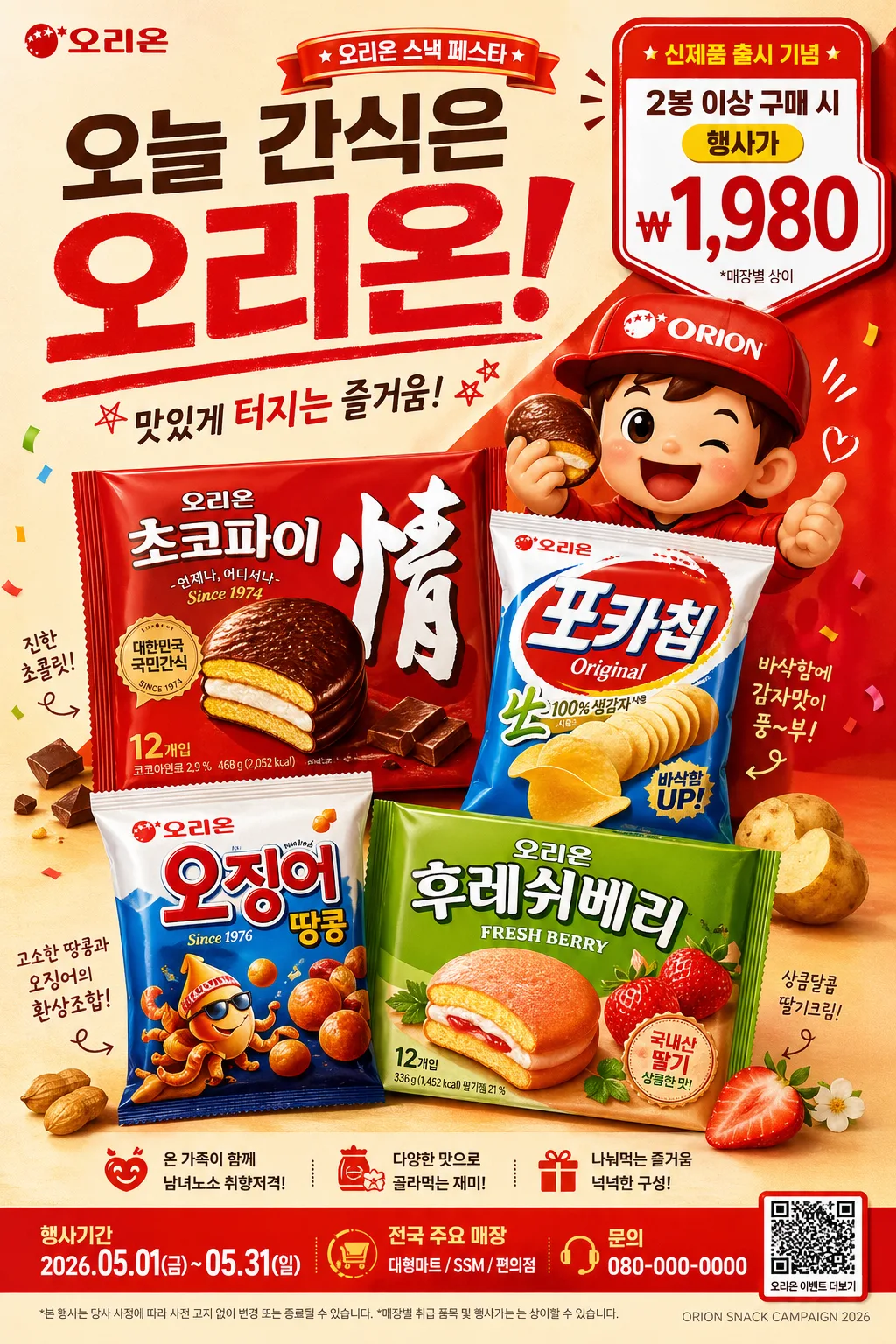
Korean snack advertisement poster, brand-safe commercial key visual for an Orion-style product promo.
Vertical retail poster with playful character-driven packaging emphasis, realistic in-store campaign details, social media readiness, and a polished mass-market snack advertising finish.

[Composition]
- Main product hero sits in the lower-middle 55% of the frame, large and forward-facing, with {제품·소재} clearly readable and visually dominant.
- Supporting character element appears beside or slightly behind the product hero, echoing a friendly mascot-ad style with playful motion, snack crumbs, small ingredient pieces, and illustrated flavor cues around the package.
- Price / promo callout is placed in a compact badge area near the upper-right or lower-left corner, balanced against the hero product; include a realistic Korean retail line such as "2봉 이상 구매 시", "행사가 ₩1,980", or "오늘만 달콤특가".
- Background uses a warmly lit studio retail set with matte paper backdrop, glossy tabletop reflections, subtle packaging shadows, small snack pieces, flavor ribbons, and campaign stickers that make the advertisement feel physically produced.
- Keep framing tight and commercial, with clear separation between hero product, character, copy, pricing, event information, and small legal/credit text.
- Add realistic poster micro-details: top campaign label, short headline, bottom store/event strip, tiny barcode or QR-code area, and small copyright/credit line such as "ORION SNACK CAMPAIGN 2026".
- {브랜드 톤} should guide the overall brand voice and visual consistency.
- {시그니처 결} should remain visibly present in the illustration, styling, packaging presentation, mascot treatment, and background graphic rhythm.
- Apply {레이아웃} and {비율} so the finished poster feels like a real vertical retail print advertisement.

[3. CORE STRUCTURE]
1. Top brand area: place the brand wordmark and headline copy in a compact upper band with a small campaign tag such as "NEW SWEET MOMENT" or "오리온 스낵 페스타".
2. Hero product area: render {제품·소재} as the central commercial object, crisp, glossy, and front-facing, with realistic packaging highlights, crimped package edges, tiny nutrition-table hints, and believable print texture.
3. Character / signature motif area: add a friendly mascot or signature visual accent adjacent to the hero product, aligned to the brand’s playful snack-advertising language; give it a cheerful pose, small motion marks, and snack-flavor interaction.
4. Promo and price area: place a clear price or value badge in a bold geometric shape, readable at thumbnail size, using Korean retail copy such as "신제품 출시 기념", "행사가 ₩1,980", "1+1 한정", or "매장별 상이".
5. Supporting copy area: include short Korean marketing text near the bottom or side margin, bold and campaign-like, for example "한입에 퍼지는 달콤한 즐거움", "바삭하게 돌아온 국민간식", or "오후 3시, 기분전환 스낵".
6. Event / retail information strip: add a lower band with realistic details such as "행사기간 2026.05.01–05.31", "전국 주요 매장", "문의 080-000-0000", a tiny barcode/QR block, and small disclaimer text.
7. Background and framing: use a studio-lit composition with warm gradients, tactile paper texture, controlled reflections, ingredient accents, playful decorative shapes, and polished retail-ad finish that keeps the hierarchy easy to read.

[4. STYLE RULES]
- Typography: use Pretendard Bold or Noto Sans KR Bold for main Korean copy, with smaller supporting text in Pretendard Medium; size hierarchy should feel like a real packaged-food advertisement.
- Main headline direction: {카피·타이포}; set bold Korean cover-style ad lines such as "맛있게 터지는 즐거움" or "오늘 간식은 오리온" with confident spacing and commercial readability.
- Color palette: {컬러 팔레트} with Orion-style red, white, warm cream, and a single accent color; use vivid but controlled saturation, glossy pack highlights, and warm snack tones.
- Border/shadow: apply soft drop shadows with 4px vertical offset, 12px blur, and 15% opacity; use subtle outline separation where needed for readability.
- Graphic details: add small flavor icons, dotted halftone bursts, paper-cut shapes, coupon-like tabs, shelf-label accents, and tiny production marks to make the poster feel retail-authentic.

[5. VISUAL STYLE]
- Camera / lens: 50mm commercial product-shot perspective, f/5.6, clean front-facing framing with slight depth separation.
- Lighting: studio softbox key light from upper-left at 45°, gentle fill from right, subtle rim highlight to define the packaging edges; incorporate {무드·라이팅} into the final light mood.
- Color grade: warm studio red + bright white + clean neutral highlights, with slightly enhanced contrast for shelf-ready advertising clarity.
- Material realism: glossy laminated snack bag, embossed logo ink, crinkled foil edges, soft tabletop reflection, small edible crumbs, and realistic printed packaging registration.

[6. MOOD]
Classic Korean snack commercial key visual — polished retail advertising with the familiar upbeat energy of a mass-market TVC still, enriched with playful point-of-sale details, seasonal campaign energy, and appetizing snack textures.

[7. CRITICAL]
- Korean text accuracy: the following strings must appear correctly if used in the composition: "오리온", "신제품 출시 기념", "행사가 ₩1,980", "한입에 퍼지는 달콤한 즐거움", "행사기간 2026.05.01–05.31".
- Preserve the exact commercial composition logic: hero product first, character second, price, headline, event information, and supporting copy clearly readable.
- Keep packaging and mascot proportions consistent with a real snack advertisement layout.
- Include realistic poster details such as a tiny barcode/QR area, store/event strip, small campaign credit line, and short Korean promo blurbs without overpowering the hero product.

[8. 🚫 PROHIBITED]
- Fake official seals / certifications
- Broken Korean characters